Life Is Strange - Fanart
Printed From: Pixel Joint
Category: Pixel Art
Forum Name: WIP (Work In Progress)
Forum Discription: Get crits and comments on your pixel WIPs and other art too!
URL: https://pixeljoint.com/forum/forum_posts.asp?TID=22427
Printed Date: 18 March 2026 at 9:12pm
Topic: Life Is Strange - Fanart
Posted By: Lakelezz
Subject: Life Is Strange - Fanart
Date Posted: 15 April 2015 at 5:45am
|
Dear PixelJoint-Forum! This thread is about the game "Life Is Strange" which deficiently climbed my heart within seconds. The concept for my fanart is the following: Providing an instant camera photo taped onto a surface. The photo features the main character in front of an environment.  The right white elements are pretending to be snow, nonetheless I am not happy with it at all nor have I clue how to make them working. Maybe they have to be removed though. As a result there are multiple attempts on diverse elements of this piece. Any suggestions about the ocean? It is still work in progress but I am not sure whether I should use more colours to describe the highlights. The surface on which the photo is also pretty boring, I might need to change that. Nonetheless it is much more neutral this way. Well, I will see. I am looking forward for your ideas and feedback. |
Replies:
Posted By: RebeaLeion
Date Posted: 15 April 2015 at 8:09am
| I think since photo has a little angle her chin should has should too. From my view it looks like body has the angle but chin is straight. I hope you understand my eng :D what i mean. |
Posted By: Lakelezz
Date Posted: 15 April 2015 at 8:47am
|
Oh, you are right! I had this weird feeling something must be wrong there (not especially the chin but something). Thanks for opening my eyes, RebeaLeion :) Is this any better? OLD: UPDATED:  |
Posted By: RebeaLeion
Date Posted: 15 April 2015 at 8:52am
| again something is wrong with the face, face seems ok now but the eyes are in same line, maybe the left one from our view is even higher /but that might be shadow play/ and it should not be (if it is not intentional). :-) toy with it a little. |
Posted By: Lakelezz
Date Posted: 15 April 2015 at 11:59am
|
Oh, you are right. Thanks a lot! Though the eye was a bit trickier than the chin. Is this any better? 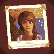 Hard to balance distortion and the right angle, haha. |
Posted By: Lakelezz
Date Posted: 16 April 2015 at 1:05pm
Ok, some snow edits.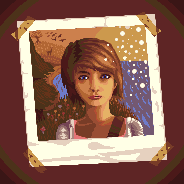 Additionally I tried to change the secondary colour to some blueish tone. Though I had to add a new colour for this.  |
Posted By: Naji
Date Posted: 17 April 2015 at 11:57am
|
the chin really looks cut off on her right (darker) side, at the bottom,
I'd round it up a tad like on the other side apart from that you did a lovely job |
Posted By: Lakelezz
Date Posted: 18 April 2015 at 5:34pm
|
Thanks for pointing out, you are completely right :) Here is a new version including a chin update and with very experimental water: 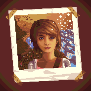 Still trying out different ways. It is hard to handle the spume and the snow. Any tips for the water in general? Additionally there is an update with background and grass. I might undo the grass edit though. Tried to make the lips less pouting and more friendly, too. |
Posted By: Naji
Date Posted: 19 April 2015 at 5:15am
|
the contrast it too high on the water, it looks rather icey
here are some examples of great water tones imo, http://www.pixeljoint.com/pixelart/49200.htm - 1 and http://www.pixeljoint.com/pixelart/82483.htm - 2 good job on the chin btw, your style is quite intresting I like it |
Posted By: Lakelezz
Date Posted: 19 April 2015 at 6:23am
|
Thanks and I agree, those are really good examples! My problem is that I fear to add new colours... Well but in order to provide a neat ocean I simply jumped over the fence and just added new colours. I can try to reuse those in the end anyway and even if I cannot - they will still be useful. Hopefully this is any better: 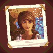 |
Posted By: Naji
Date Posted: 19 April 2015 at 8:38am
| looks way better already, only thing you can change is remove the brightest water shade towards the back to lose the focus and contrast in that area to give it depth. |
Posted By: Lakelezz
Date Posted: 19 April 2015 at 9:37am
|
The back? Do you mean the very far of the background, like shown here:  |
Posted By: Naji
Date Posted: 19 April 2015 at 11:42am
|
that's exactly what I meant :)
I'd add some highlights on that "second last" row of wave tho. I've edited it below so you know what I mean, this way the highlight doesn't stop from one wave to the next. 
|
Posted By: Lakelezz
Date Posted: 19 April 2015 at 2:50pm
|
Yes, I see! Thanks for visualizing it. I did some more edits to the waves. 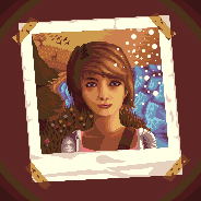 Not that happy with the ocean yet though. Does somebody have general ideas on what to improve? |
Posted By: Lakelezz
Date Posted: 21 April 2015 at 1:47pm
|
Some super experimental update. I am not even sure if I like the changes or if the tree, and grass, and hills were better in the last few updates. I am simply missing another person's view on this :/ Could somebody give me some feedback about that? The dark part of the tree might be too strong, maybe I need a new colour for the green. 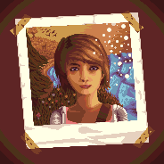 Additionally I am very unhappy with the ocean. Any tips for me? |
Posted By: Lakelezz
Date Posted: 22 April 2015 at 1:24pm
|
Since I disliked the water I decided to redo it. Here is my current version: 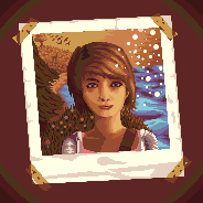 Sadly I am still not happy :/ Edit: Some cleaning on the last update. |
Posted By: Naji
Date Posted: 23 April 2015 at 4:32am
| I LIKE IT |
Posted By: Lakelezz
Date Posted: 25 April 2015 at 6:54pm
|
Thanks! I was not happy though. As a result I did quite a lot of edits. On the other hand I am still not done.  - Ocean got completely revamped. - Birds got cleaned. - Snowflakes got reduced and reshaped. - The torso has been changed according to the light source. - Her face's lighting has been adjusted and some pixels has been cleaned. - Clothes of Max got simplified. - The palette has been updated: Colours have been added, removed and changed. |
Posted By: RebeaLeion
Date Posted: 25 April 2015 at 11:39pm
| sea is muzc better now and whole pic feels better compared to 1st post. |
Posted By: Limes
Date Posted: 26 April 2015 at 1:11pm

Playing with the neck area Few notes... Pine tree needs major fixing~ Neck area and Left side of face (artists left) needs more depth~ (Seen in my edit nose shadow upper lip enlightened flat face ridden of) Sky and beach are hard to tell apart~ The characters left upper body is anatomically a mess. Her shoulders are too flat and her sweater doesn't flow. I didn't want to mess with the edit too much so I left this out. She is almost crooked and one of her shoulders seems closer to her neck then the other. Nothing you can't fix though I hope this turns out well :) EDIT: Just wanna say the hair is awesomely done good job on that :) and the overall idea of the picture is really cool. EDIT EDIT: actually you know what would be cool... A wooden table background behind the image or possibly more images below this one It would be troublesome because the light source in the photograph =/= the light source for the table. Of course the images below this one wouldn't go to such detail but it's an idea. EDIT EDIT EDIT: HER neck also may be too long. ------------- |
Posted By: Lakelezz
Date Posted: 29 April 2015 at 1:25pm
|
I appreciate your feedback and did some edits in the last days. This is just the current step and it will of course not be the last one. There are still things to be improved. 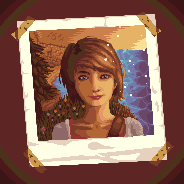 All the following perspectives are from the viewer: - The horizon's colour order has been changed back (dark -> bright instead of bright -> dark) - Nature in the back got changed - Pine tree got changed and is my greatest enemy at the moment - The left shoulder has now the same length as the right one - Her torso and neck are now more detailed - The bag's holder has a new texture/lighting - The right eye has been updated and is brighter - White dots were added inside the eyes - Her clothes' lighting got changed - Small stuff Well the pine tree is my biggest issue at the moment : / I have no clue what I could do with the surface on which the photo is taped on. A texture would be too distracting but I might change the shadows in the corners. Additionally in my opinion I have to improve the grass, too. |
Posted By: skittle
Date Posted: 30 April 2015 at 2:24am
|
Really nice to see you putting effort into your wip threads!
Some pointers though. The water should get darker as it nears the camera, and lighter as it get's further out -maybe there should be dark line at the end of the water since it is going out all the way to the horizon. The perspective on the water lines is also a bit funky atm, they're all drawn as if you're standing straight above them, instead of at an angle (note that they should also get smaller as they get farther away from the camera). Your colours are really great! My only gripe would be that the lady blends too much into the greenery behind her (and I'm not the biggest fan of that yellow on the right of her hair imo). Since she's outside, the light wouldn't only be hitting her directly from the side, try illuminating her left at little bit. Also the way you did the lighting on her shoulders makes her look like a flat board since the edges of her shoulders are the only things getting hit by light. Looking great though, kutgw! |
Posted By: Lakelezz
Date Posted: 30 April 2015 at 5:53pm
Thanks for your feedback! I started to slowly integrate it into my piece.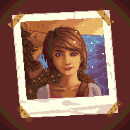 Well right now there is still a lot happening. The ocean is not completely done for example. I might have to redo the pine tree since it looks awful in my opinion. On the other hand I am running out of ideas to fix this without breaking the general style. Adding new colours for just a background object feels very uncontrolled and unsatisfying, too. |
Posted By: Lakelezz
Date Posted: 01 May 2015 at 7:36pm
|
New attempt on the pine tree. I tried to clean up the tree and correct the shapes. The old one was too noisy and uncontrolled thus I could not bear looking at it anymore. 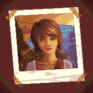 |
Posted By: Lakelezz
Date Posted: 02 May 2015 at 6:26pm
New updates!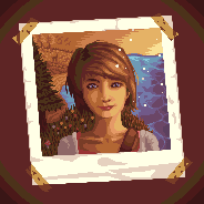 The ocean got changed again. Trying to make them becoming smaller nearby the horizon. Additionally the very far of the ocean is now a prettier. The grass area has been adjusted. Flower pattern are more consistent and feel more organized to me. Some small edits on the grass area, too. I added a few trees onto the hills in the very far. Alternatively I tried using a darker brown behind them to indicate some more pine trees but I did not like it that much. Max's hair has been slightly changed. Some missing AA was added, too. My last point is the front pine tree next to Max. I changed a few pixels on it. |
Posted By: Limes
Date Posted: 02 May 2015 at 9:25pm
|
The nose needs more shadow it almost has no shape. Like voldemort. ------------- |
Posted By: Lakelezz
Date Posted: 03 May 2015 at 6:15pm
|
Thanks for the feedback and neat comparison :D As a result I tried to increase the shadow around the nose! Additionally the background on which the photo is being taped on has been reworked. Last but not least some highlights on the ocean has been added.  Still not sure what to do with the shades in each corner of the taped background, though. |
Posted By: Lakelezz
Date Posted: 07 May 2015 at 4:24pm
 I call this done. The reasons are quite simple: This piece taught me enough and I do not feel any progress neither in the piece itself nor in my development. Thanks everyone! I appreciate your help :) I uploaded it to the gallery already: http://www.pixeljoint.com/pixelart/94644.htm - http://www.pixeljoint.com/pixelart/94644.htm |