Black Hole: The Game
Printed From: Pixel Joint
Category: Pixel Art
Forum Name: WIP (Work In Progress)
Forum Discription: Get crits and comments on your pixel WIPs and other art too!
URL: https://pixeljoint.com/forum/forum_posts.asp?TID=2273
Printed Date: 30 June 2026 at 2:42pm
Topic: Black Hole: The Game
Posted By: iSTVAN
Subject: Black Hole: The Game
Date Posted: 30 May 2006 at 3:10am
|
COLOUR MOCKUP SO FAR!
------------- You may or may not have seen my mockup artwork a while back on the gallery, but I've always wanted to turn my comic book, http://www.pixeljoint.com/istvan/blackhole.swf - Black Hole , into a game. You don't have to have read the book to help me. Want I want is help with the sprites, backgrounds and even story (if you feel so inclined). Yeah, this is probably a bit similar to Larwick's Rustbug thread. I've definitely been inspired by all great advice and comments he's received. IN SHORT... MAIN BH GRAPHICS! First off I'd like suggestions for a palette change. Four colours was originally used due to their simplicity and because it reminded me of old Gameboy games- but if you've got any better ideas, tell me! Cheers for now, ------------- Listen to what the flower people say... 
|


Replies:
Posted By: Swiifty
Date Posted: 30 May 2006 at 4:49am
|
Seems like a swell game. The only "bad" thing I have to say is that its a bit childish. I would remove the title "the game that sucks" and add some better attacks. I'll come up with more suggestions later on. |
Posted By: iSTVAN
Date Posted: 30 May 2006 at 5:19am
|
Thanks Swiifty mate. I guess the childish look is another affect of the gameboy-ish palette and style. Perhaps this will correct itself once I've adjusted the palette. 'The game that sucks' is just a working title, feel free to offer better suggestions!
I knew he wouldn't mind me posting it. Sure! I don't mind you having a go at colouring it in for me. Also, I'm not really sure where to find a GBA palette as such, I'd probably just go ahead and start using whatever colours I feel like. If you have a suitable GBA palette you'd like to provide me with, or details on how to get one, I'd muchly appreciate it. Also, keep in mind I started this project about a year ago, I just never thought to involve the community until now. So basically, my skill level SHOULD have improved, thats why I am willing to be more ambitious with colour. ------------- Listen to what the flower people say...
|
Posted By: Spoon
Date Posted: 30 May 2006 at 5:30am
| Looks good, deffinately needs a new pallette, i really hate green lol and it doesn't look as good as it could. |
Posted By: Larwick
Date Posted: 30 May 2006 at 5:33am
|
Hurrah for game WIPs! ^_^ -------------  http://larw-ck.deviantart.com"> http://larw-ck.deviantart.com">
|
Posted By: iSTVAN
Date Posted: 30 May 2006 at 5:50am
|
@Spoony: Thanks man. Haha, green was only originally used because I was using the Lil' Dudes palette from the main gallery. But I made some test variations early on. Check out these four: @Larwick: I agree with you totally about the Title Screen AAing. I am weighing up whether or not it's worth it to redo it using the current palette, if I'm going to be moving to full colour stuff. I'm glad you were amused by the simple style of graphics, a pisstake is precisely what I was aiming for! Especially as far as the running sprite goes. I have not intention to add any more frames to it. PS. Also, does anyone know the standard pixel size for game sprites and background objects? I might have to redo some of the tiles... ------------- Listen to what the flower people say...
|

Posted By: Spoon
Date Posted: 30 May 2006 at 5:57am
|
The plain black, grey and whitei s looking the best up there lol, err depends what size sprites your looking for, and the tiles usally 24x24 are 32x32 if im not mistaken.... PS. i love the second last animation..lmao that just rules.. |
Posted By: iSTVAN
Date Posted: 30 May 2006 at 6:15am
|
@Spoon: Thanks mate, lycra spandex tends to get a bit itchy...in my experience. Thanks for the tile sizes. I hadn't really broken up the background into proper tiles, I've just been using seperate items so far- not really considering their practicality for a game
Here's some preview colour images that I just threw together then. Two versions, one with all black oulines, the other with variations. I like the second best. Has a sort of Kenneth Fejer sort of look. ------------- Listen to what the flower people say...
|


Posted By: Spoon
Date Posted: 30 May 2006 at 6:32am
| Hehe thats nice, mind if i draw up some simple tile sets for you, just to prove im not useless at pixel art :P lol |
Posted By: Shark
Date Posted: 30 May 2006 at 6:45am
|
yeah I agree with larwick about it being a parody of old skool games
which is great for mockups, but if it was going to be developed i think a really cool colored version would be so much better. Perhaps he could enter a minigame and play old skool blackhole (just a thought). Im working on my own sorta take on this atm, i will post sometime tonight.. The colored sprites look so much better, if it were to be published, i still think they need a few more frames. As for GBA pallette, its massive so i think you should be able to use any color you want. ------------- Snark, we love yuu. |
Posted By: iSTVAN
Date Posted: 30 May 2006 at 6:46am
|
Go right ahead Spoon! This is all I really had in terms of background tiles so far: ------------- Listen to what the flower people say...
|

Posted By: Pixel_Outlaw
Date Posted: 30 May 2006 at 7:09am
|
Looks very nice so far, thae only thing I don't like is that you can't get a good effect with grey shading when the color it'self is used as a shade sometimes the used as a color othertimes. I would keep the other colors but dither areas where the green is the color of te object. I guess it just doesn't seem natural to shade with grey and green when ther green shares a simular saturation. It might be nice to look at some old children's books to see how the 50's monocoor artists did their work. I just wouldn't shade with the grey and green on the same space there are too close visually to conver demension. Perhaps you could also do each level a different palette. Overall excellent work! P>S> Please don't moditate me for critiquing your fine fine work..... ------------- http://www.shmup-dev.com/forum/"> 
|
Posted By: iSTVAN
Date Posted: 30 May 2006 at 7:35am
|
Thanks PO. Don't worry, you haven't upset me enough to warrant my "moditating." Your critisisms are very valid. The orignal grey and green colours were poorly chosen. They had a sort of subtle charm about them though. I tend to avoid dithering for game graphics. I'll upload some new colour talk icons that I made in the morning. Goodnight! Oh, and thanks Shark, I only just got your comment! Nice idea about the old school minigame. I can't wait to see your coloured interpretation! ------------- Listen to what the flower people say...
|
Posted By: Shark
Date Posted: 30 May 2006 at 7:46am
|
well interpretation... its looking totally diff so far, ill try and work of
your current tiles though. ------------- Snark, we love yuu. |
Posted By: iSTVAN
Date Posted: 30 May 2006 at 7:57am
|
I should be sleeping, but my mind ain't in the clouds yet. Here's those new talk icons.
Shark: Any effort is appreciated ;) ------------- Listen to what the flower people say...
|
Posted By: Souly
Date Posted: 30 May 2006 at 8:39am
|
Back -> Middle -> Back ------------- 
I am the jesus of PJ. |
Posted By: Aleiav
Date Posted: 30 May 2006 at 10:48am
|
This looks really cool. :) You'll have to tell us all when it's made into an actual game. :)
------------- |
Posted By: Shark
Date Posted: 30 May 2006 at 10:58am
|
I have worked on this on and off throughout today, i think it needs
another level of background to give it more depth. I dont really have time to add some more items but it gives you an idea of the potential this could have with more than 4 colors...  ------------- Snark, we love yuu. |
Posted By: Souly
Date Posted: 30 May 2006 at 12:33pm
|
Your spray paint inspired me to attempt to draw my new nickname. -------------
I am the jesus of PJ. |

Posted By: Pixel_Outlaw
Date Posted: 30 May 2006 at 12:50pm
|
Hmm I liked the fewer colors to be honest but it looks good. I think another layer would look good. Maybe a closer lighter could layer up top too. I know it's a kick in the crotch after al yor hard work but i like the less colored ve4rsion better, maybe because the light colors are kind of clashing with the dark night setting. If i look off screen the first things i see are the graphitti and the main character they are just too lumoneciant for the night setting. ------------- http://www.shmup-dev.com/forum/">
|
Posted By: Swiifty
Date Posted: 30 May 2006 at 3:19pm
|
I prefer the colorued mode. The only thing is I think someone mentioned, the colours of the character shouldn't be so bright in the night. I'm a beginner with this pixel stuff so I don't have much suggestions about colours etc, but I do know one or two things about arcade games. Therefor I present you these suggestions!!: Don't make the game repetive. Not just punch punch suck punch. Gets boring after a while. Investigate a little about the "real" thing. About black holes in the universe. Read a little about how they work and maybe you'll get even more inspiration for various attacks. Also it would be nice with a skill system. I mean, the reason why I play games is to get better at them. Therefor a skill system is a great thing to add to you game. I might come up with more suggestions later on, but for now, that'll do. Good night |
Posted By: Larwick
Date Posted: 30 May 2006 at 3:55pm
|
I personally love the fact he stands out so much, it's not 'right' but it works for me (like finding a candy in a bag full of coal). I agree the graffiti is too bright though. Still looks awesome. ------------- http://larw-ck.deviantart.com">
|
Posted By: Saboteur
Date Posted: 30 May 2006 at 4:25pm
|
Not that my opinion is backed with much experience, but I'd say either expand the pallette a whole bunch (like shark has done) or stick with the black, white, and greys. I'd also think it awesome if the game involved incredibly smooth Castlevania-like animations, at least moreso than the three-frame wonder souly put up (Which is rather good for three frames). Then again, that might be pushing it. Iunno, but I like the fact that you're makin' your dreams come true. Makes me feel all warm and tingly. ------------- "I was minding my own business and walking across a pebbled path, and a Duck started giving me the business." |
Posted By: Pixel_Outlaw
Date Posted: 30 May 2006 at 4:36pm
|
well i just think the 1990's style looses the 1950's monoculor feel. I have had a book called Your Friend The Garbage Man, it was monocolored. ------------- http://www.shmup-dev.com/forum/">
|
Posted By: iSTVAN
Date Posted: 30 May 2006 at 10:12pm
|
Thanks for all the helpful comments so far people. @Souly: Thank you! You're so right about the leg when he runs! I can't believe I've never noticed this before. Here's an updated verion: I've also updated the main post with the new graphics to save confusion. Also, the grafitti you and Shark have made has given me the idea to include any graphitti signatures you guys wanna send me as actual tiles in the background! Just a way to give back to the community ;) @Aleiav: Thanks a lot. With a little help from the community this thing might just see the light of day as a real game! @Shark: I really like what you've done with the background! Thanks. My version will probably be slightly lighter, but you've definately inspired me to go full steam ahead with a entirely coloured version. Thanks mate. I really like what you've done with the sky and the brick building especially. @PO: As mentioned above, my version of the background will be slightly different. I look forward to getting your help once I've completed it :) @Swifty: Your demands for a coloured version will be met, sir! And thanks for the suggestions. As far as additional attacks go I failed to mention my plans to have BH perform his special attack 'Supernova.' The attack features in the first episode of the comic, http://www.pixeljoint.com/istvan/bh1_07.htm - seen here . BH claps his hands together in order to blast a flash of white light which temporarily blinds his enemies. I plan on using a sort of 'rage meter' to control this attack. So he'd only be able to use it once he has a certain amount of kills or something. The skill system is also a nice idea, Swifty. I definitely plan on having special items that can be used for different things. This would add a level of strategy to the game. Got any ideas for this? I'm thinking the sorts of item progression that you see in games like the first game boy version of Zelda. @Larwick: My new coloured version will probably follow more the composition of the original mockup I posted, but hopefully it will still sport eye candy graphics that please you! @Saboteur: The updated first post should clear up any confusion about the issue of colour. That three frame animation Souly posted was actually posted earlier by me, and I've corrected a minor problem with it. I still have no plans to smooth it with more frames, but we'll see how things go. Thanks for the encouraging words, it's definately a dream of mine to see my Black Hole apppear under an endless line of crappy merchandise. ------------- Listen to what the flower people say...
|
Posted By: Demon
Date Posted: 30 May 2006 at 10:59pm
|
Hey, so is there anyone programming this game? I was sorta confused as to whether this was just a mock-up game or was going to be an actual game? EDIT: -This game is currently just in the concept and graphics stage. I would
love to talk to anyone about coding it, but I have no means to do so
myself. Didn't see this until after I posted  . Well, I can have some programmers in my development team, including myself, that can work on making this game official. :) Just let me know. . Well, I can have some programmers in my development team, including myself, that can work on making this game official. :) Just let me know.------------- "At least we killed some boredom..." - Death Note. |
Posted By: jalonso
Date Posted: 30 May 2006 at 11:31pm
Never seen this thread before  I like the 4 color version very much. ------------- |
Posted By: iSTVAN
Date Posted: 31 May 2006 at 12:41am
|
@Demon: I'd love to talk to you further about this man. I think it would be really fun working with you. PM me with the details you need, and we can start talking seriously ASAP :) @jalonso: Thanks mate, I only started this thread last night, but I did most of the drawings a long time ago. ------------- Listen to what the flower people say...
|
Posted By: Shark
Date Posted: 31 May 2006 at 1:54am
|
22 posts in a day must be the fasted updated post ever.
The coloring on your new stuff is coming out great... its got 'ISTVAN' style and i think it represents a sorta comic book look. Another idea i had was to make a comic book level where he runs through the frames and theres lots of 'Pow' "zap" etc...that would be cool. In the one i posted above i was trying to reflect a more crime orientated theme. In your originals it seemes so happy and just appeared to have trees and some1 at a but stop. I tried capturing a dark urban city, and i think i shooda made the grafiti less bright. ------------- Snark, we love yuu. |
Posted By: iSTVAN
Date Posted: 31 May 2006 at 4:29am
|
Thanks a lot Shark mate, I'm sort of going for that bright comic book feel, but I appreciate your efforts to being a dark side to the game. I will definately try to introduce that to the night levels. The comic book itself is meant to be a black comedy, so it suits well that there should be some more grimey elements to the graphics. Right now, though, it's my eighteenth birthday, and I'm having a big campus party, and I'm a little drunk. But as soon as I sober up I will work on some new fully coloured background and sprites. Cheers mate. ------------- Listen to what the flower people say...
|
Posted By: Spoon
Date Posted: 31 May 2006 at 4:32am
|
That coloured mock up looks hawt... PS. Happy birthday =P |
Posted By: Swiifty
Date Posted: 31 May 2006 at 5:30am
|
I haven't looked it up but I think when it comes to Black holes, the
law of physics stops working, which means that there's no gravity in
the hole itself. So maybe you could use the black hole to fly :P Also when the black hole pulls something in, it stretches it. It doesn't pull in the whole materia at once, but gradually, and when it comes to that kind of gravitation it would rip of the legs of someone if he was being sucked into the black hole. Once again, I'm not 100% sure about the facts above. Anyway I got one crazy idea :P He got 1 black hole on each of his hand right? What if he moved them towards each other and holds them like 40 dm from each other. This could maybe create some sort of weapon. You see, when you hold them that close, it drags out the light or something else from the other black hole, forming a weapon of some sort. I know they sound far fetched but maybe you could turn them into something more "acceptable" :P And I liked the "rage" thing, sounded very interesting. Maybe after a while he could develope new powers when advancing in lvl or something. I also read something about a "White hole". Although they don't seem to exist in the real world. Here's a little text about them: "The equations of general relativity have an interesting mathematical property: they are symmetric in time. That means that you can take any solution to the equations and imagine that time flows backwards rather than forwards, and you'll get another valid solution to the equations. If you apply this rule to the solution that describes black holes, you get an object known as a white hole. Since a black hole is a region of space from which nothing can escape, the time-reversed version of a black hole is a region of space into which nothing can fall. In fact, just as a black hole can only suck things in, a white hole can only spit things out. White holes are a perfectly valid mathematical solution to the equations of general relativity, but that doesn't mean that they actually exist in nature. In fact, they almost certainly do not exist, since there's no way to produce one. (Producing a white hole is just as impossible as destroying a black hole, since the two processes are time-reversals of each other.)" Maybe the final boss could have this ability :POne more thing, maybe I could assist you in your work? By that I mean, creating some pixel art for you, if good enough, you could use in the game. |
Posted By: iSTVAN
Date Posted: 31 May 2006 at 9:21am
|
Spoon: Thanks, although I hate Family Guy. !Swifty: Well your scientific mumbo jumbo alines perfectly with my current 18 year old drunken state, but yes! Combining both hands does create a special attack weapon. I like your thinking for the ultimate boss. It would be cool to make them polar opposites. As far as you contributing to the art, I guess I'd have to see some examples of your previous work before I took you on. This is all happening pretty fast, and I'd probably want to discuss things further with Demon before anything to do with the game is decided. Overall, I think I should sober up before I use the internet ever again. Love Ivan (iSTVAN). ------------- Listen to what the flower people say...
|
Posted By: Spoon
Date Posted: 31 May 2006 at 9:28am
| I only picked it till i make myself one :P |
Posted By: iSTVAN
Date Posted: 31 May 2006 at 9:32am
|
That's cool Spoon, I suppose your name is still named after a sort of cool band, so that evens things out. for me atleast. ------------- Listen to what the flower people say...
|
Posted By: Demon
Date Posted: 31 May 2006 at 11:57am
iSTVAN: I will for sure be in contact with you soon. I should have some free time later today. 
------------- "At least we killed some boredom..." - Death Note. |
Posted By: Spoon
Date Posted: 31 May 2006 at 12:07pm
| lol...Spoon is my nickname..lmao...I got it from playing football, because when i kicked the ball it spooned off in the opposite direction :| |
Posted By: iSTVAN
Date Posted: 01 June 2006 at 6:01pm
|
@Demon: I hope what I've sent you so far is a good start, I look forward to hearing back from you. @Spoon: Nice nickname origin! To everyone else, we've started talking about production of the game. It's only early days so far. I will have some more coloured graphics to show you and some details on the first level very soon. ------------- Listen to what the flower people say...
|
Posted By: Demon
Date Posted: 01 June 2006 at 7:14pm
|
Yes, it seems as though BlueStar has secured Black Hole: The Game. As iSTVAN said, the game is in it's very premature form. Basically it is in it's resource and information gathering stage of development. :D
------------- "At least we killed some boredom..." - Death Note. |
Posted By: jalonso
Date Posted: 01 June 2006 at 11:36pm
|
Originally posted by Shark ...22 posts in a day must be the fasted updated post ever... I thought I was crazy, for not having seen this WIP. ------------- |
Posted By: iSTVAN
Date Posted: 01 June 2006 at 11:57pm
|
@Demon: Fantasitc news! Do you have any more information I can read about your team BlueStar? @Jalonso: Haha, I think this mainly took off so fast because I responded to almost every post myself. Oh, and yeah, sorry for my drunkeness earlier on. Won't happen again, promise. ------------- Listen to what the flower people say...
|
Posted By: Shark
Date Posted: 02 June 2006 at 3:05am
|
Ur never gonna get drunk again o.0
gimme some more colored graphics!! ------------- Snark, we love yuu. |
Posted By: Stitchy
Date Posted: 02 June 2006 at 9:48am
|
Hahaha, so how many times did you wash those pajamas? xD Just gotta say I uh... can't wait to see more of this game. <33 /reaches for eeeet |
Posted By: iSTVAN
Date Posted: 02 June 2006 at 5:22pm
|
Okay, finally some new stuff!
And I've written up the different keys. keys/actions- x= jump You can suck enemies aswell as objects, however they cannot be stored. When sucked, the enemy collides with BH and he holds them up by the collar. They can only be sucked when they have less than half of their health. From this position the player can press either: There will also be strategically placed obstacles throughout the levels which require BH's super power sucking ability. These situations will be defined by the environment.
I should have some more background stuff up soon! Oh, and there should be a warning at the top of this post that says 'GAME SPOILERS, DON'T READ!' @Shark: Your demand have been met! ------------- Listen to what the flower people say...
|
Posted By: Shark
Date Posted: 02 June 2006 at 5:32pm
|
didnt spoil it for me i barely read it lol ------------- Snark, we love yuu. |
Posted By: iSTVAN
Date Posted: 02 June 2006 at 7:00pm
|
Well, okay. For those of you not interested in long reads, check out this updated colour mock up!
------------- Listen to what the flower people say...
|

Posted By: jalonso
Date Posted: 02 June 2006 at 7:09pm
|
GORGEOUS!!!
------------- |
Posted By: Pixel_Outlaw
Date Posted: 02 June 2006 at 7:20pm
|
It looks very light and pretty but some elements are quite flat. ------------- http://www.shmup-dev.com/forum/">
|
Posted By: Shark
Date Posted: 03 June 2006 at 4:33am
|
the pallettes make me very happy, which is good for a game...but
theres always a but... overall it lacks texture. The ground tiles just seem like grey blox. The bricks are quite nice with the simple shaded style.. but the trees definitley look like cardboard cut outs. it may a bit negative but i really like this on first glance.. but when analysing it could be better. ------------- Snark, we love yuu. |
Posted By: Swiifty
Date Posted: 03 June 2006 at 8:11am
| Looks nice, just as other says, its to plain. Add some more texture, especially to the backround, the city. |
Posted By: Doppleganger
Date Posted: 03 June 2006 at 1:13pm
|
I took it upon myself last night to mess around with coloring it because it seemed fun. Now that you posted your own it's not as useful but here it is anyways. Aside from the background buildings and clouds I used your sprites and slighty modified BH but only for clarity of appendages reasons. |
Posted By: Stitchy
Date Posted: 03 June 2006 at 1:23pm
|
That... is some sexy coloring there, Dopple. <3
------------- |
Posted By: Demon
Date Posted: 03 June 2006 at 1:40pm
|
@iSTVAN: If you would like to read more about BlueStar, we have a temporary site at http://rustbug.googlepages.com/bluestar . The official site will reside at http://www.bluestardev.net @Doppleganger: I like the coloring on the tree, but the whole scene looks a little too busy. And BH blends in with the background too much, which can get annoying while playing the game. I went ahead and made another mockup, put together some things from doppleganger's edit and iSTVAN's latest mockup. I also changed how the inventory item boxes.  ------------- "At least we killed some boredom..." - Death Note. |
Posted By: Aleiav
Date Posted: 03 June 2006 at 9:44pm
|
It's awesome but I'm personally not too crazy about yellow as the color for the top bar. It's sort of distracting to me. How about a light green. Not lime green, but a medium tint of green like the colors on the dumpster. That might be nice. :)
------------- |
Posted By: Pixel_Outlaw
Date Posted: 03 June 2006 at 9:53pm
|
Originally posted by Aleiav
It's awesome but I'm personally not too crazy about yellow as the color for the top bar. It's sort of distracting to me. How about a light green. Not lime green, but a medium tint of green like the colors on the dumpster. That might be nice. :) My thoughts exactly. Also, the shading on the tree baskets needs to have an even distribution of the light bands make dark grey on the other side too. Also you might make some slight hints of light on those bricks and add some slightlyy dark flecks to the masonry. ------------- http://www.shmup-dev.com/forum/">
|
Posted By: jalonso
Date Posted: 04 June 2006 at 12:03am
|
Originally posted by iSTVAN
This is a perfect example of "Less is more". The very simplistic style used gives it a unique/original look that added textures and colorings will take away. The game looks like it would be fun and light gaming. I actually prefer the 4 color versions originally posted the best but since most seem to prefer more color this meets the bill. I hope iSTVAN doesn't overdo it. It's AWESOME as is. ------------- |
Posted By: iSTVAN
Date Posted: 04 June 2006 at 5:33am
|
Alright, first off some responses! @Jalonso: Thank you very much! Your support is very encouraging. Some updates I think will be required, but I will try to please the pro-simpletons aswell. @PO: Thanks. I'll be working on bringing some elements a bit more texture. Expect an update soon man! @Shark: Thanks. At the moment, I am going for a chirby sort of feel. It wouldn't match the big headed cartoony character sprites to use dark disturbing colour schemes. And it will make it more dramatic later on when the game DOES get darker. The ground might be different overall if I'm going to add road tiles and cars, so bare with me for the moment. The trees, well, I like the simple cardboard cut out feel--i don't want them to overpower the character sprites. I will, however, experiment with this. Cheers. @Swifty: I would definately like to bring a bit more to the city background and sky, I'm just not exactly sure how to go about it yet. @Doppleganger: Thanks for the colour edit mate! Your's has a very textured arty feel that I'm not quite sure would work in a game, but looks great anyway! I mainly like what you did with the buildings in the background and the tree. Cool stuff! @Stitchy: Yeah! @Demon: Nice looking site you have there! I'm excited to be involved. I really like your updated inventory bar. Oh, and that big level write up way back up there was particularly intended for your eyes. I've added you to my msn contacts so I look forward to discussing this further with you ;) @Aleiav: Cheers. The colour of the top bar is meant to match up with BH's costume colours. If you can think of a different combination of his blue and yellow, I'd love to see it. Thanks for the suggestion. And heres an updated mockup! ------------- Listen to what the flower people say...
|

Posted By: iSTVAN
Date Posted: 04 June 2006 at 5:57pm
|
New coloured Thug sprites.
Running and punching. EDIT: And here's another variation on the thug, with both animations.
And a slight update to the mockup: ------------- Listen to what the flower people say...
|

Posted By: Aleiav
Date Posted: 04 June 2006 at 9:47pm
|
Maybe a reverse? The stuff you made yellow, make blue and the stuff you made blue make yellow? It might take away from the distraction. ------------- |
Posted By: iSTVAN
Date Posted: 04 June 2006 at 10:42pm
|
How's this looking, Aleiav? I hope this looks better. I never saw any distraction, but then some monitors are brighter than others, and I want to aim to please the majority of computer screen eyeballs out there! Now you make me worried about the trees. PS. New BH animations: from hold to slap and from hold to uppercut.
------------- Listen to what the flower people say...
|

Posted By: Shark
Date Posted: 05 June 2006 at 12:49am
|
the blue looks better but i dont like the brown n the health bar.
Fix those trees.. please there just killing me atm. Try shading like doppleganger's edit they werre sexy... ------------- Snark, we love yuu. |
Posted By: iSTVAN
Date Posted: 05 June 2006 at 1:56am
|
@Shark: The trees doppleganger drew are too highly textured and highlighted to match the rest of my backgrounds. Like I said, I want to avoid overpowering the sprites with complex backgrounds. I've changed the tree colours and swapped the brown with a lighter brown found in BH's costume.
I'm gonna try and get a new scene up soon using some new background pieces and sprites. I'll try and make it as different to this one as possible. ------------- Listen to what the flower people say...
|
Posted By: Shark
Date Posted: 05 June 2006 at 2:24am
|
i think the trees are too pale... keep the shading the same just edit
the colors. apart from that this looks great. ------------- Snark, we love yuu. |
Posted By: iSTVAN
Date Posted: 05 June 2006 at 2:39am
|
@Shark: Thanks mate. I'll be having variations in trees throughout the levels, so hopefully everyone will get their way at one stage. I other news, I'm looking to take aboard another pixeller for this project. The job will primarily involve tile based work (which is not a specialty of mine). You'd be working under me, and ofcourse you'll get credited for all your hard work. If anyone is interested, please PM or email me with examples of their work. ------------- Listen to what the flower people say...
|
Posted By: Larwick
Date Posted: 05 June 2006 at 3:08am
|
Looking great. How about a yellowing hue for the highlights of the trees and bushes? It seems to make them more interesting to me. Oh and for some reason the highlight colour for each plant seems to be a slightly different colour, and this is probably the same with other parts of the image (note 89 colour count). It probably isn't that important but i thought it would be worth pointing out. ------------- http://larw-ck.deviantart.com">
|
Posted By: Aleiav
Date Posted: 05 June 2006 at 4:44pm
|
Nice topbar. :) Much better. And I really like the clouds. ------------- |
Posted By: iSTVAN
Date Posted: 05 June 2006 at 4:50pm
|
@Larwick: I suspect I've repeated what you've described with the inconsistent tree colouring and mixed old colours with updated ones making my colour count massive. I've kept one set of original tiles, so it should go down to a lower number when I put them together again. I'm no pro at tiling, I admit it. Thanks for taking a closer look! And you're right about the yellow tree highlighting, its looking much better! Working on some new tiles for a construction site scene mockup. ------------- Listen to what the flower people say...
|
Posted By: Demon
Date Posted: 05 June 2006 at 5:27pm
Looking good iSTVAN. For the game, try and make the buildings background and clouds background as seperate images with transparency instead of the lighter shade of blue that makes up the main background color. This will allow for parallax scrolling, a pretty kool side-scrolling effect.  , also, a colored version of your tileset you made would be something that needs to be done. , also, a colored version of your tileset you made would be something that needs to be done.I am going to be starting on the game soon, just to let you and everyone else know. ------------- "At least we killed some boredom..." - Death Note. |
Posted By: iSTVAN
Date Posted: 05 June 2006 at 5:50pm
|
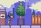
@Demon: Hey thanks man. I've been keeping the background objects as seperate layers, parallex scrolling would work awesomely for this! My tileset, as mentioned earlier isn't really a tileset, but here it is.
It's a sloppy way of doing things, I know. This is my main reason for wanting some outsite help on this project. And here's the new mockup I've been working on: ------------- Listen to what the flower people say...
|

Posted By: KawizradSaddrax
Date Posted: 05 June 2006 at 7:09pm
|
This has come such a long way! Its looking great. It kind of reminds me of the Atari Game http://www.atari7800.org/screenshots/Scrapyard_Dogscreen.htm - Scrapyard Dog . Im anxious to see where this goes. /weller |
Posted By: Pixel_Outlaw
Date Posted: 05 June 2006 at 7:18pm
|
Well it looks great but the tree baskets still annoy the hell outta me because the shading is so bizzare. ------------- http://www.shmup-dev.com/forum/">
|
Posted By: Demon
Date Posted: 05 June 2006 at 7:47pm
|
Reminds me of a level from the Sega game Spider-Man: Maximum Carnage. :D Good memories!
------------- "At least we killed some boredom..." - Death Note. |
Posted By: iSTVAN
Date Posted: 05 June 2006 at 8:32pm
|
Thanks for the comments peops! First off, @KawizradSaddrax: Thanks! This has come a long way, I'm really happy with the progress. And nice linkage- I definately see the similiarities. That Scrapyard dog looks like a strange game! @PO: Cheers. Feel free to make an edit of the tree basket to show me what you mean. @Demon: Funny you should say that. My main game related inspiration for the project has been coming from a couple of different GBA Spiderman games I used to play. Oh, and if anyone has any suggestions for background pieces for the construction site, or any of the other levels I described on page two, please let me know! I needs ideas. ------------- Listen to what the flower people say...
|
Posted By: Demon
Date Posted: 05 June 2006 at 8:44pm
|
If anyone is interested, iSTVAN is looking for someone to help with the game by making level tiles. Peace!
------------- "At least we killed some boredom..." - Death Note. |
Posted By: iSTVAN
Date Posted: 05 June 2006 at 9:28pm
|
Cheers Demon. I might write up something and post it in the job offering section. ------------- Listen to what the flower people say...
|
Posted By: Shark
Date Posted: 06 June 2006 at 3:32am
|
I dont mind lending a hand on background art and tiles... ------------- Snark, we love yuu. |
Posted By: iSTVAN
Date Posted: 06 June 2006 at 4:01am
|
@Shark: Fantastic mate. I'll talk to you a bit on MSN and we can try and have you posting stuff here aswell ASAP! ------------- Listen to what the flower people say...
|
Posted By: iSTVAN
Date Posted: 06 June 2006 at 7:30am
|
News for anyone following the game: Hope to have some new stuff to show off soon! ------------- Listen to what the flower people say...
|
Posted By: Shark
Date Posted: 07 June 2006 at 10:34am
Just compiling stuff together. Here are the items.

I had to edit your tiles to get them to a uniform tile size - 32x32. I also had to make them tile. Made a few edits aswell.  ------------- Snark, we love yuu. |
Posted By: Pixel_Outlaw
Date Posted: 07 June 2006 at 11:04am
|
I hope the Black Hole is like one of those hero's from the 1950's that makes all the kids wish that they had the hero instead of their real fathers. Gordon: Say son how would you fancy fishing with me! ------------- http://www.shmup-dev.com/forum/">
|
Posted By: Shark
Date Posted: 07 June 2006 at 12:42pm
|
lol. ------------- Snark, we love yuu. |
Posted By: Souly
Date Posted: 07 June 2006 at 1:10pm
lawl.  -------------
I am the jesus of PJ. |
Posted By: iSTVAN
Date Posted: 07 June 2006 at 6:46pm
|
@PO: Hahah. Black Hole could maybe beat your mother, but he's no real fatherly figure- that's for sure. He's more like the drunken version of Spiderman, only less whiney. That said, you can still expect many cheesy, typically superhero-esque. http://www.pixeljoint.com/istvan/blackhole.swf - Don't forget to read the comics if you want more background info on BH! The tiles and items are looking great, Shark! I especially like the different types of bricks. I'm only not too fond of the dithering on the pavement. I like the gutter you did, but I don't think we need to add any texture to it really. It'd look sharper just with a highlight line I reckon. Oh, and I'll have 6 weeks off as of this afternoon to work on the game! Can't wait to post some more stuff! ------------- Listen to what the flower people say...
|
Posted By: iSTVAN
Date Posted: 08 June 2006 at 8:00am
New BH punching animation! ------------- Listen to what the flower people say...
|
Posted By: Aleiav
Date Posted: 08 June 2006 at 9:11am
|
XD I like it. ------------- |
Posted By: Swiifty
Date Posted: 08 June 2006 at 11:47am
| You mind me asking: "Why is he moving his head like that?". |
Posted By: Shark
Date Posted: 08 June 2006 at 1:47pm
|
Cos hes an over exaggerated stereotypical superhero. Duh! ------------- Snark, we love yuu. |
Posted By: iSTVAN
Date Posted: 08 June 2006 at 7:23pm
|
@Aleiav: Cheers! @Swifty: Shark answered your question! It also makes him look pretty goofy, even a bit of a pussy. Remember, Black Hole (the comic) was always a superhero comedy. @Shark: ;) I'm personally happy that I finally managed to get some cape movement going on. That thing was looking pretty damn stiff up until now. It sort of looks more like he's practicing Tae Bo, rather than beating up some felons-- and I find that hilarious! ------------- Listen to what the flower people say...
|
Posted By: Swiifty
Date Posted: 09 June 2006 at 1:42am
|
I know what your trying to pull of, but still I think its rather stupid that you move your head completely 90 degrades to the left and right when punching someone. Maybe you could minimize the movement? Or he could duck when punching etc |
Posted By: iSTVAN
Date Posted: 09 June 2006 at 2:18am
|
@Swifty: You've been opposed to the cartooniness of the game from the get go, it doesn't surprise me that the head turning isn't your thing. Your predictions of stupidity might prove correct once we've seen the action played out in the game, but until then I'm happy with it. I like the idea of a ducking action though. Thanks for the suggestion. ------------- Listen to what the flower people say...
|
Posted By: Ensellitis
Date Posted: 09 June 2006 at 2:28am
|
I personaly like it. It goes along with the complete insanity of what I am sure this game will be (Along with all your other art). ------------- There's a pubic hair on my keyboard. What the f**k?? I "mow the lawn" so it's not mine. Gross. |
Posted By: iSTVAN
Date Posted: 09 June 2006 at 2:37am
|
@Ensellitis: Thanks a lot man! Insanity is definately in vogue at the moment. ------------- Listen to what the flower people say...
|
Posted By: Swiifty
Date Posted: 09 June 2006 at 6:28am
|
Your right. I wanted to turn the game into something more serious, with serious I mean something more like the reality, but along that I forgot, I ain't the maker of the game :P Anyway I'm still going to fight against this head thing, since I don't really get it why he moves his head to the right when he punches. There are way more better ways to implent "cartoon" features in the game without sacrificing a bit of realism. |
Posted By: iSTVAN
Date Posted: 09 June 2006 at 6:43am
|
Originally posted by Swiifty
There are way more better ways to implent "cartoon" features in the game without sacrificing a bit of realism. This just seems a bit of a contradiction to me. Cartooning is all about sacrificing a bit of realism for simplication and humour's sake. I want to hear your suggestions, cos I know this game could be cartoonier-- and for better! And don't worry, just the fact that you've taken the time to get involved with the game is enough to warrant your input some significant amount of weight. I wouldn't bother posting it here if I wasn't willing to take aboard everyone's ideas. Oh, and if you want to know why he throws his head around like that, then simply try doing it yourself. Throw a punch at an (imaginary) enemy, and turn your head the other way as if you were practicing some sort of exercise routine. It's the best way to describe the humour of the action. It also makes BH stand out from the regular Thug way of fighting. EDIT: Oh, and I think I compromised making this a serious game when I decided to make the characters big headed. I may well work on a more serious adaption of my Black Hole concept further down the track, but at the moment, I want something light, fluffy, and fun filled. I'm gonna work on colouring some of the other character sprites now. I should have some new stuff up soon. And don't forget, Swifty, read the comic! ------------- Listen to what the flower people say...
|
Posted By: Swiifty
Date Posted: 09 June 2006 at 6:51am
|
Haha.. your right, the head goes a little to the right and left when you hit something/someone :P I also have a question, are you able to controll the "suckering"? Edit: It's just that when you hit something irl your body moves aswell and thats why the head turns to the right a lil. Thats why I misunderstood it. |
Posted By: iSTVAN
Date Posted: 09 June 2006 at 8:12am
|
@Swifty: Glad I could beat some sense into you with my punching demonstration ;) I will consider making some further body movement to the action.
This will make it funner to hide secrets, objects and objectives in the background because the player has a much greater amount of directions to choose to suck, rather than just make him suck left, right and up. And once the player gets used to it I'm sure it will become faster to control. This will probably mean BH's arm will need to be a seperate object, so that it can rotate in every direction, but I'll work that out with Demon. EDIT: That's just a standin curser, by the way. Not sure what we're gonna use yet. ------------- Listen to what the flower people say...
|

Posted By: Pixel_Outlaw
Date Posted: 09 June 2006 at 8:53am
|
OH yeah! That's awsome!!!
------------- http://www.shmup-dev.com/forum/">
|
Posted By: Shark
Date Posted: 09 June 2006 at 9:11am
|
i think it'd be good to have the suck controlled by the mouse, when
you left click, thus enabling BH to suck and run at the same time. ------------- Snark, we love yuu. |
Posted By: Swiifty
Date Posted: 09 June 2006 at 9:35am
|
One possible attack could be like this: You suck something at the end of a screen( not necesserely the end) and when it comes near you, you realise the suck button, and the item/enemy flies past you and maybe slams into a wall or something. So it would be some sort of throwing attack. The speed you suck will result in how hard you throw the item/enemy. |
Posted By: Boder
Date Posted: 09 June 2006 at 4:57pm
| Have you played Boogerman? (I haven't read through every post) |