NES Style Game Project (C+C Please)
Printed From: Pixel Joint
Category: Pixel Art
Forum Name: WIP (Work In Progress)
Forum Discription: Get crits and comments on your pixel WIPs and other art too!
URL: https://pixeljoint.com/forum/forum_posts.asp?TID=23533
Printed Date: 23 October 2025 at 12:42am
Topic: NES Style Game Project (C+C Please)
Posted By: fbepyon
Subject: NES Style Game Project (C+C Please)
Date Posted: 04 June 2015 at 1:44am
|
Hello, Can some of you please give me some C+C on this mockup I did for a NES Style project I'm working on.. the tiles are part of a real in game screenshot the rest like the GUI and the player are added to the screenshot due to it not being fully done nor programmed into the game.. Also the game does comply with NES palette limitations.. Which only allows a total of 25 colors on the screen at one time. 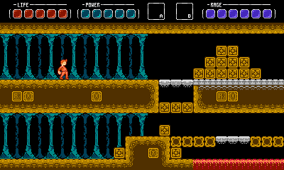 Thanks!! FBEpyon |
Replies:
Posted By: Vuototetro
Date Posted: 04 June 2015 at 8:48am
Looks really nice to me. It reminds me of Metroid//Megaman (which is good  ). ).
Also, I like the GUI and I think it fits well in the screen. |
Posted By: RebeaLeion
Date Posted: 04 June 2015 at 10:33am
| terrain is good, bars are excellent. char is interesting in design... is this your final decision for (idle stance) character or do you plan to provide more mockups with different char. I think your using of colours is great. |
Posted By: fbepyon
Date Posted: 04 June 2015 at 10:37am
|
Thanks.. The characters idle has some more work, I think once I animate him it will be better... I have so many sprites to work on in the next few weeks, but I wanted to get some feedback.. *EDIT* Here is a basic two frame animation of the Hero.. Let me know..  - New - NewWell I guess I will just keep adding to this one until I get more replies :P Here is the walking animation  - Original - Original - New - NewI have added in a floating maiden.. and yes she is floating.. its part of the plot..  Let me know what you all think PLEASE!! LOL |
Posted By: fbepyon
Date Posted: 05 June 2015 at 4:32pm
| Soo do I get no love here anymore, I haven't seen any comments or suggestions here..? |
Posted By: jalonso
Date Posted: 05 June 2015 at 4:47pm
|
There's not much to crit or suggest.
Its all looking really nice. Is something bothering you that you have a specific question about? ------------- |
Posted By: fbepyon
Date Posted: 05 June 2015 at 5:07pm
|
I'm just wanting to make sure my animations are right, this is the first time I have really put this much into something that I want done 100% Thanks.. |
Posted By: jalonso
Date Posted: 05 June 2015 at 5:52pm
|
If this is the first time you've really put in effort then its 200% already.
Anyhoo, I'm not the best at judging animations. ------------- |
Posted By: fbepyon
Date Posted: 06 June 2015 at 12:53am
|
UPDATE TIME!! 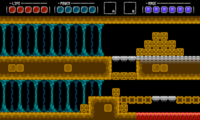 Here is an updated version of my HUD.. Let me know what you think.. :P |
Posted By: Hapiel
Date Posted: 06 June 2015 at 1:07am
|
In the walking animation: Lift up his knee! Now he walks from his hips, which makes him look very very lazy. I know he is a bit laid back, but not that much, right? If he is that much of a slowpoke, you'd also need to slow down his walk...
------------- |
Posted By: fbepyon
Date Posted: 06 June 2015 at 1:39am
|
Originally posted by Hapiel In the walking animation: Lift up his knee! Now he walks from his hips, which makes him look very very lazy. I know he is a bit laid back, but not that much, right? If he is that much of a slowpoke, you'd also need to slow down his walk... Let me know how this looks please? |
Posted By: fbepyon
Date Posted: 06 June 2015 at 10:27pm
|
Update Date Again: Please let me know what you think of this design concept for castle level theme... 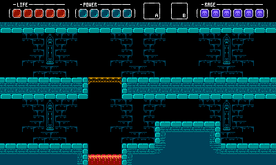 Thanks... |
Posted By: fbepyon
Date Posted: 09 June 2015 at 7:31pm
|
Hey Guys, I'm look for some more C&C, I want to make sure this looks like its going in the right direction.. I fill some of the graphics are little too first gen NES. I'm trying to go for a more later generation look.. If someone could please give me any suggestions on a directional change if any, or suggestions to improve the details of the graphics that would be great!! Thanks, |
Posted By: Hapiel
Date Posted: 10 June 2015 at 1:22am
|
Now in the new version you are lifting up his ankle, which is a slight improvement too, but his knee still stays as low as ever ;)
------------- |
Posted By: HZoltan
Date Posted: 10 June 2015 at 1:43am
|
I won't really criticise you, just a few suggestions. It's better if you find yourself a few examples. Find games wich are similar to your goal. I don't know if you played NES games, or just like the palette and it's seeming simplicity? If the second, you should watch some videos or download some games for an emulator. Watch how they made these games, when they had real limitations, because thay hade so many good ideas. For example it's rare to see background with the same colors as the collidable surface. That's why your first pictures look better with the brown ground. It's also a rare sollution for a ground to have smaller bricks inside. Why? Use bricks with the same size. If you want a deepening effect, use shade, or darker colors and then black. If not, I'm sure you can find out something. This is too noisy, especially on the thinner grounds. Watch out for fluids. They flow, so we shouldn't see the exact tile borders like on your lava, and it's also noisy. NES is a cartoonish medium, you can use outlines or even draw a surface. In the Super Mario Bros they used tiny http://www.vgmpf.com/Wiki/index.php?title=File:Super_Mario_Bros._-_NES_-_Koopa_Stage.png - flamelike outlines for the lava and that looked good. Maybe it's not your style, but you can find out something else, I'm sure. Anyway, try to use different colors for shading. If you watch some NES games, they rarely used the same tones for tiles, and it looked good. If you have "infinite" colors like on PC, you can shade as you want. But if you have around 30 colors you must avoid your levels to look the same and using different colors (even on the same tiles) can bring a new feeling. But anyway, my primary advice is to look up some examples. And just one final word: think about your character's spine. It's like he'd have some disorder. If not that's the case, let him stand straight, or if you want a dinamic pose, use some forward leaning, but this way it looks like http://cinemassacre.com/2010/11/03/avgn-lester-the-unlikely/ - Lester the Unlikely , and that's something we all want to avoid :P I hope that any of this helps you. |
Posted By: fbepyon
Date Posted: 15 April 2017 at 4:44pm

Just wanted to post an updated version of my player graphics and see if there is anything I can do to help improve them. |
Posted By: Gohan24
Date Posted: 15 April 2017 at 5:34pm
| This character looks good, especially his final pose. It reads as determined but still kind of an average joe. The walk animations from earlier were okay, but it looked to me like you were moving the same arm with the same leg, which is pretty unnatural. |
Posted By: fbepyon
Date Posted: 15 April 2017 at 11:35pm
|
Thanks,
Here is a new walking animation.. I still think there is need for improvement. 
Tweeked Version 
|
Posted By: RebeaLeion
Date Posted: 16 April 2017 at 5:13am
this helps me, 
|
Posted By: fbepyon
Date Posted: 16 April 2017 at 8:46am
|
REALLY!! You don't think i didn't use a reference.. please remove that eye sore.. no respect.. Insult to my intelligence. I may not look it but I have been on this site for a long time (join day is messed up - http://pixeljoint.com/forum/forum_posts.asp?TID=13013), and just putting a picture and saying this is what I use is a insult.. its called C+C for a reason.
|
Posted By: RebeaLeion
Date Posted: 16 April 2017 at 8:54am
|
Originally posted by fbepyon
REALLY!! You don't think i didn't use a reference.. please remove that eye sore.. no respect.. Insult to my intelligence. I don't know what's your attitude. I tried to help you with this sheet as this is the one I look at most of time. I guess you don't need my opinon then ! |