Need help with iso pixel art
Printed From: Pixel Joint
Category: Pixel Art
Forum Name: WIP (Work In Progress)
Forum Discription: Get crits and comments on your pixel WIPs and other art too!
URL: https://pixeljoint.com/forum/forum_posts.asp?TID=2386
Printed Date: 16 December 2025 at 7:18am
Topic: Need help with iso pixel art
Posted By: Flameruler13
Subject: Need help with iso pixel art
Date Posted: 15 June 2006 at 12:47pm
I need help with this: its an iso vesion of the classic sonic level: green Hill. i saw some one else make one but it was horrible. so im making one. how does it look so far?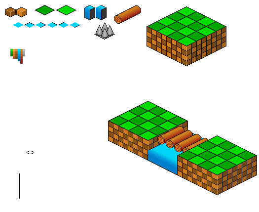 ------------- http://www.pixeljoint.com/pixels/profile.asp?pg=1&id=4085&sec=icons - Gallery |
Replies:
Posted By: Monkey 'o Doom
Date Posted: 15 June 2006 at 12:54pm
|
Grass=pillowshaded. Water=boring. Mountains=cones. Logs=cylinders. Cornerhighlights=badly needed.
Looks like you have some work to do. ------------- http://pixelmonkey.ensellitis.com"> 
RPG is numberwang. |


Posted By: Ensellitis
Date Posted: 15 June 2006 at 1:02pm
|
Ground tiles should be the same size as the grass tiles... And the colors too bright... If these filled an entire screen would burn your retinas
------------- There's a pubic hair on my keyboard. What the f**k?? I "mow the lawn" so it's not mine. Gross. |
Posted By: Flameruler13
Date Posted: 15 June 2006 at 1:04pm
|
Grass=pillowshaded=no its not shaded at all that just smoothes it out Water=boring.= i dont know how to make it better plus its classic Mountains=cones=what mountains? Logs=cylinders.=its a classic sonic level-not my fault Cornerhighlights=badly needed.= wtf is that the colors arnt that bright... ------------- http://www.pixeljoint.com/pixels/profile.asp?pg=1&id=4085&sec=icons - Gallery |
Posted By: Monkey 'o Doom
Date Posted: 15 June 2006 at 1:21pm
|
See above for answer to your dead diversions topic. ------------- http://pixelmonkey.ensellitis.com">
RPG is numberwang. |
Posted By: Demon
Date Posted: 15 June 2006 at 1:25pm
|
Originally posted by Flameruler13 ...no its not shaded at all that just smoothes it out Thats what pillowshaded basically is, just try and shade with 1 pixel per 2:1 line, instead of 2 pixels. ------------- "At least we killed some boredom..." - Death Note. |
Posted By: Flameruler13
Date Posted: 15 June 2006 at 1:31pm
|
k
------------- http://www.pixeljoint.com/pixels/profile.asp?pg=1&id=4085&sec=icons - Gallery |
Posted By: CDI
Date Posted: 15 June 2006 at 1:42pm
|
I think, they kinda match the original level and colours, but you need to make the spikes more shiny, and know that there are 4 per tile, not 1 (4x4 in your case) the logs are okay, but they need more to connect them to the land, and ropes on them to connect to each other... and a bit of slack. The grass tiles need to have that Sonic grass texture, and how you're going to do the siffrent slopes is beyond me... the water needs more lights and darks to make it look like the rapids in the game, I would suggest getting a rip of the entire level and going from there ------------- http://omnimaga.dyndns.org - Coders of tomorrow |
Posted By: Monkey 'o Doom
Date Posted: 15 June 2006 at 1:45pm
|
Those are spikes? LOL ------------- http://pixelmonkey.ensellitis.com">
RPG is numberwang. |
Posted By: Shark
Date Posted: 15 June 2006 at 2:18pm
|
Originally posted by Flamefag
Grass=pillowshaded=no its not shaded at all that just smoothes it out Water=boring.= i dont know how to make it better plus its classic Mountains=cones=what mountains? Logs=cylinders.=its a classic sonic level-not my fault Cornerhighlights=badly needed.= wtf is that Lol some people just cant accept C&C, whats the point in posting here if your just gonna argue all the suggestions put forward. Edit: damn these quote tags and macs hate each otehr! ------------- Snark, we love yuu. |
Posted By: Ensellitis
Date Posted: 15 June 2006 at 2:40pm
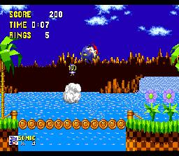 Here is what I see wrong so far... The grass doesn't match the actual used. You have blades, and sonic uses vertical patterns Your logs look less like the sonic ones, they need to be more 3d on the ends. Instead of having 2 different color blocks, you need on 1 block with both colors on it. And if you are doing this in all ISO game style, you need everything to fit into a specific grid, Pick one size and stick to it, right now the log is an odd size compared to everything else:  ------------- There's a pubic hair on my keyboard. What the f**k?? I "mow the lawn" so it's not mine. Gross. |
Posted By: Psychotic_Carp
Date Posted: 15 June 2006 at 3:33pm
this log might work for you
 -------------  got game? got game?
|
Posted By: Blick
Date Posted: 15 June 2006 at 6:10pm
|
Grass=pillowshaded=no its not shaded at all that just smoothes it out What you've done is just padded the outline of the tile, rather than aa which I imagine you thought you did. It comes off as pillowshaded and makes the lines too thick and I would just suggest getting rid of those lines that "smooth it out" altogether. ------------- http://punaji.com/"> 
|
Posted By: Souly
Date Posted: 16 June 2006 at 11:51am
|
Originally posted by Flameruler13 Grass=pillowshaded=no its not shaded at all that just smoothes it out Water=boring.= i dont know how to make it better plus its classic Mountains=cones=what mountains? Logs=cylinders.=its a classic sonic level-not my fault Cornerhighlights=badly needed.= wtf is that This is why no one likes you. Try taking some C&C into consideration you douche. How do you expect to get any better if you think that each and every peice you do is perfect. Obviously it isn't. ------------- 
I am the jesus of PJ. |
Posted By: Dra_chan
Date Posted: 16 June 2006 at 12:11pm
| Try to break the obvious geometrical forms a bit |
Posted By: Flameruler13
Date Posted: 16 June 2006 at 9:02pm
|
Originally posted by Souly Originally posted by Flameruler13 Grass=pillowshaded=no its not shaded at all that just smoothes it out Water=boring.= i dont know how to make it better plus its classic Mountains=cones=what mountains? Logs=cylinders.=its a classic sonic level-not my fault Cornerhighlights=badly needed.= wtf is that This is why no one likes you. Try taking some C&C into consideration you douche. How do you expect to get any better if you think that each and every peice you do is perfect. Obviously it isn't. telling me my mountains suck isnt C&C... ------------- http://www.pixeljoint.com/pixels/profile.asp?pg=1&id=4085&sec=icons - Gallery |
Posted By: Ensellitis
Date Posted: 17 June 2006 at 12:13am
|
OR instead of replying with what you did flame, you could have summed it all up with this: "Thanks for your crits, can you please elaborate?" ------------- There's a pubic hair on my keyboard. What the f**k?? I "mow the lawn" so it's not mine. Gross. |
Posted By: Shark
Date Posted: 17 June 2006 at 2:09am
|
Im with the Tonsil!! ------------- Snark, we love yuu. |
Posted By: Monkey 'o Doom
Date Posted: 17 June 2006 at 2:49am
|
@Mistah flammeh: Nobody said "suck". I said they were cones, and that needed to be fixed. You could have told us they were supposed to be spikes. ------------- http://pixelmonkey.ensellitis.com">
RPG is numberwang. |
Posted By: Bifur
Date Posted: 17 June 2006 at 10:20am
|
doesnt remember of sonic , water is indeed boring since at least sonic had little waves and sun reflection , grass was hiper texture since it was TALL grass and logs were made of wood ------------- 
I know! Leafs shouldn't make shadow... |