Scrublord makes a game
Printed From: Pixel Joint
Category: Pixel Art
Forum Name: WIP (Work In Progress)
Forum Discription: Get crits and comments on your pixel WIPs and other art too!
URL: https://pixeljoint.com/forum/forum_posts.asp?TID=25145
Printed Date: 14 June 2026 at 2:24pm
Topic: Scrublord makes a game
Posted By: PrototypeTheta
Subject: Scrublord makes a game
Date Posted: 18 May 2016 at 5:49am
|
As the title might imply, I've been working on a game for the last while or so, and I'm getting to the point where I've got to start taking the art assets half seriously.
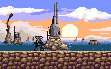
So far I feel as if I'm doing a few things wrong, but I have no idea what they are and why, so criticism/pointers would be greatly appreciated. Right now all I have to show for it is a lousy idle sprite and a mockup for a stage background/theme. Idle sprite: 
Stage mockup: 
Not overly keen on the clouds and skyline myself. Can't quite put my finger on it as to why. |
Replies:
Posted By: dpixel
Date Posted: 18 May 2016 at 6:24am
|
Your water looks fantastic. The rock tiles look a bit busy and the shading I would think would look more like this: 
------------- |
Posted By: PrototypeTheta
Date Posted: 18 May 2016 at 7:02am
|
That... Does look better actually. Not to mention some simplification to that particular tile would save a lot of time when it comes to making all the variations. I'll have a play around with that.
What about the rocks in the background though? |
Posted By: dpixel
Date Posted: 18 May 2016 at 7:09am
|
Originally posted by PrototypeTheta What about the rocks in the background though? Yeah. Same deal. Your light is coming from the rear. ------------- |
Posted By: PrototypeTheta
Date Posted: 18 May 2016 at 7:26am
One quick conversion later.

Yeah, ok, this makes a hell of a difference. EDIT: Changed the shading on the background rocks, and copied and flipped the YOLT volcano hanger thing to the other side to see how it looks. Might have to make up something else to replace the one on the right. |
Posted By: PrototypeTheta
Date Posted: 18 May 2016 at 1:39pm
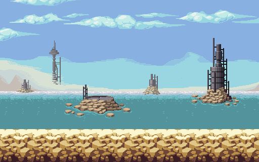
Throw a few variations of the rock tile into the mix and replaced the second volcano with something else

|
Posted By: CuriousBeefJerky
Date Posted: 18 May 2016 at 5:19pm
|
Your clouds look too solid in my opinion. Not really sure how you'd make it look less solid though.. Might have some lines coming off the clouds making it look more "wispy." |
Posted By: PrototypeTheta
Date Posted: 18 May 2016 at 5:43pm
Not sure about making it wispy, but I can try stretching them out and shade them differently might lessen the effect, or at least provide a better alternative to before.

|
Posted By: eishiya
Date Posted: 18 May 2016 at 7:45pm
|
I think the issue with the clouds is they appear lit from front-above even though the sun is behind and below them. They're also entirely unaffected by the sunset/sunrise colouring of the rest of the sky. That super-dark bit in front of the sun looks too dark. The sun, even at sunset/sunrise is very bright, so its light should "spill" into the forms of things in front of it, making them lighter everywhere where they overlap the sun (which is the entirety of that thing). http://www.sciencephoto.com/image/339576/530wm/T1100268-Offshore_oil_rig_at_sunset-SPL.jpg - Example . If there is parallax going on and you can't do that, then an easy semi-solution is to have atmospheric perspective, that is, to make the far-away parts be less contrasted and closer in hue to the sky-colour near the horizon. |
Posted By: PrototypeTheta
Date Posted: 19 May 2016 at 5:25am
|
Changed the lighting/colours on the clouds, probably still needs work.
Brightened up the central oil rig as well. 
|
Posted By: buffoftheclown
Date Posted: 19 May 2016 at 5:48am
| Can you have the water from the drain continue over the rock bellow it and keep flowing down? Looks like slime instead of water? If it is supposed to be slime, my apologies. |
Posted By: NancyGold
Date Posted: 19 May 2016 at 12:36pm
| The character is so gray and boring that even Awesome Possum will kick his sad ass. I love the sea thought, but the Sun's reflection on the water should be bigger and different. Look up references. |
Posted By: PrototypeTheta
Date Posted: 19 May 2016 at 1:41pm
|
Originally posted by snv
The character is so gray and boring that even Awesome Possum will kick his sad ass. I love the sea thought, but the Sun's reflection on the water should be bigger and different. Look up references. One quick punt later: 
Feels more accurate, probably should have looked up visual references in the first place but hey ho. As for the character, I'm pretty stuck as to what to do with it to be honest. It's probably the oldest part of the project so I've grandfathered it more than I should have. |
Posted By: PrototypeTheta
Date Posted: 19 May 2016 at 5:04pm
Made some changes to the character sprite, though I'm not sure if this is doing anything or I'm just polishing a turd at this point.

|
Posted By: NancyGold
Date Posted: 19 May 2016 at 9:26pm
|
It is good enough for a free flash game. I've seen worse in steam games. Yet people can still read it as "this a megaman clone, but more boring".
Anyway, designing a great character is a black magic and there are numerous articles on it. You have to pick target auditory. People generally like chars like Crash Bandicoot, Shantae and Earthworm Jim; but then again, these games had great gameplay, and could had made even boring characters seemingly great. Some people would find Mario annoying. TLDR: it is all subjective 
Originally posted by PrototypeTheta
Made some changes to the character sprite, though I'm not sure if this is doing anything or I'm just polishing a turd at this point. |
Posted By: DieMango
Date Posted: 20 May 2016 at 2:45am
|
The ,,Buildings'' look kinda wierd this kinda setting because they seem to have no shadows...
The charcter isnt super bad...just very plain ATM...maybe add shulder armor and tweak head and chest a little? ATM this is a Can-robot wich means he is built out of cylinders and there are just stripes to make him fancy (and that just works by cars) |
Posted By: matt0
Date Posted: 20 May 2016 at 4:08am
|
I'm enjoying watching this take shape!
One thing I'd suggest would be to tidy up the bands of colour in the sky - try making them symmetrical on either side of the sun. |
Posted By: PrototypeTheta
Date Posted: 20 May 2016 at 8:44am
|
Originally posted by DieMango
there are just stripes to make him fancy (and that just works by cars) But stripes make everything faster! In all seriousness though, I think I'm going to have to leave this part alone until I'm out of exams and have the time to really sit down and go through it properly. Every change I've made so far has been in 5-10 minute breaks between work. As for the buildings, do you mean they aren't casting a shadow or that there is no shadow on the building itself? If the latter I have been trying to address that: 
Pretty happy with the oil rig on the left. Not so much with the box on the right (could probably turn it into a cylinder and call it a storage tank, then I could probably find a reason to blow it up from within the level). Originally posted by matt0
I'm enjoying watching this take shape! One thing I'd suggest would be to tidy up the bands of colour in the sky - try making them symmetrical on either side of the sun. With regards to the asymmetry, there is some method to my madness. The idea was to plonk a big landmass over on the left hand side, which would create such a distortion (perhaps not this dramatic though). That said, I've been a right muppet and stuck the landmass over on the left hand side, completely negating the entire point. I think I'd like to re-draw it completely, try and add in some sea fog or pollution around the oil rigs. |
Posted By: dpixel
Date Posted: 20 May 2016 at 11:24am
How about a bugman? I was messing around how to shade this from the rear and went overboard. Maybe it can give you some ideas.
------------- |
Posted By: DieMango
Date Posted: 20 May 2016 at 12:41pm
|
Da left one looks better now indeed...but i think i know whats bothering me:
They have that very weird outline. The Entire thing just looks out of place because the antenne looks normal but the building has that wierd outline (sorry when i cant state my point...me bad english do) |
Posted By: NancyGold
Date Posted: 20 May 2016 at 12:56pm
|
Originally posted by DieMango
Da left one looks better now indeed...but i think i know whats bothering me: They have that very weird outline. The Entire thing just looks out of place because the antenne looks normal but the building has that wierd outline (sorry when i cant state my point...me bad english do) The background/parallax items should have less contrast to avoid distracting player into thinking that they are interactive. There are also atmospheric fog effects. desaturating far objects. |
Posted By: PrototypeTheta
Date Posted: 20 May 2016 at 1:38pm
|
Originally posted by dpixel
How about a bugman? I was messing around how to shade this from the rear and went overboard. Maybe it can give you some ideas.
No thanks, I've got enough of those in the programming. Jokes aside I've always been pretty dead set on using a mechanical protagonist (it's a little easier to justify why your character is spamming missiles Macross style out of it's backside when it's a machine, at least without playing the rule of cool that is). But that said, I am in need of a decent range of weird and wonderful aliens to fill the world with, and a bugger-like (or formic-like if you've only seen the film) race are definitely on the to-do list. Originally posted by DieMango
They have that very weird outline. The Entire thing just looks out of place because the antenne looks normal but the building has that wierd outline (sorry when i cant state my point...me bad english do) I think I understand what you're getting at, the shading should continue all the way around and not be suddenly cut off by said outline. At least that's the theory with the cylinder, with the box it could be interpreted as part of the structure, but I'm not keeping it that shape so that's irrelevant here anyway. I've had a go at removing this outline (left structure only, still haven't decided what's going to happen to the right) and had a somewhat hamfisted go at reducing the contrast of the background objects. 
|
Posted By: PrototypeTheta
Date Posted: 21 May 2016 at 5:07pm
Decided to get some practise drawing humanoids. Ended up with this rather basic enemy soldier.

Not keen on the right (or rear) leg. Or the gun. |
Posted By: NancyGold
Date Posted: 21 May 2016 at 7:58pm
|
Originally posted by PrototypeTheta
Decided to get some practise drawing humanoids. Ended up with this rather basic enemy soldier.
Not keen on the right (or rear) leg. Or the gun. Make a half-naked female cyborg with large boobs and ass, maybe with a few megaman/samus references. Instant selling point for your game. 
|
Posted By: PrototypeTheta
Date Posted: 25 May 2016 at 4:43pm
Having another crack at this, keeping a few pointers from dPixel's interpretation in mind here.

Certainly feels better as a whole, though the pauldrons don't feel right to me, and while I'd like the legs longer, I don't have much problem sticking with this. |
Posted By: Damian
Date Posted: 26 May 2016 at 9:04am
|
Hey man, made a quick edit.
I probably should of paid more attention to your profile picture though, but it will still hopefully be useful to you. A few things to think about maybe. What materials are you using? Smooth Metals tend to have a high contrast between its brightest and darkest colours, but the red paint or any decals while also a smooth shiny surface might have slightly less contrast. Thats a simple example in relation to what you've made, but thinking about these materials can go a long way in helping to render properly. Google images is your friend, go look for a reference when in doubt. Think more about light. Light theory is tough to get your head around, I struggle with it a lot myself. And here I notice about 3 different light sources, which can be visually confusing. Setting a single light source and adhering to it will go a long way in making all your characters look consistent. I made a start to this as you can see, with a light source above and slightly to the right. Shadows are important to, like under the chin, armpits etc There are other things I touched on in the edit, such as a more natural pose/stance, making sense of how different parts of the body attach to each other in a way that makes sense. But I have mentioned them, so might be worth taking some time to think about it. Hope all my rambling makes some sense. 
|
Posted By: NancyGold
Date Posted: 27 May 2016 at 6:43pm
|
Originally posted by Damian
Metals tend to have a high contrast The problem we don't know what material the robot is made of. Real world autonomous robots usually made of some lightweight yet strong material, like polycarbonates. Heavy robot movement will also quickly deplete the energy source. Although energy shortage could be a justification for some unusual gameplay mechanics, like where player has to continuously hunt for energy cells instead of mario coins, and taking damage just removes large chunks for energy due to energy shield. |
Posted By: PrototypeTheta
Date Posted: 28 May 2016 at 11:47am
|
Originally posted by snv
Originally posted by Damian
Metals tend to have a high contrast The problem we don't know what material the robot is made of. Real world autonomous robots usually made of some lightweight yet strong material, like polycarbonates. Heavy robot movement will also quickly deplete the energy source. Although energy shortage could be a justification for some unusual gameplay mechanics, like where player has to continuously hunt for energy cells instead of mario coins, and taking damage just removes large chunks for energy due to energy shield. I had envisioned it as being a lightweight ceramic armour (slight oxymoron there, but this is set in the far future so there's some leeway), with the dark black sections being some kind of flexible rubber. The problem with this is it's probably going to be painted over anyway. My immediate thoughts are to use something like this as reference: http://photos.jibble.org/Vehicles/Tanks/Bovington%20Tank%20Museum/Polish%20built%20T-55%20with%20Iraqi%20armour%20modifications%20IMG_2772.JPG As for energy, I had planned for an energy shield to be a sort of power up, so that idea could work for that, though I don't think tying it to the player's health is a good idea for what I want to do. |
Posted By: PrototypeTheta
Date Posted: 01 August 2016 at 2:00pm
|
Well. This isn't dead, just been busy re-writing the thing.
Well first off I've managed a few basic animations, an idle which I still thoroughly dislike and a basic shooting animation. 
I understand the gif isn't great quality and is a bit slow so these might be more useful https://embed.gyazo.com/54c92bace0efe79e198e59a9c897005c.mp4 - Gyazo mp4 https://www.youtube.com/watch?v=btTjfqG-iRk - Some footage from the prototype, just some stuff thrown together so I could figure out the basic gameplay I've also been trying to re-do the sky from the background I've already shown, done some experiments with dithering but I'm honestly not sure how I feel about it. 
And finally I've started thinking about another level, set in a forest by the coast. Trying to figure out how to tree, so I've taken a shot at the bark. 
|
Posted By: RebeaLeion
Date Posted: 02 August 2016 at 12:16pm
|
tree is nice.
|
Posted By: PrototypeTheta
Date Posted: 14 April 2017 at 6:43am
|
Not dead.
Started working on this again about a week ago. Gone and started work on a new background, which may or may not be useful anywhere. 
Also refined the character sprite a little more 
And started taking animations seriously. Nearly finished a run cycle (just needs hands). 
|
Posted By: Hapiel
Date Posted: 14 April 2017 at 7:08am
| You could improve the run cycle by having a mid air position. Now it looks like he is walking really fast, because his legs remain in contact with the floor |
Posted By: PrototypeTheta
Date Posted: 14 April 2017 at 7:15am
|
There actually is a mid air position, but I can probably do something to exaggerate it a bit more.
(might be worth noting that the gif is running almost twice as fast as it should, you can see the correct timing https://i.gyazo.com/1935bcce8e87422ae1d9e498e33d9eb0.mp4 - here ) |
Posted By: PrototypeTheta
Date Posted: 07 May 2017 at 7:06am
Lost the original file I had for my background, having to re-draw most of it so I can parallax it properly.
Certainly feels better than last time but I still can't get the sky right. |
Posted By: DieMango
Date Posted: 07 May 2017 at 7:26am
|
First of all: Nice sprite bro :D
Second...clouds shoudt be giant cotten pillows of softness... try to make long and thin clouds and try to make very clear line where the gradiants of the sky end (if you dont know what i mean...then ask if i have a example file) the most jarring thing tho is the composition of this scene in general... never put the big thing in the middle and have it as straight as it is right now...dont make to many islands...its a background after all and shoudt distract the viewer. I am very tired so my english is probabaly terrible atm |
Posted By: PrototypeTheta
Date Posted: 07 May 2017 at 7:52am
|
The idea is that all the islands are parallaxed and constantly move as you progress through the level so the composition will always be changing. That said I can try and target certain layouts when I get around to putting this up in engine.
As for the sky and whatnot, this is a terribly hacky edit but is this roughly what you mean? 
|
Posted By: DieMango
Date Posted: 07 May 2017 at 8:43am
| Yeah...look at some refrences for the right amount of fluff...in the clouds |
Posted By: PrototypeTheta
Date Posted: 09 May 2017 at 3:06pm
Made a few more tweaks to the background and gotten it working inside the engine.
https://gyazo.com/8522e99b220a9210e8a99e40470e140f Also gone and started work on a death animation 
https://gyazo.com/8eb40f9cc55e82f8e0d1659eb8a07afc |
Posted By: DieMango
Date Posted: 09 May 2017 at 11:20pm
|
You dont need so many frames for the legs blowing of...just 2 frames for a fast animation is enough. Nice...the background looks prrrrrrrrrrrretty good. |
Posted By: Poltergeist
Date Posted: 10 May 2017 at 7:55pm
| I love the death animation |
Posted By: PrototypeTheta
Date Posted: 16 May 2017 at 4:17pm
Started working on attack animations


|
Posted By: t3nshi
Date Posted: 16 May 2017 at 6:28pm
|
Uh, nice work! I can see the Zero inspiration in there.
I'm worried about the sword effect reach, it looks a bit too narrow. Also it is too outlined and looks solid. You might want to make it without outlines altoghether. |
Posted By: XLEdwards91
Date Posted: 18 May 2017 at 12:12am
| Honestly, the most recent updates look a lot better from the past ones. Hard for me to explain, maybe because it seems and looks more...simpler? As well as the shading doesn't look overly complicated. Not sure if that made any sense to you, since I'm still learning myself, but I know shading is a pretty big thing in pixel art, in making your characters or environment 'pop'. |
Posted By: PrototypeTheta
Date Posted: 18 May 2017 at 5:30am
Improved the shoot animation following some feedback given to me elsewhere.

|
Posted By: PrototypeTheta
Date Posted: 23 May 2017 at 11:42am
Whacked out a few basic character portraits for dialog and whatnot.

Decided that the jaw part would serve as a detachable comm unit or something. |
Posted By: PrototypeTheta
Date Posted: 25 May 2017 at 8:04am

Attempting to put some form of expression on the gormless bastard. |
Posted By: PrototypeTheta
Date Posted: 02 June 2017 at 8:00am
Working on another level theme

|
Posted By: Quake
Date Posted: 02 June 2017 at 8:44am
|
Very nice! Really good progress
I'd personally make the grass simpler. For example: |
Posted By: PrototypeTheta
Date Posted: 07 June 2017 at 4:32pm
Totally original space station.

Probably still needs some cleanup. |
Posted By: Permafrost_
Date Posted: 23 June 2017 at 1:20pm
| I'm the 3000th (and 3001st) view on this forum. Nice job with the space station. The lighting makes it really stand out like a 3D object. |
Posted By: Zubb
Date Posted: 06 July 2017 at 11:22am
|
The space station looks great, but IMO the perspective on the spike(the one near the sphere's center) is a little off. |
Posted By: PrototypeTheta
Date Posted: 23 July 2017 at 2:57am
|
A quick dump of stuff I've been doing (may have posted some of this before).
Player sprites: Redone the run animation (thrusters need to be re-done and hands added, but I'm happy with the overall motion) 
Dashing, damage and jumping sprites (all playing really fast for some reason)   
Enemies: A basic enemy mook. Still need to do walk cycles for this one.  
Complete with different death states depending on how you kill it.  
Projectiles/Misc effects A missile, pretty standard tbh 
Some explosion effects (conventional and antimatter)  
Environments: Couple of foreground elements for Mission 1 

Some more fiddling of that space station 
And finally, I wouldn't normally post anything this WIP, however it's a weird perspective that I've never tried before, and I would rather get it right first time round. Larry Niven called. He wants his ringworld back. 
Still not sure whether the landscape works (mostly the mid-ground is the problem, not used to drawing landscapes on a concave surface) and how to handle the sky. I've roughed out the atmosphere but I'm still not really sure where to go with it. 
|
Posted By: PrototypeTheta
Date Posted: 26 September 2017 at 2:42pm
Aerial slash attack:

Dashing attack: 
|
Posted By: PrototypeTheta
Date Posted: 27 September 2017 at 2:44pm
Tried to salvage old attack animation.

|
Posted By: PrototypeTheta
Date Posted: 01 October 2017 at 4:22pm
Mockup of another level.

|
Posted By: eishiya
Date Posted: 01 October 2017 at 4:53pm
|
I like the actual pixelling in this mockup, but I feel it has some readability issues. I had trouble spotting the character because they blend into the background and because all the visually interesting stuff is off to the sides where the player should probably not be looking. Try to keep the non-playable areas lower-detail (or at least low-contrast) so that they're not distracting. The way you've set the floors and ceilings apart from the walls looks very nice and it's very clear. Combined with lower-contrast/simpler walls it should work very well. Lastly, I feel like the neutral background wall feels mismatched from the rest of the level. I think giving it a blue or orange hue would make it fit better with the rest of the level. Keeping the saturation low and the contrast low would help it still be clearly distinct from the midground walls. I think there's merit to a completely grey look, but I feel like that's something you should commit more fully to, e.g. an entire level that's all greyscale, save perhaps for some accent colour. |
Posted By: PrototypeTheta
Date Posted: 02 October 2017 at 2:47am
|
Funnily enough I originally had the background tinted red, just changed it afterwards as it didn't work with the foreground at all.
As for the detail on the tiles, I'm mostly using sonic tilesets as reference here (egg rocket zone to be precise) and they seem to cram even more complexity and detail into the surrounding tiles (mind you, gameplay and level design could make all the difference here). What I can do in the meantime is mute the orange highlights to stand out less: 
Still have to make the other half of the tileset (not enough here to actually make a level) so I'll try some simpler tiles and see what I can do with it in-engine. |
Posted By: PrototypeTheta
Date Posted: 15 October 2017 at 9:08am
Made another enemy grunt.


|
Posted By: PrototypeTheta
Date Posted: 18 October 2017 at 1:11pm
Working on an actual background for the laboratory level.

|
Posted By: PrototypeTheta
Date Posted: 10 December 2017 at 6:12pm
Took a swing at a cityscape

|
Posted By: Hapiel
Date Posted: 11 December 2017 at 5:42am
|
Oh my, this has come so far! Some quick cc: The sprite doesn't stand out so much, it's equally dark as it's background. Also the bright horizontal lights are a bit distracting, maybe tone them down a bit. at last I'm really not a fan of the horizontal bands in the background... I know it doesn't fit with the PJ pixel art rules, but an actual gradient might be less distracting. or pick some colors which are closer to each other? |
Posted By: eishiya
Date Posted: 11 December 2017 at 7:38am
Here is a colour edit that I think addresses the readability issue while keeping the "look": I put the background layers into more of a haze, darkened all the windows to orange, and used a narrower range of the purple-yellow gradient for the sky, so that it could have less contrast while still keeping the same number of bands. I think the lines in the sky work very well with the style of this, but just had too much contrast and thus stood out more than they should. |
Posted By: PrototypeTheta
Date Posted: 11 December 2017 at 11:08am
Alright, made a few edits. Been thinking about having a thick layer of smoke in the bottom on the far layers but I don't quite know how to do that properly.

|
Posted By: Hapiel
Date Posted: 11 December 2017 at 11:18am
| As cool as those signs may be, they again distract from the foreground (as advertisement tends to do...) |
Posted By: PrototypeTheta
Date Posted: 28 December 2017 at 10:30am
|
Me: So I half like half the animations for this one character finished.
Inner me: Change it. (top is old version) 
|
Posted By: eishiya
Date Posted: 28 December 2017 at 12:24pm
|
I like the bunny-ears, the new eye shape, and the more solid highlight on the face. However, I think the face looked more interesting and had a clearer shape in the old version. In addition, the new big portraits have banding around the "mouth" and the chin tangents with the frame. |
Posted By: PrototypeTheta
Date Posted: 30 April 2018 at 9:53am
Well another year, another swing at this same old scene.
|