wip <RAT> - Any tips? I'm new at this
Printed From: Pixel Joint
Category: Pixel Art
Forum Name: WIP (Work In Progress)
Forum Discription: Get crits and comments on your pixel WIPs and other art too!
URL: https://pixeljoint.com/forum/forum_posts.asp?TID=2671
Printed Date: 21 July 2026 at 12:53pm
Topic: wip <RAT> - Any tips? I'm new at this
Posted By: cele1989
Subject: wip <RAT> - Any tips? I'm new at this
Date Posted: 28 July 2006 at 11:12am
|
Hi, I'm cele and I'm kinda new to pixel stuff...I really adore it, but now i actually tried. Anyway, I just made a sketch...I'm kinda stuck there. I made a sketch of a mouse/rat... I don't know if that's a good start...yes, how should i finish it, in case no; how should I start? here you go   |
Replies:
Posted By: Skull
Date Posted: 28 July 2006 at 11:27am
I think it's a good start. You have an idea and an easy to follow sketch.. now clean thoses lines up! 
------------- |
Posted By: Souly
Date Posted: 28 July 2006 at 11:58am
|
Make the lines 1 pixel thin. That way you have a good line art to work with. Hey Skull, show her that tutorial you've got. I mean it doesn't tell you how to do shading and such but it will show her the stages some artists go through when making art. And then if she gets stuck we can either help her through it or link to new tutorial for her problem. ------------- 
I am the jesus of PJ. |
Posted By: Skull
Date Posted: 28 July 2006 at 12:15pm
|
Originally posted by Souly Hey Skull, show her that tutorial you've got. I mean it doesn't tell you how to do shading and such but it will show her the stages some artists go through when making art. Oh you..   ------------- |
Posted By: cele1989
Date Posted: 28 July 2006 at 12:46pm
|
Hi, I tried to clean the lines... I think the outline is almost okay now...Not? According to me it's not a hundred procent good, I have seen a lot of pixel work...I obsessed you could say...:p but i never made something decent :s anyway... if you've got some tips for me...i would like to hear them... 1 for a more better outline 2 for the colour and the awsome effect... - I wonder if I will be able to get it that beautifull :? Is it hard to do so? Anyway...here's the "cleaned" outline http://imageshack.us">  btw: isn't the picture to big? |
Posted By: Souly
Date Posted: 28 July 2006 at 12:53pm
|
What's with the weird line where the body ends behind the ear? I think you should try and fix that line first off. Then once you're sure you've got your line art off to a good start, then you begin to think color. Oh and the fold under the arm closest to the viewer is a bit off. I think the tummy line is shooting right too much. It's caving in when really it should be folding over the normal body line. So go off and fix up the lines to your likings. -------------
I am the jesus of PJ. |
Posted By: cele1989
Date Posted: 28 July 2006 at 1:40pm
|
I think i did the outline like i wanted it to be...now I'm wondering how I can give it a colour and a nice hairy effect. any ideas/tuts/tips? thanx |
Posted By: Souly
Date Posted: 28 July 2006 at 1:46pm
|
I edited the lines up to show you what I meant. I hope you don't mind me taking the librity to point out what I thought it could use.  -------------
I am the jesus of PJ. |
Posted By: Morgan
Date Posted: 28 July 2006 at 1:57pm
| This is good (and cute!) but I'd seriously consider setting it aside for now. Do some smaller pieces first. They'll go much faster than this would, and you'll learn a lot in the process. |
Posted By: Shark
Date Posted: 28 July 2006 at 4:19pm
|
your new to pixel art.... i doubt you will finish this. Start of small. Trust it will benefit you in the long run.
------------- Snark, we love yuu. |
Posted By: cele1989
Date Posted: 29 July 2006 at 7:40am
|
hi, I made the sketch first, but it was quite big. So I resized the sketch and cleaned the lines again. I also did change some details, i didn't like so much (such as the tial, the to sharp arms etc.) I like to wor with this one because i really like it ^^ I hope you can help me with the colouring...because...that's the hardest part (i think)  |
Posted By: Souly
Date Posted: 29 July 2006 at 10:25pm
|
I still think the neck bulged thing is too big.
-------------
I am the jesus of PJ. |
Posted By: jalonso
Date Posted: 30 July 2006 at 12:45am
|
I think thats a better size. Start throwing some basic shading in now.
This will let you know if any area of the lineart should be modified. I
suggest big areas of color to create dimension, then go to detailing.
------------- |
Posted By: cele1989
Date Posted: 30 July 2006 at 6:15am
|
maybe you know some real good tutorials, where i can learn from? |
Posted By: fil_razorback
Date Posted: 30 July 2006 at 6:27am
| http://www.spriteart.com |
Posted By: Monkey 'o Doom
Date Posted: 30 July 2006 at 8:45am
 ------------- http://pixelmonkey.ensellitis.com"> 
RPG is numberwang. |
Posted By: MurrMan
Date Posted: 30 July 2006 at 4:10pm
|
there are many styles of shading, i believe that
http://www.spriteart.com only shows you one style. if you search through others works you will find thingd such as dithering ex: http://www.pixeljoint.com/pixelart/1868.htm?sec=rating# semi gradient ex: http://www.pixeljoint.com/pixelart/2108.htm# rectangle ex:http://www.pixeljoint.com/pixelart/10664.htm lines ex:http://www.pixeljoint.com/pixelart/1865.htm ex:http://www.pixeljoint.com/pixelart/12759.htm cartoon ex:http://www.pixeljoint.com/pixelart/3108.htm metal (there are a lot of ways to do this) ex:http://www.pixeljoint.com/pixelart/6701.htm link:http://www.tcp-ip.or.jp/~s-iga/tips/2-3metallic_objects.html there is much more; you have to find the one you like. ------------- I have plenty of emotions; It is Sleep that i lack |
Posted By: Dra_chan
Date Posted: 31 July 2006 at 11:00am
| Just fix the neck and you are ready to begin shading! Read the tutorials, study other people's art in zoom in, and have patience above all! Good luck and happy pixeling! |
Posted By: cele1989
Date Posted: 25 July 2011 at 8:28pm
|
I was looking around the forum, and realized that throughout the years I've started up a lot of works in progress. Most of them still are work in progress, without any progress lately. Only 3 of them where gallery-worthy. So I figured to finally finish some things I started. I think the best way to do this is to open up old topics, because I think it is nice to see the progres of one particular piece of art from zero to hero ghaha... ;-) I don't know if it is a good idea, considering the nettiquette, to open up an ancient old topic, so forgive me for doing so, but this is about the same rat... Tried some color on it for the first time within five years...LOL http://imageshack.us/photo/my-images/217/outlineratlittleiy01.png/">  I need some advise on the texture of fur...please??? |
Posted By: onek
Date Posted: 25 July 2011 at 10:35pm
|
good progress!!!
anyway... i think u shouldnt start with the lineart... the initial sketch was much more dynamic and vivid now it looks a bit static ur drawing has a lot of potential and i think you should go from that and block in basic shades and the go more and more into details heres a basic edit 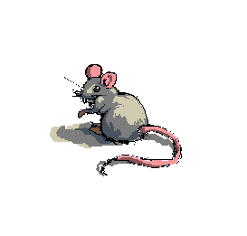
|
Posted By: cele1989
Date Posted: 26 July 2011 at 2:48am
| wow, cool edit... :D |
Posted By: cele1989
Date Posted: 26 July 2011 at 9:37am
|
I did a little more detail (especially the tail) http://imageshack.us/photo/my-images/40/rat6cele.png/">  |
Posted By: cure
Date Posted: 26 July 2011 at 10:18am
|
are you using references? rats usually have thicker tails that start a bit lower on the rump, and more elongated skulls. the arms are a bit long and have a bit too much shoulder too them. I feel we should see more of the near foot from this angle. also, you should work from your own pixel. take what onek taught you with his edit and apply it to your own work, don't take his actual work, you learn nothing that way. |
Posted By: vlad61
Date Posted: 26 July 2011 at 10:41am
|
Am i reading correctly that this thread is 5 years old?
Ah okay i see you commenting on it... but wow 5 years... |
Posted By: cele1989
Date Posted: 26 July 2011 at 3:32pm
|
@cure: I remember that at the time I did the sketch I had a reference. It was a cute rat from a fairytalebook. But at the moment I'm afraid the same book is in the attic somewhere....I do remember it was a brown rat. But it looked like a good idea to me to make it an albino, but after the edit of Onek I changed my mind LOL... I'm sorry for editing Onek's work, but I couldn't do better myself...but indeed practice makes perfect. I'll make a new one, but it is hard not to get tempted with such a wonderfull edit...:-) I just was curious how it would look like, when more detailed...:-P @vlad61: Yes this topic is 5 years old...I never finished this piece...so it's about time... |
Posted By: cele1989
Date Posted: 26 July 2011 at 4:16pm
|
Well, here is my try out: http://imageshack.us/photo/my-images/233/rat23cele.png/">  Tried with the browns. I'm not quite disapponted but it isn't as good as the example, hihi ;-) |
Posted By: Loonybin
Date Posted: 26 July 2011 at 5:22pm
| Actually, if you changed the lightest brown to a slightly more darker brown I think i'd like it better than the previous edit. |
Posted By: H|F
Date Posted: 26 July 2011 at 6:44pm
| I agree with Cure, right now it reads mouse. I think the ears are too round |
Posted By: cele1989
Date Posted: 27 July 2011 at 3:39am
|
@Cure & H|F: Mouse is okay with me... I just thought the picture in the book was cute, I have no idea if it were a rat or mouse LOL... @Loonybin: Thanks... :D, and I'll change the highlights ;-) |
Posted By: Miumau0
Date Posted: 27 July 2011 at 4:02am
| looks much better with brown colors than greys. Now its not just "original" grey mouse. |
Posted By: cele1989
Date Posted: 27 July 2011 at 4:49am
|
Update: http://imageshack.us/photo/my-images/42/rat24cele.png/">  |
Posted By: cele1989
Date Posted: 27 July 2011 at 7:49am
new update a little more detailed...a little bit stuck at the moment... |
Posted By: Alex Pang
Date Posted: 27 July 2011 at 8:22am
| I don't like this new tail! |
Posted By: Friend
Date Posted: 27 July 2011 at 11:49am
| I don't like the brown shadow or the orange teeth |
Posted By: cele1989
Date Posted: 27 July 2011 at 2:05pm
|
@Alex Pang & Frost Butt: the thing I like about the people here, is that the critics are very positive. Don't get me wrong, I don't have problems with people pointing out my wrongs. But "I don't like this or I don't like that" won't get me anywhere. Suggesting new ideas might....So please add something instead of bringing my confidence down. I don't consider this nice... P.s.: appearantly there are people who do like the browns. Some things are just a mather of taste ;-) |
Posted By: Alex Pang
Date Posted: 27 July 2011 at 2:25pm
| Sorry for being so rude, but I was pointing out that the old yellowish mouse had a much nicer tail. Btw, I like your colors don't mind if I save them? |
Posted By: cele1989
Date Posted: 27 July 2011 at 2:50pm
|
Appologies accepted ;-). Just the colors, no problem, but don't you touch my precious mouse ;-) Oh, and about the tail, you mean the shape or the colors??? |
Posted By: Alex Pang
Date Posted: 27 July 2011 at 3:29pm
| The colors, but the shape feels a little big too, I know what cure said, and I don't know enough about mice anatomy to say anything against him, but i feel your other design had more cuteness to it, which is great! |
Posted By: cele1989
Date Posted: 27 July 2011 at 3:53pm
|
hmm... I thing I see what you mean...I could try to change it and see how it works out ;-) |
Posted By: cele1989
Date Posted: 27 July 2011 at 4:10pm
You mean more like this: Or where you referring to the albino's tail? I think this is an improvement anyway... The parts of the tail looked to big and to round...I guess Anyway, now I need to start the furry part...can someone please give me some advise on how to do fur...I have no idea where to start... |
Posted By: Miumau0
Date Posted: 27 July 2011 at 4:45pm
| one thing, its leg is in shadows, so its not supposed to shine. I would go around the gallery to see examples fr fur or just google. :) |
Posted By: Friend
Date Posted: 27 July 2011 at 4:53pm
|
Originally posted by cele1989
@Alex Pang & Frost Butt: the thing I like about the people here, is that the critics are very positive. Don't get me wrong, I don't have problems with people pointing out my wrongs. But "I don't like this or I don't like that" won't get me anywhere. Suggesting new ideas might....So please add something instead of bringing my confidence down. I don't consider this nice...P.s.: appearantly there are people who do like the browns. Some things are just a mather of taste ;-) umm... I was just implying to maybe look over those sections again. I don't see at all how that is mean, or a jab at your confidence, but sorry anyway! |
Posted By: cele1989
Date Posted: 28 July 2011 at 2:36am
|
Originally posted by Frost Butt umm... I was just implying to maybe look over those sections again. I don't see at all how that is mean, or a jab at your confidence, but sorry anyway! Well, if you said this in the first place, I could have looked at the sections... If you say you don't like it, I don't know WHY you don't like it and I don't know what you want me to improve. Anyway... I already gave the fur a go...  Can I consider this one done? I'm getting so tired of working on a single piece for a long time....:-S |
Posted By: H|F
Date Posted: 30 July 2011 at 12:25am
|
It looks VERY fluffy for a ratmouse thing. Also, it looks like the fur is parting because a gust of wind or something. I have pet mice and have never seen their fur do that, it sould run along the back and down towards the tail. I think the tail kinda looks like a worm, sometimes less is more. I couldn't see a tail having such dark shadows, light would hit and almost go all the way around. Maybe test a slight under lighting.... not sure if you will know what I mean XD
Each lil pixel makes a huge change in a piece at this size. Something I always try to remind myself is to "suggest" what I want the viewer to see by creating shapes/shadows with a few pixels. I bet if you didn't create "rings" around the tail, the viewer would understand and see it because their minds would just fill in the blanks.
Anyway, know this will turn out looking pretty awesome. I like the brown. I dont get that weird bright gray?
* feet/hands look kinda chunky/round (if it's a style thing, don't mind me)
|
Posted By: cure
Date Posted: 30 July 2011 at 8:06am
|
I have pet rats, and you'll only find that fur in the 'rex' variety (which is a special mutation that gives rats 'curly' fur'). otherwise rat fur is straight and stiff. the placement of the far hand is strange, i keep wanting to read it as a nose (and it would have an incredibly long arm for a rat if the hand is that far from the body). I still think he looks goofy with such a round head, but you never claimed you were making a 100% accurate rat. I also think there's too much mass in the butt. there should be some clearance between the feet and butt so we can tell he's crouching on his haunches (right now the crouch is only evident in the upper body). also I'd consider making the half of the tail closest to the rump a bit thicker. |