Kraken Vs. Vikings
Printed From: Pixel Joint
Category: Pixel Art
Forum Name: WIP (Work In Progress)
Forum Discription: Get crits and comments on your pixel WIPs and other art too!
URL: https://pixeljoint.com/forum/forum_posts.asp?TID=2689
Printed Date: 08 June 2026 at 10:29pm
Topic: Kraken Vs. Vikings
Posted By: cure
Subject: Kraken Vs. Vikings
Date Posted: 31 July 2006 at 12:50am
|
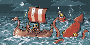
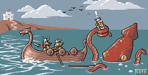
Very much a WIP, especially the right side of the image (and the stick figure). Suggestions are welcome, especially opinions about mast/sails, oars, whatever. ----------------------------------------------------------
Newest version:
 |

Replies:
Posted By: Skull
Date Posted: 31 July 2006 at 1:23am
|
I love it. /wipes tear from eye. fantastic stlye on this, I can see where you're going with it and it' looks brilliant. On another note - I have this old book that tells me how to make a Viking Longboat!  ------------- |
Posted By: jalonso
Date Posted: 31 July 2006 at 1:46am
|
Borrows hankie from skull.
------------- |
Posted By: Ensellitis
Date Posted: 31 July 2006 at 6:32am
|
very nice. i love how you contrast the good work with that n00b stick figure in the kraken's arm LOL that water looks great. i always love your palettes. not enough saturation to look crappy, but enough to make the colors pop suggestion for sail:  ------------- There's a pubic hair on my keyboard. What the f**k?? I "mow the lawn" so it's not mine. Gross. |
Posted By: Aleiav
Date Posted: 31 July 2006 at 10:53am
|
excellent work so far. :D I love it, cure. Can't wait to see the finished product. Although, I think he'd be scarier with more tentacles flying everywhere.
------------- |
Posted By: cure
Date Posted: 01 August 2006 at 5:17pm
|
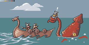
Update time.
*added a midtone between the higlight color used on the boat and the main boat color (thanks to tremulant for the suggestion); applied new color where necessary
*changed grey used on the sky to more of a blue shad, looks better on the AA on the water.
*added third viking.
*added oars and such.
----------------------------------------------------------------------------
Suggestion continue to be welcome. If you feel any changes made were negative, also let me know.
------------- |
Posted By: fil_razorback
Date Posted: 02 August 2006 at 3:37am
| Can't wait to see the finished product :) |
Posted By: Skull
Date Posted: 02 August 2006 at 6:25am
|
Just fantastic. The boat looks much better and overall brighter now, which suits better to the time of day.. and the expression on the third Viking is excellent :D
------------- |
Posted By: Blueberry_pie
Date Posted: 02 August 2006 at 8:07am
|
Damn, that rocks. Love the colours and the amount of details on the vikings. Can't wait to see the final result :) ------------- |
Posted By: Aleiav
Date Posted: 02 August 2006 at 2:25pm
|
I crave update!!
------------- |
Posted By: Lawrence
Date Posted: 02 August 2006 at 2:34pm
|
I love this, nice work so far. I was just wondering about that little group of pixels at the front of the main body of the ship. Is that meant to be a 'chip' in the wood? To me it stands out quite a lot. Anyway, those little viking people are brilliant. I don't know if it would fit in with the style you were going for, but perhaps the boat and monster could be partially reflected in the water.
------------- |
Posted By: Psychotic_Carp
Date Posted: 04 August 2006 at 5:33am
|
I love the look on the vikings face! -------------  got game? got game?
|
Posted By: iSTVAN
Date Posted: 04 August 2006 at 6:40am
|
It'd be nice to see the last viking's oars floating on the water where he dropped them. Cute characters and a cool scene. I'm a bit iffy about the jaggies on the squid and how the light source hits them.
Fun work still! ------------- Listen to what the flower people say... 
|
Posted By: cure
Date Posted: 04 August 2006 at 9:50pm
Another update: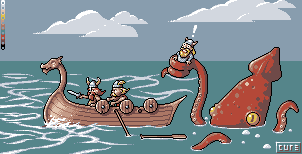 Changed the waves along the side of the boat, added more wavy stuff on the water, made another hole for an oar that is floating on the water (which I think looks like crap at the moment, maybe if I mess around with it and add some more floatsam it'll be alright), added more clouds, worked on the tentacles a bit more, added highlight to water, adjusted the left side of kraken's outline. ------------- |
Posted By: jalonso
Date Posted: 04 August 2006 at 10:04pm
|
Something has been bothering me since your initial post and I have been
unable to see it till now. If you stand back a bit and concentrate on
the shapes/outlines that you have you will notice that the bow with the
dragons head and the tentacle with the viking are not only the same
shape but the same size, ?,,? <--- like that. The 2 vikings in
between does not help the composition much since they are of the same
height. I think one of these 2 items needs modifications to have a more
dynamic layout. Lowering the dragon's head is easiest. Altering the
tentacle holding the viking would be better tho. Having the front
viking in the ship 3-4 pixels higher will also add a sense of movement.
Otherwise, this update is great, the waves are much better now. The
floating oar looks good. The mast and sail could also float if not
being help on a tentacle.
------------- |
Posted By: cure
Date Posted: 04 August 2006 at 10:08pm
|
I like the mast being held by the tentacle idea, and I see what you mean about the congruent shapes of the tentacle and front of the boat, quite obvious now that you've pointed it out. I'll get to work! ------------- |
Posted By: alkaline
Date Posted: 04 August 2006 at 10:15pm
|
i think the floating oar should be a bit longer than that judging by the other one. the new waves are great. nice catch on the shapes jal.
------------- |
Posted By: jalonso
Date Posted: 04 August 2006 at 11:52pm
|
Something else to consider. The viking in the tentacle is facing the
direction he would have beeen when he was IN the boat. If he is turned
to face the squid then because the tentacle is coiled around him not
only would the poping eyes be funnier but this too would add further
movement.
------------- |
Posted By: cure
Date Posted: 20 August 2006 at 12:55pm
|
Look who I found hiding on page 3: This topic! Sorry for the lack of updates, I had a case of artist's block (and apathy). Fear not, I haven't forgotten about this though, and it will eventually be finished.
so here's a little bit of an update:
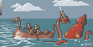 Basically, the clouds are now moving in the opposite direction, I added a little bit of shading (not yet sure if I like it) at the back of the boat, lengthened the oar, and flipped the tentacle holding the viking (and the viking himself). Since it was basically flipped, instead of having the same shape problem between it and the bow, they are now inverse shapes. Not sure if that's a good or bad thing. ------------- |
Posted By: Saboteur
Date Posted: 20 August 2006 at 1:17pm
|
Hahaha, now the curl on the back of the boat matches the little tentacle as well as the bigger one :)
I'm wondering what you plan to do with the rest of the water, and I've gotta say I'm pretty excited to see the outcome. Keep at it, it's cool. ------------- "I was minding my own business and walking across a pebbled path, and a Duck started giving me the business." |
Posted By: pixelblink
Date Posted: 20 August 2006 at 1:19pm
|
it's looking great. I'm glad you've still got it in mind to finish this. Some things I think would benefit this:
------------- |
Posted By: cure
Date Posted: 20 August 2006 at 1:27pm
|
Sab: Don't tell anyone, maybe they won't notice.
PB: I had made a small island, but it didn't fit the style of the piece, I might have another go at it. Or a jetski or something. Birds are a good idea, I like that. ------------- |
Posted By: jalonso
Date Posted: 20 August 2006 at 1:44pm
|
A jet-ski, wtf? I think Sab's observation may not be noticeable once
other details are added. I would leave those for now. It may be worth
the effort to move the tentacle holding the viking so that it slightly
overlaps the rear of the boat itself (just a few pixels). There is a
certain pause having the two scenes within the scene not touching that
interrupt the storytelling aspect of this most awesome piece.
------------- |
Posted By: Skull
Date Posted: 20 August 2006 at 1:47pm
|
The floating oar just made me laugh. :D
------------- |
Posted By: halfDemon
Date Posted: 20 August 2006 at 1:51pm
|
I like the overall piece, but I'm not loving the shading on the back of the boat. ------------- Every pixel counts, even the dead ones. |
Posted By: Draco9898
Date Posted: 20 August 2006 at 1:57pm
I'm liking that pallete and the overall piece itself 
|
Posted By: Ensellitis
Date Posted: 20 August 2006 at 5:58pm
|
looking great cure! cant wait to see the final result... however... it has a tad of humor, but it lacks your tradmark smartassness
------------- There's a pubic hair on my keyboard. What the f**k?? I "mow the lawn" so it's not mine. Gross. |
Posted By: cure
Date Posted: 20 August 2006 at 6:05pm
|
@jal: Another good idea, you seem to have an eye for these composition things that I never seem to think about.
@ens: Smartass? Moi? You must be insane. And the word is "smartassitude".
Btw, I'm in the same boat as Sab as to what I'll do with the rest of the water, so suggestions/edits are welcome.
------------- |
Posted By: Ensellitis
Date Posted: 20 August 2006 at 6:09pm
|
i say a city scape, like nyc, make it look like they are just a bunch of dweebs riding a boat in ny harbor and getting attacked for it.
------------- There's a pubic hair on my keyboard. What the f**k?? I "mow the lawn" so it's not mine. Gross. |
Posted By: cure
Date Posted: 21 August 2006 at 3:24pm
|
*added suggested birds.
*made bottom of clouds less even.
*moved tentacle so that it slightly overlaps boat.
*began messing around with a possible background,
a lighthouse also came into mind, not sure what
will be final.
I'd like to try those splashes and dripping water you mentioned, PB, not exactly sure how I'll go about it. ------------- |
Posted By: Souly
Date Posted: 21 August 2006 at 3:28pm
|
Omg omg land.
------------- 
I am the jesus of PJ. |
Posted By: Blick
Date Posted: 21 August 2006 at 4:30pm
|
Stick with the castle, viking's are too badass (and early in time period) to use lighthouses.
------------- http://punaji.com/"> 
|
Posted By: Larwick
Date Posted: 21 August 2006 at 5:05pm
|
This is looking great now. The land really hugs the rest of the image well. -------------  http://larw-ck.deviantart.com"> http://larw-ck.deviantart.com">
|
Posted By: halfDemon
Date Posted: 21 August 2006 at 6:03pm
|
The land cuts off the water a bit sharply, it makes the sea seam like a lake. ------------- Every pixel counts, even the dead ones. |
Posted By: jalonso
Date Posted: 21 August 2006 at 11:14pm
|
Originally posted by ThereIsNoCure
*added suggested birds. - great looking and possible keeper, unless it gets stormy out
*made bottom of clouds less even - a definete improvement
*moved tentacle so that it slightly overlaps boat - hmmm, will
leave commenting for later. It connects better but I expect perfection
from you.
*began messing around with a possible background,
a lighthouse also came into mind, not sure what
will be final. -
NOOOOOOOOOOOOOOOOOO! You have steered the story from fearsome warriors
and masters of the sea to wimpy sh*theads that run toward land cause
some squid thing is attacking. It's not even a sea serpent or dragon. I
say open waters and viking manliness. Fill the emptyness you find with
the water rippling you've started. It will add a lot of drama and
motion once the water is complete. You may at the end find that having
a thunderstrom in the distance and recoloring the clouds to stormy
weather is all you need to break the field you find so bare. Would I
steer you wrong? me, your PR man?
I'd like to try those splashes and dripping water you mentioned,
PB, not exactly sure how I'll go about it. - This is an awesome idea.
Try using the same technique as the water on the front of the boat.
------------- |
Posted By: cure
Date Posted: 22 August 2006 at 5:52am
|
I do respect Jal's opinion, which carries the weight of five good pixellers. I do understand where you're coming from, I was only trying to fill that empty feeling, until I realized that emptiness I felt was coming from my soul, and that can't be filled with castles and land.
"unless it gets stormy out" hint hint, eh? ------------- |
Posted By: Equinoxx
Date Posted: 22 August 2006 at 5:55am
tidal waves man, tidal waves ...having a storm in the back ground and a huge one at that would produce bigass waves, a good way to break up the flat horizon line wouldn't it ? 
|
Posted By: inkspot
Date Posted: 22 August 2006 at 10:25am
|
lol, thats pretty cool! The first viking from the left reminds me HAGAR. I definately want to see this finished! ------------- |
Posted By: jalonso
Date Posted: 22 August 2006 at 10:18pm
|
@all, I c+c cure on the PJ irc channel often and show edits there. This
edit was intended for that but I just found out that he is firewalled
at his new school so I posted it for him here. Congrats to cure on new school, btw! @cure, another quick rough visual thought for you. I now think the rear of the ship should go over the tentacles rather than behind (shadow added there). I did add 2 colors and feel free to ignore that. I am really just showing you that a stormy sky and heavy wave action will both fill the area and make the story more impactful and dramatic. Sadly the birds would need to go with this direction. The thunderbolts would replace them, I guess. The heavy wave action will also help with the jaggies on the right side of the kraken. The water drips looks like "ya know" as I drew them but the idea of water to create motion is very much worth pursuing. I did also replace the black with a dark red/brown (It bothered me when editing and forgot to recolor back to black. I know you're a fan of black outlining.) Lastly, I added a broken mast to indicate its existence but not having to show it elsewhere.  ------------- |
Posted By: AndyOaks
Date Posted: 23 August 2006 at 3:57am
This is excellent! Great characterisation.
|
Posted By: cure
Date Posted: 23 August 2006 at 5:54am
|
Jal, I love you. I'd been hoping for just such an edit. I once considered adding that dark blue you did, mostly to detail the water more, but never did. I tried the tentacle both behind and in front of the boat, wasn't sure which I preferred. I'm going to try and follow the stormy idea you've drawn out, and see if I can't accomplish while adding only one new color (12 just has a ring to it, and 13 is unlucky).
Hooray for jalonso! ------------- |
Posted By: PixelSnader
Date Posted: 23 August 2006 at 1:06pm
|
lol that kraken is straight outta hentai mag. weekly =P ------------- ▄▄█ ▄▄█ ▄█▄ ▄█▄ |
Posted By: cure
Date Posted: 31 August 2006 at 7:53am
Sorry this is taking so long kids, heres a little bit of an update for you: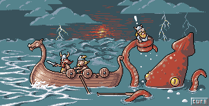 I love the sunset, but I fear it doesn't fit the mood of the piece and brightens the sky a little much. Guess it and the seagulls will just have to find their way into a later work. I've still got work to do, the sea and water effects in particular. And just for kicks:  Yeah, THAT pallete. ------------- |
Posted By: Lawrence
Date Posted: 31 August 2006 at 8:08am
|
Wow this is looking great. The thing I noticed is that if the sun was there, then everything would be a silhouette (you probably already realised). Also, perhaps it would be cool to have the underneath of the clouds light up from the lightning bolts? Great work, man.
------------- |
Posted By: Aleiav
Date Posted: 31 August 2006 at 10:45am
|
I'm not too fond of the clouds being the same color as the water. ------------- |
Posted By: tomster 785
Date Posted: 31 August 2006 at 11:51am
|
I don't know why, but I feel like pointing out all of the reused colors:
cloud -> water
sun -> kraken
and thats all ------------- c[ ] help Brian take over Pixel Joint by making him edit your sig! (to get out typos) |
Posted By: Blueberry_pie
Date Posted: 31 August 2006 at 12:16pm
|
Once again, thank you for this insightful and useful comment. Now please stop it.
------------- |
Posted By: cure
Date Posted: 31 August 2006 at 12:39pm
|
Its called color conservation. You should try it sometime.
------------- |
Posted By: jalonso
Date Posted: 31 August 2006 at 12:45pm
|
First off the lightning bolts are awesome. Now for the crit. The lighting on the foreground suggests that the moon is shining from the left hand side of the image. The sunset while it fills the srea well would, as mentioned, change all the foreground shadeing/lighting. It is also very centered on the canvas (boring). Perhaps if one lighting bolt was at the moment of striking, producing a flash of light, a similar type of lighting could be used. I would try having the farthest most left hand side bolt emit a light similar to the sunset. The palette test is not for this piece. Stop f**ukin around and concentrate. ------------- |
Posted By: cure
Date Posted: 31 August 2006 at 12:56pm
|
I'll try out what you and lawrence have mentioned about the lightning, jal. And I see what you mean, aleieieiav, but I only added 1 new color, unlike jals addition of 2 in his edit, and I'm iffy about adding a 13th color. Cause I like my low color counts. Originally posted by jalonso lmaoThe palette test is not for this piece. Stop f**ukin around and concentrate. ------------- |
Posted By: halfDemon
Date Posted: 31 August 2006 at 4:47pm
|
Originally posted by tomster 785
I don't know why, but I feel like pointing out all of the reused colors: cloud -> water
sun -> kraken
and thats all LMAO Oh the comedy.
As for the image, the new waves seem drastically differrent than the old ones. Ace sunset, though. ------------- Every pixel counts, even the dead ones. |
Posted By: Saboteur
Date Posted: 31 August 2006 at 5:33pm
|
Stop f**ukin around and concentrate. That was the most awesome censorship ever.
ANYWAYS, some crits. I'm sure you know, but at the moment the two depictions of yer water there are a little... not the same. The further-away water seems extremely choppy and tumultuous and stuff (lookit the horizon), though the water at the ship and Kraken seems not nearly so rabid.
I feel like a whirlpool would suit the mood, right beyond the ship.
Also, on the horizon, take a look at how Jal used the lighter shade for the sky, an' then dithered into the darkest. Iunno 'zactly what that did, but it's working for me and would prolly be a good example to follow.
An' I'm with Aleiav and the cloud-water colourness.
Thassall. ------------- "I was minding my own business and walking across a pebbled path, and a Duck started giving me the business." |
Posted By: Morgan
Date Posted: 31 August 2006 at 10:15pm
|
This is a really cool piece. That said, I think the first version is compositionally stronger (with the exception of the flipped tentacle).
Now you've got the horizon line nearly intersecting the ship's head, and the detail in the waves distracting from the Vikings, and lightning distracting from the Kraken + startled Viking... I dunno, maybe I'm just easily distracted. But I'd love to see this with the simple sky + horizon line of the first version.
|
Posted By: ryumaru
Date Posted: 01 September 2006 at 8:48pm
reflection of warm light from sun and bolts? yes no maybe so?
 of course done better but you get the point.
|
Posted By: Ensellitis
Date Posted: 01 September 2006 at 9:19pm
|
ew, i dont like that at all... besides, lightning doesnt just leave a little glow, it illuminates the entire cloud
------------- There's a pubic hair on my keyboard. What the f**k?? I "mow the lawn" so it's not mine. Gross. |
Posted By: cure
Date Posted: 01 September 2006 at 10:47pm
I was thinking something along these lines: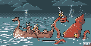 Thanks to the God of Lighting Knowledge lawrence for the helpful suggestion. I also got rid of the sunset, which is for the best. Added another color to address Aleiiav's crit as well. ------------- |
Posted By: Aleiav
Date Posted: 01 September 2006 at 11:10pm
|
The lightning really helps make it look different. Coming along nice. :) ------------- |
Posted By: Mirre
Date Posted: 02 September 2006 at 1:17am
| Wow @ 0 @ That looks so AWESOME! I love the lightning bolts and the reflections on the clouds. Also, Kraken looks so cute for some reason, haha. Mm, snack. |
Posted By: Ensellitis
Date Posted: 02 September 2006 at 6:07am
|
looks much better without the sunset. and the subtle glow looks better then what i thought it would when you use the white
------------- There's a pubic hair on my keyboard. What the f**k?? I "mow the lawn" so it's not mine. Gross. |
Posted By: buloght
Date Posted: 04 September 2006 at 11:20am
|
Ha, first post :). I just had to say, I've been following your thread for a while, it's looking fantabulous! |
Posted By: cure
Date Posted: 07 September 2006 at 12:54pm
|
I am honored that buloght's first post is on my topic. Another little update for my peeps: 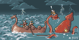 I'm working on those damned waves at the moment, such a dull and monotonous task, working on the dripping water from the tentacles, as well. C+C is still very welcome. ------------- |
Posted By: jalonso
Date Posted: 07 September 2006 at 11:40pm
|
Oh man, you took Buloght's forumvinity, I'm jelaous!
ps: looking good! ------------- |
Posted By: cure
Date Posted: 19 September 2006 at 7:19pm
|
Sorry about the long breaks, school takes up alot of time, deal. Almost finished with the waves, changed some colors for more brightitude, perhaps creating too much contrast between the two darkest colors used on the boat?  Might do a mast, not sure yet. We'll see how it works out. ------------- |
Posted By: halfDemon
Date Posted: 19 September 2006 at 7:30pm
|
Huzzah! An update!
It looks great.
I think the boat would benifit from having some water dripping on it. To emphasize the movement and clashing of the waves. ------------- Every pixel counts, even the dead ones. |
Posted By: alkaline
Date Posted: 19 September 2006 at 7:31pm
|
It's aboot time! Change the colors back, looks better as old IMO. too bright compared to the rest. i also find the water very busy and a mess, I wouldn't know how to alleviate this however but it just doesn't work for me. so keep it up! ------------- |
Posted By: halfDemon
Date Posted: 19 September 2006 at 7:32pm
|
Bah! You're crazy. It's stormy water, a stormy sea. It works fine, IMO. ------------- Every pixel counts, even the dead ones. |
Posted By: Saboteur
Date Posted: 19 September 2006 at 8:49pm
|
No words can describe. Not even ones linking the concept of orgasm to a pixelling technique.
Screw stars, I award you 300 hearts and a box of chocolates. ------------- "I was minding my own business and walking across a pebbled path, and a Duck started giving me the business." |
Posted By: jalonso
Date Posted: 19 September 2006 at 11:29pm
|
The water is looking amazing too me. I do wonder if halfdemon has a point about the boat not being affected by the water so much now? I think the color change is marginal, either way looks good. @ sab, how about krakentastic? ------------- |
Posted By: Larwick
Date Posted: 20 September 2006 at 8:41am
|
Omg alk the new colours are amazing. I think it's much more dramatic with the high saturation of the main characters. It does look great. Now i'm thinking the sky is a bit plain next to the rough seas though... i think the uniform-looking clouds with the realistic style sea is what's wrong perhaps... You might be able to fill up some space in the sky with a moon or such.. Keep it up! ------------- http://larw-ck.deviantart.com">
|
Posted By: cure
Date Posted: 20 September 2006 at 10:28am
|
I changed the colors back, with the exception of a brighter yellow, for now. I'll worry about the colors at the end. I'll see what I can do about both the kraken and the boat being affected more by the water. I agree with you, Lar, It had a cartoony style to it, until I made a more realistic sea, I'll dabble with the clouds at some point, probably. As for now, here's a WIP of a sail!  ------------- |
Posted By: Monkey 'o Doom
Date Posted: 20 September 2006 at 2:30pm
|
That looks awesome, but the dithering is very abrupt, maybe use some besides 50%? ------------- http://pixelmonkey.ensellitis.com"> 
RPG is numberwang. |
Posted By: alkaline
Date Posted: 20 September 2006 at 7:07pm
|
yes, well it's either the water or everything else...i find too much of a difference between detail and cartoon style.. water alone it looks great..the characters are good too...
------------- |
Posted By: halfDemon
Date Posted: 20 September 2006 at 7:36pm
|
I actually really like the mix between realism and cartoony. It makes a unique style. I believe the dithering at the end needs work; it's far too noticable, at least in my opinion. ------------- Every pixel counts, even the dead ones. |
Posted By: jalonso
Date Posted: 20 September 2006 at 10:20pm
|
Liking the sail a lot. I will ask again, is the black gonna become a dark brown/red? *wink, wink*. I'll leave the sky comments for later.
------------- |
Posted By: Ensellitis
Date Posted: 21 September 2006 at 9:06am
|
i think his black outlines are kinda a style that fits him, but i could be wrong, it not like something he has ever made with black out lines has ever gotta a good rating *COUGH* ../pixelart/12181.htm"> :P ------------- There's a pubic hair on my keyboard. What the f**k?? I "mow the lawn" so it's not mine. Gross. |
Posted By: cure
Date Posted: 21 September 2006 at 9:19am
|
Put that trophy back where you found it, young man. We'll see, jal. I'll be tweaking and playing around with it plenty, so it is a possibility. It has just occured to me that without you suggestions this would be an entirely different piece. ------------- |
Posted By: jalonso
Date Posted: 21 September 2006 at 11:24am
|
That is a good thing , right?
------------- |
Posted By: cure
Date Posted: 21 September 2006 at 11:57am
|
Unless you'd prefer the vikings heading toward a castle atop a hill on a sunny day, yes, a very good thing. I heterolove you jal. ------------- |
Posted By: Aleiav
Date Posted: 23 September 2006 at 3:39pm
|
So glad to see the waves in all of the water! Looking very awesome. :D
------------- |
Posted By: halfDemon
Date Posted: 23 September 2006 at 3:58pm
|
I just want to add that although the sail is sweet, it seems to be in a different perspective than the boat. ------------- Every pixel counts, even the dead ones. |
Posted By: cure
Date Posted: 28 September 2006 at 7:54pm
 the water now get darker toward the horizon- still WIP
theres now a moon
highlights on back of the boat
wave splashing against kraken
sail is improved- may change the perspective. ------------- |
Posted By: jalonso
Date Posted: 29 September 2006 at 8:40am
|
The moon is a great added detail. The water looks even better than before. The sail looks fine to me. The oar thats just floating could use a little breaking up on the lineart. The bottom edge could use a bit of a broken line its too staight. The sky dithering is the only problem now. It does not quite match the rest. I wouldn't overdo the pixelling on the sky tho. Leaving it as white space to rest the eye is fine here.
------------- |
Posted By: Monkey 'o Doom
Date Posted: 29 September 2006 at 12:49pm
|
Although it is nice to have a less busy area, as jalonso stated, I think that for logic's sake, you should at least add a few dim stars. ------------- http://pixelmonkey.ensellitis.com">
RPG is numberwang. |
Posted By: cure
Date Posted: 02 October 2006 at 8:24am
|
Its finally at the point where I find myself feeling generally satisfied with the piece. Added some stars, redid the dithering on the sky, shaded the kraken with the darkest blue, finished (?) detailing the water. If I have made any changes that you feel don't work, please point them out. ------------- |
Posted By: Monkey 'o Doom
Date Posted: 02 October 2006 at 12:31pm
|
The host you used is kind of funky and won't show the pic. Maybe you could rehost it somewhere else? ------------- http://pixelmonkey.ensellitis.com">
RPG is numberwang. |
Posted By: cure
Date Posted: 02 October 2006 at 12:37pm
|
Its photobucket, but I often have problems logging in to the forums so I use a proxy, that may be where the problem lies. Let me see if I can't fix that. ------------- |
Posted By: Larwick
Date Posted: 02 October 2006 at 1:22pm
|
I dont like the fact the farther boat wall is only one pixel away from the other (apart from the outlines). I think one pixel more would be better.. :/
LOOKS AMAZING THOUGH! =D ------------- http://larw-ck.deviantart.com">
|
Posted By: jalonso
Date Posted: 02 October 2006 at 10:23pm
|
Lar, I think thats a remmant from when it was a more cartoony piece. You are right of course, but I don't think it detracts from the piece. Cure, Looks great and complete, submit   ------------- |
Posted By: Saboteur
Date Posted: 02 October 2006 at 10:31pm
|
Hahaha, NEVER submit! It'd get too many favorites. Faar too many. System-error quantities, here. Hell, even blind people would visit pixeljoint and be able to FEEL the wickedawesomeness!
Having said that, I do have some thoughts.
The horizon still seems scrappy, because of the contrast (can't really be avoided, what with the palleteness, I suppose) and the non-fading-to-horizonitty. I feel like the waves should be getting smaller an smaller (to a greater extent) as zee olde distance increases. Perhaps I am dead wrong.
On a final note, the very front of the ship is not black-outlined, and virtually everything else is.
Everything other than that causes my salivary glands to kick in to overdrive. Cure for the win, somoene throw money at him!
------------- "I was minding my own business and walking across a pebbled path, and a Duck started giving me the business." |
Posted By: Ensellitis
Date Posted: 02 October 2006 at 10:35pm
|
i hate you and your mad skills
------------- There's a pubic hair on my keyboard. What the f**k?? I "mow the lawn" so it's not mine. Gross. |
Posted By: cure
Date Posted: 03 October 2006 at 12:33pm

^submitted.
Its been another helpful wip thread, thanks to all for the c+c. ------------- |
Posted By: Ensellitis
Date Posted: 03 October 2006 at 1:00pm
|
about time, prepare for another monthly top... this time i predict 2nd place :D
------------- There's a pubic hair on my keyboard. What the f**k?? I "mow the lawn" so it's not mine. Gross. |
Posted By: leel
Date Posted: 03 October 2006 at 1:10pm
|
I want your babies.  |
Posted By: Ensellitis
Date Posted: 03 October 2006 at 1:13pm
wait in line, honey 
------------- There's a pubic hair on my keyboard. What the f**k?? I "mow the lawn" so it's not mine. Gross. |
Posted By: cure
Date Posted: 03 October 2006 at 1:16pm
|
Why form a line? There's enough to go around.
2nd place? Quite a lofty prediction. ------------- |
Posted By: Ensellitis
Date Posted: 03 October 2006 at 1:20pm
|
if you get second place or higher, you owe me fan art. if not, i owe you fan art... do you take the bet? *holds out hand and awaits shake to seal the deal* ------------- There's a pubic hair on my keyboard. What the f**k?? I "mow the lawn" so it's not mine. Gross. |
Posted By: cure
Date Posted: 03 October 2006 at 1:24pm
|
Alright ens, I accept your offer.
*shakes hand* ------------- |