Crystalis remake
Printed From: Pixel Joint
Category: Pixel Art
Forum Name: WIP (Work In Progress)
Forum Discription: Get crits and comments on your pixel WIPs and other art too!
URL: https://pixeljoint.com/forum/forum_posts.asp?TID=3469
Printed Date: 21 April 2026 at 9:47pm
Topic: Crystalis remake
Posted By: Zetabot
Subject: Crystalis remake
Date Posted: 07 December 2006 at 7:46pm
|
Some of you may rememebr me from before, but I got caught up in a lot of stuff and the project went on hold for awhile. Anywho, here are couple of things I've been working on. Any crits or suggestions are welcome.
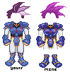
First is our hero. On the left is his jumpsuit he will come out of the cave with. On the right is his actual in game outfit afterwards.
Here's a red and blue slime. The idea with the blue is an attack where he morphs into a hammer. For the red, we were thinking of an attack where it blows a poisonous bubble out. Both animations could probably use a few more frames for smoothness, but again, these are wips.
|
Replies:
Posted By: BlackDragon
Date Posted: 08 December 2006 at 9:06am
I would add a whole lot more detail to the heros. They look kind of bland. Not sure waht to do with his face, but what do I know? Up the contrast on the metal suit and add many more highlights inside the highlights that are there. His hair also bugs me. Ditch the outlines and work on its highlights. It has too much contrast!!!
 To explain what I mean.
As for the slimes... as you said, add more frames. I don't really like th slime trail, either. The lack of shade is what I mean. ------------- "A little pain never hurt anyone." - Blueberry_Pie |
Posted By: Zetabot
Date Posted: 08 December 2006 at 10:03am
|
I see what you mean. I really have no idea what I'm doing to be honest. I've done a few other things, but nothing like this before.
I see where you are coming from on the suit of armor, is it is a bit dull. I hadn't noticed before as I took the armor straight from the Japanese box for the game, known over there as God Slayer.
So up con on the suit, down on the hair.
I'm still not 100% happy with the hero, but I think I am getting there. Thanks for the help.
|
Posted By: jalonso
Date Posted: 08 December 2006 at 10:35am
|
I like the edit on the suit Blackdragon made but not the hair. Yours was good, maybe mix the two somehow. The slime is great ------------- |
Posted By: Zetabot
Date Posted: 08 December 2006 at 1:58pm
|
Thanks Jalonso. I really respect your opinion and suggestions alot.
I'll work on a few things tonight, and post later, or maybe tomorrow.
|
Posted By: BlackDragon
Date Posted: 08 December 2006 at 2:35pm
|
Originally posted by Zetabot
I see what you mean. I really have no idea what I'm doing to be honest. I've done a few other things, but nothing like this before. Its okay! Thats what this forum is for!  ------------- "A little pain never hurt anyone." - Blueberry_Pie |
Posted By: Zetabot
Date Posted: 10 December 2006 at 8:08pm
Pretty busy this weekend, but there is an update on the hero.
 |
Posted By: Zetabot
Date Posted: 10 December 2006 at 10:10pm
|
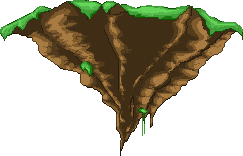
This is a wip for the floating tower. Obviously there is no tower yet, but this is the island it will be on.
I know it may look huge, but it is for the story cutscene in the beginning.
In case I didn't say earlier, the game is going to be huge in terms of art. around 800x600. I've mostly worked on the rocky underside, and definitely am going to work more on the grassy parts. Anywho, let me know how to make this thing better.
 |
Posted By: jalonso
Date Posted: 10 December 2006 at 11:06pm
|
The hero looks real good. The red blob just cracks me up. The island looks nice. I notice you're working on a huge game project all alone. For this reason I would not suggest that you alter much. If later you have time then maybe reconsider making the rocky part more realistic by making the rocks point staright down to create the cone rather than these that slope inward. Might be ok if you hang a lot of moss from the grassy top too. ------------- |
Posted By: Zetabot
Date Posted: 11 December 2006 at 6:16am
|
Yea, it is a lot of work, so I'll have to keep that in mind. I actually posted a help wanted in the job posting section.
I just have this urge to try to make everything is good as I can make it because I want people to be impressed by this game. Although I probably won't reach that level
 , I at least don't want people playing the game and then talking about how crappy the art was. , I at least don't want people playing the game and then talking about how crappy the art was.I'll keep your suggestion in mind for when things are being refined. Thanks again Jalonso.
|
Posted By: Zetabot
Date Posted: 11 December 2006 at 9:03am
|
Here's our status bar, along with visible status effects so far. I am considering changing the frozen one a bit more, and th paralyzed one will likely have a small animation, as will the poisoned bubbles.
For the bar I was going for a sort of mix between the old game, and some new school HUDs. The blue is the same blue from the original, and the green area is where we will see the charging up of weapons, a la Secret of Mana/Evermore. So, here it is.
Normal Bar:
 Various faces for effects:
 Normal Curse Stone Frozen Paralysis Poison
Also, should I make new posts like this, or put everything in the first post via editing?
|
Posted By: BlackDragon
Date Posted: 11 December 2006 at 9:31am
|
Eh, I'd say first post. But since you have already done seperate posts don't screw it up.
Oh, and on your new hero, how come there is a jewel only on the right (our right) of his chest? ------------- "A little pain never hurt anyone." - Blueberry_Pie |
Posted By: Zetabot
Date Posted: 11 December 2006 at 3:41pm
| There actualy was only one jewel on the old hero as well. I took the design for the armor straight from the japanese box art for the game, which was known as God Slayer over there. |
Posted By: jalonso
Date Posted: 11 December 2006 at 4:01pm
|
The faces look nice. Maybe the hair on frozen (lol) could be ice too?
On the poison maybe orange hair so that its the opposing color on the
color wheel?
------------- |
Posted By: Zetabot
Date Posted: 11 December 2006 at 4:10pm
|
Thanks, I'll try that out. I wasn't sure what I wanted to do with all of them. I had thought of just being really goofy and making the frozen one have a top hat and scarf.
|
Posted By: Zetabot
Date Posted: 11 December 2006 at 5:04pm
|
Ok, here's the new poison on frosty guy.
Later, I may try making the hair more like ice, but for now I'll settle for "cool" colors and a scarf. I'm still a little iffy on the scarf, though. Also, for the poison I tried a few oranges, but I like the deadish looking brown orange the best for the hair.
 |
Posted By: jalonso
Date Posted: 11 December 2006 at 5:25pm
|
ya, the scarf while appropriate seems a bit too much. The face says 'cold' without it.
------------- |
Posted By: Zetabot
Date Posted: 11 December 2006 at 5:27pm
Ha, my buddy felt the same way. Well, off to work on more crap. 
|
Posted By: BlackDragon
Date Posted: 13 December 2006 at 4:42pm
|
Well, why don't you make the scarf frozen too? Or not. ------------- "A little pain never hurt anyone." - Blueberry_Pie |
Posted By: Zetabot
Date Posted: 13 December 2006 at 6:42pm
| Nah, the scarf was a bit much. |
Posted By: dragonrc
Date Posted: 14 December 2006 at 9:21am
| Maby give the electrocuted guy yellow hair |
Posted By: PixelSnader
Date Posted: 14 December 2006 at 11:49am
|
he's not electrocuted, he's paralised. unable to move. ------------- ▄▄█ ▄▄█ ▄█▄ ▄█▄ |
Posted By: Zetabot
Date Posted: 17 December 2006 at 12:40am
Couple of tiny updates. If there are any huge glaring problems with these let me know.
 And here is Draygon. His cape is more a placeholder for now and obviously needs refining, but how is his overall design? I feel like his feet are strange and I can't fix them. I may be able to come back fresh tomorrow and do something with it. Also, the two images have different designs on the cloth, but I may just go with black. I dunno yet.
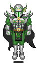 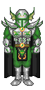 Damn, and ignore the green top on the still shot. I am fixing that
 . . |
Posted By: BlackDragon
Date Posted: 17 December 2006 at 7:27am
|
W00t. ------------- "A little pain never hurt anyone." - Blueberry_Pie |
Posted By: Pieface
Date Posted: 17 December 2006 at 8:20am
| Just a question, Is his tabard meant to have different designs, also im loving the floating island and the Purple haired dude |
Posted By: Monkey 'o Doom
Date Posted: 17 December 2006 at 9:02am
|
Also, the two images have different designs on the cloth, but I may just go with black. I dunno yet. ------------- http://pixelmonkey.ensellitis.com"> 
RPG is numberwang. |
Posted By: Pieface
Date Posted: 17 December 2006 at 9:05am
| Dammit I missed that >.< |
Posted By: Zetabot
Date Posted: 17 December 2006 at 9:39am
| I see Monkey already replied, but yes. I still don't know which I like more, and I may even just go with black, or design something new. Glad you like the stuff, Pieface. |
Posted By: PixelSnader
Date Posted: 17 December 2006 at 2:25pm
|
i'd go for black, or maybe an abstract motive. nothing really depicting something. somehow it's weird to have a dragon in your crotch.. ------------- ▄▄█ ▄▄█ ▄█▄ ▄█▄ |
Posted By: Zetabot
Date Posted: 17 December 2006 at 2:50pm
Yea, I was leaning towards the plain black, or trying something else. The more I look at it, the more I feel like it's overkill with the dragon motif. I like it on the helm and chest, but I think I'll go with something else for the "crotch".
|
Posted By: jalonso
Date Posted: 17 December 2006 at 11:49pm
|
You are doing a great job on this project.
------------- |
Posted By: Zetabot
Date Posted: 18 December 2006 at 7:43am
|
Hey, thanks Jalonso. |
Posted By: Zetabot
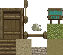
Date Posted: 23 December 2006 at 8:05pm
|
Well, I have to say the one thing I suck at most is drawing backgrounds and landscapes. It transfers over from never drawing those things in traditional mediums either.
Anywho, here are a few things I am working on so far for our town.
A little fence, a door, some wood for a house, a rock, some stone for a house or some other crap maybe, some dirt, and a pathway. the grass isn't completely mine, as I modified an old tile one of the programmers made. Also, the pathway one may look familiar, as I was looking at the tile art tut when I made it. It is all original, though. I know a lot of this needs work, but I don't really know how to fix the crap. Help would be fantastic.
 |
Posted By: PixelSnader
Date Posted: 24 December 2006 at 3:37am
|
what perspective is it supposed to be? ------------- ▄▄█ ▄▄█ ▄█▄ ▄█▄ |
Posted By: Zetabot
Date Posted: 24 December 2006 at 10:09am
| the door is terrible, but it is a standard 3/4 view, like secret of mana and the like. I've never done anything like this and it's kiccking my ass. |