my pixel art
Printed From: Pixel Joint
Category: Pixel Art
Forum Name: WIP (Work In Progress)
Forum Discription: Get crits and comments on your pixel WIPs and other art too!
URL: https://pixeljoint.com/forum/forum_posts.asp?TID=3635
Printed Date: 28 October 2025 at 8:19pm
Topic: my pixel art
Posted By: kostik92
Subject: my pixel art
Date Posted: 17 January 2007 at 4:17am
 this is my pixel art this is my pixel art
and i need revision
 what shell i do????
|
Replies:
Posted By: Souly
Date Posted: 17 January 2007 at 5:59am
|
Well that's certainly not pixel art.
------------- 
I am the jesus of PJ. |
Posted By: kostik92
Date Posted: 17 January 2007 at 6:49am
 and this one?? and this one??
|
Posted By: PixelSnader
Date Posted: 17 January 2007 at 7:51am
|
is. why did you make it all fuzzy in photoshop? ------------- ▄▄█ ▄▄█ ▄█▄ ▄█▄ |
Posted By: kostik92
Date Posted: 17 January 2007 at 7:54am
|
(if it is not a pixel art then tell me how can i correct my mistakes)

|

Posted By: kostik92
Date Posted: 17 January 2007 at 7:57am
so how can i put these pictures on the main site??
 |
Posted By: PixelSnader
Date Posted: 17 January 2007 at 10:55am
|
those are pixel art as well
i think the reason for not accepted is the quality. pixeljoint has high standards.
these are not too bad though i think with a bit extra work they will be accepted ------------- ▄▄█ ▄▄█ ▄█▄ ▄█▄ |
Posted By: kostik92
Date Posted: 17 January 2007 at 11:47am
|
Originally posted by snader
those are pixel art as well i think the reason for not accepted is the quality. pixeljoint has high standards.
these are not too bad though i think with a bit extra work they will be accepted what kind of extra work???
|
Posted By: Varock Shade
Date Posted: 17 January 2007 at 12:11pm
|
Originally posted by kostik92 Originally posted by snader
those are pixel art as well i think the reason for not accepted is the quality. pixeljoint has high standards.
these are not too bad though i think with a bit extra work they will be accepted
what kind of extra work???
probably because of the colours/shading... cause i get a lot of comment on the colours i use (not enough contrast, wrong tints, lightsource etc)... And i see kinda randomly places pixels in your shading which isnt a good thing to get approval either... ------------- http://www.mega.freeforums.org/ < PJ Member Dran's Multimedia and RP Forum |
Posted By: kostik92
Date Posted: 17 January 2007 at 12:44pm
 and what's wrong with this one?? and what's wrong with this one??
|
Posted By: BlackDragon
Date Posted: 17 January 2007 at 2:33pm
|
Bad head shape, not-so-well dithering... Do you know how to smooth things out? Check the main site for tutorials, or check out other works. ------------- "A little pain never hurt anyone." - Blueberry_Pie |
Posted By: NMEwithin
Date Posted: 17 January 2007 at 3:30pm
|
Originally posted by kostik92
and what's wrong with this one??One frame of your animation has different colors...that's why you are getting that blinking effect. You need consistancy in your frames when animating.
This piece is not that bad but you should definately check out some of the tutorials on this site and start adding a little more detail.
|
Posted By: Blueberry_pie
Date Posted: 18 January 2007 at 10:55am
|
Dude, I understand you want to get your work approved but it might be a better idea to just focus on one piece at a time rather than just posting everything and asking 'what is wrong with it'. NMEwithin brings up a good point on the animation. This piece has a couple of odd-looking frames too:  What animation software are you using? Maybe you should use another one. ------------- |
Posted By: kostik92
Date Posted: 18 January 2007 at 12:38pm
| i use photoshop |
Posted By: Ensellitis
Date Posted: 18 January 2007 at 2:02pm
|
well, stop. i dont know exactly what you are doing, but you are screwing up your animations transparency when you use it. click on one of your animations until it is really really big and the watch the outer border and you will see what i am talking about. i think what you may be doing is using the magic wand tool then pressing delete or cutting it and still having AA on. and listen to blueberry, work on one piece at a time. you won't learn anything new and retain it if you attempt to do multiple things, and many arent going to attempt to explain the problems in all the pieces you are throwing at us. ------------- There's a pubic hair on my keyboard. What the f**k?? I "mow the lawn" so it's not mine. Gross. |
Posted By: kostik92
Date Posted: 18 January 2007 at 2:37pm
ok thanks to all
i will try to make my 1st work
I tryed but there are not a lot of changes  |
Posted By: NMEwithin
Date Posted: 18 January 2007 at 3:21pm
|
There is definately a noticeble improvement with this piece. Some advice: Work on your pixeling before you jump into animation. I know having animated sprites is cool and all that but without the basics they will just end up looking like crap.
When you do decide to start animating your stuff I suggest Microsoft .GIF animator. It's easy to use and free. You might also want to download the free version of Graphics Gale for your pixeling....
Good luck...
|
Posted By: kostik92
Date Posted: 19 January 2007 at 11:06am
|
sorry .i have a question
why are my 2 works isn't accepted they stand here two days and there's
wrated "AWAITING APPROVAl" why so long??
 but other work i uploded in the morning and in the evening "revision needed"
|
Posted By: Pixel_Outlaw
Date Posted: 19 January 2007 at 11:41am
|
Because there are actual people that aprove work, it's not an automated process. I'm sure the MODs have real lives too and can't sit online all day long without exception.
Actually it might help reduce the work for mods if a programmed checking system could be done. If a pic exceeds a given color to area ratio, it would be auto rejected.
I started a sentence with "Because", sue me. ------------- http://www.shmup-dev.com/forum/"> 
|
Posted By: PixelSnader
Date Posted: 19 January 2007 at 2:12pm
|
sue is way tou cute a girl for you. ------------- ▄▄█ ▄▄█ ▄█▄ ▄█▄ |
Posted By: Ensellitis
Date Posted: 19 January 2007 at 6:00pm
|
Originally posted by kostik92 sorry .i have a question why are my 2 works isn't accepted they stand here two days and there's
wrated "AWAITING APPROVAl" why so long??
but other work i uploded in the morning and in the evening "revision needed" there are many reasons for this, mainly if one work is obviously to poor of quality, it will be turned down immediatly, if it is on the line, we will wait for the users to vote on it. ------------- There's a pubic hair on my keyboard. What the f**k?? I "mow the lawn" so it's not mine. Gross. |
Posted By: kostik92
Date Posted: 20 January 2007 at 11:34am
|
but this two are steal waiting for aparove
and first work is aproved in one day but these two are waiting 4day??
|
Posted By: Monkey 'o Doom
Date Posted: 20 January 2007 at 11:41am
|
The ninja looks like you were going for a simplistic style that didn't need much realism or polish. But the other ones have attempted (but, unfortunately, failed) shading and other techniques. I suggest you use more than just a 50% dither and that you add contrast and hue shifting to the yellow thing. ------------- http://pixelmonkey.ensellitis.com"> 
RPG is numberwang. |
Posted By: Ensellitis
Date Posted: 20 January 2007 at 12:10pm
|
ENOUGH FOR F*CK SAKE! we just explained to you why. this is a WIP topic, not a "Why was my work revised" topic. Your work that was revised means it wasnt good enough to get into the gallery. I am on the verge of locking this thread, so unless you start showing some wip and asking for actual help and not just whining about how we do things around here, then I will lock this. If you want a place that doesnt care about quality, go to deviantart, they let anything in ------------- There's a pubic hair on my keyboard. What the f**k?? I "mow the lawn" so it's not mine. Gross. |
Posted By: kostik92
Date Posted: 20 January 2007 at 1:47pm
|
ok. I understand
here is my new work
 comments and edits are welcome
|
Posted By: kostik92
Date Posted: 20 January 2007 at 2:13pm
|
Originally posted by Monkey 'o Doom
The ninja looks like you were going for a simplistic style that didn't need much realism or polish. But the other ones have attempted (but, unfortunately, failed) shading and other techniques. I suggest you use more than just a 50% dither and that you add contrast and hue shifting to the yellow thing. something like this??
  |
Posted By: Monkey 'o Doom
Date Posted: 20 January 2007 at 2:40pm
|
You're shading it like a sphere. Think about how light would reflect off something shaped like that is, but 3d. I also notice you have a fricking BUNCH of colors. Try arranging them all in a row like you have 5 of them and you'll see what I mean.
My edit:
 ------------- http://pixelmonkey.ensellitis.com">
RPG is numberwang. |
Posted By: Monkey 'o Doom
Date Posted: 20 January 2007 at 2:50pm
|
Originally posted by kostik92
something like this??
That's not what I meant. Contrast means the difference between colors. The highest possible contrast is found in a black-and-white piece, while something with most colors close to a 50% grey has very little contrast. I opened it in Photoshop and messed with your colors and contrast and I think it looks a lot nicer. The eyes are very harsh, though, try decreasing their saturation.
My edit:
 EDIT: Oh, snap. Do excuse the double post. ------------- http://pixelmonkey.ensellitis.com">
RPG is numberwang. |
Posted By: leel
Date Posted: 20 January 2007 at 4:47pm
|
Originally posted by kostik92
ok. I understand here is my new work
comments and edits are welcome
This looks nice, one suggestion though - if you don't dither but use smoother shading it'll look much more sleek and slimy - which is what I'd assume a slug to be, and then you could add some sort of texture for interest.
Here's a quickie to better explain.
 Also, don't be upset by ensellitis - he's right, you're not really improving any of the pieces that weren't accepted, you just show other pieces repeating the same flaws over and over. So work on one thing at a time and you'll be an expert in no time, ok? We'll help you, as long as you're willing to work.
 edit: didnt realize m0d already cc'ed you :p
|
Posted By: kostik92
Date Posted: 21 January 2007 at 8:48am
 i very enjoed LeeL's edit
and so i tryed to do right shading
i very enjoed LeeL's edit
and so i tryed to do right shading
|
Posted By: leel
Date Posted: 21 January 2007 at 9:00am
|
It's an improvement, glad to see you upped the contrast, it was something I forgot to do in my edit. Something to work on - in your palette, the two shades below the black are virtually the same, so you should just use one color (I'd say the lower one which you're using for the outline anyway) Also, on his tail you have those two colors right on top of each other - it really stands out and doesn't really make sense shading wise, so shorten the top line a little and it'll look less like an unexplainably wide outline. |
Posted By: kostik92
Date Posted: 21 January 2007 at 12:00pm
is head any better??
 |
Posted By: leel
Date Posted: 21 January 2007 at 12:07pm
|
I actually like the flatter version more than the pointy one (because it really looks more pointy than round.)
I'd say make the left side of the flat one rounded like the left side and it'll look fine.
Also, a note - the 3 lighter pixels aren't doing anything good on the rounder head. If you want to AA or selout, do the whole thing, not just one side because the outline now looks really choppy and as it it's missing something. I think for something simple as this, just leave the clean outline, it'll fit the style better.
|
Posted By: kostik92
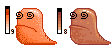
Date Posted: 21 January 2007 at 12:54pm
 like this?? like this??
|
Posted By: leel
Date Posted: 21 January 2007 at 12:58pm
| yeah the outline is good, but again, either aa the whole thing, or don't aa at all. |
Posted By: Monkey 'o Doom
Date Posted: 21 January 2007 at 12:59pm
|
That looks much better. Your aa, however has a few little issues. The inner aa is pretty much ok, but on the outside you need to consider 2 things:
1. Often times a pixel will be intended for various backgrounds and thus outer aa is not something you want to do if you'll have different backgrounds for the piece.
2. Your aa color, if you only want to aa with one color, should have RGB valuse halfway between those of the colors you're antialiasing. In this case, where you have an established palette, you can just use the closest color you already have.
You should also probably decrease the piece's overall saturation sometime, and if you're antialiasing part of it, you should antialias the whole thing.
EDIT: leel posted too fast. "eating," lol. ------------- http://pixelmonkey.ensellitis.com">
RPG is numberwang. |
Posted By: kostik92
Date Posted: 22 January 2007 at 12:23pm
sorry i am not so good in english wat is aa??
 |
Posted By: Monkey 'o Doom
Date Posted: 22 January 2007 at 12:39pm
|
aa is short for antialiasing. http://www.spriteart.com/tutorials/01_AA.html - The most commonly linked tutorial is this one. ------------- http://pixelmonkey.ensellitis.com">
RPG is numberwang. |
Posted By: kostik92
Date Posted: 23 January 2007 at 11:22am
 is this edit without aa?? is this edit without aa??
|
Posted By: leel
Date Posted: 23 January 2007 at 12:56pm
| Yes, though I'd advise to keep the outline on the top either the same or at least slightly darker then it is now. Just because there's so much contrast at the bottom and very little of it on the top, it looks almost cut off. |
Posted By: kostik92
Date Posted: 24 January 2007 at 7:26am

|
Posted By: Aleiav
Date Posted: 25 January 2007 at 4:48pm
|
how about some actual eyes instead of black squigglies? ------------- |