First Pixel Portrait (Revision) - Finished
Printed From: Pixel Joint
Category: Pixel Art
Forum Name: WIP (Work In Progress)
Forum Discription: Get crits and comments on your pixel WIPs and other art too!
URL: https://pixeljoint.com/forum/forum_posts.asp?TID=3734
Printed Date: 30 September 2025 at 3:30am
Topic: First Pixel Portrait (Revision) - Finished
Posted By: Varock Shade
Subject: First Pixel Portrait (Revision) - Finished
Date Posted: 05 February 2007 at 12:58pm
|
Finished Version: http://pixeljoint.com/pixelart/20318.htm - Some might remember me posting this portrait. After beging busy pixeling other things for a while, i want a revision on the Hair. (So, id prefer to get tips about the hair). Photo Reference: http://i65.photobucket.com/albums/h212/Varockshade/RSnl%20Forum%20-%20Pixels/portraitphoto-png.png - http://i65.photobucket.com/albums/h212/Varockshade/RSnl%20Forum%20-%20Pixels/portraitphoto-png.png As i dont know how i can get the hair as good as this: http://pixeljoint.com/pixelart/3217.htm - http://pixeljoint.com/pixelart/3217.htm http://pixeljoint.com/pixelart/14762.htm - http://pixeljoint.com/pixelart/14762.htm http://pixeljoint.com/pixelart/16288.htm - http://pixeljoint.com/pixelart/16288.htm SO, could someone please tell me how i could get a result like this, or does someone have a link to a tutorial that can teach me how to do this...?  (cause ive been looking for ways to do the hair since i posted this pixel art). (cause ive been looking for ways to do the hair since i posted this pixel art).Edit 1: This is of my old version, looks a bit familiar, but im gonna do that part again, in photo and pixel... Edit 2:  Before I begin editing the hair, I want the palette right (at least the number of colours) cause I found that the old version had 36 colours, which is too much. I found colours that I didnt replace well, I removed some colours and replaced them for existing colours to get a 22 colours palette... (You might think the palettes are from photoshop... That's right, I wanted an overall picture of the colours i used, because you cant see the palette itself in paint) Edit 3:  Old and New Hairlocks comparisation. Before i can go any further, could someone tell me how to get the highlights and shadows in the right place when shading the hair??? Edit 4:  After not getting any new tips or anything on how to shade the hair I decided to give a try without support from someone who can shade hair... So, as youll probably see i didn't really take a look at where the dark and light parts really are in the photo... i know, thats a shame, but well... i think it looks better than the previous version... anyone willing to give me some c&c on this?btw, after the hair edit (if the hair will look something like this) im gonna change the colours on the face, also work a bit on the shape and probly remove a big part of the dithering cause it doesnt fit the style i made the hair with... Edit 5: Sorry for the veeeeeery late bump, but i decided to do some more editing and ask you people to decide whether the face matches better or not, and what i should change on the face...  Things ive done since the previous edit: - Attempt on making her face less chubby (cause it was too chubby according to some people) - another edit on the eyes - less round and smaller forehead - small changes on the shading - Making the nose a bit larger edit 6:  Edits since last edit: - made the distance between chin and lips smaller by 1px - start on hair (the black outlines are gonna be the edges of the locks and ill maybe put in some more detail)... edit 7:  Edits since last edit: - Finished Part of the Hair (I need comment on the result) edit 8:  Edits since last edit: - Overview of the highlights and shadow of the hair - Shading ears and neck (might get some more edits before finished version)... - Shirt in greytints - Attempt on making the face less chubby edit 9:  Changes since last edit: -Finishing the hair edit 10:  Edits since last edit: - Recolouring and reshaping face (unfinished) edit 11:  Edits since last edit: - Finishing Face colouring - Adding Freckles - Detailing Ear - Reflections Glasses - AA on glasses ------------- http://www.mega.freeforums.org/ < PJ Member Dran's Multimedia and RP Forum |
Replies:
Posted By: Cryssy
Date Posted: 05 February 2007 at 3:21pm
|
I don't know of a tutorial but I can show you some of my process in how I do hair if you wish with an emphasis on the I because it would be very subjective First thing first go through and find the sections of the hair. Though hair is individual strands which you should acknowledge the strands usually behave in a group called locks(or sections) :P. 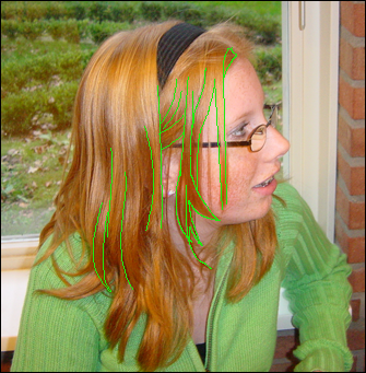 I started showing the sections/locks of hair with my green line work very rough and quickly done. but for you I would build off this idea ------------- 
|
Posted By: Monkey 'o Doom
Date Posted: 05 February 2007 at 3:51pm
|
Take a look at that hair. You'll see that those use streaks on the edges of color to indicate texture and use dithering only as a means to make those streaks smoother. Try something with that technique and show us what you come up with. ------------- http://pixelmonkey.ensellitis.com"> 
RPG is numberwang. |
Posted By: Ensellitis
Date Posted: 05 February 2007 at 5:02pm
|
main problem i see is that you shaded horizontally instead of vertically, so it doesnt really look lik hair at all
------------- There's a pubic hair on my keyboard. What the f**k?? I "mow the lawn" so it's not mine. Gross. |
Posted By: Aleiav
Date Posted: 05 February 2007 at 9:05pm
|
I think also, you should avoid shading the hair as a whole, especially in a gradient like format. It just doesn't look very good.
I know I'm not really one to talk since I suck at hair but.. just throwing that out there. ------------- |
Posted By: Varock Shade
Date Posted: 09 February 2007 at 8:13am
|
Originally posted by Cryssy I don't know of a tutorial but I can show you some of my process in how I do hair if you wish with an emphasis on the I because it would be very subjective First thing first go through and find the sections of the hair. Though hair is individual strands which you should acknowledge the strands usually behave in a group called locks(or sections) :P. I started showing the sections/locks of hair with my green line work very rough and quickly done. but for you I would build off this idea  This is of my old version, looks a bit familiar, but im gonna do that part again, in photo and pixel... Edit: Green lines added to the hair on the photo (if not visible, you might have to refresh the page)...Edit 2: Before I begin editing the hair, I want the palette right (at least the number of colours) cause I found that the old version had 36 colours, which is too much. I found colours that I didnt replace well, I removed some colours and replaced them for existing colours to get a 22 colours palette... (You might think the palettes are from photoshop... That's right, I wanted an overall picture of the colours i used, because you cant see the palette itself in paint) Edit 3: Old and New Hairlocks comparisation. Before i can go any further, could someone tell me how to get the highlights and shadows in the right place when shading the hair??? ------------- http://www.mega.freeforums.org/ < PJ Member Dran's Multimedia and RP Forum |
Posted By: Varock Shade
Date Posted: 18 February 2007 at 7:18am
|
bumping topic + new edit (4) After not getting any new tips or anything on how to shade the hair I decided to give a try without support from someone who can shade hair... So, as youll probably see i didn't really take a look at where the dark and light parts really are in the photo... i know, thats a shame, but well... i think it looks better than the previous version... anyone willing to give me some c&c on this?btw, after the hair edit (if the hair will look something like this) im gonna change the colours on the face, also work a bit on the shape and probly remove a big part of the dithering cause it doesnt fit the style i made the hair with... ------------- http://www.mega.freeforums.org/ < PJ Member Dran's Multimedia and RP Forum |
Posted By: Monkey 'o Doom
Date Posted: 18 February 2007 at 10:45am
|
The hair isn't bad in this version, but really doesn't look like what you originally wanted with the links to pixelled hair you were trying to emulate. I suggest showing groups of 1px or less thickness lines like the references did and using those groups to emulate the structure of the hair in the reference. Notice how the brightness of the bunched hairs increases in some places and decreases in others; that's what you need to do to give the hair form and shape as well as make it realistic. Your "Old Hairlocks" pixel needed more contrast in the hair and better representation of the lightness of the reference's hair in those places, as well as the representation of single strands of ahir to give it texture. ------------- http://pixelmonkey.ensellitis.com">
RPG is numberwang. |
Posted By: Varock Shade
Date Posted: 19 February 2007 at 11:12am
|
Originally posted by Monkey 'o Doom The hair isn't bad in this version, but really doesn't look like what you originally wanted with the links to pixelled hair you were trying to emulate. I suggest showing groups of 1px or less thickness lines like the references did and using those groups to emulate the structure of the hair in the reference. Notice how the brightness of the bunched hairs increases in some places and decreases in others; that's what you need to do to give the hair form and shape as well as make it realistic. Your "Old Hairlocks" pixel needed more contrast in the hair and better representation of the lightness of the reference's hair in those places, as well as the representation of single strands of ahir to give it texture. youre right that it doesnt really look like what first wanted... so you'd say i should make the locks thinner (and add more of them)? and look better for the light and dark spots? ------------- http://www.mega.freeforums.org/ < PJ Member Dran's Multimedia and RP Forum |
Posted By: Varock Shade
Date Posted: 02 April 2007 at 10:14am
|
Sorry for the veeeeeery late bump, but i decided to do some more editing and ask you people to decide whether the face matches better or not, and what i should change on the face... Things ive done since the previous edit: - Attempt on making her face less chubby (cause it was too chubby according to some people) - another edit on the eyes - less round and smaller forehead - small changes on the shading - Making the nose a bit larger (Edit: Maybe i should make her chin a bit smaller too..?) ------------- http://www.mega.freeforums.org/ < PJ Member Dran's Multimedia and RP Forum |
Posted By: PixelSnader
Date Posted: 02 April 2007 at 10:33am
|
now you've made her chubby AND wrinkly..
maybe do some sketches in a program like photoshop to get a feel for the shapes and volume?
|
Posted By: Varock Shade
Date Posted: 02 April 2007 at 2:01pm
|
Originally posted by snader now you've made her chubby AND wrinkly.. maybe do some sketches in a program like photoshop to get a feel for the shapes and volume? i dont really see wrinkly things, or do you mean the rough dithering on the cheek at the moment? ------------- http://www.mega.freeforums.org/ < PJ Member Dran's Multimedia and RP Forum |
Posted By: PixelSnader
Date Posted: 03 April 2007 at 4:11am
|
i mean the chin and neck, it looks like she is melting there
and i feel you should work on the palette more
|
Posted By: Varock Shade
Date Posted: 03 April 2007 at 5:37am
|
Originally posted by snader i mean the chin and neck, it looks like she is melting there and i feel you should work on the palette more i am gonna work on the palette, cause the colours are indeed not like on the photo... Ill take a second look at the chin but about the neck... im still working on some things so dont worry, ill be editing that cause i know, its far from the photo (im at the moment more asking if the face looks like the photo...?) edit 6: The black lines are gonna be in the reds too, and it will (hopefully) finally look realistic...?  ------------- http://www.mega.freeforums.org/ < PJ Member Dran's Multimedia and RP Forum |
Posted By: Metaru
Date Posted: 03 April 2007 at 10:16am
|
those shadows in the chin must be almost invisible. and notice i say 'almost'.
I marked you some points to work at.(i felt like Nip/Tuck doing those red lines... lol)
 ------------- I ate leel's babies |
Posted By: Varock Shade
Date Posted: 03 April 2007 at 12:39pm
|
Originally posted by Metaru those shadows in the chin must be almost invisible. and notice i say 'almost'. I marked you some points to work at.(i felt like Nip/Tuck doing those red lines... lol)
ok tnx  ill give it a try ill give it a try ------------- http://www.mega.freeforums.org/ < PJ Member Dran's Multimedia and RP Forum |
Posted By: pixelblink
Date Posted: 03 April 2007 at 12:48pm
|
Where is your light source in your pixel image? In the photo, the lightsource comes from the camera's flash, which gives the photo a very, very, very flat finish. It doesn't give any definition to the girl. I think, if you're going to continue to pixel this, you should really try thinking outside of the box and using the photo only as a reference, not a complete guide to colouring. If wanted, I'm currently working on an edit to show you what I mean and what else I think could be done with it. edit: nm, here it is:  see what a little hue shifting, enhanced lighting and some subtle line fixes can do? ------------- |
Posted By: Metaru
Date Posted: 03 April 2007 at 2:46pm
|
to me, she looks like a completely diferent person. ------------- I ate leel's babies |
Posted By: pixelblink
Date Posted: 03 April 2007 at 3:26pm
|
well, i wasn't about to finish the piece for him so i changed a few things
------------- |
Posted By: Varock Shade
Date Posted: 06 April 2007 at 3:50am
edit 7:  Edits since last edit: - Finished Part of the Hair... I think it looks reasonable, but i need comment on this...  And pixelblink, you have a point with the lightsource... but well, im keeping lightsources the same... i guess mainly cause i dont want to spent another lot of hours on the colouring of the new hair AND the face... ------------- http://www.mega.freeforums.org/ < PJ Member Dran's Multimedia and RP Forum |
Posted By: PixelSnader
Date Posted: 06 April 2007 at 4:05am
|
the hair is allready way better then your last attempts, though i wouldnt quite call it done yet
you really should look into the face though, because its still messy
|
Posted By: Varock Shade
Date Posted: 06 April 2007 at 4:23am
|
Originally posted by snader the hair is allready way better then your last attempts, though i wouldnt quite call it done yet you really should look into the face though, because its still messy im looking at your edit you made in the first thread of this portrait cause i think i can improve it by comparing them ------------- http://www.mega.freeforums.org/ < PJ Member Dran's Multimedia and RP Forum |
Posted By: Mil
Date Posted: 06 April 2007 at 4:32am
|
The hair is on a good way, it looks silky, maybe too shiny compared to the photo but it's pretty :) I think you should draw her eye a little bit bigger and her lower lip looks thicker on the photo. |
Posted By: Metaru
Date Posted: 08 April 2007 at 6:07am
|
i think the hair is at last in armony with the picture. like pixelblink said, Varock's using the photo only as a reference, since the ligth source on it is messed with the Camera's Flash. keep up the good work Varock! i'm rooting for you!  ------------- I ate leel's babies |
Posted By: Varock Shade
Date Posted: 09 April 2007 at 3:42am
|
Thanks Metaru anyway, i have another edit... its for the hair again... edit 8: I got one of the unfinished stages of the hair again, and finished it by making highlights and shadows on the front of her hair too... now it needs more detail... i also edited the shading of ears and neck, and i made the shirt grey... that has a few reasons: 1. she mainly wears black clothing 2. it reduces the colours 3. because there are only skin hair and greytints, the hair and skin will almost jump out of the piece, which is the part of the portrait you want people to focus on... Also, i hope you see i did attempts to make the face less chubby (for example: the line that runs over the cheek is less round) ------------- http://www.mega.freeforums.org/ < PJ Member Dran's Multimedia and RP Forum |
Posted By: Metaru
Date Posted: 10 April 2007 at 2:29am
|
the last ear was fine, now is a bit blurry and hard to 'identify' as an ear the eyes are perfect, no more edits on them. there... those are the spots you need to focus. the mouth need another revision. almost varock. almost ------------- I ate leel's babies |
Posted By: Varock Shade
Date Posted: 13 April 2007 at 11:59am
|
Originally posted by Metaru the last ear was fine, now is a bit blurry and hard to 'identify' as an ear the eyes are perfect, no more edits on them. there... those are the spots you need to focus. the mouth need another revision. almost varock. almost a little bit of detailing on the ear-area should do, and im gonna work on the chubbynes after the shirt... edit 9: Changes since last edit: -Finishing the hair ------------- http://www.mega.freeforums.org/ < PJ Member Dran's Multimedia and RP Forum |
Posted By: Metaru
Date Posted: 13 April 2007 at 7:10pm
|
that's rigth. i just needs a bit more definition on it. less dithering maybe.
------------- I ate leel's babies |
Posted By: Varock Shade
Date Posted: 14 April 2007 at 2:23am
|
Originally posted by Metaru that's rigth. i just needs a bit more definition on it. less dithering maybe. you mean the hair, or...? ------------- http://www.mega.freeforums.org/ < PJ Member Dran's Multimedia and RP Forum |
Posted By: Metaru
Date Posted: 14 April 2007 at 3:45am
|
sorry, the ear.
------------- I ate leel's babies |
Posted By: PixelSnader
Date Posted: 14 April 2007 at 5:09am
| when i get home tonight i'll give her some loving again, i think she's still a bit messy. i'm a ditherwhore, but only to a certain limit. |
Posted By: Varock Shade
Date Posted: 17 April 2007 at 11:13am
|
I have a question about editing the face... Isn't it easier to start from scratch with the colouring? cause i also wanna change the palette, and I tried it two times and all i got was that the face starts to look worse instead of more realistic, and i think i might want to have a good palette before i start editing the face again...? If so, can anyone tell me what edits the the old palette needs to get a new, fresh and fitting palette?  (For the people who want to make edits, sketches or whatever to help me, here is the face without the old colouring) ------------- http://www.mega.freeforums.org/ < PJ Member Dran's Multimedia and RP Forum |
Posted By: PixelSnader
Date Posted: 18 April 2007 at 3:40am
 this might give you an indication of how to shade this might give you an indication of how to shade
what i see is that you want to use the same ramp everywhere, causing it to look flat. instead, some areas should be shaded with the darker half of the ramp, and some areas should be shaded with the lighter half of the ramp.
i still feel stepping away from the photo lighting will end up giving a prettier, more realistic, and more depth picture
i allso just noticed the eye is seen through the glasses as well
|
Posted By: Varock Shade
Date Posted: 18 April 2007 at 10:30am
|
Originally posted by snader this might give you an indication of how to shade
what i see is that you want to use the same ramp everywhere, causing it to look flat. instead, some areas should be shaded with the darker half of the ramp, and some areas should be shaded with the lighter half of the ramp.
i still feel stepping away from the photo lighting will end up giving a prettier, more realistic, and more depth picture
i allso just noticed the eye is seen through the glasses as well thats cool, tnx And i think that isn't the eye, but those plastic supports of the glasses that keep it from putting pressure on your nose... but well, ill see what i can do with this Edit: should i consider a higher contrast on the skin than my previous palette? ------------- http://www.mega.freeforums.org/ < PJ Member Dran's Multimedia and RP Forum |
Posted By: PixelSnader
Date Posted: 18 April 2007 at 10:45am
|
the contrast of the palette itself is okay, the hues arent. currently youre not using the maximum of your palette, using it too straight.
look closely at the reference, and you'll notice it IS the eye, you can even see the lashes and iris. this is because glasses were made to break lightbeams.
allso, the image i showed you is just a rough colourreduce, but it does give a hint of where to use bright colours, desaturated colours, and light and dark colours.
take notice of the hair, neck and HER left shoulder/upperarm
has she seen this allready?
|
Posted By: Stitchy
Date Posted: 18 April 2007 at 2:13pm
|
Squinting your eyes while looking at the picture can also help with defining how light/dark areas really are. First off, I'm going to say that her eye needs to be moved back towards her ear a little. Try looking back and forth between your drawing and the photo quickly, and you'll begin to see where things don't match up exactly. The curve of her eyelid/eyelashes should also be a little sharper, but that's me being nitpicky. Now, the skin tone. You have the right color just about where the lower part of her is, but... the color on the rest of her face is far too dull and cold. She has rosy cheeks and a nice bright color to her. Try eye dropping the color of her skin (from around her cheeks, the edge of her nose, etc,) and you'll see there is a subtle difference between her actual skin tone and the one you used on her face. Try and brighten her up! Hair is one of my favorite things to do, so I feel I might be able to help you a whole lot with it. Now, with hair, you have to think of the areas of the hair as merely general chunks of different lights and darks.  I used Snader's color reduced image, so please compare this simple diagram with that one. Her hair consists of 4 very basic color areas, with a warm highlight, cool highlight under that, a medium base color, and then the darkest areas. You'll notice that the darkest color hardly appears in the area above her glasses, while the highlights don't enter the area below her glasses much at all, either. The line where her glasses are mark a distinct difference in how much light hits the hair. If you put down those basic colors, you can then work to add more transitions between the shades, or choose to do some super dithering. I hope that all made sense... and that it could be of use to you. PS: The warm and cool highlights are key to complimenting each other, and will make each other brighter in the process. It's worth it to try and render them. ------------- |
Posted By: Varock Shade
Date Posted: 28 April 2007 at 12:14am
|
Thanks stitch for your comment... but i did already finish the hair, but ill take it as an axample for a next portrait Originally posted by snader the contrast of the palette itself is okay, the hues arent. currently youre not using the maximum of your palette, using it too straight. look closely at the reference, and you'll notice it
IS the eye, you can even see the lashes and iris. this is because
glasses were made to break lightbeams.
allso, the image i showed you is just a rough
colourreduce, but it does give a hint of where to use bright colours,
desaturated colours, and light and dark colours.
take notice of the hair, neck and HER left shoulder/upperarm
has she seen this allready? Yeah, it does look very eye-ish... I'm gonna work on 5-6 new colours for the face now... Should i only change the hue and keep the old shadow/highlight spots or should i start from scratch with the new palette?------------- http://www.mega.freeforums.org/ < PJ Member Dran's Multimedia and RP Forum |
Posted By: PixelSnader
Date Posted: 28 April 2007 at 12:21am
|
i'd say start from scratch, or you'll still be influenced by the errors of the past versions. ------------- ▄▄█ ▄▄█ ▄█▄ ▄█▄ |
Posted By: Varock Shade
Date Posted: 29 April 2007 at 1:50am
|
edit 10: Edits since last edit: - Recolouring and reshaping face (unfinished) Hopefully less chubby (it looks better imo, but i need to know if it looks like her)... (th eye now looks too small, but ill make it a bit larger with some darker shading) And snader, it was the support on the nose, i looked at the larger picture... but it needs to look like on the smaller picture, so the reflections of the glasses should be fine now... ------------- http://www.mega.freeforums.org/ < PJ Member Dran's Multimedia and RP Forum |
Posted By: Varock Shade
Date Posted: 01 May 2007 at 2:47am
|
edit 11: Edits since last edit: - Finishing Face colouring - Adding Freckles - Detailing Ear - Reflections Glasses - AA on glasses Well, as i didn't get any comment i hope it's alright...  anyway, i dithered the colouring, added some details... I'm gonna put a few edits in the shirt now, please post c&c on the face, (other things are welcome too but i especially need c&c on the face) cause i need to know if it needs edits before posting... anyway, i dithered the colouring, added some details... I'm gonna put a few edits in the shirt now, please post c&c on the face, (other things are welcome too but i especially need c&c on the face) cause i need to know if it needs edits before posting... ------------- http://www.mega.freeforums.org/ < PJ Member Dran's Multimedia and RP Forum |
Posted By: Metaru
Date Posted: 01 May 2007 at 3:01am
|
could you reduce the contrast in the skin below the glasses? that shadow is a bit exagerated. so far, is almost finished .------------- I ate leel's babies |
Posted By: Varock Shade
Date Posted: 02 May 2007 at 1:13am
|
It's now finished: http://pixeljoint.com/pixelart/20318.htm - http://pixeljoint.com/pixelart/20318.htm Hope you all like it... ------------- http://www.mega.freeforums.org/ < PJ Member Dran's Multimedia and RP Forum |