[WIP]bunny plush
Printed From: Pixel Joint
Category: Pixel Art
Forum Name: WIP (Work In Progress)
Forum Discription: Get crits and comments on your pixel WIPs and other art too!
URL: https://pixeljoint.com/forum/forum_posts.asp?TID=4271
Printed Date: 21 April 2026 at 9:46pm
Topic: [WIP]bunny plush
Posted By: Stacy3601
Subject: [WIP]bunny plush
Date Posted: 20 May 2007 at 5:15pm
just wanted some CandC on this before i try and submit it to the gallery. how to improve it and what not. |
Replies:
Posted By: jalonso
Date Posted: 20 May 2007 at 6:47pm
|
The contrast is a bit weak. Fixing that and toning down the overly saturated colors could make a much better pixel.
------------- |
Posted By: Stacy3601
Date Posted: 21 May 2007 at 9:08am
is this better or worse? i tried playing around with the saturation and colors. |
Posted By: Gryturd
Date Posted: 21 May 2007 at 9:30am
| Better, much better, but like you said, im also new to pixeling so dont take my advice as gospel |
Posted By: jalonso
Date Posted: 21 May 2007 at 11:38am
|
Seems more like a color change than a contrast change. Mind you its no guarantee it will look better its just that all the pixels are kinda running together into a pixel pudding if you will. ------------- |
Posted By: leel
Date Posted: 21 May 2007 at 12:32pm
|
I'd tone down the dithering. It takes away from the cartoony feel.
------------- |
Posted By: Stacy3601
Date Posted: 21 May 2007 at 5:38pm
|
I thought i added contrast to it... I made the shades of colors i used
have more of a difference between them. meaning, there is more contrast
between the darkest pink and the next shade, and so on. but maybe i am
not fully understanding what you mean by contrast jalonso I took some of the dithering out, but not i dont think it has that soft look to it that i was going for... what do yall think of the latest edit? 
|
Posted By: Larwick
Date Posted: 21 May 2007 at 6:03pm
|
Nooooooo the dithering gave the doll texture, and the bright colours were stylish! Bah! Is what i have to say on the matter.
-------------  http://larw-ck.deviantart.com"> http://larw-ck.deviantart.com">
|
Posted By: leel
Date Posted: 21 May 2007 at 6:10pm
|
That's not quite what I meant. I'll give you an edit in a bit ;)
------------- |
Posted By: Stacy3601
Date Posted: 21 May 2007 at 6:17pm
 thanks larwick i think the original colors looked good. the dull pink is boring. how is this? |
Posted By: leel
Date Posted: 21 May 2007 at 7:13pm
|
Acidic is the first word that came to mind. I realize that hot pink may sound exciting, but it just doesn't look pleasant imho here's what i meant about the dithering - it was completely overtaking the whole thing, and by using solid shades and soft dithering for texture you can make it look like a 3d object rather than just blinding pixels all in straight rows. 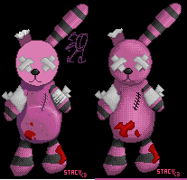 hope it gives you some ideas. I also tried to give it more shape - like the belly and such, that's what makes it less boring. when you have a ball sitting on top of another ball then yes, it will be pretty boring, so give it slightly more complex form. ------------- |
Posted By: Ensellitis
Date Posted: 21 May 2007 at 7:22pm
|
try some direction dithering... dont have the time to actually edit right now, but my year of the boar piece is a good example: ------------- There's a pubic hair on my keyboard. What the f**k?? I "mow the lawn" so it's not mine. Gross. |
Posted By: Aleiav
Date Posted: 22 May 2007 at 9:17am
|
The think making the shadows deeper further away from the lightsource will make it pop more. ------------- |