Spock (Wip)
Printed From: Pixel Joint
Category: Pixel Art
Forum Name: WIP (Work In Progress)
Forum Discription: Get crits and comments on your pixel WIPs and other art too!
URL: https://pixeljoint.com/forum/forum_posts.asp?TID=4370
Printed Date: 30 September 2025 at 6:44am
Topic: Spock (Wip)
Posted By: Dutrho
Subject: Spock (Wip)
Date Posted: 05 June 2007 at 8:35am
My latest effort; --> -->  --> --> --> --> --> --> --> --> --> --> --> -->  --> --> --> --> --> -->  --> --> Heavy tracing was used. Not exactly sure where I'm going with this, gonna try to remain as close to the ref pic as possible. Still lots of work yet to be done, right now I just want to get a feel just to know if I'm going in the right direction. ref pic;  ------------- Mmmm.. Thats good placebo! |
Replies:
Posted By: HiyuKantaro
Date Posted: 05 June 2007 at 11:09am
|
I like it,
some expresion o nhis face and its really good!
|
Posted By: leel
Date Posted: 05 June 2007 at 2:56pm
|
his upper lip should be much thinner and darker.. And what's with the dotted lines? just block out the shading first and then dither when you're done, otherwise if you screw up and have to go back it'll be a bitch to fix ------------- |
Posted By: Dutrho
Date Posted: 05 June 2007 at 8:41pm
|
If your talking about the dotted black lines on his face, Its just the way I traced the picture, their not permanent.
------------- Mmmm.. Thats good placebo! |
Posted By: Dutrho
Date Posted: 11 June 2007 at 8:15am
|
Progress has been slow, (Nice weather outside) but continuing. I've started work on the eyes, but already its giving me problems. How my doing? ------------- Mmmm.. Thats good placebo! |
Posted By: Malor
Date Posted: 11 June 2007 at 8:38am
| I dislike the dithering, as Leel said, jsut block out the colors, the dithering is ruining the peice, in my opinion. |
Posted By: ceddo
Date Posted: 11 June 2007 at 9:45am
|
The hair looks great!
There's no need to dither so much - just get an extra skin tone or two and it'll look much better. You should also start on the eyes now. Just getting the basic shape is enough, but It's usually one of the first things I do. Good luck with your progress. :) |
Posted By: ATinyDot
Date Posted: 11 June 2007 at 10:14am
aw wow that's really good, i especially like the hair, it seems to be very precise and matches your ref pic very very well  i'm not too sure on the dithering on the left of the pic, seems like you've dithered more than neccessary, i see that this part of the ref pic is really dark but surely just a darker tone would be effective instead of so much dither?
|
Posted By: Ensellitis
Date Posted: 11 June 2007 at 11:29am
|
the only place this piece should have dithering anywhere near that style, are the clothes. otherwise, it looks like crap, to be honest
------------- There's a pubic hair on my keyboard. What the f**k?? I "mow the lawn" so it's not mine. Gross. |
Posted By: Dutrho
Date Posted: 12 June 2007 at 8:35am
|
Alright I get it, lol here you go less dither. Shirt still has them, cuz I got to go to work soon ------------- Mmmm.. Thats good placebo! |
Posted By: Metaru
Date Posted: 12 June 2007 at 3:06pm
|
use the dither to make the face more rounded, specially on that shadow of the left. ------------- I ate leel's babies |
Posted By: leel
Date Posted: 12 June 2007 at 4:03pm
|
metaru, I'm gonna disagree with you atm. Dithering should be saved for last! I know from experience - when i did the portrait of lisa, i dithered the entire face and had it all perfect when i had to go back and edit some likeness problems and had to redo the entire shading because it got screwed up. if you have time to play and mess around k whatever, but you'll get really sick of the dithering soon enough and then get unmotivated to finish. Just shade with solid colors for now, once you have everything down start smoothing out and creating texture. ------------- |
Posted By: Dutrho
Date Posted: 13 June 2007 at 8:03am
|
Small update on the eyes and eyebrow ------------- Mmmm.. Thats good placebo! |
Posted By: Skull
Date Posted: 13 June 2007 at 8:19am
|
Originally posted by Dutrho Small update on the eyes and eyebrow Although looking real nice at the moment, the side of the face is just far far too dark. ------------- |
Posted By: Dutrho
Date Posted: 14 June 2007 at 9:32am
|
Lightened the dark shadow just a tad and worked a bit on the nose. also tried my hand at those greenish shine spots. ------------- Mmmm.. Thats good placebo! |
Posted By: PixelSnader
Date Posted: 14 June 2007 at 7:09pm
|
the eyes are really tiny, and the mouth is big ------------- ▄▄█ ▄▄█ ▄█▄ ▄█▄ |
Posted By: Aleiav
Date Posted: 15 June 2007 at 5:58am
|
Your problem isn't a lack of dithering, it's too high of a contrast. Lighten the shadow of his cheek bone. It looks like he's got a hole in his face now. How about some lines on that hand of his? ------------- |
Posted By: ATinyDot
Date Posted: 15 June 2007 at 7:45am
|
Hmm now his face looks really distorted... if you look on your ref pic it gets lighter, maybe add a lighter shade and maybe i bit of subtle dither?
Also i think his lower lip is a bit too fat..
|
Posted By: Dutrho
Date Posted: 19 June 2007 at 8:00am
|
Lightened the shadows a bit again, fixed his lower lip by 1px. ------------- Mmmm.. Thats good placebo! |
Posted By: Aleiav
Date Posted: 19 June 2007 at 10:47am
|
I think the shadows are still too dark. He looks like he has a hole in his face. ------------- |
Posted By: leel
Date Posted: 19 June 2007 at 11:16am
I'm not really sure why I made this, but hopefully it'll help you in your rendering. Basically, you're doing fine but you need to pay closer attention to the subtle shapes. Also your aa could be improved, it seems you just put two pixels of lighter shades on every edge, it doesn't always work like that. It's hard to explain what i mean so you can just zoom in I guess. 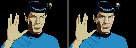 Sorry.. I love editing things and I get carried away sometimes... :) But I hope it gives you some ideas as you continue. Especially about the skin tones. There has to be a hue shift there. Cause he's not just all yellow like that, there's some grays in the lighter part. ------------- |
Posted By: Aleiav
Date Posted: 19 June 2007 at 7:00pm
|
Damn, leel. ------------- |
Posted By: Dutrho
Date Posted: 21 June 2007 at 8:33am
|
been working on the face a lot @Leel; I appreciate all the help your giving me, but please don't edit my stuff to such a degree, sure it helps to be able to visualize what your saying, but it really annoys me. To any and all that want a got at this, I'll post the line art in the Line's Den once I'm done. ------------- Mmmm.. Thats good placebo! |
Posted By: Skull
Date Posted: 21 June 2007 at 8:41am
|
Wow, a drastic improvement with that grey - looks great. I still somewhat have problems with that dark brown. I don't see why that side of the face should be so dark, considering their no dramatic lighting on the other side. ------------- |
Posted By: Dutrho
Date Posted: 21 June 2007 at 8:50am
|
I'll lighten it again in the next edit, the ref pic shows the shadow to be pretty dark, but it dosen't translate well to pixels.
------------- Mmmm.. Thats good placebo! |
Posted By: Aleiav
Date Posted: 21 June 2007 at 12:38pm
|
Maybe some dithering or an extra shade will make the transition not be so dramatic. ------------- |
Posted By: Dutrho
Date Posted: 22 June 2007 at 8:22am
Don't have much time to pixel today, but I tried to fix the shadow a bit; or or  first one I just added a transition colour and reduced the size of "dark" shadow. Second one I replaced the "dark" with the transition colour. I prefer the 1st one, to me it seems to have more dept. but then again my monitor is soo crappy its hard to tell. ------------- Mmmm.. Thats good placebo! |
Posted By: Aleiav
Date Posted: 22 June 2007 at 10:18am
|
I like the newer color is better but perhaps the problem is the highlight on his left cheek isn't pervasive enough so you don't see the outline of his entire jaw, so it looks like he has a big hole in his face. I'd take heed to leel's edits. Hers looks more like the side of his face is dark, not like it's a hole. ------------- |
Posted By: Dutrho
Date Posted: 26 June 2007 at 8:50am
|
Had some time to work on it a bit today. messed around with the shine and added some highlights to the cheeks. also played around with the hand. ------------- Mmmm.. Thats good placebo! |
Posted By: Monkey 'o Doom
Date Posted: 26 June 2007 at 4:35pm
|
This is really improving, but some of the colors in your palette are really strange-looking with the rest. In particular, the color HIS left cheek is shaded with is desaturated compared to the colors above and below it on the skin ramp. You'd also probably be better off if you didn't use the dithered edges on the sides of his nose--go for something smoother using the intermediate colors in your palette. ------------- http://pixelmonkey.ensellitis.com"> 
RPG is numberwang. |
Posted By: Dutrho
Date Posted: 27 June 2007 at 8:27am
|
dang-it, totally forgot about that, thanks MoD. I'm thinking the face is pretty much done, unless someone finds something I should change/add/remove. Next step, hand and shirt. ------------- Mmmm.. Thats good placebo! |
Posted By: Hatch
Date Posted: 27 June 2007 at 10:44am
|
The line on his right (our left) cheek looks awfully sharp to me.
Great work otherwise! 
EDIT: To be perfectly clear, I mean the line coming from his nostril, between his cheek and upper lip. |
Posted By: Aleiav
Date Posted: 27 June 2007 at 12:04pm
|
Try making the light highlights on the jaw on our left more round, like leel's and reaching down more. ------------- |
Posted By: Dutrho
Date Posted: 28 June 2007 at 9:26am
|
hopefully I've addressed the sharp line and jaw issue, they were minor edits but hopefully effective. started work on highlighting the hand, not really diging the results but i'm hesitant to add any more colours, i'm already at 25.  ------------- Mmmm.. Thats good placebo! |
Posted By: SoulChild
Date Posted: 28 June 2007 at 11:46am
| I would say stick to a <36 colour pallete so you have a bit of leniancy. |
Posted By: eckered
Date Posted: 28 June 2007 at 11:53am
|
yeah, i say aim for 32 max >.> |
Posted By: K.s
Date Posted: 01 July 2007 at 8:11am
|
think you should make the eyes wider, and i agree with eckered about the 32 colours max ------------- |
Posted By: Dutrho
Date Posted: 01 July 2007 at 8:38am
|
32 is a lot of colours my friends hand and shirt still needs tweaking, but some progress has been made. still at 25 ------------- Mmmm.. Thats good placebo! |
Posted By: Pixel_Outlaw
Date Posted: 01 July 2007 at 6:49pm
| TNG is the best series. Granted the first Star Trek was a pioneering series but it had no real depth. I want a large Piccard. This is looking wonderful however. |
Posted By: Dutrho
Date Posted: 02 July 2007 at 8:39am
|
Did a few minor edits on the hand and added sel-out. 23 colours now. Picard eh? I wonder....  hmmmmm???? ------------- Mmmm.. Thats good placebo! |
Posted By: Aleiav
Date Posted: 02 July 2007 at 9:15am
|
Try making the highlight shade less blue. More reddish, I think. ------------- |
Posted By: Dutrho
Date Posted: 12 July 2007 at 9:19am
|
I tried making the shirt highlights redish/pinkish but I didn't like the results. Tweeked the chin just a bit. ans worked on the shirt. tried to add some folds in the shirt where there was nothing. Sorry for the lateness of my reply, been busy. ------------- Mmmm.. Thats good placebo! |