WIP- The timid drawing (finished)
Printed From: Pixel Joint
Category: Pixel Art
Forum Name: WIP (Work In Progress)
Forum Discription: Get crits and comments on your pixel WIPs and other art too!
URL: https://pixeljoint.com/forum/forum_posts.asp?TID=5406
Printed Date: 23 October 2025 at 12:38am
Topic: WIP- The timid drawing (finished)
Posted By: Solid Pixel
Subject: WIP- The timid drawing (finished)
Date Posted: 18 November 2007 at 4:53am
|
Here is a piece I just started working on recently and with that I need some good ol C&C from you folks. Its been awhile since I was last here so do be gentle.
 |
Replies:
Posted By: Mahonri
Date Posted: 18 November 2007 at 6:50am
| Looks great so far. The one big thing that stands out to mee is the way her left arm is contorted behind her back. With a pose like that I think it would be more natural to have her leaning on that arm with her left hand on the ground. Otherwise I think it's looking pretty good. |
Posted By: MashPotato
Date Posted: 18 November 2007 at 10:41am
Looks quite nice  I agree about her left arm, and her right arms seems a bit long and curved to me. I agree about her left arm, and her right arms seems a bit long and curved to me.
------------- http://theindiestone.com - the INDIE STONE |
Posted By: herbert_west
Date Posted: 18 November 2007 at 8:01pm
Very nice. Cute girl.  Don't know if you want to do this (just a suggestion) but to me a more shy pose would be if she were hugging her knees (kind of more withdrawn). If not that, maybe bring her arms in front, folded. Of course, I'm thinking shy. If you're thinking sexy shy, you're pose is good. I'm no expert in anatomy, so I'll leave the comments on arm length and position to the rest. Don't know if you want to do this (just a suggestion) but to me a more shy pose would be if she were hugging her knees (kind of more withdrawn). If not that, maybe bring her arms in front, folded. Of course, I'm thinking shy. If you're thinking sexy shy, you're pose is good. I'm no expert in anatomy, so I'll leave the comments on arm length and position to the rest.  Looking forward to and update... Looking forward to and update...
|
Posted By: Solid Pixel
Date Posted: 19 November 2007 at 1:18am
|
Originally posted by Mahonri Edited:
The one big thing that stands out to mee is the way her left arm is contorted behind her back. With a pose like that I think it would be more natural to have her leaning on that arm with her left hand on the ground.  I shortened her right arm and repositioned her left. That better?
Originally posted by Mahonri I like the idea but I think I'll stick to my formula. The reason why; the sooner I finish this the better.Don't know if you want to do this (just a suggestion) but to me a more shy pose would be if she were hugging her knees (kind of more withdrawn). If not that, maybe bring her arms in front, folded. ------------- |
Posted By: Sabata
Date Posted: 19 November 2007 at 3:15am
|
Well I
guess that you are looking for comments on anatomy and overall looking of this
piece, and the only thing I can say that it looks very promising. I really
like the way you did her dress. ------------- We fall to rise again. |
Posted By: Metaru
Date Posted: 19 November 2007 at 11:01am
 however, isn't truly accurate. if you have used a reference, please provide as i couldn't find a good one. i want to remark the good use of colors you've used in your lineart. ------------- I ate leel's babies |
Posted By: Solid Pixel
Date Posted: 20 November 2007 at 1:12am
|
Update:
 Originally posted by Metaru however, isn't truly accurate. if you have used a reference, please provide as i couldn't find a good one. Well, for the hands and arms I was the reference, don't know if that helps... eh.
For the body stance I had a shopping catalog nearby which had models in various positions.
Originally posted by Sabata Well I guess that you are looking for comments on anatomy and overall looking of this piece. Thats the idea. :) ------------- |
Posted By: Setzer
Date Posted: 20 November 2007 at 5:46am
 just a quick palette edit, you had brought the skin tones into blues for the shadows but everythign else was staying in its stubborn ramps, thought that looked weird. I'd probably make the skin's shadows slightly warmer too. ------------- http://sj-gfx.com"> 
|
Posted By: Solid Pixel
Date Posted: 20 November 2007 at 6:13am
|
I was eventually gonna color swap the gown, but since your palette won me over I'll stick with yours. The skin on the otherhand will be slightly modified to fit the shadows blue tone. ------------- |
Posted By: Metaru
Date Posted: 20 November 2007 at 9:50am
|
oh i forgot, that left arm(her left) couldn't show that curve, or else she wouldn't have bones.
------------- I ate leel's babies |
Posted By: Omegavolt
Date Posted: 21 November 2007 at 11:51am
|
Her right thigh looks a bit awkward. It looks too short and has a lump in the middle. The fix for this really depends on the pose you're shooting for.
If the thighs are supposed to extend together, then the left thigh should be more visible and the knees should end up side by side. But if the right thigh is slightly draped over the left, then it should be longer and smoother, which will result in her right foot being pulled back toward her buttocks, so not as much of it will be shown. ------------- http://www.ongamedev.com/ - OnGameDev |
Posted By: Solid Pixel
Date Posted: 22 November 2007 at 12:49am
|
Fixed some anatomy issues with the body, bulked up the jaw, lengthened her body, and completly erased the left foot. Still need to address afew other issues however, like for instance; the jaw and her right arm.
 On a side note; is it just me or does she not look that shy anymore?
Maybe I'll lower her head or something. ------------- |
Posted By: Squirrelsquid
Date Posted: 22 November 2007 at 1:15am
Posted By: surt
Date Posted: 22 November 2007 at 1:30am
| Squid's right there. The eyes, I think, are the main thing. The down-turned eyes lent a fitting sadness to the piece. |
Posted By: skamocore
Date Posted: 22 November 2007 at 1:53am
|
yeah she kind of looks more affronted now...definitely the eyes...in fact I think she looked the most shy when her eyes were looking the other way. Perhaps because now it looks like she's looking more towards the 'camera', but before it seemed she was...well...shying away from it |
Posted By: Solid Pixel
Date Posted: 22 November 2007 at 1:53am
Alright. I'll try lowering her eyelids again, but in the meantime I have here a quick/sloppy update toward Squirrelsquids 'head-shape issue'.
 How does it look now? Any better? ------------- |
Posted By: Squirrelsquid
Date Posted: 22 November 2007 at 2:03am
|
better, but still the expression could be more shy ;) did an edit to illustrate it: 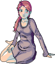 ------------- vote for squirrels crates! |
Posted By: Solid Pixel
Date Posted: 23 November 2007 at 6:25am
|
Small update; I've desided to ditch the current palette for a more limited one.
Yeah it looks odd being that everything is but one color. I just all of a sudden got an urge to do a different style. Don't ask why. :)
 Originally posted by Squirrelsquid So obvious! The eyebrows.. Stupid me, I'd had totally forgotten about raising them, instead I just ended up making'em more bushy.. er. better, but still the expression could be more shy ;) |
Posted By: cthulhu
Date Posted: 23 November 2007 at 10:05pm
How can she be shy now that she's in the dark and doesn't know she's being watched with nightvision goggles?  (and you know those can see through clothes; nudge, nudge, wink, wink). Seriously, this is looking good. (and you know those can see through clothes; nudge, nudge, wink, wink). Seriously, this is looking good.
------------- Artist formerly known as "herbert_west" |
Posted By: Solid Pixel
Date Posted: 24 November 2007 at 3:21am
|
Another minor (but making progress) update:
  |
Posted By: Monkey 'o Doom
Date Posted: 24 November 2007 at 7:23am
|
I think her right leg looks pretty good (aside from the lump that Omegavolt mentioned), but her left one seems to be having problems; it looks like it ends in a stub, squashed between her other knee and the ground, rather than going back behind the other one. I can't seem to do this pose, IRL, getting my legs in the positions they are in your picture. ------------- http://pixelmonkey.ensellitis.com"> 
RPG is numberwang. |
Posted By: Solid Pixel
Date Posted: 27 November 2007 at 5:48am
|
Update:
 Notable changes that I have made are too obvious so I won't go an point them out for ya.
Any better/worse? C&C always welcome.
Originally posted by Monkey 'o Doom Your right. I tried doing it yesterday and I hurt my kneecaps forcing myself into position, and I just gotta say; she'd be in a great deal of pain sitting their like that.I can't seem to do this pose, IRL, getting my legs in the positions they are in your picture. |
Posted By: Elwin
Date Posted: 27 November 2007 at 6:07am
| Hmm I don't like the palette much... Liked the old colors better ^^ But it's fantastic anyway. |
Posted By: Skaka
Date Posted: 27 November 2007 at 1:21pm
|
I like her better with her hand on her leg, looks more 'shy'. As for her face she looks like she just spied a turd on the floor or something, I'd make her tilt her head down and be kinda staring at the floor right next to her, kinda more withdrawn. That's how the girl who lives in my basement is like XD
------------- Ars longa, vita brevis. |
Posted By: Solid Pixel
Date Posted: 29 November 2007 at 10:54pm
|
Update. I'm finaly getting somewhere with this, hopefully finished.
EDIT: Still need to adjust her left leg..
 Originally posted by Elwin You prefer the hideous Night Vision Goggles colour scheme?Hmm I don't like the palette much... Originally posted by Skaka As long as this piece portrays a shy person I don't mind if she was. :)As for her face she looks like she just spied a turd on the floor or something, |
Posted By: Elwin
Date Posted: 29 November 2007 at 11:32pm
| Hmm original. ^^ It's still one of the most fantastic pieces I've seen though ^^; |
Posted By: Hatch
Date Posted: 29 November 2007 at 11:35pm
|
The paper seems a bit weird to me unless you're going to make her more sketch-like. Speaking of which, we should see the baselines through her, no?
Also, are you planning on getting rid of that black outline? I really like the palette, but I think it looks dreadful with the outline. ------------- |
Posted By: Solid Pixel
Date Posted: 29 November 2007 at 11:49pm
|
Originally posted by Hatch No your right, but its still pixel art so I'm gonna refrain from doing that.
The paper seems a bit weird to me unless you're going to make her more sketch-like. Speaking of which, we should see the baselines through her, no? The paper is just a template. I'm not going for a realistic approach.
Originally posted by Hatch Nah, I'm not keeping it. Also, are you planning on getting rid of that black outline? |
Posted By: Skaka
Date Posted: 30 November 2007 at 12:13am
|
Hah what I mean was she looks more shocked than shy :P
------------- Ars longa, vita brevis. |
Posted By: MurrMan
Date Posted: 01 December 2007 at 6:24pm
|
widen her right arm at the bottom near the elbow, looking nice...
------------- I have plenty of emotions; It is Sleep that i lack |
Posted By: Solid Pixel
Date Posted: 03 December 2007 at 2:44am
|
Update. This time around I made her a bit nerdy, and gave her a plush doll.
Seriously though I have to quit adding stuff to this or it will never get finished. :)
 Originally posted by MurrMan I figured someone would mention it sooner or later. I'll fix it next time I update.widen her right arm at the bottom near the elbow So is there anything else thats out of place? Criticism is always welcome.
|
Posted By: GeorgiePie
Date Posted: 03 December 2007 at 7:55am
|
Looking great, I don't think I'll do any major CC at this point.
Her expression is great btw.
I have one lil CC. The pencil on the right, some of the colors are off (I think they are)
I understand how your dark outlining out the far outlines, but on the pencil some of the inner lines don't have the same colors as the other pencil. ------------- |
Posted By: Solid Pixel
Date Posted: 04 December 2007 at 9:35pm
|
Update:
 Originally posted by GeorgiePie I was not finished shading the lines at that time, sadly I forgot to mention it.I have one lil CC. The pencil on the right, some of the colors are off However I did finish the pencil details earlier today. Anything else I missed?
|
Posted By: greenraven
Date Posted: 05 December 2007 at 12:34am
|
That looks pretty good.
-------------  "pwnage comes with patience, practice and planning." ~ Jalonso "pwnage comes with patience, practice and planning." ~ Jalonso 
|