Dragon Hatchling
Printed From: Pixel Joint
Category: Pixel Art
Forum Name: WIP (Work In Progress)
Forum Discription: Get crits and comments on your pixel WIPs and other art too!
URL: https://pixeljoint.com/forum/forum_posts.asp?TID=5840
Printed Date: 21 July 2026 at 12:40pm
Topic: Dragon Hatchling
Posted By: Inventrix
Subject: Dragon Hatchling
Date Posted: 14 January 2008 at 12:45pm
Trying something bigger this time. I have no idea what to do with the background.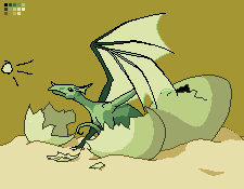 Still a WIP, of course. :P Latest: 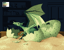 |
Replies:
Posted By: BlackDragon
Date Posted: 14 January 2008 at 1:10pm
|
Agreed. Well anyway what are you hoping to accomplish with this? What mood, what type of coloring, what style? We could crit better and more accurately the more we know. |
Posted By: Inventrix
Date Posted: 14 January 2008 at 10:14pm
|
Thanks, both of you! :D I have no clear idea of what mood I want the image to have, to be honest. Coloring, warm, I'm aiming for it to look lit by a pale yellow light when I'm done. I'm not totally happy with it as it is, but it's good enough to work with for now. Style... Semi-realistic, I guess? Anyway, here's an update, not a whole lot of changes. Mostly the outlines, some shading additions and changes.  I'm focusing on the dragon's body for the moment, and the current shading just doesn't look finished. I can't figure out what I could do to it, however. I've tried adding another color with poor results, and I made an attempt at dithering to see how that would look and failed utterly. Any ideas or suggestions? |
Posted By: leel
Date Posted: 15 January 2008 at 7:51am
|
He needs texture! There's lots of dragons in the pj gallery you could study. A for background.. hmm cave? but the lighting wouldn't fit a cave I guess.. you could have it set in a house (surprise kid, your bird is a dragon!) that could be kind of funny. Hm yeah that's all I got at the moment, just woke up. This is looking really nice, keep it up ;) ------------- |
Posted By: Inventrix
Date Posted: 15 January 2008 at 9:34am
Textured the dragon's body, and it looks a lot better. :D |
Posted By: Metaru
Date Posted: 15 January 2008 at 11:30am
|
perhaps a bit more contrast on those scales?
------------- I ate leel's babies |
Posted By: Inventrix
Date Posted: 15 January 2008 at 1:00pm
Thanks Metaru, increasing the contrast looks a lot better. :)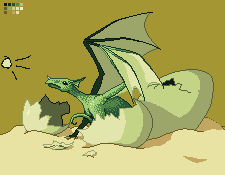 I'm going to attack that front eggshell next, it keeps looking horrible and I want to get it over with. |
Posted By: leel
Date Posted: 15 January 2008 at 3:29pm
|
some stylized dithering would look awesome on the eggs, imho. Speckled eggs are SO cute! XD Great job on the skin texture :) ------------- |
Posted By: Inventrix
Date Posted: 15 January 2008 at 4:17pm
To be honest, I have no clue what I'm doing when it comes to dithering. Tell me if I did anything absolutely horrible to this egg before I try it on the others. :P |
Posted By: BlackDragon
Date Posted: 15 January 2008 at 4:24pm
|
Hm, try making the dithering more like speckles:
http://pixeljoint.com/pixelart/4593.htm - http://pixeljoint.com/pixelart/4593.htm
or more like this:
http://pixeljoint.com/pixelart/21485.htm - http://pixeljoint.com/pixelart/21485.htm
|
Posted By: leel
Date Posted: 15 January 2008 at 4:41pm
|
Yeah I meant more like BD's examples there. I'm sure you'll find plenty more in the gallery, I wanted to post some but nothing just came to mind at the time. I did some dithering like that too in http://pixeljoint.com/pixelart/22168.htm# - this piece but it's not very good, so.. do some searchin in the gallery haha Yeah right now the shell it's just a tad plain. ------------- |
Posted By: pixelblink
Date Posted: 15 January 2008 at 8:11pm
|
I like the looks of where this is going. I'd like to suggest a few things though, if I may. The piece would benefit from contrast warm and cool colours, specifically between the background and foreground. I also suggest not dithering on the eggs. Dithering generally implies texture and eggs (for the most part) have a nice smooth surface. I would like to see some more contrast in general as well as some darker shades where the light doesn't hit. Also, the tail doesn't look like it's coming from his rear but, rather, like it's coming from his.. umm... you know. Anyways, a few things to think about. Hope it helps :) ------------- |
Posted By: leel
Date Posted: 15 January 2008 at 8:27pm
|
I think there's ways to dither that doesn't necessarily create a rough texture. I'll search for some examples, if it doesn't work out, then you could always just make it celshaded and add regular speckles for interest. ------------- |
Posted By: Inventrix
Date Posted: 15 January 2008 at 10:37pm
|
Hmm. I like that bunny egg style, I'm going to try something like that (in the morning, that is). I thought the tail was fine. :P The line of the tail generally follows the curve of the eggshell the hatchling is sitting in, so I'll see what I can do to make that more visually obvious. Probably a steeper curve down to behind the shell. |
Posted By: Inventrix
Date Posted: 16 January 2008 at 10:18am
I guess it's more spotted than speckled, but I like the way it looks!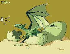 |
Posted By: jalonso
Date Posted: 16 January 2008 at 11:35am
|
I am enjoying the development of this pixel. *munching popcorn ------------- |
Posted By: Inventrix
Date Posted: 16 January 2008 at 1:22pm
|
Mmm, popcorn. Did the second egg, messed with the colors a little more. The wings aren't finished, but they can wait until after I do the background. 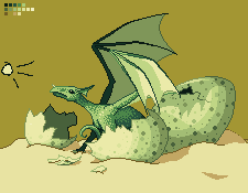 |
Posted By: Serendor
Date Posted: 16 January 2008 at 4:22pm
|
I kinda liked your version with dithering... it gave the egg a special rough surface that suited the egg I think.... I think you should do something inbetween your dithering and this speckles... very nice though... //Albin |
Posted By: leel
Date Posted: 16 January 2008 at 5:13pm
|
lose the biggest speckles, they're too much. I agree with Serendor. try to work with a similar dithering style as Black Gragon's second example. ------------- |
Posted By: Inventrix
Date Posted: 16 January 2008 at 6:05pm
|
Aw, I kind of like the big spots. Are they too distracting? I'll try working some sort of dithering into it and see how that looks. |
Posted By: leel
Date Posted: 16 January 2008 at 6:23pm
|
Well we're not forcing you to do anything hehe, if you like it - go ahead and keep it. I think it might be too much, you could try to just get rid of some of them, and keep a few. Just play around, see what works best :) ------------- |
Posted By: Hatch
Date Posted: 16 January 2008 at 8:11pm
|
Having the dots as perfect circles all over makes no sense. They should be distorted into ellipses by the shape of the egg and our perspective. ------------- |
Posted By: Inventrix
Date Posted: 16 January 2008 at 8:54pm
Heh, a friend of mine complained about all the circular spots too, although for an entirely different reason. :P Circularity has been strategically modified.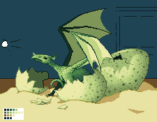 (You'll probably notice I took the house idea ;) ) I'm pretty happy with the way the eggs are right now, actually, although I'll probably mess with the colors some more. |
Posted By: leel
Date Posted: 17 January 2008 at 7:23am
|
better :) now make slimey things hang down from the wings! XD tehe ------------- |
Posted By: absinthelord
Date Posted: 17 January 2008 at 7:11pm
This looks fantastic.... and for someone who says they are new to dithering you sure pull it off well. I love the textures! 
|
Posted By: Inventrix
Date Posted: 17 January 2008 at 8:52pm
|
Thanks absinthe! :D I have to say I'm somewhat pleasantly surprised about how the eggs came out. Anywho, latest shot. I'm working on populating those shelves in the back right now, and it's slow going. I'm used to filliing a bookcase with books, but that's visually boring, so I'm digging for other ideas. Ignore the background colors, they're nowhere near what they're going to end up. 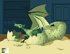 |
Posted By: AtomicMushroom
Date Posted: 17 January 2008 at 9:23pm
|
Hey there's geodude! |

Posted By: Inventrix
Date Posted: 18 January 2008 at 4:25pm
And the background is pretty much done (I hope).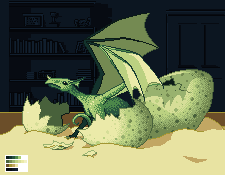 I guess I'll finish the wings next, and then the box and the sand. |
Posted By: Inventrix
Date Posted: 19 January 2008 at 2:43pm
Doi. Well I learned one thing: larger pixels are very time consuming. xD I'm going to take a break from this for a few days and focus on my other project, then come back with a fresh view to finish it up. Feel free to offer up any critiques etc. of what I've got done so far in the meantime, if you feel like it. 
|
Posted By: Inventrix
Date Posted: 27 January 2008 at 1:41am
Break over!   Yay it looks like sand now! I like the idea of having some sort of slimy membrane oozy thing on the wings, but that's going to be haaard. It's on the to-try list for when I'm happy with the sand and the box. |
Posted By: Blu
Date Posted: 27 January 2008 at 8:44am
|
If you do do the slime, remember that where there's more it will probably be more of the color, assuming it's translucent.
If that makes sense. *Headdesk*
I'd heighten the contrast a bit with the background. It's kind of hard to see the books. But they look great. :D Must have taken a while. XD ------------- Gremlins rule the world; you just don't know it yet. |
Posted By: leel
Date Posted: 27 January 2008 at 9:31am
|
Actually the slime might be a bit of a blessing for you - wing texture is always a bitch, and just regular dithering, very very very rarely actually looks good. But having "strands" of oozing dripping goo stretching between the joints, would make the space look a lot cooler. Then the remaining bits of the wings you might just plain dither, but it would actually help the look, instead of being boring. So good luck to you! Take a look at fool's gallery for inspiration - he's got a slimy snail and a really bitchin dragon whose wings you might wanna look at. Can't wait for an update, this is really turning out nice. ------------- |
Posted By: xeroxz2k7
Date Posted: 27 January 2008 at 3:20pm
| Lovely. I especially like the background. ^^, |
Posted By: Blu
Date Posted: 27 January 2008 at 3:24pm
|
If you want, especially since the dragon is just hatched, you could have veins showing through the membrane (FUN! XD). Which would be hard to pixel and get down right. >.>
But a good idea, imo. ;p ------------- Gremlins rule the world; you just don't know it yet. |
Posted By: Inventrix
Date Posted: 30 January 2008 at 12:26am
Well, the egg membrane idea isn't working out well at all, so I scrapped it. Fool did like a vein thing for the one I went to look at, which seems like a good idea, so that's what I'm shooting for right now. I also boosted the background contrast a teensy bit. Why do I always seem to end up working on this picture long after I should've gone to sleep? xD |
Posted By: Blu
Date Posted: 30 January 2008 at 12:16pm
|
Huzzah! ^^ You can see the books a little better/they're more noticable on first glance, so you do tend to look closer. So, yay. ^^
I think it's probably because you get so into it? Or because "I'll just finish..." and either you keep going or it takes longer than you'd think. Er, at least that's how it is for me. =P
And the veins look good, I think. XD I'd maybe make them a bit more sparce, though...more spread out. ------------- Gremlins rule the world; you just don't know it yet. |
Posted By: Inventrix
Date Posted: 02 February 2008 at 12:50am
Been busy this week. :( Did some more work on the wing. I haven't quite decided if I like it or not, yet... |
Posted By: Blu
Date Posted: 02 February 2008 at 7:14am
|
The veins on the lightest part look too light, compared to the veins on the darkest part, I think... =( ------------- Gremlins rule the world; you just don't know it yet. |
Posted By: Inventrix
Date Posted: 02 February 2008 at 7:32am
| That's a good point. I'm not sure if it'd look too dense if I made it darker, though. I'll have to see. |
Posted By: Inventrix
Date Posted: 02 February 2008 at 9:55am
Man, I'm working on the back wing too and I'm almost tempted to just make it all dark and forget about any veinwork on it. >:( The colors just don't work, and I don't reeeally want to add another color just for the veins. I guess I could do that. I tried out three options with my current colors though for comparison's sake. |
Posted By: spartan_117
Date Posted: 02 February 2008 at 9:57am
|
well you could make holes in the wings if u dont want veins else you have to add some blue too your palette.Things dont always go as planned, do they.
------------- |
Posted By: Inventrix
Date Posted: 02 February 2008 at 10:01am
|
Blue...? What would I need blue for? I was thinking a shade between a couple that I have now, since the veins in the back wing are contrasting too much with the wing membrane, either by shade or hue. Holes in wings make me go ouch. :( |
Posted By: spartan_117
Date Posted: 02 February 2008 at 10:03am
|
to tell you the truth you just overkilled the veins. try just a few but make them long.
------------- |
Posted By: Inventrix
Date Posted: 02 February 2008 at 11:52am
|
I decided to go one better and switch from using the basic concept of patterning that Fool used and went and looked at bat wings instead. Added another color anyway but I think it looks better. Still not totally happy with the contrast levels, and I think I might make the back wing darker, not sure. ***EDIT*** Actually, I went and had lunch and then came back, and I think I'm done with this. Finally! xD Just need to do some cleanup and anti-aliasing and then submit it, yay~ |
Posted By: spartan_117
Date Posted: 02 February 2008 at 6:42pm
 this is much better than the other veins.good job, ill definitely fave this one. this is much better than the other veins.good job, ill definitely fave this one.
------------- |