WIPS portraits, avatars, logos etc
Printed From: Pixel Joint
Category: Pixel Art
Forum Name: WIP (Work In Progress)
Forum Discription: Get crits and comments on your pixel WIPs and other art too!
URL: https://pixeljoint.com/forum/forum_posts.asp?TID=6523
Printed Date: 17 November 2025 at 6:33am
Topic: WIPS portraits, avatars, logos etc
Posted By: purpletree
Subject: WIPS portraits, avatars, logos etc
Date Posted: 17 May 2008 at 2:37pm
some wips of mine, the evin logo and aliens are drug adicts were umm sent back for revision...
     
i know thats a lot but i am keen on to work on all~ ;P |
Replies:
Posted By: M.E.
Date Posted: 17 May 2008 at 11:59pm
|
Hi PurpleTree, Evian: The width of the lines are too different from what I remember of the original. AA is a bit rough. Aliens: Hmm.. a bit simple. If you want to keep the current pallete I would focus on make extra beams. Make the trees more like trees *Volume*.. add background: city-skyline. Make the sky dark and give the moon(?) some craters. Guitar hero: add lightsource Flying Turtle: The behind wing is to straight up .. make it diagonal and watch out for interfering lines. Skyline: Usually there isn't so much space between appartments that big Put something in front and to the back of the buildings. Logo: Maybe a hue-shift in colors? A general comment would be to focus on volume. All the pictures are really flat. Make things round if they are round and search for highlights = lightsource on the others. If you have worked for an hour on each .. tripple the time and experiment, watch reference photos of what you are trying to do. To become a better artist think more on quality instead of the quantity. Pick one thing that is close to your heart as that will keep your attention span and work on it for a week or more. Post WIPs of that thing and we will try to help you with it. From the above the most interesting things that I find are the guitar player and the flying turtle. But that is my own opinion. If you like the others better, take one and really focus on what you want to do with it. Try answering the questions as why you want to make it. What is it for (game, publishing, a gift for someone?) That will give you means to work hard on it. Good luck! Best regards from M.E. ------------- http://www.kunststukken.nl - KunstStukken.nl M.E. Art |
Posted By: Aleiav
Date Posted: 18 May 2008 at 11:09am
| You should really only post one WIP and work on one at a time. |
Posted By: purpletree
Date Posted: 18 May 2008 at 2:02pm
| because these are small 'prjects' i don't think that really would matter... |
Posted By: Bengoshia
Date Posted: 18 May 2008 at 3:45pm
|
Less crap for us to critique on, we'd be able to all hone in on one piece and help you with that, which is a lot easier for everyone. |
Posted By: purpletree
Date Posted: 18 May 2008 at 4:27pm
| well thenn umm first i would work on the gutiar player and the evian logo.... |
Posted By: skamocore
Date Posted: 18 May 2008 at 9:10pm
|
Do not touch the evian logo. It was a failed challenge entry which you just quickly threw together, that ended up breaking multiple challenge rules, and then got rejected. If you were going to choose one piece to work on why would you choose an existing logo for a water company? The guitar player, on the other hand seems to have some sort of potential if you work on the AA and play around with colours and shading etc... ------------- |
Posted By: Metaru
Date Posted: 18 May 2008 at 10:16pm
|
let these rest in piece, and use your efforts in something new. its the best thing you could ever do.
------------- I ate leel's babies |
Posted By: purpletree
Date Posted: 19 May 2008 at 2:31am
|
@skamocore yes i thought the guitar player was the best one to work on and it is someting that i made when i made this topic. i think that the flying turtle can also be turned into something................................................................................,,... @ Metaru, i personally think i should keep going with the guitar player and the flying turtle... as the guitar player is a recent work and the flying turtle is umm.... cool?
|
Posted By: Metaru
Date Posted: 19 May 2008 at 1:03pm
|
what I mean is, instead of save them in a post-edit, redo them into something completely new. The flying turtle guitar player. ------------- I ate leel's babies |
Posted By: Garrett
Date Posted: 19 May 2008 at 1:25pm
|
Well, if you really like your flying turtle then I suggest you to make it looks like a winged turtle, maybe using a koopa as reference... Now i looks like a stone-weirdwing-worms-cannotbenamedthingthatshouldlooklikeacloud mass. The guitar player instead looks better, you need to make the antialiasing (?) more noticeable. |
Posted By: purpletree
Date Posted: 19 May 2008 at 3:11pm
 so this is my edit, sortof made a light source ... and i think i'm going to make a stage kind of thing for the background.... so this is my edit, sortof made a light source ... and i think i'm going to make a stage kind of thing for the background....
|
Posted By: M.E.
Date Posted: 20 May 2008 at 9:25am
|
Hi Purpletree, Look at your avatar and compare it with what you have now. Shade it more like the tree ... Search for references on how a guitar is played. Best regards from M.E. ------------- http://www.kunststukken.nl - KunstStukken.nl M.E. Art |
Posted By: purpletree
Date Posted: 21 May 2008 at 3:19am
thanks M.E hmm i like how i've started the guitar player and have found good refs as well!~ but this is for my school assignment-(portrati) so i;ve started one on my friend   hmm btw i'm only 13 years old and am a girl not a he... hmm btw i'm only 13 years old and am a girl not a he...
|
Posted By: Garrett
Date Posted: 21 May 2008 at 5:51am
|
not a bad sketch, but she seems older in the pixel! Look better the ear, how the jaw join with it and the flow of the hair above the quoted ear. |
Posted By: purpletree
Date Posted: 22 May 2008 at 7:52pm
| hmm having big trouble with the noes..... |
Posted By: Metaru
Date Posted: 22 May 2008 at 9:18pm
|
wait, are you a girl purple? D:) ------------- I ate leel's babies |
Posted By: purpletree
Date Posted: 23 May 2008 at 2:15am
|
yep never got tom mention it... ;)
|
Posted By: Opacus
Date Posted: 23 May 2008 at 5:49am
|
Originally posted by purpletree yep never got tom mention it... ;) GRULS R TAKING OVER PJ SOON HELM WILL ALSO REVEAL HE IS ACTUALLY A GRUL AND JAL And maybe even Metaru DDDD: I don't even know who to trust anymore! AAUGHH ------------- http://www.last.fm/user/Shadowwwolf/?chartstyle=Bones"> 
|
Posted By: Metaru
Date Posted: 23 May 2008 at 8:29am
|
I said i was a girl a while a go but no one believe me. perhaps you're a girl opacus and you haven't noticed it before D:/ by the way purpletree, be sure to clean all your lines before doing any work. i hope you'll apply all the things you've learned so far. varock shade has made some nice photo portraits that you might want to use as a reference. and a protip: don't let the poor quality of the photo fool you. I'm sure her skin is way more lighter than that. ------------- I ate leel's babies |
Posted By: purpletree
Date Posted: 23 May 2008 at 5:08pm
hmm here's my update, had difficulty cleaning up the shirt and tie area, still having troubles with the nose
been looking at varock shade's piece http://www.pixeljoint.com/pixelart/30858.htm# - http://www.pixeljoint.com/pixelart/30858.htm# also been working on my guitar player. . . 
|
Posted By: Metaru
Date Posted: 23 May 2008 at 7:43pm
|
The portrait implies more difficulty and is also an school assigment, so i suggest you to focus on it and let the guitar player wait. still, your lines are way messed. I believe this is one of these exceptions were tracing would be a good idea, since what you will need to pay attention is shading, not lineart. ------------- I ate leel's babies |
Posted By: purpletree
Date Posted: 24 May 2008 at 3:24pm
 put some colours in trying to fix the tie and and some lines around the hair! :( put some colours in trying to fix the tie and and some lines around the hair! :(
|
Posted By: Garrett
Date Posted: 25 May 2008 at 3:46am
|
Still have every problem I mentioned... If the pixel should be like the girl in the photo, and is a school assignment, I think you should make it resemble the model! Then refine the lines, you owe them! And... am I wrong or she has blue eyes? |
Posted By: Metaru
Date Posted: 26 May 2008 at 10:34am
|
its not a good idea to start putting some colors yet purple, your lines aren't ready yet.
------------- I ate leel's babies |
Posted By: leel
Date Posted: 26 May 2008 at 12:22pm
|
you need to really REALLY pay attention to the photo, because the features you're putting on your portrait don't match up at all! for example, the lips you drew are basically front view, when the girl in photo is 3/4th view, the eyebrows you drew are long arcs and pointy on both ends, when in the photo her left eyebrow is thicker near the nose and does not curve down in the thick part. Also her hair line looks completely different. You have to draw what you SEE not what you think should be there. Draw the shapes, not your ideas of what those shapes are supposed to be. That's clearly what you're doing - making the lips an oval with a line through it, when that's not anywhere close to what the photo shows. If I have a minute later I'll do an edit to help you improve the likeness, but Don't worry so much about shading, though using colors while still working on the general shapes and likeness is pretty helpful. It can be really hard, especially for beginners, to see things right using only contour lines. So instead, try blocking out areas with basic shades while you're still working on the lineart. The palette doesn't have to be perfect you can always edit that as you go along when you polish the piece.
------------- |
Posted By: leel
Date Posted: 26 May 2008 at 2:00pm
ok get ready for a long one. 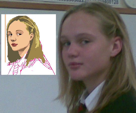 In order to avoid rambling and going off tangent, I'll just list the things I was trying to show with this edit. The main point is to draw what you SEE, and not make stuff up. The best examples for this are: 1. Lips - what you drew was the generic two half ovals for lips, with a little dip in the middle of the upper half - the photo quality is really crappy so it's hard to see the curves and angles exactly, but lips are much less symmetrical at 3/4th view. 2. Ears - are not all just C shapes with some squiggles in the middle. Every person has a different curve, so it's important to pay attention to the shape and the angle of the ear. This girl's ear is tilted a little bit and it gets narrow toward the bottom, while your drawing the ear is just a half-circle and is very vertical which makes it look chunky. 3. The hairline - you had a generalized curve, but looking at the picture, this girl's hairline is not even close to being a perfect c-curve, but rather a zig zag, as I showed in my edit. That's all I'll get into, I did a lot more in the edit, just zoom in and study that a bit. It's a pretty quick sketch, and it's not perfect, the colors aren't too great, as they're only meant to help you visualize it better. Also the nose is quite a challenge I don't think I got it quite right, but it's all a matter of time and tinkering and playing around until you get the right shape. Also, try to find VarockShade's WIP threads, there was a ton of good advice given and he's improved immensely, so reading through those will do you a lot of good! Good luck ------------- |
Posted By: purpletree
Date Posted: 26 May 2008 at 3:23pm
|
thanks for the edti and the advice, but the problem is i'm at school and i sorta cant see the image, is there any chance you could use iaza.com??? coz thats the only one that works..... |

Posted By: Monkey 'o Doom
Date Posted: 26 May 2008 at 3:49pm

There you go. ------------- http://pixelmonkey.ensellitis.com"> 
RPG is numberwang. |
Posted By: leel
Date Posted: 26 May 2008 at 4:01pm
|
I actually made a few teeny edits, while i http://www.iaza.com/work/080527C/purpletree82303.png - uploaded, but monkey beat me to it.
------------- |
Posted By: purpletree
Date Posted: 26 May 2008 at 6:47pm
|
WOW that actually looks like her, thanks <p>
<p> i'll go find some of varock-shade's wip forums!~ <p>
|