Crit on my stuff
Printed From: Pixel Joint
Category: Pixel Art
Forum Name: WIP (Work In Progress)
Forum Discription: Get crits and comments on your pixel WIPs and other art too!
URL: https://pixeljoint.com/forum/forum_posts.asp?TID=6617
Printed Date: 17 November 2025 at 5:38pm
Topic: Crit on my stuff
Posted By: geminoid
Subject: Crit on my stuff
Date Posted: 05 June 2008 at 1:18am
|
First time posting...Ive been a bit of a lurker for a while. Anyone care to chew apart this base template Im working on for a project? |
Replies:
Posted By: Blueberry_pie
Date Posted: 05 June 2008 at 7:29am
| The poses all seem very familiar. Based on the ever-popular Mega Man X sprites, perhaps? |
Posted By: geminoid
Date Posted: 05 June 2008 at 9:17am
| I did reference somme of the posing from the maga man dudes, yes. Theyre to be used an an action rpg. These guys go along with a series of four directional top downs I made as well which werent referenced. Ill post them as soon as I have a recolour done |
Posted By: Metaru
Date Posted: 05 June 2008 at 9:24am
|
1st row is completely sideview, while 3rd row has perspective-ish view(judging by the feet) its either one or the other. try to not mix these things. also, would be a goog idea to post an animated version of the movements. ------------- I ate leel's babies |
Posted By: geminoid
Date Posted: 05 June 2008 at 7:27pm
| Ill try an get a .gif or two up for better study, thanks. |
Posted By: geminoid
Date Posted: 08 June 2008 at 7:10pm
|
Okay, I made some minor alterations to sort of meet up with member_profile.asp?PF=9586&FID=8 - Metaru 's advice... I lengthened the leg in the perspective view poses so that they match up with the rest....however, there is good reason for the perspective views in the thrid row, but the original posting was errored in that the sprites did not line up properly with the side view tilesets I used. In each cell the sprites leading foot is 2 pixels lower then the other foot, so that it gives a slight overlap...in the case of the thrid row poses, they are all intended as special poses, where the sprite would be standing still while say a special attack, or defensive stance animation would take place. In every cell (that the characters feet are firly planted on the ground) the leading foot is going to overlap the tile beneath it by one pixel... I attached an example. The tileset Used is my own, but undergoing some construction. Ill be posting the Tiles for some crit soon too. 8) I attached some gifs to display the walking, climbing and a very simple slashing animation. The slashing animation is not final, as I will be breaking it into a low jab, a downward slash, an upwardslash-into-upward jumping attack, a quick jab and the pose already shown.    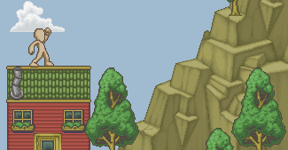 Sorry if ive blathered on about nothing. Ive had a long day which I plan to counterattack with some zen spriting shiznat. EDIT: also, these are some of the tiles im working on...may as well post what ive got thus far.  those are my tiles im working on. |
Posted By: Metaru
Date Posted: 08 June 2008 at 7:50pm
|
your running animation REALLY needs to be revised. at this moment its more like he's being suspended by the head swinging his arms hopelessly. When one normally walks, there is always a point of contact with the ground, and a 'up' movement of the body produced by the moment when our legs are fully extended on the ground, and a 'down' movement produced when one of our legs are moved foward to make a step. now, running is a succesion of small controlled jumps, wich means that, at some point there is no contact with the ground at all. however, this depends how fast you're running and how are you running. the up-down movement here is more evident as the force used to make these jumps is stronger and our legs are not only used to make a new step, but also to absorb the recoil of our body after each 'jump'. this whole unncesary 'explanation' can be ilustrated with an example  ------------- I ate leel's babies |
Posted By: geminoid
Date Posted: 08 June 2008 at 7:58pm
|
lol. i totally didnt notice the head suspension factor until you mentioned it. I see what you mean. Ill try and fix that. Thank you. Any input on the rest? Aside from the climbing animations one pixel jump which i just now noticed? Thanks for the input too. I appreciate it. Until now ive only ever worked on top down rpg style sprites...(www.charas-project.net is where ive spent most of my internet time...i moderate and post frequently there, but there really is not a lot of side view stuff going on there. and this is my first attempt with side view....particularly dashing...BUT MAN I CAN MAKE A MEAN TOP DOWN WALKING.lol) |
Posted By: Metaru
Date Posted: 08 June 2008 at 8:58pm
|
the jab animation needs more energy. after all, he's using some strengh to deliver an attack, not to wave a flag. on this movement, the whole torso(or at least the head) twists to make the circular movement more powerful by adding extra centripede force. but how can you out more energy in that movement without adding more frames? let me show you an small 'trick' called motion blur. motion blur occurs when a movement is so fast that our eyes can't identify all the stages of the movement, therefore distorting the image we see in the end. I made a simply edit to show you what I'm talking about. your animation had 9 frames, but I've reduced it to 4(mainly because of the redundant movements in the original*)  and an extra one with a 'weapon' to show how the item is distorted too.  *2 Questions: what software are you using for animations? and Are you making those frames from an animation and then you export them into a sheet, or the other way around? ------------- I ate leel's babies |
Posted By: geminoid
Date Posted: 08 June 2008 at 9:33pm
|
Im making them from a sheet and then exporting the animations, but Now im beginning to use the gamemaker sprite editor to modify things a bit. See, Motion blurs always intimidated me. I always figured i could circumvent using them with the added layers, but now that i see what yove done there, I think youre absolutely correct. I have used the motion blurring before to some extent, but it was on the weapon layer, and not the sprite itself. So at risk of sounding redundant, Im using Game Maker pro 7 for the actual animations, And MS paint for the basic Layout and tiles. The blurring you did there... How did you do it exactly? Did you just carry over the colours in the arm to match the movement arch, or is there some sublime trick you use? |
Posted By: Metaru
Date Posted: 09 June 2008 at 2:24am
|
its suposed to be blurry = there is no definition/details. use the most important color to make the trail and ignore outlines. these are easier than they appear, just remember that they must follow and represent the original movement of the element. use some references for better examples.(almost all zero sprites use motion blur) and I do encourage you to make the frames from an animation and then export them into a frame, to test the movements while you're making it(in order to avoid the head-suspended incident), and to avoid the game maker sprite editor for these animations. there are way more powerful software out there for those for free, such as Animation Shop 3(wich is what i use) ------------- I ate leel's babies |
Posted By: geminoid
Date Posted: 09 June 2008 at 1:00pm
|
Ive got the running animation fixed. It looks great, thanks to your advice. However, Im making an attempt at motion blur, for a downward swipe of the arm.   Can You tell me how this looks? (keeping in mind, that i wont be any turning of the head until the base forms are made. The head, and faces and hair are going to be layered onto the sprite in-game) I DL'd animation shop...Im going to have to spend some tinkering time to figure out |
Posted By: TDOT
Date Posted: 09 June 2008 at 3:08pm
| I think you've got too many frames. It looks nice and smooth, but you don't really see a lot of power in it. I would say take a frame out and see how it looks after. |
Posted By: Metaru
Date Posted: 09 June 2008 at 6:13pm
|
indeed. the motion blur is caused by an energic, quick movement. wich means the sequence needs the least amount of frames posible. that, or increase the frame speed, if posible.
------------- I ate leel's babies |
Posted By: geminoid
Date Posted: 09 June 2008 at 8:55pm
|
I see what you mean. I could just adjust my in game framerate i guess, but im thinking If I cut out the first blurred frame it would acheive the effect |
Posted By: geminoid
Date Posted: 10 June 2008 at 11:30am
So here is the running animation As for the Striking animation, Im still uncertain as to the fps that the game itself will be running at...Im thinking it would be about 22, which makes the striking animation quite fast.....Im going to hold off on omitting a Cell from that particular Animation until I know for sure. Id hate to do something I regret later. Ill now start working on Faces, Hairs, Clothing and Weapon Layers.... Il post those once I have 'em ready |
Posted By: TDOT
Date Posted: 10 June 2008 at 8:29pm
| The running is still missing something. Check out his legs. They look more like he's kicking the running. You need to bend his knees more and show a bit more force when he's pushing from the ground. Overall I think he's kinda stiff. Loosen him up a bit and it'll look tons better. On another note, it's never good programming practice to lower FPS to change animation speed or motion speed or anything like that. Try to go for a minimum of 30 FPS, then use functions like image_speed or make your own animation script to change the speed at which it animates. |
Posted By: geminoid
Date Posted: 10 June 2008 at 9:07pm
|
good point. I see what you mean about the legs. Before i change the template though, Im going to see if the problem can be fixed through the clothing layer. Most of the outfits are fairly loose fitting, and give a bit more dynamic to the movement, simply through the fabric's creases. I will make/post a version wearing some pants, and see what the verdict is after posting it...Im thinking Ill probably end up changing the template though.lol In the meantime, I was just making a quick mockup of my tile set in use. 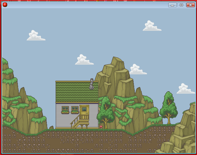 |
Posted By: Metaru
Date Posted: 10 June 2008 at 9:09pm
|
Originally posted by Metaru your running animation REALLY needs to be revised. at this moment its more like he's being suspended by the head swinging his arms hopelessly. When one normally walks, there is always a point of contact with the ground, and a 'up' movement of the body produced by the moment when our legs are fully extended on the ground, and a 'down' movement produced when one of our legs are moved foward to make a step. now, running is a succesion of small controlled jumps, wich means that, at some point there is no contact with the ground at all. however, this depends how fast you're running and how are you running. the up-down movement here is more evident as the force used to make these jumps is stronger and our legs are not only used to make a new step, but also to absorb the recoil of our body after each 'jump'. this whole unncesary 'explanation' can be ilustrated with an example read this AGAIN. your animation has improved a bit but still the same desing problems persist. ------------- I ate leel's babies |
Posted By: TDOT
Date Posted: 10 June 2008 at 9:11pm
| Wow, the tile set is great. I love the pallete you're using. All the colors are a bit dulled down (something I always seem to fail to achieve) which gives it a nice feel. I think this could be a great game if your coding's up to snuff :p |
Posted By: geminoid
Date Posted: 10 June 2008 at 9:18pm
|
With my tiles, I always try to crank down the stauration of whatever Im trying to acheive. It gives a nice minimal eyeburn result. Thanks. For the Record, Ive never Coded a Platformer before. I hope I can pick it up. I recently have decided to work with game maker 7 as opposed to RPGmaker XP (the latter I was pretty damn good with) So I really hope I dont butcher the whole thing. But RPGMaker is really not very practical with Platformers. |
Posted By: TDOT
Date Posted: 10 June 2008 at 9:28pm
Hopefully you'll be drawn in by GM and leave RPGM behind  You can do sooo much more with it. In any case, if you need some help, I'd be glad to give it. |
Posted By: geminoid
Date Posted: 10 June 2008 at 10:17pm
|
well, I am extremly impressed by the lack of restriction. Im devoted to learning the GM. RPGM was all fun and all, but the end product is really...amateur. I may take you up on that offer...who knows. I keep trying to get through tutorials, but get side tracked playing with sprites and other functions i didnt have in RPGM. |
Posted By: geminoid
Date Posted: 14 June 2008 at 2:29pm
ive been taking a break from the sprite set, to make a heap of tiles.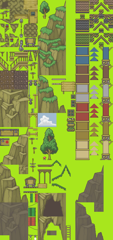 the cave door on the bottom is not done yet |
Posted By: Metaru
Date Posted: 15 June 2008 at 1:37am
|
guess all these mountain tiles aren't what one would call pixel art. but hell, they do look good to me.
------------- I ate leel's babies |
Posted By: Indigo
Date Posted: 15 June 2008 at 4:35am
|
how are the mountains not pixel art? O_o
------------- |
Posted By: geminoid
Date Posted: 15 June 2008 at 12:09pm
| dude those were made by hand. |
Posted By: BlackDragon
Date Posted: 15 June 2008 at 12:34pm
| I guess the high color count threw him off. Maybe you should AA and shade with less colors, or switch to NPA. There isn't a point in taking so much time making PA when you can get the result you're looking for with Photoshop or the like. |
Posted By: Indigo
Date Posted: 15 June 2008 at 3:31pm
|
they are right, 62 colors for the rocks alone is insane. I didn't realize thats how many colors you were using. Not to mention it *does* appear that the grass was brushed, because the grass areas alone contain over 256 colors. NPA on the grass
------------- |
Posted By: Metaru
Date Posted: 15 June 2008 at 5:35pm
|
not to mention that rock tiles and grass in the mountains are pillowshaded.
------------- I ate leel's babies |
Posted By: geminoid
Date Posted: 15 June 2008 at 7:40pm
|
the grass, and the cracks in the rocks ig uess could be considered cheated on, now that i think about it. The cracks were done with a 22 percent variable transperancy using my tablet, pressure sensitive, And the grass was made with the same, but on top I gave it a guassian blur for some reason. I had intended not to post the guassian blur in the grass, on account of it looking gay and fake. I apologise for my misleading you there. I did in fact use not pixel effects for the grass. Aside from the minor details in those aspects, the rocks entire colour sceme was constructed as PA. The rock tiles however, with the exception of the grass was not "pillowshaded" in any way. Those rocks are home made with love. Again, Apologies. When i posted this set, i was a bit out of sorts. Chilling out after a long birthday party weekend, not thinking. Had i been thinking i would have just posted the originals, before the grass blurring. A quick question though... What is the general PA view on using a graphics tablets pressure funtionality? |
Posted By: Kee
Date Posted: 15 June 2008 at 9:30pm
| its comming along great |
Posted By: Indigo
Date Posted: 15 June 2008 at 10:10pm
|
pen pressure is fine if you're using it for shape dynamics (changing brush-size). It is *not* okay if you're using it to automatically pick colours for you (ie opacity variance)
------------- |