Stuffs for my plataformer
Printed From: Pixel Joint
Category: Pixel Art
Forum Name: WIP (Work In Progress)
Forum Discription: Get crits and comments on your pixel WIPs and other art too!
URL: https://pixeljoint.com/forum/forum_posts.asp?TID=6657
Printed Date: 13 June 2026 at 12:38pm
Topic: Stuffs for my plataformer
Posted By: ellie-is
Subject: Stuffs for my plataformer
Date Posted: 14 June 2008 at 12:25pm
|
I started a plataformer game on GM, and I have been doing some graphics stuffs for it, would any of you know any ways to improve them, or anything I should change? Walking pose:  (a bit faster in the game) (a bit faster in the game)Chipset:  Chipset exemple:  Thanks for reading ^^ |
Replies:
Posted By: BlackDragon
Date Posted: 14 June 2008 at 1:29pm
Haha, your mockup looks a bit like mine:
 Perhaps you could learn a bit from this?
|
Posted By: ellie-is
Date Posted: 14 June 2008 at 1:38pm
|
I see. Gonna try to change a few stuffs stuffs and then post the result here. And it does looks similar :P Thanks for the help. |
Posted By: ellie-is
Date Posted: 14 June 2008 at 2:38pm
Hm, how about it now? And here is another screenshot, with the re-done tiles.  Sorry for the double posting. EDIT: Here is an enemie I did for the game. Its not very good or anything and I still gotta animate, but I want to know if any of you knows how to improve it and stuff. For the walking animation I ll make it put its head forward and widely open its legs or something.  |
Posted By: BlackDragon
Date Posted: 14 June 2008 at 4:45pm
|
More tips:
There should be a clear distinction between dirt and grass. Right now it looks like one section died.
Dunno what you're trying to do with that platform with the skinny pole. Are you trying to emulate the (original) Super Mario level where Mario has to jump across the mushroom platforms? I'd advise not to do this.
Too much contrast in the sky. It really distracts the player; as does those huge life icons.
Those clouds still look like lumps :P Notice how my clouds are circles on a straight line, going from big to small:
..oO. or ..oOoo. NOT OoO
I also did an edit on your character:
 Notice the re-used colors, the hueshift, the birhgter colors. You may even want to create a snout for a more memorable character. Its also a good idea to use black outlines on these sprites for visiblility. Avoid using black outlines on the inside.
|
Posted By: ellie-is
Date Posted: 14 June 2008 at 5:30pm
|
Thanks for all the tips. I ll be trying to re-do the graphics, with better sprites and stuff. But I am not adding a snout :P By the way, I was wondering... I am not a very good pixel artist, you see... And if instead of making the graphics better, I made them simpler? Like old games and stuffs? Just an idea that got trough my head. EDIT: Did some quick edits, I dunno if I am on the right path or if its the other way around, could anyone help me? >.<  |
Posted By: BlackDragon
Date Posted: 14 June 2008 at 6:23pm
|
Don't worry about being bad. You're just learning right now. I was pretty bad when I first started out; in fact most people around here were. Its all about getting used to Pixel Art.
On to your sprite.
A little better, keep it up. Couple things:
|
Posted By: ellie-is
Date Posted: 14 June 2008 at 6:34pm
I edited it a little bit, is it better now? |
Posted By: BlackDragon
Date Posted: 14 June 2008 at 7:25pm
Yes. MORE CRITS:
Wow, I feel like I'm molding your work into mine O_o Someone else help crit :P |
Posted By: ellie-is
Date Posted: 15 June 2008 at 5:33am
 Okay, edited the bucket, the lighting and the outlines. As for the style, I am trying to do something a bit old school styled, but with a little more detailed graphics. EDIT: Re-did the raptor I posted earlier, can anyone tell me if this looks better?  EDIT2: Improved tileset, with better clouds, and no skinny poles. Some changes on the colors, as well as making the sky less contrasted.  That thing is one of these plataforms stuffs that float on the air, and the things under it are for a vertical plataform thing. The things next to it are for a single tile plataform, both vertical and horizontal. Dunno what I ll use them for, but if I need them they will be here. lol |
Posted By: BlackDragon
Date Posted: 15 June 2008 at 11:49am
|
Hey, old style sprites with more detail?
You might wanna create a universal 16 color palete before you jump into making all the sprites. You'll learn a lot about colors AND get that style you're going for.
Another quick edit:
 6 colors. 9(?) less colors than your sprite, and no detail lost. See how the blue is used in both the green AND grey ramps? Thats the kind of thing you want when you make your colors. Less is more!
Oh yeah, I also changed the shading a bit, changed the bucket to the slope (less linear, you don't want a stiff character) and moved the front foot back.
I'm sure http://www.wayofthepixel.net/pixelation/index.php?PHPSESSID=9a77a93988fee4dacc897a689e292850&topic=4306.0 - this will help you with your palette :)
|
Posted By: Garrett
Date Posted: 15 June 2008 at 11:51am
|
Indeeed, long life to Ludwig Mies!
------------- You'll hear your steps making no noise |
Posted By: ellie-is
Date Posted: 15 June 2008 at 11:55am
|
I see, thanks. I ll be trying to use only 16 colors but I dunno if I got the skills it take. Are the clouds better now btw? |
Posted By: BlackDragon
Date Posted: 15 June 2008 at 12:00pm
|
They look a little lumpy. Give them a flat bottom and sculpt bottom lumps from there. Their colors ar a bit drab as well, its OK to use white because the background is blue. Shade with a light blue or cyan. Look at my mockup for further reference if you need it. You have the skill and resources to pull the 16 color palette off ;)
|
Posted By: ellie-is
Date Posted: 15 June 2008 at 12:04pm
|
Originally posted by BlackDragon They look a little lumpy. Give them a flat bottom and sculpt bottom lumps from there. Their colors ar a bit drab as well, its OK to use white because the background is blue. Shade with a light blue or cyan. Look at my mockup for further reference if you need it. You have the skill and resources to pull the 16 color palette off ;) Right. I ll edit them later with the 16 color limit. If you say it works, it should work... Or so I hope  |
Posted By: BlackDragon
Date Posted: 15 June 2008 at 12:06pm
| What should work exectly? The colors, or the clouds? |
Posted By: ellie-is
Date Posted: 15 June 2008 at 12:14pm
|
Colors. EDIT: Hm, epical failure here. The grays where too dark to shade the bucket, and I screwed up on the body. lol. And there was no for the eyes. I think I may not be good enough to use limited palletes just yet.  |
Posted By: BlackDragon
Date Posted: 15 June 2008 at 12:52pm
|
You'll never improve if you don't try, try again! Make the color palette first, then everything else will fall into place. While you are kep in mind to make every color DISTINCT AT 1X and never use colors that look the same!
Take another look at the http://www.wayofthepixel.net/pixelation/index.php?PHPSESSID=9a77a93988fee4dacc897a689e292850&topic=4306.0 - Pixelation Thread and post back!
|
Posted By: Ethan
Date Posted: 15 June 2008 at 1:07pm
|
I'm working with Lucas, and I'm just curious, how would using just 16 colors benefit the game?
------------- "> 
|
Posted By: Tarenken
Date Posted: 15 June 2008 at 1:09pm
|
I don't know the logistics of games, but it would improve his pixel skill by restricting him to a color amount. 16 colors isn't too bad. |
Posted By: ellie-is
Date Posted: 15 June 2008 at 1:13pm
 Not good but I think it is not as bad as the last one. I could try more shades of gray but by doing that I would need to remove an existing shade of gray, or to remove another colour, which I dont know if it would be good. And Ethan, it would just give it that "Old School" feeling, I guess. Which is what I was aiming for when I started this. And I did looked at that thread on pixelation but it did not helped me much more than the first time I looked at it. ------------- |
Posted By: BlackDragon
Date Posted: 15 June 2008 at 1:26pm
|
Tarenken, that is right. He will have to think about what colors to use in shading/highlighting. And yes it will give an old school look as well. Ok. I still think you should make your palette before moving any further. Start with black, a mid-grey, and white. Grey is a neutral color so it can be used in just about every color ramp. Then think of how you would shade each color in the spectrum: Red. Shade with purple, highlight with yellow.Yellow. Shade with orange or red, highlight with white.
Blue. Shade with black, highlight with green, yellow or cyan.
Like that. Make a list of each color, then add/remove colors as you go. Keep it simple, keep your head cool. Stress is the enemy. Look at some 16 color palettes for reference.
|
Posted By: ellie-is
Date Posted: 15 June 2008 at 1:37pm
|
I managed to find 8 colors that I am assuming they would work, still got room for 8 more but I dont know which colors I could add. Like, I am afraid to add the wrong colors and then realize I forgot some. Any suggestions or ideas?
------------- |
Posted By: BlackDragon
Date Posted: 15 June 2008 at 1:41pm
|
Post it and we'll see what you need. |
Posted By: ellie-is
Date Posted: 15 June 2008 at 1:43pm
Right. I completely forgot to put it in the post. I even uploaded it, lol. Perhaps I could make saturation smaller or something as well? ------------- |
Posted By: BlackDragon
Date Posted: 15 June 2008 at 1:54pm
|
Great! You're making progress. Add orange, a MID grey (inbetween the two that you have) and other shade colors. Try to go for ones that don't
have a very good shift, like your green ramp. As in, make a darker green, but keep the brown in there to avoid monotoned-ness. Which would make 4 colors; remember that some ramps can have more colors than others.
If I were to mess with the saturation at all I wold say go higher.
Keep in mind your brightness values. Maybe brighten up that blue a bit, and shade with the purple. |
Posted By: ellie-is
Date Posted: 15 June 2008 at 2:13pm
Thanks. How about it now? 2 more colors to go, still dont know which ones I should add or if some of these should be removed, any ideas? ------------- |
Posted By: BlackDragon
Date Posted: 15 June 2008 at 2:33pm
|
Cool. I'm making an edit now, but my dad stole the computer I was working on :P
Well you'll need a color for skin, so a pale pink would be good for that. Your "orange" is a slightly darker yellow :P Orange is between red and yellow!Not sure about that last one, I'll have to work on the palette and do more research, once my dad is done.
Also, hueshifting a little more when you go lighter/darker is nice. Light blue is NOT the same as cyan. THIS versus THIS. Try to keep your colors as pure is possible is what I'm getting at. Try to stay at the very top of the saturation level (255 i beleive). Put your colors against some of the ones over at Pixelation. Try to match theirs, but keep it your own :)
On the topic of purity, your greys were a liiiitle too close to white and black on the palette. Try to keep them 25% grey, 50% grey, and 75% grey. Do you get what I mean or do I need to show a diagram? WTF, text color got messed up. I changed it to black.
|
Posted By: ellie-is
Date Posted: 15 June 2008 at 2:36pm
|
I get what you mean. I ll wait til you get your computer back before I do more changes though :P
------------- |
Posted By: BlackDragon
Date Posted: 15 June 2008 at 2:58pm
Alright.
 Slightly altered version on the right, I think I like it best. Less bright.
Added a teal because it can be used to shade blue as well. Added a tan for skintones, as well as the pink. Pink can highlight red and purple as well. Altered some of the other colors, but I think you got it!
|
Posted By: ellie-is
Date Posted: 15 June 2008 at 3:01pm
|
Yours is way better than mine :P Mind if I use it? Cause since its just the colors, I dont know if there is a way to make it looking similart withouth using the same colors. If not, its ok though. ------------- |
Posted By: BlackDragon
Date Posted: 15 June 2008 at 3:03pm
|
Aw what do I keep saying :P
You won't learn these things unless you try. Make your own. Use mine as reference only :)
|
Posted By: ellie-is
Date Posted: 15 June 2008 at 3:09pm
|
Okay then >.< EDIT: Here it is, there are only 15, I ll add the other one when I need it cause I still dont know what it could be.  EDIT2: Did the character with that pallete, what do you think?,  ------------- |
Posted By: BlackDragon
Date Posted: 15 June 2008 at 3:34pm
|
Many nitpicks on the palette:
On your palette, the orange is more of an yellow-orange. In a small palette such as this you need to make every color count. The dark green and brown are also too similar, the brown should be more red to make a distinction. For your greys, just use the default M.S. Paint greys and one darker grey at 75% luminocity. Your blue might look better at a more cyan level, a little more green. Your yellow-green is a bit pointless. Try to follow my palette a bit more, maybe you can ge a better result.
It might be good to organize your palette in "rainbow order" like mine so I can see it better :) |
Posted By: ellie-is
Date Posted: 15 June 2008 at 3:48pm
Okay. I was looking at your pallete and I noticed many colors are from paint's default colors, so I took some colors from ms paint as well. I changed the orange a little bit, I still dunno if its good, added a skin tone too. ------------- |
Posted By: BlackDragon
Date Posted: 15 June 2008 at 4:07pm
|
I used no MSPaint colors! These were all original, including the greys. If you used any, which I didn't check to see if you did, then I suggest you make your own, again.
You missed the slightly darker yellow (which should be replaced with pink or something) in your green ramp. This goes to show you that you need to make each color as UNIQUE AS POSSIBLE. Your green ramp need a few contrast (shades darker and highlights lighter) and hue adjustments. The brown should be more red I think, to have an interesting shift in the green and a better shade in the red.
|
Posted By: ellie-is
Date Posted: 15 June 2008 at 4:14pm
Like this? And your purple, blue and grays where pretty much just like ms paint's default. But lets not talk about that. They are just colors after all. ------------- |
Posted By: BlackDragon
Date Posted: 15 June 2008 at 4:22pm
|
WOW I seriously did not realize how close I got that purple to the default :O The greys in MSPaint were essentially "perfect" and should not have been tampered with anyway :)
Your palette.
Keep one of those greens or better yet combine them. The teal needs to be dark enough to effectively shade BOTH the green and the blue! Lighten up that brown as well, it looks too dark against the background. That last color is up to you. Personally I would choose pink cuz goes in with a lot of ramps.
Other than that its almost time to start spriting.
Oh, I'd like to stress that careful planning is needed when making a palette. Make sure everything works before you move on. Tweak it till its juuuuust perfect.
|
Posted By: ellie-is
Date Posted: 15 June 2008 at 4:30pm
Like this? ------------- |
Posted By: BlackDragon
Date Posted: 15 June 2008 at 4:37pm
|
!!!
You took out the darker yellow, but left those two greens just sitting there! You only need one green, so combine them or remove one or whatever and add a different color to complete the palette.
pink. srsly
|
Posted By: ellie-is
Date Posted: 15 June 2008 at 4:42pm
|
Okay, here is your pink ._. Hope its the right pink. lol  EDIT: Made the green slighty darker, too lazy to post it here. ------------- |
Posted By: BlackDragon
Date Posted: 15 June 2008 at 4:47pm
|
WTF you removed the teal? How will you shade green now :P Again, "If the difference is not visible at 1x, don't use it."
Make your pink inbetween that red and your white. Its not usefull unless you can use it in both the red and purple ramps
I feel like I'm taking over your work O_O Someone else crit. Seriously
By the way, is there a particular reason he has a bucket on his head? Does it make a difference in the game or storyline I mean.
|
Posted By: ellie-is
Date Posted: 15 June 2008 at 4:58pm
 Right, better now? :P About the bucket on his head, well, kinda :P   Tried to do some stuffs with the limited colors. I think I failed >.< ------------- |
Posted By: BlackDragon
Date Posted: 15 June 2008 at 5:24pm
|
Perfect. So, your sprite. There are a few shading issues I'd like to point out: The bucket is symetrical but the shading is not. I think the eyes messed you up here, you tried to get around them. The belly seems pillowshaded. The arms should almost be lit up fully, remember your light is coming from the top!
Alright, I remade your sprite in three steps:
1. Lineart. Get it perfect. Your foot was bothering me, how it was so close to the other one. They should be spread apart. Also changed the bucket so it had even slopes. Your tail and body were seperated unrealstically. A tail is simply an extention of the spine, keep this in mind. No eyes yet, cuz it messed with your shading.
2. Shading. I added the teal back in :P The belly is shaded with pink for a little change. Use big contrast with metal! Metal is shiny, use that white.
3. Detail. I bring in the black a little in the darkest parts of the body and bucket. I removed all the other black lines inside the lineart, replacing them with darker colors. I mixed in a bit of color in the metal for taste.
Notes: Make sure everything is visible or "readable". Make sure your lines and shading are perfect or close to it before detailing. And above all, have fun with it! Don't turn it into a chore.
|

Posted By: Metaru
Date Posted: 15 June 2008 at 5:24pm
|
not that bad. in fact, you're going in the right way. knowing wich colors are rigth and wich are not is just a matter of experience.
------------- I ate leel's babies |
Posted By: ellie-is
Date Posted: 16 June 2008 at 1:10pm
 Tried to use the skin tone and the pink as shade for the belly, as well as making the light from above. I think it looks better now. BTW, as for the bucket, I want to make it with straight lines. And thanks Metaru. ------------- |
Posted By: BlackDragon
Date Posted: 16 June 2008 at 1:32pm
|
It does indeed look better :)
But...
From now on, I will be making edits less often and without a huge explanation. You should be able to figure out what I mean by really studying the edit, which I intend for you to do in the first place! Fair enough?
The shading is wrong on his stomach. His belly is essentially a sphere, no? When shading you must keep in mind the basic shapes of every part of your character. What you are doing on his belly is called (I beleive) beveling. The highlight should be around the middle top.
This is what I mean:
http://images.google.com/images?hl=en&q=sphere&um=1&ie=UTF-8&sa=N&tab=wi - http://images.google.com/images?hl=en&q=sphere&um=1&ie=UTF-8&sa=N&tab=wi
Also, the shading and pixeling is uneven (it takes a practiced eye to see this so don't worry) on his bucket. Don't be afraid to mirror (copy/paste then flip) the shading/lineart. The bucket is indented in a bit near his eyes, but not on the other side. This may be intentional.
Also, you seem to refuse the idea of no black outlines on the inside of the lineart. The way I see it, you can either
1. Go NES on this project. Don't shade as much (only highlight when needed) and seperate the setions by color. Use black outlines if you need.
Reference:
http://tsgk.captainn.net/index.php?p=showgame&t=sy&sy=6&ga=167 - http://tsgk.captainn.net/index.php?p=showgame&t=sy&sy=6&ga=167
2. Go SNES on this project. Basically what you are doing now. Use black outlines only on the outside. Shade not subtley but still have it visible.
Reference (Kirby again for camparison's sake):
http://tsgk.captainn.net/index.php?p=showgame&t=sy&sy=8&ga=294 - http://tsgk.captainn.net/index.php?p=showgame&t=sy&sy=8&ga=294
How come you want the straight lines for his head?
|
Posted By: ellie-is
Date Posted: 16 June 2008 at 1:41pm
|
Not for the head, for the bucket :P In the first drawings I did of him, long ago, the I used a bucket for shading reference, and it was a straight bucket. I liked how that bucket looked :P And yep, the uneven lineart on the bucket is intentional. But I think it did not came out very well. I ll try to fix that along with the shading, maybe even try to make the bucket not straight, see how it comes out. About the black outlines, I ll be trying to fix that as well. And dont worry about making edits less often. Its actually not that good when someone does like, the perfect edit, and you are afraid to do the same thing. lol ------------- |
Posted By: BlackDragon
Date Posted: 16 June 2008 at 1:49pm
|
Exactly, and I'm sorta feeling like I'm taking over your work. Looking forward to an update :)
Edited last post. |
Posted By: ellie-is
Date Posted: 16 June 2008 at 1:59pm
Hm, thanks for the links. Removed the brown, changed the belly a little like you told me to, as well as the bucket's bottom, I dunno if its good, cause a bucket that gets bigger on the top and smaller on the bottom would not be a good bucket for a normal bucket's purposes but I think its a better bucket to put your head inside it :P ------------- |
Posted By: BlackDragon
Date Posted: 16 June 2008 at 2:38pm
|
Cool! The top of the bucket should be less of an angle in.
May I make a suggestion?
|

Posted By: ellie-is
Date Posted: 16 June 2008 at 2:50pm
|
lol, you really want me to add that huh? >.< I am afraid of it looking a bit like a yoshi with a bucket on his head or something, but I ll try it. Just gonna have dinner first :P ------------- |
Posted By: BlackDragon
Date Posted: 16 June 2008 at 3:11pm
|
Do what you want, but I think the tilted bucket with room for the snout just made more sense. Basically what I'm getting at is character design. Yours was good but not great. Just a little lacking on the details and specifics side :)
On a related side note, you may want to resize that Raptor to be about the size of the character if its just a "soldier" type enemy like a Goomba. If its just a tougher enemy, I suggest to resize it about 1 1/2 to 2 times the characters height. Either way, I suggest redesigning the Raptor to be more cartoony. He looks realistic and almost unfitting in the game.
The blue dinosaur character in super mario world is a good reference:
http://www.nes-snes-sprites.com/ImagesSheet/SuperMarioWorldOriginalSheet.gif - http://www.nes-snes-sprites.com/ImagesSheet/SuperMarioWorldOriginalSheet.gif
He's six over from the giant Bullet Bill. Compare Mario's height with him.
|
Posted By: ellie-is
Date Posted: 16 June 2008 at 3:47pm
 Thanks for the help. I also changed back the edges of the bucket, thought it looked kinda like a flower pot >.<  ------------- |
Posted By: BlackDragon
Date Posted: 16 June 2008 at 6:04pm
|
Hey, your raptor is no longer a raptor! He is a cute lil' dino now, he almost looks harmless. You must learn to give a character... character.
When making a cartoon character of any kind, you must first look up a reference of a realistic photo/drawing/whatever and study it.
http://www.flexus.com/raptor.jpg - http://www.flexus.com/raptor.jpg
Ok. So we know he has:
Basically a fast and tough dino. What we decide now is what we want to exagerate...
 Here I simplified the head and made him a bit shorter to fit in with the body proportions of your existing "hero" (given these there wasn't much we could do to exagerate anything else). We cant give him overy cute eyes, so I gave him a narrow slit that is colored red.
Not the greatest edit but I hope it shows what I'm trying to do here.
|
Posted By: ellie-is
Date Posted: 16 June 2008 at 6:12pm
|
It shows. But what I had in mind what doing it was something as impish as a goomba, you see. A though looking dino is not something that could be smashed by just jumping at it. So my idea was to make it a bit more harmless, and maybe do a raptor later. Like a though enemy on later parts of the game.
------------- |
Posted By: Indigo
Date Posted: 16 June 2008 at 6:22pm
|
the whole concept of arne's thread was a tribute to the retro games of the past which only allowed for 16 colors. when artists were FORCED to use the colors provided by the hardware. now days, this is not necessary... in fact.. I'd say it is counterproductive. Its more important to make the colors work for the piece, rather than the piece work for the colors. Under that train of thought, I usually create my palette while I'm working on a piece; constantly tweaking the colors as I go. ------------- |
Posted By: BlackDragon
Date Posted: 16 June 2008 at 6:23pm
Well, in that case its good. Still a couple suggestions:
If you want to use the raptor in a more hamless enemy, round out his face and eyes.
|
Posted By: ellie-is
Date Posted: 16 June 2008 at 6:26pm
|
Originally posted by Indigo the whole concept of arne's thread was a tribute to the retro games of the past which only allowed for 16 colors. when artists were FORCED to use the colors provided by the hardware. now days, this is not necessary... in fact.. I'd say it is counterproductive. Its more important to make the colors work for the piece, rather than the piece work for the colors. Under that train of thought, I usually create my palette while I'm working on a piece; constantly tweaking the colors as I go. I see what you mean. Which makes me wonder, should I use more colors then and give up the 16 colors thing? ------------- |
Posted By: BlackDragon
Date Posted: 16 June 2008 at 6:34pm
|
I see what you're saying Indigo, but Lucas is going for that style. Old-school. The colors benefit the style.
But yes. Maybe it is better for him to go out on his own with his palette. Maybe not. Right now he is learning what colors to use and which to not use. Its like training wheels, he has a smaller range of colors to explore before going into the full spectrum. Maybe just limit yourself to a limited amount of colors per sprite? I don't know, im for it and against it at the same time at this point.
Your choice Lucas.
|
Posted By: Indigo
Date Posted: 16 June 2008 at 7:52pm
|
Originally posted by lucas_irineu I see what you mean. Which makes me wonder, should I use more colors then and give up the 16 colors thing? I'm not saying you should bump up the color-count... nor am I saying that you shouldn't. What I am saying is add, subtract, and modify the colors as you work. Think you need another buffershade for this lil piece here? add a shade. Think you need a new hue all together for another thing? add a ramp. Think two colors are similar enough that they can be merged? merge them. Think one color may be more recyclable if you tweak it? Then tweak the color. Obviously it is good practice to keep the color-count low, but its more about not using needless colors. Keeping it within a predefined amount is only good if you are working with hardware restrictions - otherwise, do whats best for the *ART*. If you can do the same job (or better) with fewer colors, then thats what pixel art is all about; making the most out of the least. ------------- |
Posted By: ellie-is
Date Posted: 17 June 2008 at 9:22am
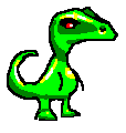
I see, thanks. Just finished this, I dunno if its better or worse, I am afraid the contrast may be too low on this one. EDIT: Reshaded the raptor as well, still did not added the stripes. Dunno if its better now.  ------------- |
Posted By: dragonrc
Date Posted: 17 June 2008 at 10:25am
|
I agree with Indigo on this, don't restrict yourself to using lesser colors, especially since you are still learning most of the basic things of pixelling. Use the colors you need, but you shouldn't overdo it either. I made of an edit of your sprite:  I'm not too fond of the shading of the bucket on your current version since it looks more like a pot now. A bucket usually has the shading I used on my edit. But I totally agree with Blackdragon on that it would look weird when placed on the background. So I made another edit in which I combined both types of shading: I hope it helps! Anyway, Great progress so far, you can really see you are learning from editing and perfecting your pixels. edit: I was playing around with your character some more and this is the result: personally I prefer this design over the bucket totally over the head design because this gives more character to the sprite. |
Posted By: ellie-is
Date Posted: 17 June 2008 at 11:06am
Thanks for all the help, tried to make the shading better on the sprite, here is it.  I dunno about that. Everyone seems to be saying its better to show part of the head instead of the bucket totally covering it, so it seems to be the right thing to do. I ll be trying to change the sprite in order to show more of its head but I still dunno. Perhaps if I can make it look good I ll keep it. EDIT: Been trying to change it. I dont think I can do it. Like, I was thinking, and it do look better withouth the bucket covering its head but I dont think I can sprite it. Aint good enough to =\ EDIT2: I ll be puting this project on hold until I get a better understandment of how Game maker works. I know enough to make a basic plataformer but I am not familiar enough with it for the more advanced stuffs I wanted to do for this game. As to avoid creating too many topics, I ll be posting all my WIPs in this one, even though I think they wont be about this game anymore =\ Thanks for all the help though, you guys helped me to improve a lot in this short period. ------------- |
Posted By: BlackDragon
Date Posted: 17 June 2008 at 2:02pm
|
Originally posted by lucas_irineu
EDIT: Been trying to change it. I dont think I can do it. Like, I was thinking, and it do look better withouth the bucket covering its head but I dont think I can sprite it. Aint good enough to =/ You did this didn'tcha:
--->
<---What makes you think you can't sprite a dino/croc/lizard/whatever head? There are several references and edits posted for you and you should use them. More importantly learn from them.
Also, less is more. Don't use ridiculous amounts of colors to shade a metal "properly". The 3 or 4 were fine. No need to change :) Keep color counts in mind when making a sprite or any pixel art. Don't use any more colors than what is necessary.
Avoid posting to many WIPs. They can easily get out of hand. Only work on what you are serious enough to finish. What do you need to do in GM that you don't know currently? I know a bit.
|
Posted By: ellie-is
Date Posted: 17 June 2008 at 2:50pm
|
You are right. But what I cant do aint the dino, its the bucket. Like, I can make a bucket, but I cant make it look good enough to fit the head. Some fancy plataformer stuffs. Like, grabbing on a cliff's edge, and other stuffs. But dont worry. On the meantime I ll be working on simpler projects and try to learn from them, until I am ready to go back and work on this game. ------------- |
Posted By: BlackDragon
Date Posted: 17 June 2008 at 3:15pm
| Always remember to post what you have. We can't help you if we can't see the problem! |
Posted By: ellie-is
Date Posted: 17 June 2008 at 3:18pm
Right. This is not pixel art or anything, just some concept art I am doing
for the lil guy. The game is stoped due to coding difficulties but I decided I ll still
be spriting for it . ------------- |
Posted By: BlackDragon
Date Posted: 17 June 2008 at 4:52pm
|
Heehee :P
Its cute! Now sprite it :)
|
Posted By: dragonrc
Date Posted: 18 June 2008 at 5:02am
 I totally like the new design! |
Posted By: ellie-is
Date Posted: 18 June 2008 at 5:07am
Thanks ^^ Still did not added the eyes, wanted to know what you think of the shading first. It uses less colors than the previous one and its better imo :P EDIT: Forgot to add the stuffs on its tail, added them now. Dont like the result too much EDIT2:  ------------- |
Posted By: BlackDragon
Date Posted: 18 June 2008 at 10:50am
|
Have you given up on the 16 colors? Sure seems like it :/
The bucket has WAY too many colors. Like I said 3-4 is fine.
You may want to try out a different snout, he looks a lot like Yoshi currently.
|
Posted By: ellie-is
Date Posted: 18 June 2008 at 11:11am
|
Yeah, I give up on the 16 colors :P And the bucket has only 5 colors :P And I ll try a different snout then. Just gimme a while, dunno how to do it :P EDIT: Try it now  ------------- |
Posted By: dragonrc
Date Posted: 19 June 2008 at 9:46am
|
The new sprite it great! A big improvement over the old one Made a little edit again (color and shapes) My edit still has some issues but I hope it helps in some way |
Posted By: ellie-is
Date Posted: 19 June 2008 at 2:56pm
|
Thanks. But I dunno, your edit looks more like yoshi than mine. But your bucket is better, I ll try to make mine look a bit more like that.
------------- |
Posted By: dragonrc
Date Posted: 19 June 2008 at 10:00pm
|
Originally posted by lucas_irineu Thanks. But I dunno, your edit looks more like yoshi than mine. But your bucket is better, I ll try to make mine look a bit more like that. You are right, it would resemble yoshi too much. But those things are usually solved with just minor tweeks. But my edit was just for guidelines anyway, to show you what could be improved on your sprite. Like the bucket, the colors, the length of his arm and the feet. This is for a platformer, right? With your current feet making a walk animation would be harder than it should be. |
Posted By: BlackDragon
Date Posted: 20 June 2008 at 10:36am
|
Edited Dragon's edit for visibility:
Keep in mind what colors can and cannot be seen. Dragon's edit was good but it had a few color issues which were worked out in mine.
|
