1st Isometric attempt
Printed From: Pixel Joint
Category: Pixel Art
Forum Name: WIP (Work In Progress)
Forum Discription: Get crits and comments on your pixel WIPs and other art too!
URL: https://pixeljoint.com/forum/forum_posts.asp?TID=690
Printed Date: 13 June 2026 at 2:56am
Topic: 1st Isometric attempt
Posted By: Hydra
Subject: 1st Isometric attempt
Date Posted: 08 August 2005 at 1:12pm
|
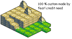
Hi , iam whole new to this site and i saw you guys make amazing isometric style stuff! , so i started to make something too , the style is a Final Fantasy Tactics and the colors are form that game too , i suck and searching colors :( the are always to dark or light or something like that , but here it is :
C+C Please |
Replies:
Posted By: Rifts
Date Posted: 08 August 2005 at 3:59pm
|
quite nice, but this shudnt be in the joint section
can someone move it? |
Posted By: Zoomrix
Date Posted: 12 August 2005 at 6:48pm
This has been here... without good critique or comments, sitting in a corner of a wrong forum for about 5 days now.  ------------- http://zoomrix.com - My Portfolio |
Posted By: PixelSnader
Date Posted: 12 August 2005 at 7:37pm
|
first i suggest you dont recolour grass to be sand next, the dark parts in the topo right make it very repetetive and lastly.. "100% made by fear!" ... uh.. you are hydra ------------- ▄▄█ ▄▄█ ▄█▄ ▄█▄ |
Posted By: leel
Date Posted: 12 August 2005 at 8:00pm
|
Originally posted by Zoomrix
This has been here... without good critique or comments, sitting in a corner of a wrong forum for about 5 days now. It's because it's not joint related, and we were all confused since no one moved it We are sheep. |
Posted By: Zoomrix
Date Posted: 12 August 2005 at 8:08pm
|
I know that it's not Joint related... That's why I said "wrong forum". Anyway, might as well comment. The first thing that I noticed was how bad of a transition you did on the going from ground to grass tile. It doesn't... transition enough.
------------- http://zoomrix.com - My Portfolio |

Posted By: pixelblink
Date Posted: 12 August 2005 at 11:24pm
|
Never saw this one guys... sorry about that. It's been moved now. ------------- |
Posted By: ryan-gfx
Date Posted: 13 August 2005 at 3:40am
|
are you also new to english too?
------------- |
Posted By: leel
Date Posted: 13 August 2005 at 8:46am
|
Originally posted by Zoomrix
I know that it's not Joint related... That's why I said "wrong forum". I know lol, I was just saying that no one gave c/c because we were waiting for it to be moved, not that I'm the first person to notice that it's in the wrong place Back on topic - I like the hills/piles of rocks, but not so much the sand tiles. The line between rows of tiles is way too thick, but the middle part is ok... I don't know alot about tiles, so from a noob's point of view they look pretty good. And I agree about the transition from sand to grass - everything around it is so soft and blurry, but that one tile isn't so it looks out of place |

Posted By: randomblink
Date Posted: 07 September 2005 at 8:07am
|
Nicely done... I agree that Grass should not be recolored sand tho, it looks obviously 'odd'... ------------- www.randomblink.com I am me... no! Really! |