CHALLENGE 8/25/2008: View From A High Pla
Printed From: Pixel Joint
Category: Pixel Art
Forum Name: Collaborations/Challenges
Forum Discription: Submit pixel art project ideas/templates or contribute to an existing pixel art collaboration.
URL: https://pixeljoint.com/forum/forum_posts.asp?TID=7011
Printed Date: 05 July 2026 at 3:02am
Topic: CHALLENGE 8/25/2008: View From A High Pla
Posted By: administrator
Subject: CHALLENGE 8/25/2008: View From A High Pla
Date Posted: 25 August 2008 at 6:45am
CHALLENGE: View From A High PlaceChallenge winner http://pixeljoint.com/p/16489.htm - matt0 challenges you to pixel a scene as seen from a high vantage point. You can use any style and subject - realistic or abstract, sci-fi or fantasy, city or landscape... whatever strikes your fancy.Colours: 64 max Canvas size: 320x240 (landscape) or 240x320 (portrait) Transparency: none CHALLENGE RULES
CHALLENGE JUDGING
CHALLENGE PRIZES/GOODIES
CHALLENGE VOTING/pixels/poll.asp?id=1100' name='vote' target='_blank'>Vote now for your favorite pixelart in this week's challenge!CHALLENGE AWARDSThe View From A High Place pixel art challenge is complete and we have three new champions. This week's challenge awards go to the following pieces:/pixelart/35316.htm' target='_blank'>  Colinas verdes - Weekly Challenge by /p/17621.htm' target='_blank'>JinnDEvil Colinas verdes - Weekly Challenge by /p/17621.htm' target='_blank'>JinnDEvil/pixelart/35346.htm' target='_blank'>  Emogirl by /p/16805.htm' target='_blank'>BlazeAce Emogirl by /p/16805.htm' target='_blank'>BlazeAce/pixelart/35313.htm' target='_blank'>  towers of the colossus by /p/12253.htm' target='_blank'>FrostPumpkin towers of the colossus by /p/12253.htm' target='_blank'>FrostPumpkinThanks so much to all who took the time to vote and participate in the challenge! |
Replies:
Posted By: jalonso
Date Posted: 25 August 2008 at 7:45am
|
NOTE: Changed canvas to 320x240 or 240x320 for easier entry checking :D
------------- |
Posted By: FrostPumpkin
Date Posted: 25 August 2008 at 8:00am
Eeeearly WIP : I think I'll do something like a huge crashed spaceship, or deepsea monster. |
Posted By: fucbillgates
Date Posted: 25 August 2008 at 9:32am
|
This sounds fun! I'm gonna try a picture of Mars 1 hundred years after it was been terraformed and colonized. |
Posted By: BlazeAce
Date Posted: 25 August 2008 at 11:51am
 Is teengirls camera high enough or should it more like a cliff and someone looking into a distance? |
Posted By: FrostPumpkin
Date Posted: 25 August 2008 at 12:26pm
EMOOO <3 btw (dunno if the brown/red works :/) btw (dunno if the brown/red works :/) |
Posted By: Luca
Date Posted: 25 August 2008 at 12:42pm
|
i think you should change it frost.. ------------- http://s3.gladiatus.onet.pl/game/c.php?uid=136159 |
Posted By: FrostPumpkin
Date Posted: 25 August 2008 at 12:55pm
| Ok, fix'd. just tried to add a stylish touch >.> |
Posted By: Jinn
Date Posted: 25 August 2008 at 4:41pm
|
Anyone can post in the forum, right? o.õ Well... I'll try to finish this until the weekend...  Is it being cool? ._. [edit]~ I update the WIP. |
Posted By: Malor
Date Posted: 25 August 2008 at 6:15pm
| JinnDEvil, that is sweet. You too FrostPumpkin. |
Posted By: Larwick
Date Posted: 25 August 2008 at 7:51pm
|
Originally posted by JinnDEvil Anyone can post in the forum, right? o.õ Of course! To an extent. Frostpump, you're getting me excited with this. -------------  http://larw-ck.deviantart.com"> http://larw-ck.deviantart.com">
|
Posted By: FrostPumpkin
Date Posted: 26 August 2008 at 2:21am
|
Thanks 8D Here is what I've got so far  , I don't really like how it turned out :/ it needs contrast, saturation... , I don't really like how it turned out :/ it needs contrast, saturation...Maybe I'll make a castle or a dark tower instead of a spaceship... |
Posted By: Jinn
Date Posted: 26 August 2008 at 10:33am
|
Uau! it's great Frost... I wish i can make that kind of smoke some day, 'cuz it's really great! ~ Well... Just another step:  |
Posted By: FrostPumpkin
Date Posted: 26 August 2008 at 11:02am
Awesome work on the shadings Jinn ! But there is a big perspective problem IMO. We shouldn't see the sky from that point of view, and only the roof for the houses. Totally changed the theme, didn't liked the old one... Totally changed the theme, didn't liked the old one... |
Posted By: Jinn
Date Posted: 26 August 2008 at 11:44am
|
Oh yeah! Good point, is really true. I made some changes; And I think I fixed the problem now.  ~ O loved the smoke on the other, But this fog it's awesome too! ^^ |
Posted By: BlazeAce
Date Posted: 26 August 2008 at 11:52am
Seriously  Two that awesome WIP's so early. I really like works of you both JinnDEvil and FrostPumpkin. I can't wait to see the final results. Two that awesome WIP's so early. I really like works of you both JinnDEvil and FrostPumpkin. I can't wait to see the final results.As for my WIP, I'm having difficulties with anatomy   Those legs are terrible, need to redo them next. Anything else in need of fixing? |
Posted By: Jinn
Date Posted: 26 August 2008 at 12:13pm
|
I think the other legs worked better with this point of view... But somehow she still like is sat down. (I don't know if it's the correctly way to say this x.O) Anyway, thank you! ^^ I'll try to work more tomorrow |
Posted By: FrostPumpkin
Date Posted: 26 August 2008 at 12:57pm
|
Hey Blaze, please, finish it ! Also, I made an edit about anatomy and perspective on your work : The soulders were too large and I remade the legs  I hope it helps ! @Jinn : Yeah, that's better now. EDIT :  better perspective I think. |
Posted By: Pok3'
Date Posted: 26 August 2008 at 6:01pm

This one is an ISO cube Viewed from a high place
 (I don't think that i got the required habilities to join in this one, i made this just for joking..
 ) ) |
Posted By: Jinn
Date Posted: 26 August 2008 at 6:07pm
You should put some shadows... 
|
Posted By: BlazeAce
Date Posted: 27 August 2008 at 6:09am
Thanks Frostpumpkin, that really helped  I'm planning to finish this so no need to worry. I'm planning to finish this so no need to worry. The shoulders may still be too big... Anything in need of fixing? I've started working with shadings now and I'll be sketching that left hand to look somewhat "cool" or interesting next. Now it's just hanging there for nothing. |
Posted By: fucbillgates
Date Posted: 27 August 2008 at 12:49pm
Ok!!! i got started on my picture here is what i have made so far.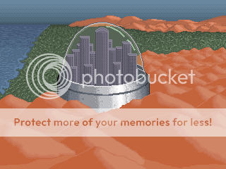 Help me improve this. |
Posted By: FrostPumpkin
Date Posted: 27 August 2008 at 1:06pm
| I think there shouldn't be vegetation nor water on mars, even if it's colonized... |
Posted By: thecommontask
Date Posted: 27 August 2008 at 1:29pm
Some people just don't care for imagination... 
|
Posted By: Jinn
Date Posted: 27 August 2008 at 2:11pm
|
Oh yeah, i think I close to finish this... \o/ At last... XD  ~ And member_profile.asp?PF=16685&FID=1 - BlazeAce you should try to finish the face of the girl rotating the image, like this:  I think this way will be more easy... O.o Once you end, turn it again! And yeah, I like this kind of "future" mars, great job member_profile.asp?PF=16516&FID=1 - Fbg ! |
Posted By: amerup
Date Posted: 27 August 2008 at 2:18pm
|
Ace, the dithering doesn't look good. The shading on the face is great, so I think it's the low contrast and dithering that's messing it up. You can barely see the white. |
Posted By: BlazeAce
Date Posted: 27 August 2008 at 2:18pm
|
Omg, you rotated it :D I tried that at early phase and noticed it looked terrible. I'm working on it the way it is because it's a pain to do it "upside down" like in the one you posted. It's kind of weird how terrbile a picture can look upside down compared to the original one o___O Working on the floor:  It's midnight here, need to wake up at 6:20 to make it in time to school... I quess that's how far I got today with it. JinnDEvil: Your entry is starting to look really good :O Can't wait to see the final one. |
Posted By: fucbillgates
Date Posted: 27 August 2008 at 3:04pm
| ummmmm....... terraformed...... and can anyone help me improve????? |
Posted By: thecommontask
Date Posted: 27 August 2008 at 5:12pm
|
My initial ideas for improvement have to do with atmospheric perspective. I think you need push the things that are farther away from us more away. By that I mean lower the saturation and brightness of those back mountains, and even the ones in the middle of the picture. Same goes for the grass/plains you have, you've got them slightly darker in the back but maybe push it more. In general I also think more variations will help make things look like they've got natural color and form. Change a few of the grays in the buildings, tint them a different color or something, same goes for the mountains or maybe they're sand dunes? If you can pull out more character from these desolate things, the composition will be much more attractive. Hope that helps somewhat. *edit* I also think a more definitive light source will help. And this may be picky but to me, the buildings in the dome fit too perfectly within it. Especially the center one, it's like all the way at the top. I think having buildings that aren't so uniform in size according to the dome would be more interesting... maybe cut them out and move them around a little to test it out. |
Posted By: Metaru
Date Posted: 28 August 2008 at 12:22am
|
I got my idea. now i need to make it true.
------------- I ate leel's babies |
Posted By: FrostPumpkin
Date Posted: 28 August 2008 at 2:13am
 Those tower gives a better impression of high and "greatness" of the towers. Do you think I should keep it ? @Jinn : Can't wait to see it finished ! The rotation of Blaze's work really shows all the problems there are in it, Especially on the face and the shoulders. And I think her left arm is still too short. EDIT : Darkened colors and added a bird to get a size reference about the cliff. |
Posted By: BlazeAce
Date Posted: 28 August 2008 at 5:09am
Frostpumpkin, I think you should keep them. It gives kind of depth to the picture. It could be something else too, not only similiar looking tower though... But it looks really good so far   Too many people pointed out the mistakes in the work so I had to flip it and rework it this way. I liked it as it was before too but this isn't bad either. It's just annoying to remove somethign you thought you had already done quite well Oh well, I'll get over it and start working with the picture by checking it on both ways every once in a while. Thanks for the tips so far, they've been a great help! |
Posted By: Jinn
Date Posted: 28 August 2008 at 10:55am
Now the face of the girl is really nice, member_profile.asp?PF=16685&FID=1 - Blaze !  I like the left hand too; But somehow I preferred the old right arm 'cuz the distortion was great...  ~ Anyway, I think I finish it!  I can post the final work here too, right? ~ And member_profile.asp?PF=12145&FID=1 - Frost , I think you should keep them, But it would work better if the others towers are smaller than the main one. |
Posted By: FrostPumpkin
Date Posted: 28 August 2008 at 12:02pm
|
http://pixeljoint.com/pixelart/35313.htm - submitted I am too tired of it to work on it more, sorry. |
Posted By: Jinn
Date Posted: 28 August 2008 at 1:21pm
|
Somehow I understand you, member_profile.asp?PF=12145&FID=1 - Frost ! @_@ I ../pixelart/35316.htm - submitted too. Hope you guys comment there! XD ~ And member_profile.asp?PF=16685&FID=1 - Blaze , don't stop to post your WIPs! o.o I want to know how it is going! ^^ |
Posted By: BlazeAce
Date Posted: 29 August 2008 at 6:33am
|
Originally posted by JinnDEvil And member_profile.asp?PF=16685&FID=1 - Blaze , don't stop to post your WIPs! o.o I want to know how it is going! ^^ Okay, blame Jinn if you don't like my WIP postings   That wall is going to be a real pain... Don't have any good ideas for texture and plain wall is simply awful. I'm thinking of some kind of wallpaper for background with some posters. And then there's the hair too  I'll probably go with the animestyle since I really have no intentions to use my whole freetime of the week for this. Some amy hate it but it's lot more better than it's now. I'll probably go with the animestyle since I really have no intentions to use my whole freetime of the week for this. Some amy hate it but it's lot more better than it's now.Comments are really welcome although I won't be doing any drastic changes on it. |
Posted By: Jinn
Date Posted: 29 August 2008 at 7:57am
|
Just be careful with the colours restriction, you are really near to the limit of 64... ^^" And oh yeah! a poster will be nice on the wall! |
Posted By: fucbillgates
Date Posted: 29 August 2008 at 2:42pm
|
I remade mine. It's not done i still have to finish the grass, water and city outside of the dome. NEW 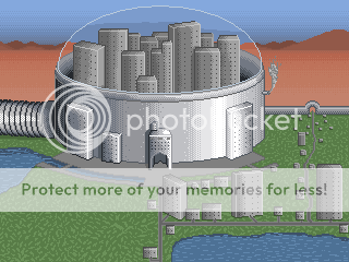 OLD |
Posted By: Metaru
Date Posted: 30 August 2008 at 12:12am
|
ironically, i'd say go witha plain wall ace, so the focus would be the girl and not her surroundings. no need to overdo it. ------------- I ate leel's babies |
Posted By: BlazeAce
Date Posted: 30 August 2008 at 2:05am
|
Originally posted by Metaru ironically, i'd say go witha plain wall ace, so the focus would be the girl and not her surroundings. no need to overdo it. Ironically I was just about to post a wip and tell you guys that I don't have time nor interest to do any superdetailed background  What do you guys think of those gray lines on the wall? I'm currently shading the wall so it's not finished. fucbillgates: Looking good. I'd probably change the direction that two big buildings outside the dome are facing. They are just bothering me. |
Posted By: DoomDoom
Date Posted: 30 August 2008 at 7:19am
BlazeAce I like your creation VERY GOOD
|
Posted By: Raytheon
Date Posted: 01 September 2008 at 3:59am
|
:( i didnt finish it on time my internet went down and so i didnt bother finishing it/didnt get to submit it |