Pixeldam: Grand Cafe 'The Bollard'
Printed From: Pixel Joint
Category: Pixel Art
Forum Name: WIP (Work In Progress)
Forum Discription: Get crits and comments on your pixel WIPs and other art too!
URL: https://pixeljoint.com/forum/forum_posts.asp?TID=7069
Printed Date: 21 April 2026 at 9:46pm
Topic: Pixeldam: Grand Cafe 'The Bollard'
Posted By: Hapiel
Subject: Pixeldam: Grand Cafe 'The Bollard'
Date Posted: 08 September 2008 at 3:45am
Hello all  , ,I am going to put my hands on some isometric building again. For pixeldam  . .As usual all edits, tips, compliments or criticisms are welcome! (especially I invite Jal and Zi to help me  ) ) Its far from finished, but thats why this is a WIP thread ;) Thanks in advance for watching, reading and commenting, Lollige EDIT: Current version:  |
Replies:
Posted By: Club Beuker
Date Posted: 08 September 2008 at 4:51am
|
In my opinion the first thing that bothers me is the fact that the stairs are quite big (in compare with the doors). Or the doors being too small.
------------- Without me, it's just aweso |
Posted By: Hapiel
Date Posted: 08 September 2008 at 5:08am
|
Originally posted by Club Beuker In my opinion the first thing that bothers me is the fact that the stairs are quite big (in compare with the doors). Or the doors being too small. I totally agree and I am going to modify that. the guy in the left down corner is there to show the scale, and if you compare the stairs with him the stairs are way to large. What do you think of my old version?  I think those are too small, but maybe you think they are just fine? EDIT: It was easier to make the stairs smaller than I was afraid of (seems I did it very unhandy the first time I changed the stairs)  ------------- |
Posted By: Club Beuker
Date Posted: 08 September 2008 at 6:04am
|
Much better, since the building is supposed to be a public place the length of the steps isn't bothering. Another small thing that's bothering me is the door upstairs. There is so little space between the wall and the door, maybe you can move it a bit to the right (a little bit behind the air vents tube thingy). This is just mark-up stuff, to make the image a bit more lively. ------------- Without me, it's just aweso |
Posted By: Hapiel
Date Posted: 08 September 2008 at 6:33am
|
again I agree. I fixed it, you will see when there is more updated to show :) EDIT:  Comments/edits on the sitting man please! ------------- |
Posted By: Club Beuker
Date Posted: 08 September 2008 at 6:40am
|
Looking forward to it
------------- Without me, it's just aweso |
Posted By: Sabata
Date Posted: 08 September 2008 at 7:23am
|
I think that table is too small... compared to chairs
------------- We fall to rise again. |
Posted By: Club Beuker
Date Posted: 08 September 2008 at 7:31am
|
Sitting man is good enough for me, but the table.. yes it is a bit too small.
------------- Without me, it's just aweso |
Posted By: Hapiel
Date Posted: 08 September 2008 at 7:33am
|
Originally posted by Club Beuker Sitting man is good enough for me, but the table.. yes it is a bit too small. witch one of the 2 sitting man club? Table is indeed small and fixed, I also made the air tube thing a bit smaller. I think the air tube itself looks better now, but I also liked that the ends were a bit over the door and outside the building contours...... What do you think?  ------------- |
Posted By: Club Beuker
Date Posted: 08 September 2008 at 8:16am
|
I think the left guy (on the chair) is looking great, the other (lazy hanging) one should be altered a bit. If I sit like that on a chair my bum is on the edge, his bum is halfway the chair. Legs should be put forward (like he stretches them). For the air tube, I liked the bigger one better. The size change isn't noticable and you should always try to avoid lines crossing eachother (ex. side of air tube and wall/door post). Just one small thing, how are the people supposed to be able to put their legs underneath the table? Raise that little rascal ------------- Without me, it's just aweso |
Posted By: Hapiel
Date Posted: 08 September 2008 at 8:54am
 I am not jet finished with the 2 man on top, but I am having dinner now. Ill continue soon :) ------------- |
Posted By: jalonso
Date Posted: 08 September 2008 at 9:42am
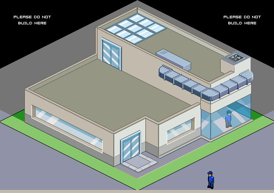
I find the space is too crowded. Open it up everywhere you can. Something like this... ??? What is this building supposed to be? ------------- |
Posted By: Hapiel
Date Posted: 08 September 2008 at 10:10am
|
I really have no idea what this building is used for, ill make some sort of a café of it but than still a lot of things do not make sense. Thats why I named it in the topic just 'building', maybe it will become something later. Name I had in mind earlier was Clubhouse... but this is not really a clubhouse.... ah well. Now that you say so, I see that the building is indeed a bit 'closed'. (there goes my bodyguardattheentrance idea  ) and ill see what I can do against it. The wall were you placed 4 windows on seems to be a good spot (not because its usable but just because its still free ). The 3 windows I placed from low to high seemed very funny in the beginning but it already bores me now, so there is room for adjustment too, and I think ill have another door on the whole left side of the building. ) and ill see what I can do against it. The wall were you placed 4 windows on seems to be a good spot (not because its usable but just because its still free ). The 3 windows I placed from low to high seemed very funny in the beginning but it already bores me now, so there is room for adjustment too, and I think ill have another door on the whole left side of the building.Making the stairs smaller seems to be a good way to get some extra room in front of the building, ill steal that idea as well Lollige EDIT:  ------------- |
Posted By: bren0098
Date Posted: 08 September 2008 at 12:25pm
|
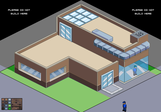
You could try modernizing it a bit, like so:
 |
Posted By: Hapiel
Date Posted: 08 September 2008 at 1:56pm
|
Wow bren thats awesome! However, even tough mine is 'modern', I want it to be very colorful. The beige works good with the green but it gives such a cold feeling. However, I am really going to steal your ideas of the windows and the door! Great! Thanks  ------------- |
Posted By: zi-double
Date Posted: 08 September 2008 at 2:56pm
|
Lollige I'm afraid that with current colours will have problems for shadows and with contrast... also have too much gray in your colours ! What I suggest to make - pick 3 palettes with 6 or 7 different colours be shure that one of them going to blue region. If you need more colours than will add some diferent palettes with new 3-4 colours. I like Jal variant use his work. Must take decision what building you will make, because than easy can think which type of windows, doors, furniture ets. you will need. As example if make french coffee will have tents, metal chairs and tables, waiters, metal parapets ets. 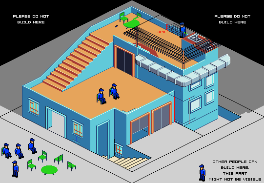 1st - think for heigh of the windows - see right part - first have plint, then blue line, then window, need some heigh over window and again blue line and window. This part with the ventilator is very low and I try to hide with some roof. Also windows must be as part of the building. I like english garden in right part. In that building you have some area for supply, for entrance of the peoples in left, kitchen in right area /first and second floor/ and area for visitors in second and third floor. Also have some celler for cold store. Must make some scenes to show type of areas. Think to open doors windows est because isn't good to repeat elements /but always can hide some windows with trees/, make some car supply, maybe butcher and dog when steal his meat, cook who make fire in some window ets :) I show 3px /in right upper part/ because if you make walls with bricks you will need 3 bricks x 3px and they are in the middle of the person and will need some parapet over them. Will be better to make that in the begining. Also will be good if make some thickness of the walls everywhere. Don't forgot that in real have green and shadows everywhere ;) Doors and windows now aren't part of the building - but they must be in unison with type of the building ! You have too many floors and that is why 3 windows with different thickness from the ground aren't good choice ... maybe windows with 2,3,4 wings and different thickness are better. Think where building will have column than can show some ot them for more interesting view. If watch work of the member_profile.asp?PF=14677&FID=8 - bren0098 /she is nice bren;)/ windows are like inside of the walls they must be in the middle of the walls. |
Posted By: Garrett
Date Posted: 08 September 2008 at 4:30pm
|
Originally posted by bren0098 You could try modernizing it a bit, like so:
Le Corbusier! Where are the pilotis? The pilotis! Apart from that, zi-double is right, nothing more to say. ------------- You'll hear your steps making no noise |
Posted By: Hapiel
Date Posted: 09 September 2008 at 5:24am
|
Grand Café "The Bollard" How does that sound?  I worked a few more hours on it, this is what it looks like now :) To help myself I am going for a 32 color max. I am counting the sidewalks palette as well (thats why I modified a lot of things from the original) ------------- |
Posted By: Larwick
Date Posted: 09 September 2008 at 8:03am
|
When you're making a cafe floorspace is very important, so those massive stairs seem a bit odd in such a place. They're very interesting architecturally but take up too much room imo. :P Then again, maybe it used to be a museum or something :D Anyway, keep it up! -------------  http://larw-ck.deviantart.com"> http://larw-ck.deviantart.com">
|
Posted By: bren0098
Date Posted: 09 September 2008 at 10:36am
You could also remove the stairs completely and add a skylight. Some transparent effects will add a kick to the colder tone.
 |
Posted By: Hapiel
Date Posted: 10 September 2008 at 12:39am
|
The huge window looks awesome! I just thought of a skylight myself but where should I put it? If you remove the stairs it becomes an even more crowded building, and your version does indeed not look very good as a restaurant, more like an office. Larwick: I was thinking of a museum as well, but than: Why is there so much room outside, and not so much inside? Stairs will get smaller, I'll make sure of that :) ------------- |
Posted By: Club Beuker
Date Posted: 10 September 2008 at 12:41am
|
Why don't you cut the whole building in half, lose the stairs (add an elevator) and make a huge terrace in front where people can sit and drink? You can also make some kind of balcony scene on the roof where people can sit underneath umbrella's. Just my two cents ------------- Without me, it's just aweso |
Posted By: Hapiel
Date Posted: 10 September 2008 at 2:21am
|
Where would I have room to put an elevator? An parasol is called a parasol in English as well club ;), and yes, I had the same idea, because its a good idea :)  ------------- |
Posted By: Club Beuker
Date Posted: 10 September 2008 at 2:26am
|
Hmm I see the spacing problem now (I started my own piece on Pixeldam). Forget the elevator.. (Umbrella's are for catching rain... silly me) ------------- Without me, it's just aweso |
Posted By: Hapiel
Date Posted: 10 September 2008 at 3:49am
 Stairs better now? ;) ------------- |
Posted By: Club Beuker
Date Posted: 10 September 2008 at 4:19am
|
Well, do you have enough room for the other stuff you want to make?
------------- Without me, it's just aweso |
Posted By: Hapiel
Date Posted: 10 September 2008 at 8:11am
Think so :) ------------- |
Posted By: bren0098
Date Posted: 10 September 2008 at 8:54am
You could try warming it up a touch and branching it out, like so:
 |
Posted By: Hapiel
Date Posted: 10 September 2008 at 12:13pm
|
Warm? Thats hot Bren, hot like coffee ;) EDIT: Before I go to sleep, I will show you the last few modifications I did tonight.  ------------- |
Posted By: Club Beuker
Date Posted: 11 September 2008 at 12:40am
|
I think it's about time to start detailing. Starting to look great! (one small brainfart: add an outside BBQ)
------------- Without me, it's just aweso |
Posted By: Hapiel
Date Posted: 11 September 2008 at 1:29am
|
Originally posted by Club Beuker I think it's about time to start detailing. Starting to look great! (one small brainfart: add an outside BBQ) Nice idea beuker :)  What do you think of these detail plants?  ------------- |
Posted By: Club Beuker
Date Posted: 11 September 2008 at 1:51am
|
They still look kinda flat and random. Add more highlights? And try to follow the shape of the wall.
------------- Without me, it's just aweso |
Posted By: Hapiel
Date Posted: 11 September 2008 at 3:13am
|
They are flat and random.. And how do you mean following the shape of the wall?
------------- |
Posted By: Club Beuker
Date Posted: 11 September 2008 at 3:23am
|
Well it is hard to explain. I'm guessing the plants look a lot like "klimop". Those plants never are that flat (sure they're pin pointed to the wall), but do have some depth in them (like twigs sticking out). For following the shape of the wall, without the depth they look like random scribbles. So in that case (in my opinion) it is better to let them follow the isometric shape of the wall. Problem you get there is that the plants look static that way, so that's not an option. Also a nice way to get dynamic action is to think (and draw) outside of the box. Left some twigs hang in front of the window, let them curl around the door post, etc. You know what to do ------------- Without me, it's just aweso |
Posted By: Hapiel
Date Posted: 11 September 2008 at 5:14am
|
ok :) current version (without your things yet)  and for fun a wip animation:  ------------- |
Posted By: Hapiel
Date Posted: 13 September 2008 at 7:23am
|
I find it very difficult to get the people in the right body positions... An update:  (Can you find me? ;)) ------------- |
Posted By: Hapiel
Date Posted: 16 September 2008 at 1:52am
|
I'm getting closer to the finish. I added shadows on the most places. Does that make it better?  ------------- |
Posted By: Club Beuker
Date Posted: 16 September 2008 at 4:23am
|
In my opinion.. yes Almost finished ------------- Without me, it's just aweso |
Posted By: jalonso
Date Posted: 16 September 2008 at 2:25pm
|
I think the floor is too boring. The windows too. Use your darkest blue to create shadows inside the windows. See my treehouse to see what I mean. I would rethink your green ramp to be blue-based. ------------- |
Posted By: schrumpfkopf
Date Posted: 16 September 2008 at 11:52pm
|
im not sure if this is just a style-question for you, but i think some more texture wouldnt hurt. like stone-tiles on the roof a small plant or two in a corner... stuff like this. id make a mini edit if you dont mind. |
Posted By: Hapiel
Date Posted: 17 September 2008 at 12:42am
|
@Jalonso: I tought of making floor tiles with the color I used for those shadows too. Ill try to make something with that and see if it works :). What do you exactly mean with a blue based green? that the end of the ramp ends on green? As you can see in the palette in the leftup corner thats already quite possible. Ill use your treehouse idea, I think it fits good here :), thanks @shrumpfkopf: I am not going for a specific style. I just start somewhere and see where I end up. If texture looks pretty here, ill use texture :) Please make that edit and show me what you exactly mean :) ------------- |
Posted By: bren0098
Date Posted: 17 September 2008 at 8:04am
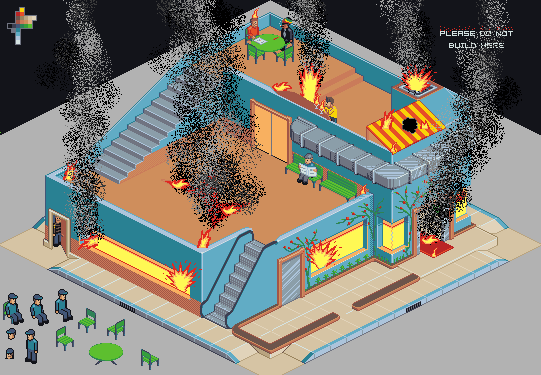
I think you need a fire escape.
 |
Posted By: jalonso
Date Posted: 17 September 2008 at 1:35pm
|
XD
------------- |
Posted By: Hapiel
Date Posted: 23 September 2008 at 2:10am
|
Fire exit is on the other side of the building. Thanks for your help! i'm done with this now :) ------------- |