[WIP] Bistro for Pixeldam
Printed From: Pixel Joint
Category: Pixel Art
Forum Name: WIP (Work In Progress)
Forum Discription: Get crits and comments on your pixel WIPs and other art too!
URL: https://pixeljoint.com/forum/forum_posts.asp?TID=7080
Printed Date: 23 October 2025 at 12:42am
Topic: [WIP] Bistro for Pixeldam
Posted By: Club Beuker
Subject: [WIP] Bistro for Pixeldam
Date Posted: 10 September 2008 at 7:40am
Lollige inspired me to do a piece for pixeldam and I'm trying to make a trendy, hip but expensive Bistro. I'm planning to make a terrace on the "balcony" section and a road underneath the "overhanging". After that it's detailing time. Still I have loads of free room. What to do, what to do? Current version:  ------------- Without me, it's just aweso |
Replies:
Posted By: zi-double
Date Posted: 10 September 2008 at 8:08am
|
bistro is little space for drink ... maybe will be good If make some Hotel with bistro. Also so quadratic forms isn't best choice. When I see your fence in the terace I think for that type of building. http://www.frizz-restaurant.com/images/travelguide/architecture-3.jpg - http://www.frizz-restaurant.com/images/travelguide/architecture-3.jpg Also colours from reference are good ... yellow and white - near to your choice. Make small Hotel - big like your main building with arc and elements and can add big arc for cars in front part like your columns and where is terrace - make her small with steps which going to outside garden with bistro /If you haven't enough space than will use pavement for tables/. Add some white ornaments everywhere and some nice green in the garden, tents or some interesting objects. In the hotel can make some space for newspapers ets. This building which you start for me is very big and maybe will be hard to fill all areas with interesting elements or scenes. PS because building will be with two floors you can make front/left part /face of the hotel/ with roof and in back part to see terrace than you will fill space with something different. |
Posted By: Club Beuker
Date Posted: 10 September 2008 at 8:26am
Small update: Zi I think you're right, except the building you're showing is a bit out of my league. Then again, it's good to have a challenge. I'll change the colors (cause they're more sunnier) and keep your C&C in mind. ------------- Without me, it's just aweso |
Posted By: Hapiel
Date Posted: 10 September 2008 at 12:11pm
|
Why are your highlights so light! They could be a lot darker and prettier!
------------- |
Posted By: jalonso
Date Posted: 10 September 2008 at 2:12pm
|
Nice!!! Maybe it could have a drive thru area under that, or a V.I.P entrance???
------------- |
Posted By: Club Beuker
Date Posted: 11 September 2008 at 12:37am
|
@Lollige: I think it's because that way I can see what I'm doing (color's can change easily later on) @Jal: Thanks, yup I was thinking about a drive-thru with some ropes to lead rich people to the entrance. Or something like that. ------------- Without me, it's just aweso |
Posted By: Club Beuker
Date Posted: 11 September 2008 at 4:34am
There, something new and improved! ------------- Without me, it's just aweso |
Posted By: Club Beuker
Date Posted: 12 September 2008 at 6:18am
Just a quick update before the weekend: ------------- Without me, it's just aweso |
Posted By: jalonso
Date Posted: 12 September 2008 at 1:09pm
You're gonna make the guests get wet when entering... ...think logical when adding items ------------- |
Posted By: Club Beuker
Date Posted: 15 September 2008 at 5:48am
And that's why you should hang around here forever: ------------- Without me, it's just aweso |
Posted By: zi-double
Date Posted: 15 September 2008 at 6:48am
|
just finish to show idea ... construction of the hotel will crush without column ... also if show depth of the pool will see that haven't space for the pool - that is why I suggest to remove him. Also maybe must think for another colours because your yellow is too much in the work. Also contrast need more - I talk for parapets and everywhere /try to use very dark near to very light lines to show direction. As example for parapets can put detail with 2 vertical dark lines and some light between them and make some details/. Here just pick one column which I make years ago for one unfinished work and add round part in the end also change 3 yellow colours with dark and will leave some parts with yellow palette to show where plaster is fall. Make your blue for the windows and for frames of the windows with more contrast. 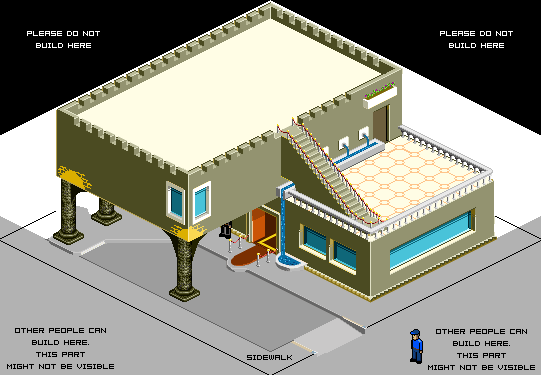 |
Posted By: Club Beuker
Date Posted: 15 September 2008 at 7:20am
|
Wow, that looks great. Colors are way better too this way. I intended it had to be like some desert building, but this way (the old english castle look) it gives it more of a feeling to it. Detailing ideas would be easier this way too (candles and torches, etc.) Thanks, I'll implement this immediatly. Edit: How does this look? ------------- Without me, it's just aweso |