The island
Printed From: Pixel Joint
Category: Pixel Art
Forum Name: WIP (Work In Progress)
Forum Discription: Get crits and comments on your pixel WIPs and other art too!
URL: https://pixeljoint.com/forum/forum_posts.asp?TID=7160
Printed Date: 22 April 2026 at 2:54am
Topic: The island
Posted By: zlajonja
Subject: The island
Date Posted: 29 September 2008 at 1:00am
|
Almost a year ago I was working some map for a friend who wanted to make a fantasy MMO browser game. So we've started working on this island as a starting point in the game, but he then resolved around IRL stuff and quit his project to go working on another, so I've left this sitting by until I stumbled upon it yesterday. I was horrid. It had 160 colors and needed shaping up, and I played a bit last night and put it down to 21 colors palette.  This is current WIP: 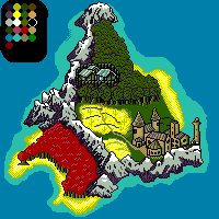 I'm now working on the sea. Most definitely it will lead to some 10-20 frames animation of the island. :) ______ Any ideas, c&c, liky/no-liky and etc. is most welcome. :) ------------- somnabularian insomniac 
|
Replies:
Posted By: skeddles
Date Posted: 30 September 2008 at 1:29pm
|
The colors are kinda icky. Sand should be tan, not yellow, the contrast on the mountains shading is a tad much, and it could prolly use another color. Everything seems kinda flat. ------------- |
Posted By: Aleiav
Date Posted: 01 October 2008 at 10:42am
|
Your perspective in this piece is really off. The buildings do not seem to match the way you would view the land. I think it would help to draw or find a grid of the perspective of the land and draw the buildings from that. Right now it looks like this is a top view of the land but then maybe a slight side view of the buildings, if that makes sense.
And, as skeddles said, your colours are super satarated. You should try to lower them down a bit. I'm not a pallate expert but from what I've seen, saturation is better in lowlights than highlights. |
Posted By: zlajonja
Date Posted: 01 October 2008 at 11:37am
|
yah, I know about the sizing - the idea is to have some 45 degree view of the island and then enlarge the stuff on it like that town, the camp in the forest, the trees and such stuff. That was the basic idea the guy has asked me to make him. I'll work out something out of that palette and make it a bit darker/change some colors. Though I'm just wondering.. what can I do to make it less flat?? I didn't quite understand that part...? And thank you very much both. :) ------------- somnabularian insomniac
|
Posted By: Moments
Date Posted: 01 October 2008 at 12:38pm
| Just my two cents; maybe it's because you came down from so many colors but there's something really delightful in the palette. It feels very much like something I'd play back in middle school. So I don't know if messing around with those is that big a deal. Same thing with the perspective. Maybe if you showed foreshortening in the surf surrounding the island and dithered it out right it might help with that. |
Posted By: fawful
Date Posted: 02 October 2008 at 10:58am
|
That red tree right in the lower left of the sprite seems to be in platform view,and the mountin right above it suffers from a similar problem.
Also the colour is indeed very bright,the sand is far too yellow(both stated before),that town looks like its made of a sort of off cheese.
Normaly i put light blues line around the beach in the sea if im drawing islands in top down or a similer view.Just something to think about.
It does however have a certan charm about it though.
|