Second Piece (Many changes made - please comment)
Printed From: Pixel Joint
Category: Pixel Art
Forum Name: WIP (Work In Progress)
Forum Discription: Get crits and comments on your pixel WIPs and other art too!
URL: https://pixeljoint.com/forum/forum_posts.asp?TID=7179
Printed Date: 17 November 2025 at 12:16am
Topic: Second Piece (Many changes made - please comment)
Posted By: Igthorn
Subject: Second Piece (Many changes made - please comment)
Date Posted: 03 October 2008 at 4:02pm
|
Please help! You can hopefully see what I am trying to do with the hair but I need some tips for the hair texture. Advice? I want to use about four greens for the robe (perhaps with maroon vertical stripes] is four enough? Does my lamp need more yellow or can I keep on using what I have? Thanks  |
Replies:
Posted By: Souly
Date Posted: 03 October 2008 at 4:43pm
|
Don't AA especially how you're doing it. I dislike the AA that is about it, this looks awesome. Use solid colors, mark off all your volumes, then start doing AA. Right now the lamp has a different light source. ------------- 
I am the jesus of PJ. |
Posted By: Igthorn
Date Posted: 03 October 2008 at 9:53pm
|
Can you tell me why? Is it too much? Wrong colours? Thanks |
Posted By: minipuck
Date Posted: 03 October 2008 at 10:44pm
|
Originally posted by Souly . Right now the lamp has a different light source. the lamp has it;s own lightsource, the flame that is coming out of it. |
Posted By: Souly
Date Posted: 04 October 2008 at 3:44am
|
Oh sh*t, I'm a moron. I compeletly forgot lamps made light... I thought genies came out of them, I should probably finish school. Righto Then my only crit is the AA, it's too much and WAY un needed try selout instead. AA just looks so.. bleh. :/ -------------
I am the jesus of PJ. |
Posted By: Igthorn
Date Posted: 04 October 2008 at 6:06am
Alright - I have removed the AA on the outside in the segment below - I'm not sure if its better though - I am very conscious of the edginess of the face. oh and a newbie question - selout? |
Posted By: ellie-is
Date Posted: 04 October 2008 at 6:49am
|
I think its better now. Less blurry. You should try to make your lineart 1 pixel thick. Would look better imo. |
Posted By: Igthorn
Date Posted: 04 October 2008 at 10:31am
|
Alrighty - any thoughts regarding a background? a shape like a window or something? 
|
Posted By: Igthorn
Date Posted: 06 October 2008 at 3:43am
I submitted the piece and then Lollige suggested that the move had been a bit premature and gave me some specific advice - I have made some of the improvements but would like some further feedback. Some questions: Lollige indicated that my interior lines were too jagged - do I fix this with AA? I have decided not to put a background since I haven't any idea what to put there so I'll not AA outside the figure - is this right? I want to avoid line art between colours is this the right approach? With this in mind I have softened (correct term?) some of the outer lines with different colours (face and hands) does this improve the work? Then - please don't just look - tell me what's missing - I've got another idea clamouring for my attention and I'd like to polish this off before I start with a different project. |
Posted By: Emtch
Date Posted: 06 October 2008 at 7:12am
|
Yes you do can fix the lines with AA, but you should maybe try to change the lines a little bit first, it's mostly about preference.
Whether or not it looks better with extrerior AA is mostly about preference.
I would say it's a very good idea to avoid outlines between colors.
First think of what you want yourself, because as I said, art is mostly about preferences.
Go with what you said in that post, I'm sure you'll make something good.
|
Posted By: Hapiel
Date Posted: 06 October 2008 at 10:31am
|
No aa at this point. I will make you a small edit. Zoom in, and take a good look at the parts I cut out and edited on the right.  ------------- |
Posted By: JC Denton
Date Posted: 06 October 2008 at 11:05am
|
I like the drawing but I keep thinking why are the hair and the beard from different colors ? It seems very strange when you look at the picture.
I also think that the green should be darker and the staff longer 
Keep on going, you doing a good job |
Posted By: Quake
Date Posted: 06 October 2008 at 11:32am
|
Yeah, i agree with whoever said to make the staff longer, i'd preferably make it so it actually touches to floors surface. Gives the vibe of a "wise, Elder" etc I also did a small edit, changed the green colours.. changed some other parts too.. 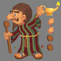 Can i just say, you have an awesome character, who was made with lots of creativity |
Posted By: Igthorn
Date Posted: 06 October 2008 at 2:03pm
|
Thanks for the compliment. I can see the sense in changing the nose and staff as suggested so I will do that - the darker green is very sombre though - almost too dark for the cartoony style but I have something to think about. I have an idea for the staff that I will check next. The beard and eyebrows did need a redo. Again thanks for all the commentary - I am really new to all this |
Posted By: Quake
Date Posted: 06 October 2008 at 2:52pm
|
Well, if you're going for a cartoony effect, don't make it as saturated xD -Quake |
Posted By: Souly
Date Posted: 06 October 2008 at 3:17pm
  Your shading is so messy. -------------
I am the jesus of PJ. |
Posted By: Emtch
Date Posted: 06 October 2008 at 10:08pm
|
I think the staff lacks texture/detail, and I agree with whomever said that the beard should change to the sam color as the hair.
Originally posted by Quake Well, if you're going for a cartoony effect, don't make it as saturated xD Saturation is your freeeind. All cartoons need it! All cartoons must be generic.
 |
Posted By: hsn2555
Date Posted: 06 October 2008 at 10:18pm
| well done so far , i think you should smooth some parts . |
Posted By: Igthorn
Date Posted: 07 October 2008 at 12:44am
|
Made some further changes - tried to smoothe some lines and worked on shading a bit as well. Redid the facial hair and eye. What additional detail are you talking about?  |
Posted By: hsn2555
Date Posted: 07 October 2008 at 1:45am
|
it still needs some more smoothing at shades, also since he's holding this absconce you should add shadows, it'd add some development. |
Posted By: Hapiel
Date Posted: 07 October 2008 at 2:02am
|
When are we going to get rid of the jags everywhere? the staff and the nose were only an example, but it has to happen everywhere. ------------- |
Posted By: Souly
Date Posted: 07 October 2008 at 8:15am
|
OKay what is with the green AA going around his moustache? I seriously think you should use his light brown in his hair on his skin. Your THICK color around the nose is killing me, see my edit for what I mean. -------------
I am the jesus of PJ. |
Posted By: Souly
Date Posted: 07 October 2008 at 8:16am
|
Originally posted by Souly Your shading is so messy. Notice the edits on the nose and face, see how I pulled some shading down the nose from the eye? -------------
I am the jesus of PJ. |
Posted By: Igthorn
Date Posted: 08 October 2008 at 4:54am
Your edits seem to smooth the face out a lot though - changing the texture and I am struggling to work out where the light source would be since it has to interact with the lamp but you make some good points. BTW - How do you withdraw a piece submitted to your gallery - I would obviously want to change the lampholder piece |
Posted By: Hapiel
Date Posted: 08 October 2008 at 8:07am
|
Go to edit icon details and click remove. NOW FIX THOSE JAGS!
------------- |
Posted By: Igthorn
Date Posted: 08 October 2008 at 12:36pm
| Okies - I've smoothed the skin to how I want it - I assume you're speaking of the staff and robe stripes? How do I smooth them without taking away the curve? Or am I misunderstanding? |
Posted By: Quake
Date Posted: 08 October 2008 at 12:57pm
|
There's a curve, but it isn't the best curve.. if you don't want to change the curve on the staff, then do AA.. otherwise make the curves smoother by doing the curve more consistent.. 4-3-2-1-2-3-4 By them numbers, i mean the amount of pixels.. if this, confuses you then search up "pixel art lineart" on google. |
Posted By: Hapiel
Date Posted: 09 October 2008 at 12:20am
|
The staff is not that bad, except for the useless colors and scribbly like things in it, but you can just remove those. The robe is not that bad too, except his left arm. There is a lot of jags in 1 of the stripes, and there is a useless color in it (seems like bad aa or so.. unneeded. More important: The toes! ------------- |
Posted By: Igthorn
Date Posted: 09 October 2008 at 11:44am
Some significant changes |
Posted By: hsn2555
Date Posted: 09 October 2008 at 12:48pm
|
Originally posted by Souly Your shading is so messy. notice the nose .. |
Posted By: Igthorn
Date Posted: 09 October 2008 at 2:58pm
| I can see the difference but I don't like the texture and for me its a confusing light source. The nose is supposed to be rough and slightly angular. It's a diificult call - this edit to make me take another look at the face - I made some major changes |
Posted By: hsn2555
Date Posted: 09 October 2008 at 3:23pm
| only the nose !!! |
Posted By: Metaru
Date Posted: 10 October 2008 at 12:27pm
|
even if you're aiming for an angular nose, its not suposed to look as if there was something pushing/molding it. ------------- I ate leel's babies |
Posted By: Igthorn
Date Posted: 12 October 2008 at 4:41am
|
i'm not understanding - please help |