Fantasy Inn [wip]
Printed From: Pixel Joint
Category: Pixel Art
Forum Name: WIP (Work In Progress)
Forum Discription: Get crits and comments on your pixel WIPs and other art too!
URL: https://pixeljoint.com/forum/forum_posts.asp?TID=7852
Printed Date: 22 April 2026 at 2:26pm
Topic: Fantasy Inn [wip]
Posted By: zi-double
Subject: Fantasy Inn [wip]
Date Posted: 07 February 2009 at 6:41pm
|
here where I'm until now. Have many unfinished parts and details, but ... Fence in right need one big portal also I'm afraid that roof of the cattle-shed going very large, bu he is empty. Main Idea of the trees come from Arachne. Mainly idea is to try don't use only regular pixel lines. 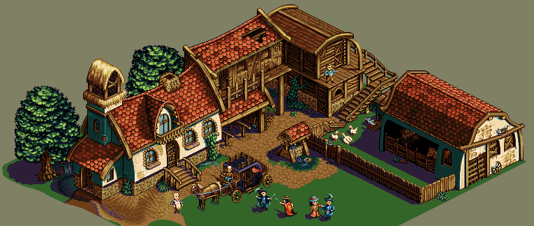 The work is for Pixeldam. Colours are 34 until now. |
Replies:
Posted By: thebiscy
Date Posted: 07 February 2009 at 6:44pm
| I like your style alot.. Not much that I could comment on.. |
Posted By: jalonso
Date Posted: 07 February 2009 at 6:50pm
|
I expect nothing but the best from you!!! This does not disappoint! I will however question the saturation of the 2 blue shades of the shadow side of the buildings. I think the red of the tiles would throw the shade colors into the purples not the blues :\ EDIT: Maybe swap the purples from the carriage with the shadow colors? ------------- |
Posted By: Keeper-of-Styx
Date Posted: 07 February 2009 at 6:58pm
| Wow! That is certainly impressive. |
Posted By: Ricki
Date Posted: 08 February 2009 at 5:00am
|
This is absolutely awesome. Really superb work. Your typical style .. I love this. You have reserved place between my favorites. Sure. |
Posted By: Evilagram
Date Posted: 08 February 2009 at 5:16am
|
Beautiful. Now the grass could use some texture. |
Posted By: zi-double
Date Posted: 09 February 2009 at 6:25am
|
Jal maybe now is better - yep blue was very cold ... also change 2 colours for green, because was also very cold. They come from shadows of the building and was good for green in the shadows, but for green in the sunny places going badly. Think now is better and with better contrast. Evilagram I plan don't have many places with grass. Here start in right corner and plan don't make like texture because will have clear view of the details and shadows. 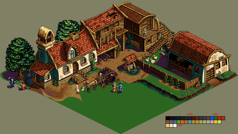 Also here is some small idea for animation :) 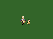 |
Posted By: Fatalis67
Date Posted: 09 February 2009 at 8:36am
| The carriage definitely needs a shadow, and maybe some tracks so it doesn't look like it was built in that spot. |
Posted By: linx
Date Posted: 09 February 2009 at 8:42am
|
Hey i think the different shading on the dirt looks weird but maybe its just me
http://imageshack.us">
  |
Posted By: zi-double
Date Posted: 11 February 2009 at 5:46am
|
yes yes Fatalis67, but I'm not shure where he will be :( linx I think to make some path between main entrance and left door, but first must add all big parts :( Also that empty soil in 2 places is disgusting. I'll think to fill with something interesting :) Here make large repairs of one old building which never be finished. I think tavern is good fill of big empty place in the center. Of course need more work everywhere, but I'm glad that will finish work :) I'm not 100% shure that gipsy is from this epoch, but before many many years I see peoples like that, also they lead and bears, but I'm not plan bear in the moment :) 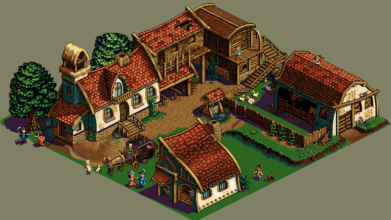 |
Posted By: Hapiel
Date Posted: 11 February 2009 at 6:20am
|
I like the new building, but the focus is now gone on the carriage. I suggest you put it outside of the building ground (streets) next to the pace where now the man with the monkey is. You could move the monkey to the place where the carriage is now. ------------- |
Posted By: zi-double
Date Posted: 14 February 2009 at 8:03am
hm Lollige maybe you are right, but I will focus scenes in right and in left sides from the building. Than maybe will keep eyes everywhere. I'm not shure, but will try, because think that carriage now have place inside /between two building - front and back/ to make manoeuvre. That is because passengers must go to the door of the Inn.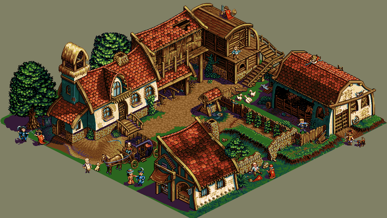 |
Posted By: Hapiel
Date Posted: 14 February 2009 at 8:33am
|
If you want it that realistic, its wrong again ;). Since there is now only one way in large enough for the carriage, he has to make a turn at the open spot in the middle. Which is hardly possible with a carriage like that ;) Anyway, I really like the progress on this! ------------- |
Posted By: zi-double
Date Posted: 24 February 2009 at 4:13am
|
Something between realistic and fantasy Lollige :) Because I never should build so small buildings. They are so biggest like carriage - I don't want to live there hehehe ok here is /I hope/ near to the end ... repair many areas, must fill some empty places, but ... Else I'm afraid to make some animations which I plan because too many characters and elements are in motion in the work, but maybe only for my pleasure will make some. Change many colours for better contrast. Maybe now ramp between green /for grass/, brown /for earth/ and purple /for shadows/ is better. PS I'm afraid for purple smoke because haven't grey palette. Play too much with him and if he isn't very poor will keep fire :)  |
Posted By: Hapiel
Date Posted: 24 February 2009 at 4:40am
|
Zi, you have once again produced something beautiful!
------------- |
Posted By: Slemsvamp.
Date Posted: 24 February 2009 at 7:51am
|
How the H could I miss this? Beautiful! Anyway I'm not the guy to crit any of your work. Good luck! |
Posted By: Riboflavin
Date Posted: 24 February 2009 at 9:15pm
| I don't really have the technical wisdom to critique this, but I must say, it is a huge inspiration to me. I'm really loving all the little details- they pretty much make the whole scene for me. |
Posted By: Souly
Date Posted: 24 February 2009 at 9:40pm
|
Hey Zi, looking sweet dude. The shingles. <3 I like the sniper on the roof. His sights are totally on the musketeer with the women. Dame:"Honey, I'm pregnant!" Musketeer:"I'm going to be a father! :D" Sniper:"Not anymore bitch" Anyways enough of useless newground quotes. My only crit is you forgot the old guys shadow. That is all, remarkable work. Do you use promotion? ------------- 
I am the jesus of PJ. |
Posted By: zi-double
Date Posted: 25 February 2009 at 2:15am
|
Lollige I hope to be better from previous else if haven't progress poor :) Slemsvamp., Riboflavin thanks :) hehehe Souly that for sniper was nice hahaha yep this is connection between right and left part, because all other scenes are in small regions. I'm not forgot that shadow - here is :) No I use only Photoshop, else try before year promotion and have some easy and good facilitation, with them easy can make one work to be nice PA and I see many such works in the inet, but maybe I'm too hard-core. Also majority of the peoples which works are inspiration for me don't use promotion. If the works was for commersial purpose..., but that is another question :) This is only my vision. The main question is with or without animations. Be shure that I can't animate all, but can try some specifically places to make cyclic animation and to keep size of the file near to 100kb. 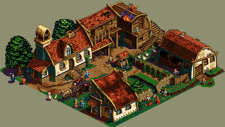 |
Posted By: TheInquisitor
Date Posted: 25 February 2009 at 6:10am
|
It's pretty good. Infact, it's astronomically good! It's a great little scene with a perfect colour palette. I love how you manage to get such visible poses and uniquness into each little person with such a limited amount of colours and pixel space. The mind boggles. Edit: I commented on this on Pixelation as well. That just goes to show how impressed I am by this piece. :P |
Posted By: Keeper-of-Styx
Date Posted: 26 February 2009 at 4:47am
|
Once again, another amazing update. Really nice work Zi. Nice colors, shading, everything. |
Posted By: zi-double
Date Posted: 29 December 2010 at 6:10pm
|
near to 2yearс later want to finish that work ... a bit late but want to finish with that work Reduce colours from 34 to 31 Make some small changes of the colours Clear many areas and make them with clear view Add some small details  Here just put difference between old and new changes. Else general view will be different and will make many small fun animations. If haven't big remark soon will add some animations. I dislike area with fire, but this area is very empty ... in exactly dislike smoke, but try with my colours some different and this is best result from me :( Two white birds on the roof must be herring-gull, but haven't grey and they look not very well. |
Posted By: ChrisButton
Date Posted: 29 December 2010 at 10:47pm
|
I like the vibrant colors of this piece. |
Posted By: Finoli
Date Posted: 29 December 2010 at 11:23pm
|
I think the smoke should be more grey Otherwise I can't think of any possible improvement |
Posted By: cele1989
Date Posted: 30 December 2010 at 7:36am
| this piece is just WOW! |
Posted By: jalonso
Date Posted: 30 December 2010 at 1:43pm
|
Fantastic new details. Its all looking so good. Very nice to see this scene didn't die. My only crit is that maybe since tree and ground shadows lean to purple but roofs lean to reds/browns so maybe a little purple in roof shadows would help tie things up. ------------- |
Posted By: zi-double
Date Posted: 30 December 2010 at 1:43pm
|
Thanks for comments :) Some animations ... some new, some old, but plan to make more for funny view :) Don't plan to make walking characters, because want to keep size of the file, but will try to make some areas with animated scenes and to keep bunch between characters. until now my favourite is the mouse :)  Oops until I post Jal was write :) Yep for me maybe also scene have too much red and need a bit purple over the roofs, because shadows on the ground and over the roofs have very different view now. Trees again need some purple ... I will try maybe to do something, but not promise because must repair too much areas. Else thanks for suggestion Jal fully agreed ! |
Posted By: zi-double
Date Posted: 30 December 2010 at 4:31pm
Jal are you think that need more purple over the roofs. You use more "hard"shadows, but I'm not shure in this case need more purple or not. I'm not repair all roof areas, but just test. |
Posted By: jalonso
Date Posted: 30 December 2010 at 4:36pm
|
Yes! some purple really makes a big difference. Terrific.
------------- |
Posted By: zi-double
Date Posted: 03 January 2011 at 5:31pm
One new horse ... I don't know 1st or 2nd variant is better or maybe saddle must be a bit in back. ... and just some small update of the animations ... Be shure that animation of the man which stand on the wooden building /near to the fire/ is very simply, but you will see why :) Also add some red/brown in the shadows to keep tie between shadows/green/roofs.  PS I like monkeys, but sometimes you have to aim at them  |
Posted By: JaumeAlcazo
Date Posted: 05 January 2011 at 5:34am
| Totally awesome art!! |
Posted By: jalonso
Date Posted: 05 January 2011 at 8:55am
|
The level of detail and all of the individual animations and mini-scenes within the scene are amazing and make this a most entertaining scene. I just love it!!! However, the top roof areas where the fire and the 2 birds sit on the roof are too static right now. If you don't wish to animate the fire, for example. Perhaps one of those 2 birds should flap their wings. Or some bats could be flying inside the hole in the roof. Seems like something should be animated in that general top area. ------------- |
Posted By: zi-double
Date Posted: 05 January 2011 at 9:23am
Just play with horse a bit more ... I think now is finished ... change colours, add more details and move saddle maybe in correctly place. With this horse easy can understand why I dislike colours of the big scene, but now is very late to change them all :( Also play a bit with one new character maybe for next work ... I think the puma is finished.  Thanks JaumeAlcazo. aaa Jal thanks for suggestion about the bat :) Else yep agreed that 2 birds need to move because area is very static. If make animation on the fire than must animate and smoke. For smoke I haven't grey or some better colurs and think that will be poor choice. Also if make animation ot the fire and the smoke than must animate and man who is over the roof, but his motion can't have loop animation /or I haven't idea/. With that 3 animation the file will grow up too much and when somebody look his first look will be on the fire because motion will be without interruption. Part with gooses now is finished and you will understand why man near to the fire haven't interest to extinguish fire :)  |
Posted By: jalonso
Date Posted: 05 January 2011 at 9:27am
|
Originally posted by zi-double ...yep agreed that 2 birds need to move because area is very static... I think that's the best and simplest solution. I could see why fire is not animated which is why I thought of the birds or adding bats or some other 'loopable' animation up there :) ------------- |
Posted By: zi-double
Date Posted: 06 January 2011 at 2:16pm
 Today - new day - new small animations near to the fire in upper direction. A bit fantastic, but I can't see reason why the bat will fly.  Jal I explain to someone else if not understood why I don't want to animated fire :) You said what I thought and I realized that this is correct. Best thing is that I see the end of work soon. Hesitate whether to do a few animations that I have an idea. Мust be completed and the trees with more purple. |
Posted By: jalonso
Date Posted: 06 January 2011 at 4:39pm
|
I always clearly understood that any animation needed a good loop in this piece ;) I think its great and any more is not needed. The preview is great! Iso done right is awesome and my favorite kind of pixelart. I could look at this for hours. *Only thing I don't like is the background* ------------- |
Posted By: PixelEtsu
Date Posted: 06 January 2011 at 5:19pm
|
This is the best animation work ive never saw :O Congratulations dude. i love how you make everything move at same time o.o |
Posted By: H|F
Date Posted: 06 January 2011 at 7:33pm
|
This is so awesome! I love how alive this is! one of the best I have ever seen.
BUT I must ask.... so much going on and people/things moving but the flames don't? Is there a reason? Are you still working on it?
|
Posted By: jalonso
Date Posted: 06 January 2011 at 7:46pm
|
@ member_profile.asp?PF=30069&FID=8 - H|F
, I'm going to answer for zi because he is Bulgarian and sometimes has difficulty expressing himself in English. In pixelart this style animation is a technique that arises from gif animation of early computer days. The main theory is to animate only the items that 'loop' seamlessly with minimal frames. In this case animating the fire would mean animating the smoke too and the 'loop' would stand out. Notice other things not animated for this reason. I personally think in this example maybe too many things are animated and thus the viewer's mind wants more. I would have done less animated details to merely suggest the action in the piece without crossing the line. I can imagine this will keep coming up...poor zi  ------------- |
Posted By: H|F
Date Posted: 06 January 2011 at 8:20pm
| Ok I knew that there was a reason! Thanks for clearing that up! |
Posted By: wenruto
Date Posted: 07 January 2011 at 3:22pm
|
I Love this it's so inspiring, marvelous, and very atmospheric... Now iwanna try animating hehe :P ... ------------- Earn free stuff by searching like Google http://swagbucks.com/refer/wendy"> 
|