Tagger
Printed From: Pixel Joint
Category: Pixel Art
Forum Name: WIP (Work In Progress)
Forum Discription: Get crits and comments on your pixel WIPs and other art too!
URL: https://pixeljoint.com/forum/forum_posts.asp?TID=7968
Printed Date: 23 October 2025 at 12:59am
Topic: Tagger
Posted By: Keeper-of-Styx
Subject: Tagger
Date Posted: 27 February 2009 at 5:23pm
|
Hello, here for yet another piece of pixel art. This is my tagger. For once this is an idea that popped into my head, instead of using reference for an idea. As you can tell lighting is not done yet, thinking top right have a lamp but not seen? On the brick wall there will be some graffiti. The side walk will have some trash to make it less plain. 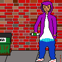 |
Replies:
Posted By: TMH
Date Posted: 27 February 2009 at 6:08pm
|
the bricks look kool. the jeand and shoes look kinda weird tho. the blue lines between his shirt and jeans dont make sence(im guessing there boxers but people who arnt Gs like you and me might not be able to tell) boxers dont usually go over your pants! im looking forward to see it shaded.
------------- |
Posted By: Keeper-of-Styx
Date Posted: 27 February 2009 at 6:23pm
|
Thank you. Yes they are supposed to be boxers. Forgot to add the pockets and belt loops lol, that may help. His pants are supposed to be quite baggy, but I wasn't sure how to do that, so I made rumples or tried to. The shirt is just really long on purpose. I may change the color of the shirt and put a logo on it. |
Posted By: TMH
Date Posted: 27 February 2009 at 6:33pm
|
i think you need to have the jeans wider near the bottem if you want hem really baggy.. i might do an edit edit: i made an edit for the jeans and boxers!  added shirt added shirt  ------------- |
Posted By: Keeper-of-Styx
Date Posted: 27 February 2009 at 9:33pm
|
Uh thanks, those pants look really cool. Very nice, not sure how did all of that quickly. Though one comment is that they almost look like a cowboy. Edit: I made them a bit larger at the feet. Though I feel something needs to be done with the jacket but I do not know what. 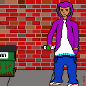 ------> ------> 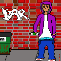 |
Posted By: TMH
Date Posted: 28 February 2009 at 6:59am
|
yea. another thing that i might want to comment on it the way the shoes are facing. it might hurt a bit to have both your feet twisted the same way. i think that the right one should be facing the audience?
------------- |
Posted By: cure
Date Posted: 28 February 2009 at 2:00pm
|
I thought I already commented on this. Odd. The bricks should be a uniform shape. The black outlines used throughout the piece (especially on the interior objects) hurt the look a lot. The arm on our left is bent odd, if that's supposed to be an elbow, then it's too far down. The colors are too saturated, in my opinion, and you could really use some shading. Facial anatomy and details could use a lot of work. The hand on our right looks awkward, perhaps try drawing the entire hand in a natural, relaxed position. Neck is too slender. And I echo TMH's concern about the positioning of the feet. ------------- |
Posted By: Keeper-of-Styx
Date Posted: 28 February 2009 at 4:19pm
|
I actually looked up a brick wall and it was full of different sized bricks, so I figured I would do that. I will work on the arm,foot, and neck. Do you mean re-draw the whole right arm? Because the right hand is inside the jacket pocket(or do you mean his right?) I figured I would get structure and everything done then do shading and such. Edit: Not much change but here ya go 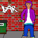 edit to omit black lines on tagger-> edit to omit black lines on tagger->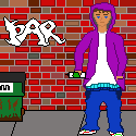 |
Posted By: Keeper-of-Styx
Date Posted: 05 March 2009 at 1:56am
|
How would I shade as if there are folds are in the pants, since they are baggy? Edit: Referring to the tag Kind of boring... 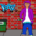 |