my first pixel building WIP
Printed From: Pixel Joint
Category: Pixel Art
Forum Name: WIP (Work In Progress)
Forum Discription: Get crits and comments on your pixel WIPs and other art too!
URL: https://pixeljoint.com/forum/forum_posts.asp?TID=8462
Printed Date: 10 June 2026 at 3:43am
Topic: my first pixel building WIP
Posted By: wenruto
Subject: my first pixel building WIP
Date Posted: 30 May 2009 at 7:23pm
|
can anyone help me with that picture i don't know what to do else plz help me edit it. that's What it looks like  |
Replies:
Posted By: Lizard
Date Posted: 31 May 2009 at 7:17am
|
GRAAAHHH!!!!! .JPG!!!! N..no... its.... its k.....killing...me.... |
Posted By: jalonso
Date Posted: 31 May 2009 at 8:55am
|
Please save your art as a gif or png8 file and post that. jpegs and pixelart do not work together.
------------- |
Posted By: wenruto
Date Posted: 03 June 2009 at 5:36pm
my pc was giving me problem so there it is again in png this time i think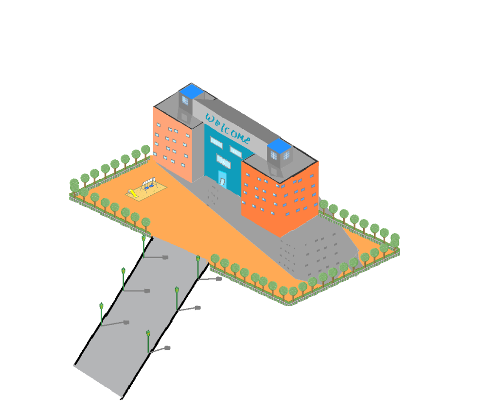
|
Posted By: smk
Date Posted: 04 June 2009 at 1:44am
|
Though there's nothing wrong with fooling around with perspectives, I'd advise you to try doing your first pixel buidings in ISO. At the moment your work looks pretty much horrible, no offence. The windows aren't in perspective, your light source makes it seem like you have two suns. Also I have no idea why you have dark spots in the shadow for windows. The trees are ok, but feel a tad flat. Also, at the moment it looks like the road is coming from way below the yard of the hotel(?). I really like the playground though, even though you forgot to remove the whites. Iso(metric) tutorials: http://www.idigitalemotion.com/tutorials/guest/pixel/pixel.html http://www.drububu.com/tutorial/index.html Iso shadow tutorial(basic): http://www.idigitalemotion.com/tutorials/guest/cube/cube.html Also, study these lines, they're important for your first iso piece. Straight lines are very important in buildings, especially in iso pieces.  Your piece has potential, now get back to work! (: |
Posted By: wenruto
Date Posted: 04 June 2009 at 11:39am
| Ok thanks i ll do those and thx for the link |
Posted By: wenruto
Date Posted: 04 June 2009 at 8:12pm
i made a lil arrangement on it because my pc is old now and keep on shutting down ok okand how should i do the road so that it does not look like its coming from way below. http://i602.photobucket.com/albums/tt107/wenruto/FIRSTSCHOOL2.png 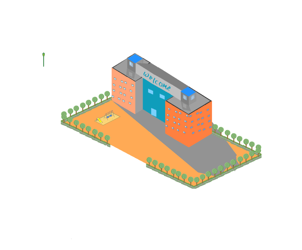
|
Posted By: smk
Date Posted: 05 June 2009 at 12:58am
 Thing to think about: A: The grassland FOLDS?!?! B: Light source should affect the shading of the walls. (Farther away from the sun, darker) C: Symmetric windows D: Shadows / light source (I'd advise trying something more from the left, you can play around with how long the shadow are by making the sun lower or higher) E: You should try shading the trees into more round shapes. Also, LINES LINES LINES. You need to work on them, you should redo most of the lines in this piece. Also you saved it again into a strange file format as it has a lot of pixels that shouldn't be there, or you used a technique that isn't allowed in pixel art. Save in PNG if you know what you're doing, or easier would be just to save in GIF. I would also like to see some humanoids around the grounds ;3 Hope that helps :) |
Posted By: A.B. Lazer
Date Posted: 05 June 2009 at 2:36am
| If your PC is shutting down, better backup all your files that you can't find on Internet (texts you written, photos you made etc.) as soon as possible, or it will be too late. |
Posted By: wenruto
Date Posted: 05 June 2009 at 11:56am
|
@ smk I'll do those and thnx it helped a lot
 @ A.B Lazer i started to do a 4 mins sprite movie and i wanted to take all the work i did ( pictures sound effects) and all that but it's going to take a long time for me to take all of those back now i have to work on that pixel pic thanx again |
Posted By: wenruto
Date Posted: 05 June 2009 at 3:59pm
|
there i made some arrangement and i am still working on the windows no more thing to do ?  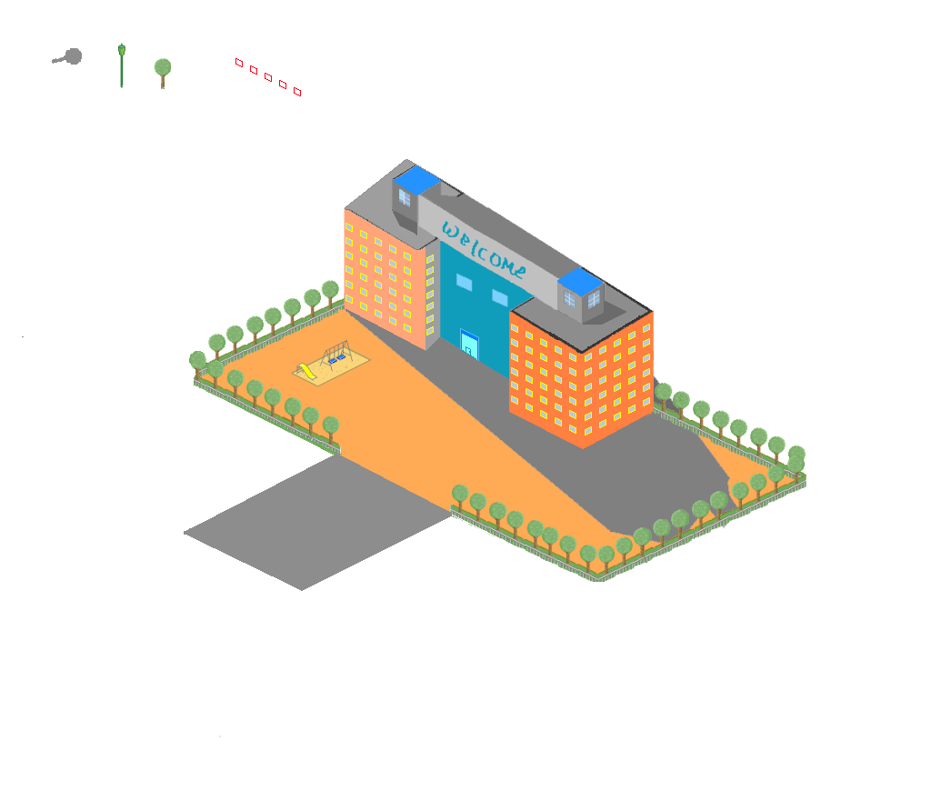 |
Posted By: Pumpkinbot
Date Posted: 05 June 2009 at 5:15pm
| Wow, it already looks a lot better. :D I'm no good at isometric, so I can't offer any advice, though. :/ |
Posted By: smk
Date Posted: 05 June 2009 at 5:38pm
| Your shadows go in three different directions :( |
Posted By: nomadic_cupcake
Date Posted: 05 June 2009 at 5:47pm
| the building is skewed upwards. once you fix that will should look a lot better. then there is the shadowbehind the building with the trees. you could take that one out. unless there is a rear potion it doesn't need to be there, but it does look much, much better all ready. |
Posted By: wenruto
Date Posted: 06 June 2009 at 6:55am
thank you guys
|
Posted By: wenruto
Date Posted: 06 June 2009 at 1:24pm
I made some arrangements and i don't know what color i should give the shadows 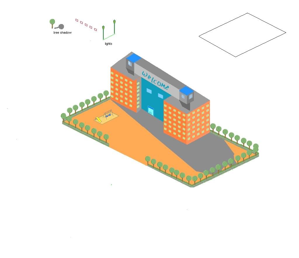 |
Posted By: Dr D
Date Posted: 08 June 2009 at 2:39pm
|
(Excuse the delayed response, I know you've moved on, but I've been working on my reply/edit for a bit, whilst having some trouble with it.) You're saving in .JPEG again, that's a big no-no. =[ (Or you're saving in .BMP, in which case photobucket is converting it to .JPEG. Just use PNG, you should be fine. =]) Well, I took some time to demonstrate some more fundamental issues that you have. Allow me to scribble over your picture once more. 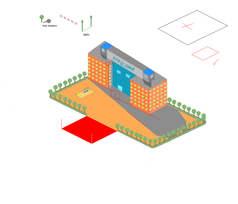 Right now, you have a lot of conflicting angles. They suggest different perspectives, or a lack of a solid perspective, thereof. (Or crappy architecture.) Your shadows still aren't fixed. They're all pointing in a similar direction, but not the same. You can fix this, simply by making sure the casting angles are the same, for your building, check the lines, since they're not organic. Like was mentioned before, your building is skewed. It's not fitting properly into the space. If you visualize it in 3D (which is always a good practice.) It would be jutting out of the park in the corner, although you can't actually see it, but the lines suggest it does. Related, both sections of your building aren't lining up either, and are at slightly different angles. Your windows are a leap of improvement from your first version, but are still not properly aligned. 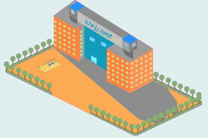 In this edit, I used a proper (to the best of my ability, I've never done iso before) isometric perspective, and after properly constructing I also modified and added a few things that I would think would add a little interest. Such as, a parking lot, rails and border on the roof, walkways, etc. You can use/study this base/edit if you'd like. You can see that everything is aligned. At this point of construction, it's all about the line work, and making sure the angles are correct. I really think you should work on them, make sure you get everything neat and tidy, and that everything is consistent. Before you think about adding any details, or other fundamentals, like shadows. Take each a step at a time, you'll be sure to improve. Your trees are still very flat, by the way. Show some highlights and shadows, and make sure they contrast, so they're visible. Oh and you don't have to succumb to jaggy lines. (Even without jpeggin' your pic!) I would advise you to research Anti-Aliasing. Apply a method like this to your pics, granted you do it in moderation, and they will be sure to be a lot more pleasant.  Long posts ftw. Hope I helped. =] And keep up the good work, looking forward to seeing you improve. |
Posted By: wenruto
Date Posted: 08 June 2009 at 5:26pm
|
wow so i need to do a lot of work on that piece your piece looks a lot better than mine and thnx it really helped i need to go to work on that, and since i am having trouble with that shadow i think i wont need it. too hard for a beginner |
Posted By: nomadic_cupcake
Date Posted: 08 June 2009 at 6:40pm
|
@ Dr. D: haha. thanks too. you taught me something. :) You should add shadows almost last so that you don't miss something you added later.
|
Posted By: Dr D
Date Posted: 08 June 2009 at 7:28pm
|
Glad I could help. Once you begin shading, of course you're going to have to account for natural darker areas, and drop shadows, too. But you can hold off on adding them until you have everything else right. We can help you make that decision if you keep showing your progress. If you aren't sure of something, just ask, before you do anything. |
Posted By: smk
Date Posted: 09 June 2009 at 4:07am
|
Nice explanation Dr D :)! |
Posted By: tripnfelt
Date Posted: 09 June 2009 at 10:12am
| what a useful edit. |
Posted By: wenruto
Date Posted: 09 June 2009 at 12:27pm
|
do i only have to work on the shadows or the building?
|
Posted By: smk
Date Posted: 09 June 2009 at 1:05pm
|
Sorry to say, but mostly everything. As Dr D explained, if the base lines are not right, it affects the whole piece, so you'll mostly need to start over :/ Don't throw your idea to waste though, you can make the exact same building, but just make it with better lines/perspective. But you definitely should (mostly) start from scratch. |
Posted By: wenruto
Date Posted: 09 June 2009 at 3:02pm
since it came to this i have started to make a new one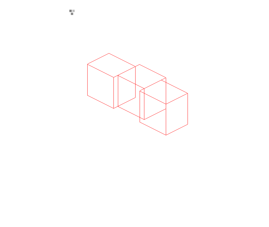 |
Posted By: Pumpkinbot
Date Posted: 09 June 2009 at 4:04pm
| That looks a lot better. :) Keep it up! |
Posted By: smk
Date Posted: 10 June 2009 at 12:41am
|
A lot better, keep it coming. The door at the lower center could though be nearer to the middle, unless you want it the way it is, that's fine. Also the doors on the roof could perhaps be a tad lower. |
Posted By: Hapiel
Date Posted: 10 June 2009 at 7:46am
Some quick notes: Those black blocks on top, their top lines are the same as the top lines of the building. This often does not look very nice, and is easy to avoid. Also, you can place the windows exactly in the middle of your building, I made an example on how to do that. Have a look! ------------- |
Posted By: wenruto
Date Posted: 10 June 2009 at 2:29pm
ok did what you said and i came up with that and the thing in the top is some kind of animated billboard electric that i am trying to make that |
Posted By: Hapiel
Date Posted: 10 June 2009 at 3:12pm
|
Please do post a still image next time. Now work on your lines. Noone likes red lines. In the worst case make 'm black, but I am sure you can think of something better than black!
------------- |
Posted By: wenruto
Date Posted: 10 June 2009 at 3:43pm
sorry about that 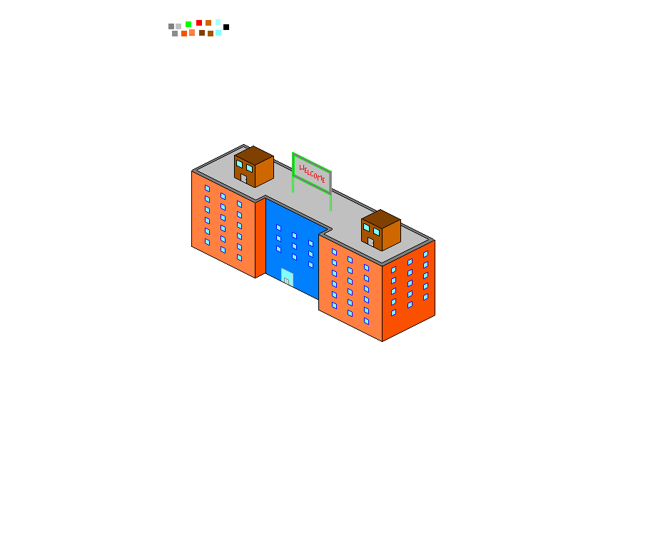 |
Posted By: Dr D
Date Posted: 10 June 2009 at 3:55pm
| Oh, and decrease your canvas size so the posts don't become massive. (Although most of them already are.) |
Posted By: Igthorn
Date Posted: 12 June 2009 at 3:09am
|
This could be turned into a useful tutorial - I am enjoying it and I've already learned some new things. Keep it up please. |
Posted By: wenruto
Date Posted: 12 June 2009 at 10:17am
i worked on it yesterday and i am on this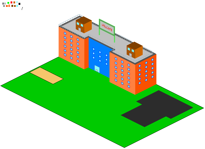 |
Posted By: Tentenn
Date Posted: 12 June 2009 at 12:01pm
| The first thing I notice is the rail on the roof. It is on the left side different placed than on the right side, but maybe you did that intentionally.? |
Posted By: monotov
Date Posted: 12 June 2009 at 1:00pm
|
Originally posted by Tentenn The first thing I notice is the rail on the roof. It is on the left side different placed than on the right side, but maybe you did that intentionally.? Perhaps a subliminal message? |
Posted By: wenruto
Date Posted: 12 June 2009 at 1:50pm
| other than that? |
Posted By: cure
Date Posted: 13 June 2009 at 12:59pm
|
i assume the colors are stand-ins, pretty garish if not. the "welcome" on the sign isn't in iso, front door isn't centered. personally i'd just remove the sign on the roof altogether, i don't think it's adding to the piece. not much else to say as it's just brightly colored boxes right now. once details, textures, and other objects are added it'll be easier to crit. |
Posted By: wenruto
Date Posted: 20 June 2009 at 2:36pm
i know i took some time with that but i came up with that for now because i am working on other pieces
 |
Posted By: FrostedMayhem
Date Posted: 21 June 2009 at 4:32am
|
Try putting the grass and road in perspective with the rest of the building, as at moment it looks like it is situated on a slope and it looks kinda weird. Unless that is what you intended...
EDIT: You had it in perspective a couple of posts back, so I guess you did intend for it to be on a slope. My bad.
|
Posted By: cure
Date Posted: 21 June 2009 at 5:16am
| what's with this newest image? it went straight downhill, the perspective isn't even right. i'd recommend you focus on one project right now. |
Posted By: wenruto
Date Posted: 23 June 2009 at 5:49pm
i took away that line and i fix some problems that i had before
 |
Posted By: AngelOTG
Date Posted: 23 June 2009 at 6:36pm
| The railing on the roof goes off it's usual track in one spot (the corner just to the left of the box on the roof on the right). |
Posted By: wenruto
Date Posted: 30 June 2009 at 3:38pm
is there anything I could fix because i think i am done and ready to post it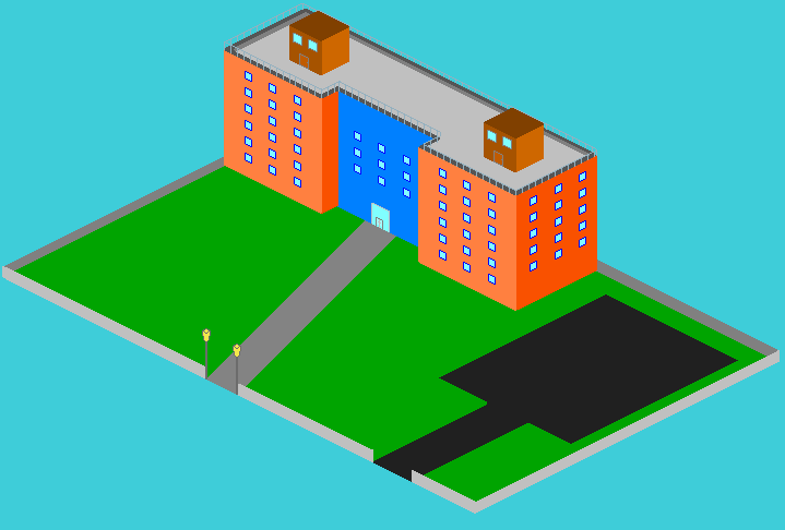 |
Posted By: AngelOTG
Date Posted: 30 June 2009 at 4:54pm
|
There are many things to fix: THE RAILING IS NOT CONSISTENT. Sorry, but you've been ignoring that point and it should really be fixed. D: I'd also suggest dropping the saturation on everything. The black and grays are the only tones that don't blind me. :P Also:
|
Posted By: wenruto
Date Posted: 30 June 2009 at 6:50pm
| thanks a lot Angel of the Great i am going to those |
Posted By: Dr D
Date Posted: 30 June 2009 at 8:59pm
|
You could do so much more, you've come a long way since your first version, and I'm proud of you, but you have a long way to go and a lot to learn. Currently, it looks more like a flat-shaded construction for a piece, than a piece that is even close to being finished itself. You need detail on everything. You don't have to make it realistic, if you don't want to, but even simplistic styles have a decent amount of detail. In fact, I'd say it's the unique rendering of the important details in simplistic styles that makes them work. Like Angel said, you should probably try out adding some textures (first) and shadows (after) to the piece. Don't worry if you do horrible, we'll help you along. Just keep in mind your lightsource (choose one if you haven't already) and shade accordingly. I think you should try to apply some texture/detail to pretty much everything, give the cement/asphalt some cracks, show some of the roughness, perhaps, the erosion that has taken place. Maybe you want to add markings to show where to drive/park/walk, and curbs. Show some of the wear and tear on the building, as well. Again, cracks and stains work wonders. But you could also decorate it, pipes running down the sides of the wall. Perhaps you need to change the design to a little bit more something intricate, if you feel you are ready enough for that. Most buildings, such as schools are a little more than perfect boxes attached to each other, just look up some references if you need refreshing. And everything else, a lot of greenery actually never hurt anyone, make some trees, flowers, and bushes, etc. to decorate the outside of the school. Some parked cars, and students walking/conversing/doing whatever. Make the scene come to life. You could also try out some of that AA I was telling you about (once you're done doing everything else.) |
Posted By: wenruto
Date Posted: 01 July 2009 at 3:05pm
|
Thank you I was working on it this morning and i still need other objects to create like a ceiling glass to put on top of the building to replace the boxes i have texture to add for the grass and other stuff, and the green thing in the wall is some kind of plant running on the wall here's the work 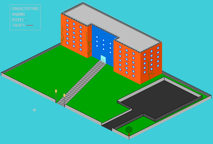 |
Posted By: wenruto
Date Posted: 05 July 2009 at 1:03pm
I edit it and i don't know if the grass is ok the way i did it, if not show me how plz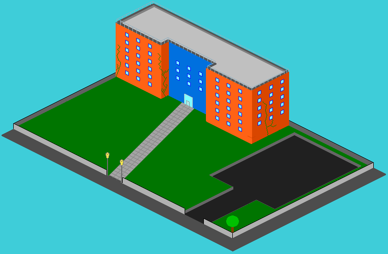 ------------- Earn free stuff by searching like Google http://swagbucks.com/refer/wendy"> 
|
Posted By: wenruto
Date Posted: 13 July 2009 at 12:31pm
|
I added some people and bushes ( Are the bushes correct like they are ?) And do you usually need to have shadows to pixel art and can mine stay with out shadows ? because i am really bad at adding shadows here's my work plz help me 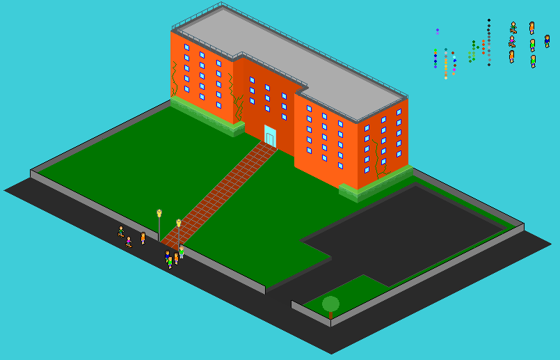 ------------- Earn free stuff by searching like Google http://swagbucks.com/refer/wendy">
|
Posted By: cure
Date Posted: 13 July 2009 at 1:32pm
| your palette is extremely saturated right now, especially the orange building. desaturate the oranges. where is your lightsource? And unless this building is on an alien planet where 8 suns light the sky, then yes, you need shadows. the tree needs work (a ball and a stick?), google images of trees. the last three tiles of the sidewalk are a different length than the rest. the door is off center. why don't the bushes wrap around both sides of the building? dithering the grass creates one color at 1x, so all it accomplished was looking like one color but taking two to do it. try a real grass texture. the stiff, inorganic lines of the vines bother me a little, and i think details like vines should be saved for later on in the piece. not sure what's going on with the grey area where the grass meets the pavement. |
Posted By: wenruto
Date Posted: 12 August 2009 at 5:15pm
I was having trouble with my PC (troubleshooting) so since it's kinda fix now i want to finish that piece i am working on so can you guys help me with my grass tile because mine aint good here's what it looks like 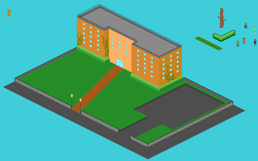 the shadow will be next ------------- Earn free stuff by searching like Google http://swagbucks.com/refer/wendy">
|
Posted By: Manupix
Date Posted: 13 August 2009 at 4:05am
|
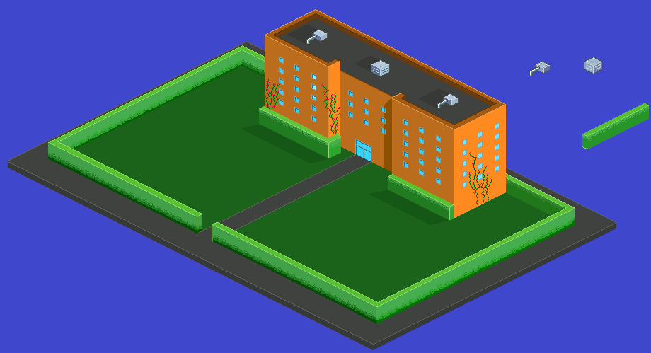
This has certainly come a long way! But there are still a number of issues, and grass is not so important at the moment. Grass tends to be boring anyway, I'm sure you'll find more interesting stuff to put in all that empty space. Your little grass tile is not bad by the way, it has volume. Speaking of empty space, I think it would look far better on a much smaller, but controlled, ground patch. Parking lots and grass, well, that's boring unless you fill them with stuff. There are still important shape, color and light issues. The central part of the building is not symmetrical: the door and windows are shifted to the left. Because the right aisle is hiding a bit of the central wall, what you see as the middle of this wall is not the middle! Also, why are there only 3 rows of windows? There is room for one more at the top. But a more interesting possibility would be to reduce the height of that central part, by 1 story. That would make the bldg more interesting. The horiz space between windows changes randomly (15, 16 or 17 pxs), it's enough to give an uneasy feeling. I don't like so much that there are the same n° and spacing of windows on the narrower right side. Get them closer? have 5x4 on the front sides? Make the aisles square? Windows and door are completely flat: give them some depth. Windows are also very small, but this might be the architects choice ;-) The railing is still not good, far too uneven, and I think it was better in a light color. First, you should check the low roof wall it is supposed to be set on. It is itself far from uniform. Then put the railing posts along the middle of this wall, not at the edge, and space them regularly. You have to calculate the interval before, to make sure it comes OK at the angles! There might be some detail on that roof too. Your former boxes were not very good, too big, but think of smaller ones, with a technical look: elevator shelter, as well as chimneys, pipes, air con, tv. The building would look better if it was not exactly on the grounds corner. The hedges would look better if they were a little apart from the building. And check the hedge corners, you have problems keeping corners iso. Vines are a distraction. The outside grounds wall has no thickness. The alleyway has a problem. I guess it is tiled with square tiles, but since the alley is sideways, the short lines should not follow the 2x1 iso persp. Try 3x1 or 4x1. Lamp posts: one is inside, one is outside. Shading/color: There's not enough contrast between the lit and unlit sides; also make sure to shift saturation and hue on the darker sides, not just lightness. If the central part is deliberately of a different color, make it really different! Think architect! No pure greys, please... Why not make the outside wall bricks? Why are the inner sides out the outside wall darker than the outer sides, regardless of light? Grass and hedges are much too green. And, if you want to give real depth and light: things cast shadows. Choose a direction light comes from (left side, 45° is an easy one to start with), and put these shadows in. On the walls, roof, ground, hedges. Keep going! |
Posted By: minipuck
Date Posted: 13 August 2009 at 6:15am
i'd fix the driveway/walking path to the door.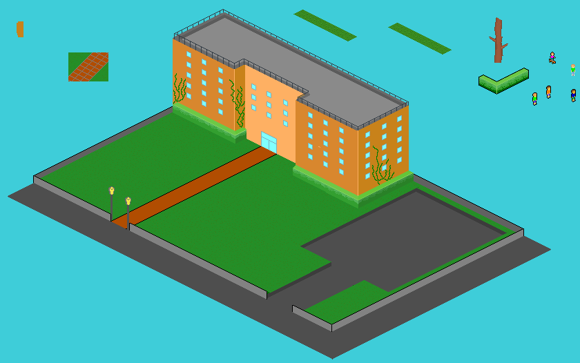 ------------- http://dragcave.net/viewdragon/G3eW"> 
please click it, otherwise it will die, and it seems special. |
Posted By: wenruto
Date Posted: 21 August 2009 at 6:31pm
|
Thank you guys for taking your time to help me TNHX
------------- Earn free stuff by searching like Google http://swagbucks.com/refer/wendy">
|
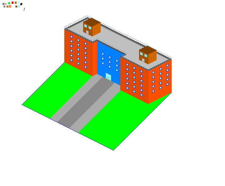
Posted By: wenruto
Date Posted: 21 October 2009 at 5:48pm
I've done some work but i was waiting for my soccer season to close to finish it and since i am new to those kind of techniques i dunno if i am doin the right thing here and i really appreciate you comments and there are still stuff to do especially the shadows ;( i have to work on so this is where i am so far =) 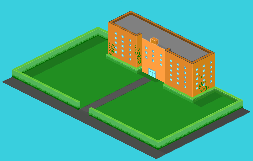
------------- Earn free stuff by searching like Google http://swagbucks.com/refer/wendy">
|
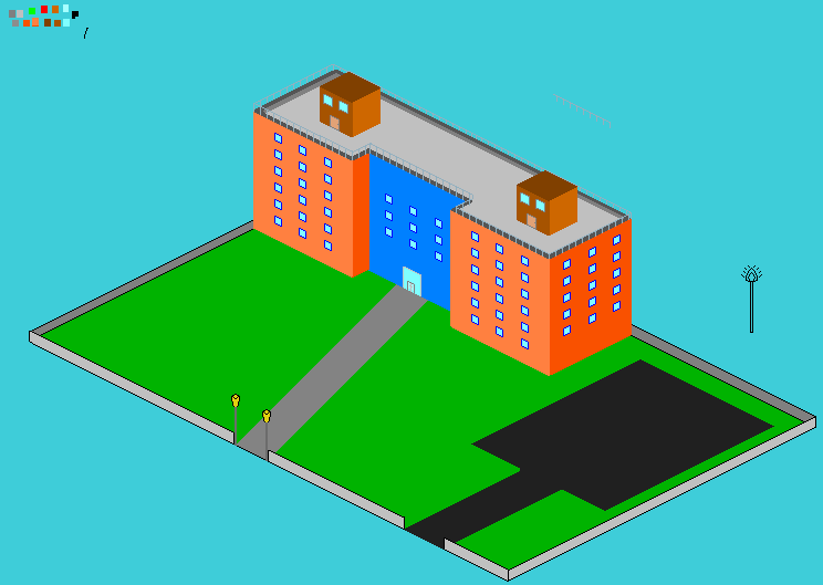
Posted By: wenruto
Date Posted: 17 November 2009 at 7:05pm
CAN ANYONE HELP ME WIT MY SHADOWS PLEASE???
 ------------- Earn free stuff by searching like Google http://swagbucks.com/refer/wendy">
|
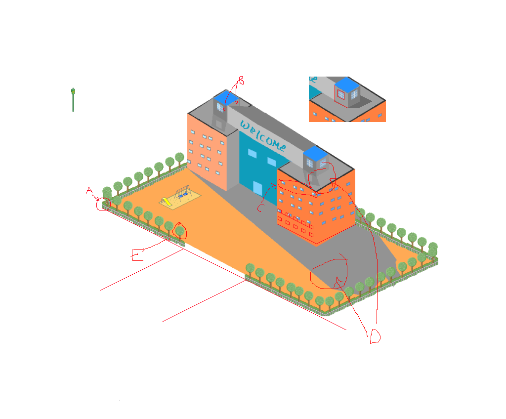
Posted By: Club Beuker
Date Posted: 18 November 2009 at 2:06am
|
Your shadows look weird because your shading is off. How can the middle part off the left side of the building be lighter than the same side of the "wings". The shadow of the building suggests that the light comes from the back (top in the pic) while the shading of your windows suggests it comes from no direction at all. The shadnig on the building suggests your light comes from the bottom left. Make up your mind here! I'll try to make a quick edit for you that shows how you should properly shade. ------------- Without me, it's just aweso |
Posted By: Club Beuker
Date Posted: 18 November 2009 at 2:24am
Very very quick n dirty edit: btw I counted 52 colors ------------- Without me, it's just aweso |
Posted By: Walrus
Date Posted: 18 November 2009 at 7:06am
|
there is a perspective problem i found in the right corner of the bush-wall.
i dont know what caused the problem or how to solve it though. 
|
Posted By: Hatch
Date Posted: 18 November 2009 at 7:31am
|
(left, right, back, and front in this post is relative to someone standing in front of the building, facing the road)
Don't go crazy with the dithering like that. Just use solid, flat shades. You've drawn your shadows as if they're being cast by completely flat structures, like billboards. If your light is coming from back-right, the shadows would be cast not just in front, but to the left as well. Currently it's like only your front faces are casting shadows. I would suggest making your light source coming from completely straight-on behind. You can follow the iso lines and your life will be much easier. Lastly, the hedge to the immediate right of the door is out of perspective. You need to learn to be more precise and careful. I don't know much about iso, but I do know you need to develop a bit of fussy nitpickiness about the SCIENCE behind it in order to be good at it. EDIT2: Actually, no, you'll need to lower the bottom of the hedge there and where it wraps around the bldg, I believe. I think this will also fix the perspective problem I pointed out above. ------------- |
Posted By: wenruto
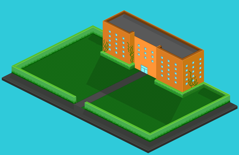
Date Posted: 11 December 2009 at 3:21pm
I Fix The Hedges and other stuff to do on the right side
 ------------- Earn free stuff by searching like Google http://swagbucks.com/refer/wendy">
|