WIP female base sprite (now with walk animation)
Printed From: Pixel Joint
Category: Pixel Art
Forum Name: WIP (Work In Progress)
Forum Discription: Get crits and comments on your pixel WIPs and other art too!
URL: https://pixeljoint.com/forum/forum_posts.asp?TID=8734
Printed Date: 15 April 2026 at 4:12pm
Topic: WIP female base sprite (now with walk animation)
Posted By: Lendrick
Subject: WIP female base sprite (now with walk animation)
Date Posted: 08 July 2009 at 8:09pm
|
So, I thought I might try my hand at some pixel art, and I decided I'd put together a base sprite. What I wanted was to get some C&C on the front view before I dive into the rest of it. Here it is: Any thoughts? In particular, I'd like to hear about: * Proportions * Head, face, and eyes * Pixel shading ...but any other comments would be appreciated as well. :) Thanks! Bart ------------- http://opengameart.org - http://opengameart.org Free, legal art for Open Source game projects. |
Replies:
Posted By: Psychotic_Carp
Date Posted: 08 July 2009 at 8:50pm
|
mostly looks pretty good to me add some nee caps and toes? -------------  got game? got game?
|
Posted By: cure
Date Posted: 08 July 2009 at 10:22pm
| legs are extremely wrong in comparison to the torso. legs could use more pronounced curves and more well-formed feet |
Posted By: Lendrick
Date Posted: 09 July 2009 at 8:26am
|
I've done some work on the legs (in progress) and also made the shading a bit more dramatic. I'll leave the feet for later. What do you guys think now? ------------- http://opengameart.org - http://opengameart.org Free, legal art for Open Source game projects. |
Posted By: Lendrick
Date Posted: 09 July 2009 at 7:09pm
|
Here it is. Thoughts? I'm not sure how to deal with the feet. ------------- http://opengameart.org - http://opengameart.org Free, legal art for Open Source game projects. |
Posted By: Psychotic_Carp
Date Posted: 09 July 2009 at 9:24pm
|
either leave it or just add a horizontal line one pixel from the outline -------------  got game? got game?
|
Posted By: Lendrick
Date Posted: 12 July 2009 at 12:47pm
|
How does this look? I tweaked the shading a bit in general, and especially around the feet. ------------- http://opengameart.org - http://opengameart.org Free, legal art for Open Source game projects. |
Posted By: Lendrick
Date Posted: 12 July 2009 at 3:04pm
|
...and in color, with redone hands. ------------- http://opengameart.org - http://opengameart.org Free, legal art for Open Source game projects. |
Posted By: Hatch
Date Posted: 12 July 2009 at 4:24pm
|
Looking good! :D
Here's a quick 'n' dirty anatomy edit: 
I'm most certainly NOT an expert when it comes to anatomy, but the hips/pelvis seemed way too high, which also made the thighs too long. Corrected that, as well as thickening up the neck and adding http://en.wikipedia.org/wiki/Clavicle - clavicles (very sloppily). You've got a lot of noisy, messy pixels sort of all over. It's making her look sort of, you know, mottled. I think I nice clean shading style would suit her well. Lastly, you've got quite a number of wasted colors that are used only for a handful of pixels (and I don't mean the blues for the eyes, which I understand and agree with). May want to clean up your palette a bit. I should point out that the edited frame in that gif anim uses only 16 colors versus your 31. ------------- |
Posted By: Lendrick
Date Posted: 12 July 2009 at 4:52pm
|
Shading needs t be cleaned up still, but I made some edits to based on your suggestions. Part of her shape is stylistic, but I think I may have gone a bit too far. Check this out. I moved her hips down a pixel and widened her neck and arms, and also made some tweaks to the hands and feet. ------------- http://opengameart.org - http://opengameart.org Free, legal art for Open Source game projects. |
Posted By: Lendrick
Date Posted: 12 July 2009 at 5:18pm
|
...And here she is with her legs shortened by three pixels and her feet moved inward a bit: ------------- http://opengameart.org - http://opengameart.org Free, legal art for Open Source game projects. |
Posted By: cure
Date Posted: 12 July 2009 at 5:22pm
| needs a lot more change than 3 pixels. legs are too fat in comparison to upper body, torso is too small, stance is very stiff and not feminine, and the shading right now is just noisy, block out areas with three basic shades to create volume first. |
Posted By: Lendrick
Date Posted: 12 July 2009 at 7:09pm
|
Here it is, re-shaded. Dividing it into three shades worked really well. I like the result. At this point, I'm satisfied with her general shape. I realize the hips are wide, but that's the look I want. As for her posture, this is pretty much just a reference image. My plan is to create some animations, including a natural standing pose, which I imagine will be pretty difficult to do. One other cool little note. This is all being done in greyscale, so I can change the skin gradient in photoshop to whatever I want. Check this out: ------------- http://opengameart.org - http://opengameart.org Free, legal art for Open Source game projects. |
Posted By: cure
Date Posted: 12 July 2009 at 8:18pm
|
there are way more than three shades there. i mean three browns: base, highlight, and shadow. use those three to block out areas in order to define volume and form (as it is currently rather flat). the updates aren't really addressing the underlying problems and thus the piece hasn't improved much. leg size/general anatomy still needs work. blob feet are temporary, i hope? |
Posted By: Lendrick
Date Posted: 12 July 2009 at 8:30pm
|
Also, holy crap, toes are hard! I think I'm done for the evening. :) ------------- http://opengameart.org - http://opengameart.org Free, legal art for Open Source game projects. |
Posted By: Lendrick
Date Posted: 12 July 2009 at 8:57pm
|
Originally posted by ThereIsNoCure there are way more than three shades there. i mean three browns: base, highlight, and shadow. use those three to block out areas in order to define volume and form (as it is currently rather flat). the updates aren't really addressing the underlying problems and thus the piece hasn't improved much. leg size/general anatomy still needs work. blob feet are temporary, i hope? Looks like we crossed posts. When I went back and re-shaded, I followed your suggestion of using three shades, then I filled in additional colors, since this isn't intended to be a low-spec sprite. I've made an attempt at improving the feet. The leg and torso size, however, I'm going to be obstinate about. If need be, I can re-do the shading again in three shades and post that here so you can see what my process is. As far as the body type goes, I'm aiming for something like in Ragnarok Online (note the wide hips and legs, and excuse the missing head):  ------------- http://opengameart.org - http://opengameart.org Free, legal art for Open Source game projects. |
Posted By: cure
Date Posted: 12 July 2009 at 11:19pm
|
it isn't about being low-spec, it's about creating volume with a simplified palette. yours still need planes created via shading and contrast between the shades of those planes. also, note the pose in the reference sprite you've shown. much more dynamic, much more depth, with more features exaggerated. As you've only exaggerated one proportion, it looks like bad anatomy rather than style. note how the reference sprite shades areas so that they recede back, or highlights them to make them pop out. yours is pillow-shaded, and pillow-shading is never good. |
Posted By: Psychotic_Carp
Date Posted: 13 July 2009 at 8:27pm

? -------------  got game? got game?
|
Posted By: cure
Date Posted: 13 July 2009 at 10:58pm
| there are at least twelve shades of brown. you still haven't isolated the planes. please explain in your updates what it is that you've changed |
Posted By: Dr D
Date Posted: 14 July 2009 at 12:21am
|
Did you notice that Psychotic Carp posted that last edit, not Lendrick? I much prefer the toes that Lendrick had, though, but it is a nice alternative when working with little space. That just kind of looks awkward to me, right now, though. And I do agree with everything TINC mentioned, it would be nice if you could post the 3-shade version. |
Posted By: cure
Date Posted: 14 July 2009 at 3:00am
| no i did not (I could barely even tell it was different from the last one). still applies either way so whatever. both take note. |
Posted By: Elk
Date Posted: 14 July 2009 at 3:54am
| Ohh I love gingerbreadmen! |
Posted By: Lendrick
Date Posted: 14 July 2009 at 6:08am
|
I'm in the process of re-working the pose at the moment. The reference pose isn't working for people, so I've got a more natural one now that I'm working on. I'll post it once I get it shaded with three tones. ------------- http://opengameart.org - http://opengameart.org Free, legal art for Open Source game projects. |
Posted By: Lendrick
Date Posted: 14 July 2009 at 9:57am
Here is is, with 3-level shading. I'll address the head later, if need be. (edit: minor tweak to shoulders) ------------- http://opengameart.org - http://opengameart.org Free, legal art for Open Source game projects. |
Posted By: NotlikeTheOther
Date Posted: 14 July 2009 at 10:16am
|
@Lendrick
I just want to say I really like the overall shape you have going, including the thicker thigh. It is more realistic than a "Paris Hilton" stick-figure wanna be. Kudos! ------------- Polly Pickle |
Posted By: cure
Date Posted: 14 July 2009 at 11:14am
|
draw in 2d, think in 3d. more contrast, be more bold. define more forms, don't stray away from the edges as much when you shade or highlight, makes it look pillow shaded (almost). quick edit:  |
Posted By: Lendrick
Date Posted: 14 July 2009 at 1:36pm
|
I see what you mean now -- your shading very clearly expresses shapes that the line art can't. The question, of course, is whether or not I have the skills to pull it off. I'll give it a shot tonight. ------------- http://opengameart.org - http://opengameart.org Free, legal art for Open Source game projects. |
Posted By: Lendrick
Date Posted: 14 July 2009 at 4:39pm
How's this? ------------- http://opengameart.org - http://opengameart.org Free, legal art for Open Source game projects. |
Posted By: Lendrick
Date Posted: 15 July 2009 at 7:13pm
Here's my first ever attempt at animation. I think I see some issues with it, but I'd rather get other peoples' opinions. Here it is: Thoughts? ------------- http://opengameart.org - http://opengameart.org Free, legal art for Open Source game projects. |
Posted By: Hatch
Date Posted: 15 July 2009 at 7:15pm
|
Her feet never leave the ground, which makes it look like she's shuffling along. I wish I had better critique, but animation is not one of my strong suits. Good luck. ------------- |
Posted By: Lendrick
Date Posted: 15 July 2009 at 7:51pm
Here, with her feet actually leaving the ground. Also, she was bouncing lower on the wrong frame, so I fixed that. I think it looks a bit more natural now, although her arms seem to be hugging her hips. edit: Tweaked the arms...  ------------- http://opengameart.org - http://opengameart.org Free, legal art for Open Source game projects. |
Posted By: cure
Date Posted: 15 July 2009 at 9:02pm
|
the feet need to be farther apart when taking steps, right now she's taking baby steps. you need more dramatic leg movement between frames, especially because the upper body is moving so much. her arms do indeed seem to be hugging her hips, try letting them swing freely. |
Posted By: Dr D
Date Posted: 15 July 2009 at 9:46pm
|
She's got huge hips, and a small shoulder width, so her arms seem to kind of intersect her hips, if they were hanging straight down. That's why you're getting that 'hugging' effect. It's going to be a bit more difficult than it should to get a loose, comfortable swing without having the arms rub up on the hips too much. They're going have to be doing some work on their own. |
Posted By: cure
Date Posted: 16 July 2009 at 7:35am
| even so, the arms kind of cling to the hips more than they should. there isn't much room to make them swing freely given the anatomy, quite true, but I think there's a little, though I'm not sure how well it'll turn out. if not i guess she could carry something |
Posted By: Lendrick
Date Posted: 16 July 2009 at 11:25am
Here's a *very* rough edit, with some tweaks to the motion, and also a slower frame rate. I'll clean it up later when I have time, but, in the meantime, does it look a little more natural?
------------- http://opengameart.org - http://opengameart.org Free, legal art for Open Source game projects. |
Posted By: cure
Date Posted: 16 July 2009 at 12:26pm
| it's also odd that there's a frame where her feet are side-by-side. i'd remove that one. |
Posted By: Lendrick
Date Posted: 17 July 2009 at 11:15am
|
I'm not sure what frame you're referring to. Near as I can tell, there is always at least a 3 pixel difference, and there's only the 4 walk frames. Are you seeing something that actually looks like a stray frame, or is my positioning incorrect? ------------- http://opengameart.org - http://opengameart.org Free, legal art for Open Source game projects. |
Posted By: Lendrick
Date Posted: 17 July 2009 at 3:27pm
Here it is, cleaned up. Thoughts? Edit: ...with a couple of minor shading tweaks:  ------------- http://opengameart.org - http://opengameart.org Free, legal art for Open Source game projects. |
Posted By: Lendrick
Date Posted: 18 July 2009 at 12:06pm
Okay, the next step... side view. Thoughts?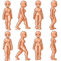 (edit: tweaked the feet and shading a bit) ------------- http://opengameart.org - http://opengameart.org Free, legal art for Open Source game projects. |
Posted By: leel
Date Posted: 18 July 2009 at 2:33pm
| Don't forget the ears! :) |
Posted By: cure
Date Posted: 18 July 2009 at 3:09pm
| head should sit further back on profile view. also, still odd to have the middle frame where the feet are so close to one another. |
Posted By: Lendrick
Date Posted: 18 July 2009 at 5:03pm
|
Originally posted by leel Don't forget the ears! :) This being a base, I was figuring the ears would go with the hair (seeing as how people like to give their sprites elf ears and the like. At least, that's the excuse I'm giving myself for being lazy. :) At some point I'm going to have to go back and fix the fingers and toes, which I'd rather not do yet until I get the larger movements down anyway. I'll probably do the ears then. Originally posted by ThereIsNoCure head should sit further back on profile view. also, still odd to have the middle frame where the feet are so close to one another. I see what you mean about the head thing. I moved it back a bit and also made it slightly smaller from front to back. 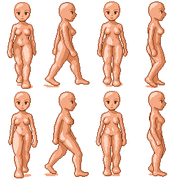 As for the middle frame, should I move the foot up higher? ------------- http://opengameart.org - http://opengameart.org Free, legal art for Open Source game projects. |
Posted By: Lendrick
Date Posted: 18 July 2009 at 8:51pm
Here's the 8 frame version of the right walk. I also lengthened the lower legs on the forward walk a bit. How's it looking? ------------- http://opengameart.org - http://opengameart.org Free, legal art for Open Source game projects. |
Posted By: littlesapphire
Date Posted: 19 July 2009 at 1:30pm
|
Looking pretty good, but there's something wrong with the side view. I just can't put my finger on it, but it looks as if she's unbalance when her right leg is going forward and the left is back. I think both legs, but especially the left (the one in the back) needs to be straightened out more. Right now she looks like she's about to crouch down or something. Also, the front view is nice but it feels choppy. I feel like speeding it up a little bit would help, or even cutting out the frame where the legs are side by side. One last thing! The side view makes her look kind of chunky. Try creating more of an inward curve to the back, and shaving off some flesh from the back of her thigh and at her ankle. |
Posted By: Dhr. Bosch
Date Posted: 21 July 2009 at 8:28am
|
the side view is a bit strange because her head/torso/hips doesn't bob up and down enough compared to the size of the steps she is taking. i animation (and drawing in general) you often get a more 'realistic' result when you exadurate movement, not because that feels more real but because artist virtually always instinctively try to downplay the movement so when you try to exadurate you are usually a lot closer to the actual movement. and people put ther foot down on ther heel and the round of to their toes. the movement she makes with her anlkes looks painfull... ------------- Vanitas, vanitatum omnia vanitas |
Posted By: Lendrick
Date Posted: 23 July 2009 at 9:42pm
I've addressed the choppiness in the front walk animation. I'll work on the right walk next.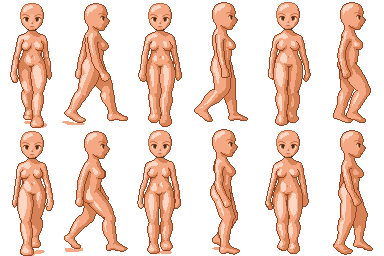
------------- http://opengameart.org - http://opengameart.org Free, legal art for Open Source game projects. |
Posted By: Lendrick
Date Posted: 24 July 2009 at 7:44am
|
Originally posted by Dhr. Bosch the side view is a bit strange because her head/torso/hips doesn't bob up and down enough compared to the size of the steps she is taking. i animation (and drawing in general) you often get a more 'realistic' result when you exadurate movement, not because that feels more real but because artist virtually always instinctively try to downplay the movement so when you try to exadurate you are usually a lot closer to the actual movement. and people put ther foot down on ther heel and the round of to their toes. the movement she makes with her anlkes looks painfull... One thing that's been noted to me (maybe I mentioned this earlier) is that the right walk animation looks a lot more "determined" than the front one. I'm pretty much going to redo it at this point, probably this evening. I'll take your advice into account when I do so. Thanks, Bart ------------- http://opengameart.org - http://opengameart.org Free, legal art for Open Source game projects. |
Posted By: Hatch
Date Posted: 24 July 2009 at 7:48am
|
I think you should mute your brightest skin tone just a tad. It makes her look somewhat glossy at the moment. ------------- |
Posted By: Lendrick
Date Posted: 24 July 2009 at 4:29pm
Done. Also, I gave her some more pelvis. Now I *really* need to re-work the right walk. ------------- http://opengameart.org - http://opengameart.org Free, legal art for Open Source game projects. |
Posted By: MrWeirdGuy
Date Posted: 24 July 2009 at 4:33pm
| I think the side view would work a little better if she was facing the screen slightly. |
Posted By: Lendrick
Date Posted: 25 July 2009 at 11:07am
I'm trying to figure out her torso.. which is better: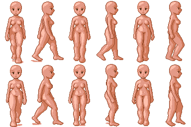 or or 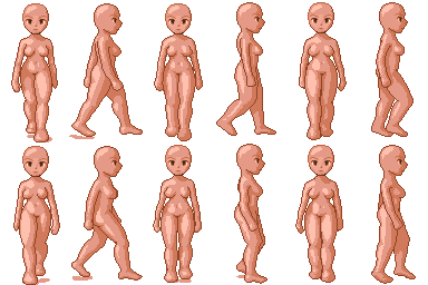 ------------- http://opengameart.org - http://opengameart.org Free, legal art for Open Source game projects. |
Posted By: Lendrick
Date Posted: 28 July 2009 at 6:35pm
|
For the record, I am, in fact, still working on this, if anyone is still interested in critiquing it. :) Before I finalize this rough walk animation (the one to the right), does anyone see any glaring issues with it? 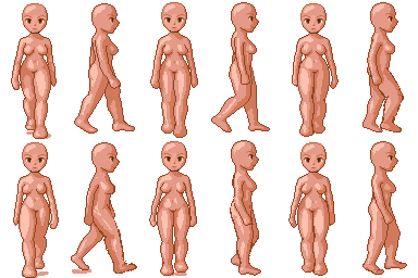 Furthermore, does the anatomy work a bit better now? I gave her more of an hourglass shape by adding a little more hip and slimming down her torso. Any thoughts? ------------- http://opengameart.org - http://opengameart.org Free, legal art for Open Source game projects. |
Posted By: Zeratanus
Date Posted: 28 July 2009 at 11:50pm
|
The side view bothers me. The neck is thick, closer to "real" proportions, but the jaw is super-anime-slanted. I'd say either pull the right side of the neck in so the neck is thinner (and thus more keeping with the anime look) or pull the chin out to the right so the face is less anime (and going for a more realism approach)
The shading on both seems to bob around a lot too, particularly the collarbone and stomach highlights on the front view. They seem to kinda randomly pop around in a few frames rather than just shrinking and growing with the movement of the body. Oh, also on the front view, the right arm (our right) seems to go into shadow when it goes back, and then pops out of shadow for a frame, and then goes back into it. It's coming along though :) |
Posted By: Dhr. Bosch
Date Posted: 29 July 2009 at 12:57am
|
that ankle is looking much better now, but you should change it on the other foot too
------------- Vanitas, vanitatum omnia vanitas |