Alien
Printed From: Pixel Joint
Category: Pixel Art
Forum Name: WIP (Work In Progress)
Forum Discription: Get crits and comments on your pixel WIPs and other art too!
URL: https://pixeljoint.com/forum/forum_posts.asp?TID=8816
Printed Date: 13 June 2026 at 11:43am
Topic: Alien
Posted By: Dr D
Subject: Alien
Date Posted: 19 July 2009 at 4:45pm
|
Started off as a doodle, was trying to make one thing and it ended up being something completely else (alien head), and I liked it, so I kept it and went with it. But after that I had no idea what I was doing, but kept winging it. I'm stuck now, due to the lack of conceptualization. So, I need some suggestions. Critique on what I have already would be pretty swell, too.  >> >> >> >> >> >>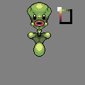 >> >>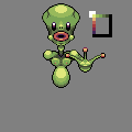 >> >>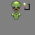  I have no problem with undoing anything, I just thought I'd like to get something done for once. My process is whack here, I kno. Thanks. |
Replies:
Posted By: CrapFactory
Date Posted: 19 July 2009 at 5:10pm
| My eyes go straight to the nipples. :) |
Posted By: UnHated
Date Posted: 19 July 2009 at 5:22pm
|
I know you aren't done but I think this is a pretty good edit of that head.. I just added a little dithering to add texture to the aliens skin. |
Posted By: cure
Date Posted: 19 July 2009 at 6:35pm
|
the dithering makes it worse. I think the anatomy looks a little segmented atm, should flow more naturally (add traps to connect shoulders/neck and flow into head, add ribcage etc). little too much aa/banding on the mouth right now. I think the current arm position is a bit confusing, I'd have them more or less at rest, or else performing some task (playing banjo for example) |
Posted By: Dr D
Date Posted: 20 July 2009 at 1:58pm
|
You're right, the arms blended in with the body too much, and there is no real purpose for it being like that as I've yet to figure out what to do with them. Worked on the mouth a bit, edited colors a bit. I attempted to follow your suggestions with tying the anatomy together a little bit, and tried the ribcage thing. Better or worse? Although I don't agree with the dithering, I do agree it may need some texturizing after I flesh it out more. |
Posted By: Quake
Date Posted: 20 July 2009 at 2:31pm
the shadow above the breasts is well tooo dark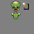 edit, just made the lines less dark so they blend in more since.. abs for example aren't lines. the muscles rise up. |