Izotomic Industries Incorporated(WIP)
Printed From: Pixel Joint
Category: Pixel Art
Forum Name: WIP (Work In Progress)
Forum Discription: Get crits and comments on your pixel WIPs and other art too!
URL: https://pixeljoint.com/forum/forum_posts.asp?TID=8829
Printed Date: 23 October 2025 at 5:34am
Topic: Izotomic Industries Incorporated(WIP)
Posted By: Winzenhimer
Subject: Izotomic Industries Incorporated(WIP)
Date Posted: 24 July 2009 at 1:05am
|
Hello, Hello! My name is Winzenhimer and I come from the quite lands of Stencyl, I'm currently working on a project for their beta call Galaxy Star. K, introductions over, lets get to the point. Stage, totally unfinished. 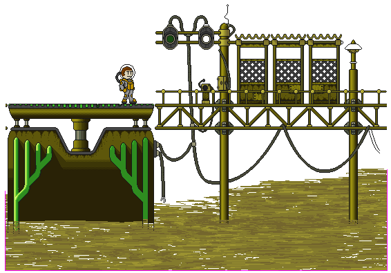 Background, will be made one when they're complete. 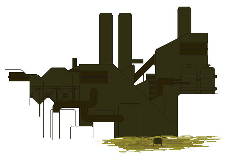 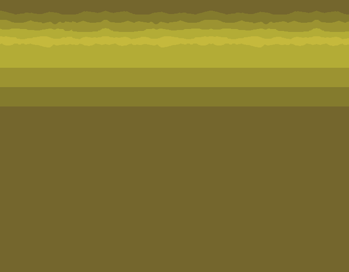 This is Izotomic Industries Incorporated, the factory level and as of now, only the first zone (Landing Level) has been sprited. I'd like C&C namely on the lighting, shading and the wires hanging about, but if you find any thing else please let me know. Thanks! btw, hi mozzy. |
Replies:
Posted By: jalonso
Date Posted: 24 July 2009 at 6:13am
|
Your project is looking great. The colors however I find unattractive. I think its far too green-ish a yellow.
------------- |
Posted By: Reo
Date Posted: 24 July 2009 at 8:13am
|
Hello dude and welcome aboard the forums! As Jal said you have a cool looking project! It is a little flat looking though, and In the place with the wires/lamps/reactors It' hard to see whats part of the foreground and not, you really need to use shadows to seperate the Background and foreground. I made some edits concerning some faults I saw:  1.is dealing with issues in your main charcter, first I thougth that he was not finished, but since you sumbitted him to the gallery that dosn't seem to be the case. you rely to heavily on outlines instead of letting ligthing and shading show forms. The lack of shading is also making the sprite hard to read, and a bit boring to look at. I'm not sure whats up with his legs atm? another thing I noticed is that neither his head nor his helmet is very round. The scruffy beard was added just to give something more unique to the character, looks a little plain atm. 2 is an edit of one of your 'pillars', this is a good example of when your shading makes the tiles look flat. Also, see how the ligth on the shiny metal dosn't line up with the shading of the rest of the pillar. Also I tried to make the pillar look more worn out by adding blotches/dithering of other color ramps to it, like orange for rust on the shiny metal, and grey on the rest of the pillar(grey will make almost anything look worn out). I also added scratches and stuff, see how the tiles become much more intersting with little details like that? I think The metal slug sprites/tiles would be a good reference for you, since it has a similar style/mood. Anyway keep up the good work, I look forward to an update! |
Posted By: Winzenhimer
Date Posted: 24 July 2009 at 2:37pm
Thank you Reo for pointing out the problems with the main character(Ovbius), I'll use your edit as a reference and fix him up: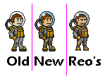 I'd like to stick with B.L.E (Black lines everywhere), it's a style that I'm more familiar with, but if it becomes to much of a nuisance I'll change it. I have to admit I've been a little reluctant to use more than one type of color, every level focuses on one mood of a color (Slimy green: Izotomic Industries Incorporated, Soft cool blue: Frozen Fern Forest, Hot reddish-orange: Molten Magma Mountain) and this has made me feel that adding other colors could mess this patter up. However, seeing your edits has changed my mind. Update on the stage: 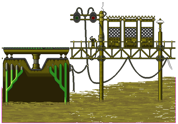 Fixed the shading and added a few scratches and rust marks like Reo suggested. I completely agree with the foreground and back ground blending, right now the BG is using the darkest shades of the three greens (below). Thanks Jal, do you have a suggestion for another hue or color? The yellowish green is only for this small outside portion of the entire level, once you go inside things will become more greenish and even a little blue in the Design & Development zone. This is the current color palette for III: 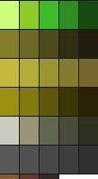 ------------- |
Posted By: Winzenhimer
Date Posted: 30 July 2009 at 4:42pm
|
Been a little busy lately, Dad's original job has dramatically and Mom and I have been helping him coop with the stress. Anyway, a light update. 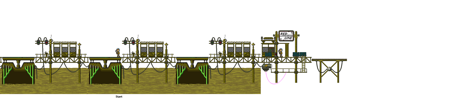 The "dock" tile has be finished, however separate "props", like the crash ship preventing players from travailing to far to the left, have yet to be made. For right now I'm working on the train station and the rail cars that will be used. 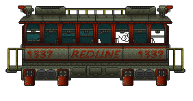 Any errors? Edit: Updated rail car ------------- |