Critique on mockup, please?
Printed From: Pixel Joint
Category: Pixel Art
Forum Name: WIP (Work In Progress)
Forum Discription: Get crits and comments on your pixel WIPs and other art too!
URL: https://pixeljoint.com/forum/forum_posts.asp?TID=8922
Printed Date: 19 December 2025 at 11:21am
Topic: Critique on mockup, please?
Posted By: MrSmiley
Subject: Critique on mockup, please?
Date Posted: 06 August 2009 at 4:46pm
I decided that I would make a monochromatic mockup. This is the enlarged version:

So, how is it? Critique and comments are welcome. Oh, by the way, the order left-right, up-down is title screen, opening cutscene, meteor busting a ship, middle cutscene of entering the atmosphere, boss fight vs. a fighter, boss fight vs. a tank, the end, the end cutscene, the screen where it shows your score, and the Retry? screen. You are the meteor and you move only up and down (or left and right near the end) and you try to cause as much damage as possible before exploding as you hit the earth. |
Replies:
Posted By: A.B. Lazer
Date Posted: 06 August 2009 at 5:17pm
|
With 1-bit color you don't have colors to suggest to viewer what thing is what. For exampe you have no blue for sky, so you place flying planne on it or draw horizon line. You don't have green for trees, so you should draw the tree with a form that should be obvious for viewer - this is a form of tree. And so on. Is it enemy, bonus or just scenery? If it is explained that way that viewer understands what it is - it is good graphics, because in the game player will interact with these drawn objects and should know what he looks at immediately.
So look as if you're looking at all these for first time - do you understand everything? |
Posted By: Iron
Date Posted: 07 August 2009 at 5:45am
| I see a plane... And uh... uh... The retry buttons. |
Posted By: inphy
Date Posted: 07 August 2009 at 10:34am
Why is someone watering a plant from a tap in the "end cutscene" picture? :) Here's a quick edit that hopefully illustrates member_profile.asp?PF=11482&FID=8 - A.B. Lazer 's point.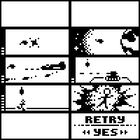 You also don't need the score popup. Or the excessive hud. Or all that shading. The text also bothered me. |
Posted By: MrSmiley
Date Posted: 08 August 2009 at 8:49am
| Well, no offense, but your side meteor isn't very good. I guess I should try a better explosion and stuff. |
Posted By: ellie-is
Date Posted: 08 August 2009 at 9:39am
|
Dude, he was just showing you how you could do stuff. His meteor is better than yours :/
But you should listen to Lazer. ------------- |