Mocha flavor
Printed From: Pixel Joint
Category: Pixel Art
Forum Name: WIP (Work In Progress)
Forum Discription: Get crits and comments on your pixel WIPs and other art too!
URL: https://pixeljoint.com/forum/forum_posts.asp?TID=9264
Printed Date: 27 October 2025 at 4:41am
Topic: Mocha flavor
Posted By: emlan
Subject: Mocha flavor
Date Posted: 15 October 2009 at 11:05am
|
More or less finished with this piece so I'd like some feedback! I'm not sure about the glass look and the face maybe feeling a bit busy, inputs on all other areas are welcome too of course! Don't be shy on nitpicking, though I'll say right away that my solid black outline is going nowhere. Added the base and my attempt on shine...Bottom is how I'll most likely layout the spoon.  I'm quite fond of the plain look but it really feels like it need some kind of shine no? Character ref: http://img243.imageshack.us/img243/7008/ultimecia033.jpg - |
Replies:
Posted By: jalonso
Date Posted: 15 October 2009 at 11:13am
|
I find the part inside the glass hard to read. I think that not only is shine required on the glass but some distortion too. That there is no color value change on the inside to outside complicates reading it. Also, the coloring on the glass and spoon are the same. Is the spoon glass, or is the glass metal.
------------- |
Posted By: Manupix
Date Posted: 15 October 2009 at 11:23am
|
Main issue, readability. I don't really understand: is the char coming out of the glass? Are these her crossed arms on the rim? Why not show her mouth? Is that her whole body inside the glass? Agree with jal, but still I find you did a very good job with lighting. The glass probably needs some colder tones, and maybe more of an idea of transparency. Its shape is a bit plain too. At least I think the foot should be as wide as the rest. I don't mind the double outline, but presently it has strong banding. Some aa is needed. |
Posted By: emlan
Date Posted: 15 October 2009 at 11:32am
|
Hnn didn't think about the spoon/glass material looking too alike, but when you mention it-! The spoon should obvs be metal but for the glass I'm not sure how to go on about the color or transparentcy since there's no BG to go after (I'll get rid of the brown bg for final product) Perhahaps make it more white since I'll make the outline white...? Or brown... Is there really a lot of distortion for smooth glasses without ornament dents? The inside being smooshed is a desired effect since it's a drink/icecream feel I'm going for, I wouldn't want it to be too detailed/sharp. Shall I make a whole new lil pallete for the shine instead of just using the lighter ones I already have maybe? |
Posted By: emlan
Date Posted: 15 October 2009 at 11:44am
|
Originally posted by Manupix Main issue, readability. I don't really understand: is the char coming out of the glass? Are these her crossed arms on the rim? Why not show her mouth? Is that her whole body inside the glass? Agree with jal, but still I find you did a very good job with lighting. The glass probably needs some colder tones, and maybe more of an idea of transparency. Its shape is a bit plain too. At least I think the foot should be as wide as the rest. I don't mind the double outline, but presently it has strong banding. Some aa is needed. Yah she's resting on the rim, half of her face is covered by the crossed arms since the glass is a bit high...I could try and actually have her head rest at the arms instead but I'd like to obscure it a bit since I want as much focus on the fluff on top as possible...Not sure where her body could be if not all in the glass? Can't AA the outline since since it'll be transparent BG. Also I'm personally not fond of smooth AA pixelart so. |
Posted By: jalonso
Date Posted: 15 October 2009 at 2:05pm
|
I think just adding to desaturated blues to your current palette is fine. This will help the glass AND the metal in the spoon. The glass distortion can be added on the side edges only. * **Kitten Alert!!!  ------------- |
Posted By: emlan
Date Posted: 15 October 2009 at 5:00pm
|
Kittens makes reffing fun for the whole family-! I gotta go to bed so I've only started to edit the glass... Still not really sure how to tackle it but lemme know if I'm heading in right direction or not ya? I'll continue tomorrow, maybe see if the head can be positioned better too.  Shortened the glass and made the foot a bit bigger ( Ah, will prolly need to smoothen the foot too now when I look at it.) |
Posted By: Elk
Date Posted: 16 October 2009 at 3:17am
I'd do it like that |
Posted By: emlan
Date Posted: 16 October 2009 at 6:10am
That's looking great but I want to show off her wings/dress more or less so it's a no-go for me! I took the liberty of stealing some shine though, here's a update!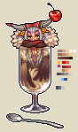 EDIT: aah...the top is too straight, I'll get rid of the shine under the armpits or balance the foot more with it. A tiny little hue change of the fluff too. I was gonna show a version of the head resting on the arms instead of behind them too but I simply didn't like how it looked after editing it so I'll be rolling with this pose. |
Posted By: Elk
Date Posted: 16 October 2009 at 10:14am
|
Looking good :) But yo should make it look more round! make the top edge visible with a while line |
Posted By: emlan
Date Posted: 16 October 2009 at 12:01pm
 About to call this done unless I get further inputs, I won't edit anything that requires massive redrawing effort tho-! EDIT: uploaded! Thanks for the help guys |