alice in wonderland's cat
Printed From: Pixel Joint
Category: Pixel Art
Forum Name: WIP (Work In Progress)
Forum Discription: Get crits and comments on your pixel WIPs and other art too!
URL: https://pixeljoint.com/forum/forum_posts.asp?TID=9279
Printed Date: 01 August 2026 at 4:24pm
Topic: alice in wonderland's cat
Posted By: mokakokakola
Subject: alice in wonderland's cat
Date Posted: 18 October 2009 at 5:07am
|
so i made the pink cat from alice in wonderland...
i subbmitted it on the pixel joint and they said this:
here is the pixelart:
http://www.pixeljoint.com/files/icons/full/alice_in_wonderland_cat.png">
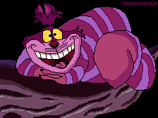 i love it as it is... i didnt shade the cat for a reason i think it is prettier like this...
what do you think plz help me...
|

 System @ 10/17/2009 7:27:21 PM
Replies:
Posted By: mickeydonald
Date Posted: 18 October 2009 at 5:58am
|
i think it looks to much likes the original http://www.alice-in-wonderland.net/alicepic/disney-movie/cheshire-cat-5.jpg - http://www.alice-in-wonderland.net/alicepic/disney-movie/cheshire-cat-5.jpg |
Posted By: lieuwe
Date Posted: 18 October 2009 at 8:53am
| it's a bit low quality, try adding some shading in there, right now it's just filled-in lineart... |
Posted By: Hapiel
Date Posted: 18 October 2009 at 11:48am
|
You could improve it by adding more of your personal touch to it. Like in thisone ../files/icons/full/chesya.gif">  ------------- |
Posted By: jeremy
Date Posted: 18 October 2009 at 8:47pm
|
As has been said, this is traced. That's not always a bad thing, but that plus the lack of shading = it looking like there's a distinct lack of effort.
The trace itself is quite lumpy, you still do need to clean the lines. An image like this'd be perfect for practising anti-aliasing, combined with careful cel-shading this could look quite nice :) And yes, putting your own spin on something does a world of good (And it feels good too :3 ) Oh, and for future reference: His name's the Cheshire Cat ;) |