ghost scorpions!
Printed From: Pixel Joint
Category: Pixel Art
Forum Name: WIP (Work In Progress)
Forum Discription: Get crits and comments on your pixel WIPs and other art too!
URL: https://pixeljoint.com/forum/forum_posts.asp?TID=9481
Printed Date: 10 April 2026 at 3:42am
Topic: ghost scorpions!
Posted By: grumble-bee
Subject: ghost scorpions!
Date Posted: 26 November 2009 at 11:36pm
i finally ran into a freelance break, so it's pixel time! i'm making ghost scorpions for my cricket to fight. here are my original sketches: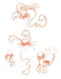 here's #1:  here's #2: 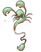 everyone has such amazing color choices here, so i wanted to do some experimenting! i'm trying to figure out this linear vs. non-linear color ramp deal - i may do a little more tweaking before continuing... they both still need cleaning up, i just started #2 so he's super sloppy right now. i want to make all of them, but i may have to re-design the one on the bottom right since he does not have a good enough silhouette. and he's not that much different from #2. stay tuned! |
Replies:
Posted By: Pumpkinbot
Date Posted: 26 November 2009 at 11:42pm
| The only advice I can give you is hue-shifting. The colors get more blue as they get darker, and they get more red/yellow as it gets lighter. Why is the shadow on the scorpion brown? |
Posted By: Manupix
Date Posted: 27 November 2009 at 2:07am
|
The sketches look great! Only thing, their tails and stings don't seem poised for striking, that will make them hard to read as http://lisette31.free.fr/scorpion.jpg - scorpions . |
Posted By: grumble-bee
Date Posted: 27 November 2009 at 11:42am
|
Originally posted by Pumpkinbot The only advice I can give you is hue-shifting. The colors get more blue as they get darker, and they get more red/yellow as it gets lighter. Why is the shadow on the scorpion brown? i've been adjusting those hues like mad. before they got so much more yellow and limey as they got lighter, i can adjust a little further i geuss. and often when i paint outside of the pixel world, i shade things in the opposite color. i was trying to play around and see if there was a way to mimic this with pixels. the scorpions are this blue-greenish hue, so i shaded him in this reddish-orange. Originally posted by Manupix The sketches look great! Only thing, their tails and stings don't seem poised for striking, that will make them hard to read as http://lisette31.free.fr/scorpion.jpg - scorpions . thanks! and once again, i want to make fake critters based on actual critters. none of my bugs look like their real bug, i wanted them to look a little weirder. hopefully i'll have time to work on them further today! thanks for both of your comments :) |
Posted By: Indigo
Date Posted: 28 November 2009 at 7:18pm
|
Originally posted by Pumpkinbot The only advice I can give you is hue-shifting. The colors get more blue as they get darker, and they get more red/yellow as it gets lighter. Why is the shadow on the scorpion brown? This made me cringe a bit. There is absolutely no rule for how colors shift from shadow to light. it sure is *common* for pixel artists to use cool colors for the darks and warm for the lights, but it truly is dependent on the environment the sprite is used in... nothing more. its all about reflected light. If you are outside on a clear blue-sky day, shadows will indeed tend to be cooler since everything will be reflecting the blue light from the sky into the shadowed areas of the subject. while direct light will be warm because the sun gives off warm-yellow light. But if you're inside, or outside on a cloudy day, or next to something of a prominent color, or next to different light sources - all of it can change the way colors are shifted. ------------- |
Posted By: Pumpkinbot
Date Posted: 28 November 2009 at 7:49pm
|
Originally posted by Indigo I suppose.Originally posted by Pumpkinbot The only advice I can give you is hue-shifting. The colors get more blue as they get darker, and they get more red/yellow as it gets lighter. Why is the shadow on the scorpion brown? This made me cringe a bit. There is absolutely no rule for how colors shift from shadow to light. it sure is *common* for pixel artists to use cool colors for the darks and warm for the lights, but it truly is dependent on the environment the sprite is used in... nothing more. its all about reflected light. If you are outside on a clear blue-sky day, shadows will indeed tend to be cooler since everything will be reflecting the blue light from the sky into the shadowed areas of the subject. while direct light will be warm because the sun gives off warm-yellow light. But if you're inside, or outside on a cloudy day, or next to something of a prominent color, or next to different light sources - all of it can change the way colors are shifted. Listen to this guy! =D |
Posted By: grumble-bee
Date Posted: 28 November 2009 at 9:57pm
|
well regardless, i attempted to shift my colors around more! i tried to warm up the green and desaturated the orange/brown so that they would unify a little more. they may need more work, i've been working on my laptop and it'll be easier to tell once i return to my desktop! #1:  #2: 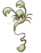 i like how this green is a little more undead looking but i'm not sure if the highlights match at all. i think #1 is cool, but #2 needs more work especially on his claws and stinger. i find the claws difficult to shade, and it may because i dislike their shape. they look too squishy and gummy, so i need to figure out how to make them look more hard. or i may need to sleep on it! any comments and suggestions are welcomed - stay tuned for more, soon i'll get #3 in the mix! :) |
Posted By: Manupix
Date Posted: 29 November 2009 at 7:54am
Edit: I see some issues somewhat similar to your previous bug, with lines, colors and light. You can refine those lines better: I made a few changes to claws (small 'finger', right side of right claw) and upper part of tail; precision work on the curves can give a more 'nasty' feel (or whatever you want). Highlights can move closer to the edges, and shadows accordingly take up a larger portion of the body (claws, a bit on the head). Think more of the actual volumes: the claws and head don't direct their 'bulges' the same way towards the viewer; head is rounder than claws. I tweaked your palette, towards a single ramp joining green highlights to brown shades; removed the lightest brown from the claws and head (but not elsewhere): its value is way too close to the nearest green. Added a darker reddish brown. The 'tusks' are not very readable, I used some reds from the eyes to make them more visible. And, check for banding! (this can wait for the latest cleaning stages) Editing these bugs is quite fun! ;) @ Indigo:  |
Posted By: grumble-bee
Date Posted: 30 November 2009 at 5:34pm
|
i'm glad you enjoy it! i can always use you help! :) a quick update before i have to return to my non-pixel work :( #1:  #2: 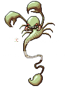 ok, so i shifted the colors, and moved over some highlights. i tried reshaping #2's claws, they still need a bit more smoothing out i was trying to make them somewhat angular, so they'll look less soft. i also tried to create the illusion that the "thumb" part of the claw is segmented from the main claw. (i didn't want to use black for it, but maybe that super dark brown you had in your palette would do the trick because i don't think that "thumb" highlight works for me.) i just know i'm in for a nightmare of banding issues! i need to study up on that a bit more, but now i think i should tackle that before i begin #3. thank you kindly! more soon! |
Posted By: grumble-bee
Date Posted: 02 December 2009 at 5:23pm
|
so i've been practicing at spotting banding! like in this useful http://www.wayofthepixel.net/pixelation/index.php?topic=8110.msg92434#msg92434 - thread , i outlined what i think might be banding on my scorpions. i'll link them since i scaled them for the purposes of outlining - and they might be too big and obnoxious for forum view. http://i898.photobucket.com/albums/ac187/grumble_bee/ghost_scorpion01_band.png - #1 http://i898.photobucket.com/albums/ac187/grumble_bee/ghost_scorpion02_band.png - #2 am i on the right track? i don't quite get 45 degree banding, but i have a feeling i'm very guilty of it! it seems i staircase all over the place! i also spot some 2x2 squares within bigger "clusters" and i'm not sure if they count as banding, but they seem to stick out so i outlined some of them. is this a good start? any comments? i'll continue to work on #2's claws and fix some of what i think are banding issues in the meantime! :) |
Posted By: Manupix
Date Posted: 02 December 2009 at 6:35pm
|
That's it! I can see more, esp in the tail. Sometimes it's only on one end of the 'stack'. In fact, once you start looking hard, you'll find some everywhere - I mean, in most other pixel art too. I don't easily find 45° yet either, and I think it's more difficult to remove, esp on small pieces. It's as always a matter of judgment, checking pieces at 100 or 200% at all times and keeping what works, discarding what doesn't. I don't mind those solid 2x2 squares you mentioned, but if they stick out for you, they shouldn't be difficult to fix.  |
Posted By: grumble-bee
Date Posted: 02 December 2009 at 7:08pm
|
oh my goodness! banding abound! this may take some time, i hope i can figure it out. if only i could pixel all day long.... thanks of course! |
Posted By: Manupix
Date Posted: 03 December 2009 at 2:49am
|
Once again, it's not strictly necessary or even possible to remove absolutely all of it, it's more of a balance kind of thing btw neat lines, volume=shading, AA, banding. But it sure does take time, when you're at this refining stage! I don't remember from the previous thread, but don't forget to think background when applying / removing outlines / AA. |
Posted By: grumble-bee
Date Posted: 09 December 2009 at 3:31pm
|
no i didn't forget! i did a tad more tweeking! #1:  #2: 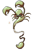 yes, i've been trying to learn the balance of fixing banding and leaving it alone. some of it looks too strange when i remove it so i left those. and a lot of my step and 45 degree banding seems necessary, though i could be very wrong. i don't want to look at these to death and over work them either so i'm stopping very soon! (then i can finally do #3) i think i'm finally happy with #2's claw shapes though! so that's something. i think what i have left for him is the shading on his left arm (our right) and he has more shading issues at the bottom of his body towards the tail - but i feel much closer so that's something... i was thinking about background issues too! that's just something i'll worry about much later, they may never make it to a BG, if they do they'll probably need more editing. :P i think after this i'll take a bug break and do something a little more fluffy! :) |