Ne to PA
Printed From: Pixel Joint
Category: Pixel Art
Forum Name: WIP (Work In Progress)
Forum Discription: Get crits and comments on your pixel WIPs and other art too!
URL: https://pixeljoint.com/forum/forum_posts.asp?TID=9814
Printed Date: 22 April 2026 at 5:04am
Topic: Ne to PA
Posted By: MikeSalazar
Subject: Ne to PA
Date Posted: 04 February 2010 at 10:00pm
|
Hi! I was just surfing the net and found this site, fell in love with pixel art and tried my first pixels!! I'm in need of some constructive criticism. Everyone's opinion is welcome!! thnx in advance! 
Reference 

Reference 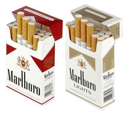

Reference 
Fixed your image tags for ya :) --Hatch |
Replies:
Posted By: MikeSalazar
Date Posted: 05 February 2010 at 12:18am
|
Thank you very much Hatch.
I tried searching for the correct way to post image tags but, as you can see, I was unsuccesful to do it. :P Mike |
Posted By: jeremy
Date Posted: 05 February 2010 at 1:15am
I like the lighter metal effects. The cig packet isn't great, try simply making an isometric box which is shaded, before doing stuff like that dither-gradient. then add cylinders. Something like this:

Obviously didn't edit everything. I don't understand the trap that people using iso fall into with the religious black lines :) The logo doesn't follow the isometric perspective, and you have a total of 101 colours there. Mainly in the AA, did you use some form of automatic tool for it or something? |
Posted By: DrunkBurger
Date Posted: 05 February 2010 at 4:06am
|
Funny how the pictures go from great to bad...strange even. I really like the base of the lighter, it's just 2 colors but you can clearly see the perspective. Also the color use and light effect is pretty nice. The fags could use some work. The text is uneven and it could overall use less dittering. The cup uses too much colors. Also the logo looks too flat. ------------- ~Mo Money Mo Bitches~ |
Posted By: Shrub
Date Posted: 05 February 2010 at 7:13am
|
First one looks traced, or at least referenced. I think it's a general rule here that you post any references. < Original image < Your pixel art |
Posted By: MikeSalazar
Date Posted: 05 February 2010 at 11:04am
|
Thank you all for the critics/advice =)
I'll try to follow the advice you are giving to be a better pixel artist. ;) Just a fe points: 1- @Jeremy: I didn't get your comment about AA (I previously researched what is AA) are you talking about the logo? it was "hand made" but yes, it doesn't follow isometric perspective, I tried and failed =P 2- @Shrub: Thnx man for putting the reference picture, I think I skipped that part of the rules =P. I'll edit my post and put the references. |
Posted By: jeremy
Date Posted: 05 February 2010 at 3:42pm
| I meant your anti-aliasing between some of the red and white, such as the white oval shape on the top - almost every AA colour there is different! |
Posted By: MikeSalazar
Date Posted: 05 February 2010 at 4:23pm
|
It may be a problem with resolution of gif when I uploaded it because I didnt use any AA, it was all hand made.
Thnx for the observation anyways =) |