WIP - Ipod Touch
Printed From: Pixel Joint
Category: Pixel Art
Forum Name: WIP (Work In Progress)
Forum Discription: Get crits and comments on your pixel WIPs and other art too!
URL: https://pixeljoint.com/forum/forum_posts.asp?TID=9902
Printed Date: 19 December 2025 at 11:21am
Topic: WIP - Ipod Touch
Posted By: Slemboll
Subject: WIP - Ipod Touch
Date Posted: 23 February 2010 at 1:25pm
|
I have been working on a pixel version of an ipod touch.
This is my progress so far.
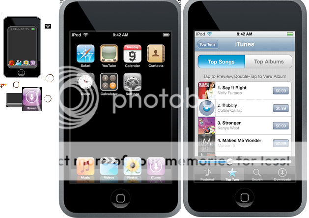 Ref pictures included.
You think this will get accepted? Please give me some pointers of what i can improve or change
Edit there its a PNG
|
Replies:
Posted By: iggybork
Date Posted: 23 February 2010 at 11:56pm
|
Step 1: Never ever ever ever save pixel art as a .jpg. When jpgs compress an image, they screw up your colors and add a couple hundred new colors to your work. And they look plain awful with solid blocks of color, so just say no! Save as .png or .gif!
(Don't worry, it happens to everyone once. If you uploaded it to an image hoster and they converted your filetype without you knowing, I apologize in advance!) |
Posted By: onek
Date Posted: 25 February 2010 at 3:56pm
|
if u wanna do stuff like this its essential to learn about anti aliasing... otherwise its going to be difficult putting in details, and u end up with blocky stuff like those icons at the bottom of the display....
or the clock, which is way to big and in no relation to the original... u can create the illusion of something that small, for example, with just a line of pixels with slightly diffrent brightness, ... aa'ed edit: 
|
Posted By: DrunkBurger
Date Posted: 03 March 2010 at 9:53am
|
Right off the bat, it feels too wide. And it actually is. The original ipod touch is long and slick. This one is short and chubby. So i would suggest making the outer part taller and thinner. Good luck! ------------- ~Mo Money Mo Bitches~ |