CHALLENGE 3/8/2010: Fantastic Environment
Printed From: Pixel Joint
Category: Pixel Art
Forum Name: Collaborations/Challenges
Forum Discription: Submit pixel art project ideas/templates or contribute to an existing pixel art collaboration.
URL: https://pixeljoint.com/forum/forum_posts.asp?TID=9960
Printed Date: 21 July 2026 at 7:37am
Topic: CHALLENGE 3/8/2010: Fantastic Environment
Posted By: administrator
Subject: CHALLENGE 3/8/2010: Fantastic Environment
Date Posted: 08 March 2010 at 12:00am
 sunrise by /p/4343.htm' target='_blank'>vierbit
 Pearl tree by /p/20935.htm' target='_blank'>griffsnuff
 Fantastic Environment by /p/25237.htm' target='_blank'>bitswitcher
 Realm of Memories - Weekly Challenge. by /p/26700.htm' target='_blank'>Kinnison
Replies:
Posted By: Elk
Date Posted: 08 March 2010 at 12:18am
| Great idea! |
Posted By: orenshtiv
Date Posted: 08 March 2010 at 3:47am
|
Umm... can I make it more as a... land and not a world? [EDIT] can I put Something like this? 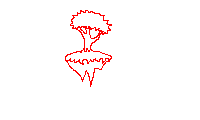 [UPDATE] Umm... I think something is wrong... :/  [UPDATE] I don't think i'm going to submit this OO" too simple :S  ------------- ░▒▓█▓▒░ ◘The power is in our hands!◘░▒▓█▓▒░ |
Posted By: Robinhood
Date Posted: 08 March 2010 at 3:23pm
|
"It should be unlike anything found on Earth" Floating rocks aren't that common on Earth are they? I thin kyou'll be good, but the tree should look more alien. |
Posted By: Ruban
Date Posted: 08 March 2010 at 4:10pm
|
:O Epic. Must try this. Edit: WIP (sorta)  C&C Please. C&C Please.Also, Any ideas on how I can clean up the bottom? |
Posted By: Dhr. Bosch
Date Posted: 08 March 2010 at 5:12pm
this is what i've got so far not sure how to proceed. the white will become fog. i want the giant fungi to kind of emmerge from the mists of the lower parts. i think i'll put some flying fungi in there aswell. ------------- Vanitas, vanitatum omnia vanitas |
Posted By: orenshtiv
Date Posted: 08 March 2010 at 11:30pm
|
@TheRobinHood - Umm... ok I'll try to make it more alien when I get back from school ;) -and I'll think about it at school,lol :P @Dhr.Bosch - It looks awesome! :D @Ruban - looks cool,what is it? a cheese world? that would be cool xD ------------- ░▒▓█▓▒░ ◘The power is in our hands!◘░▒▓█▓▒░ |
Posted By: jeremy
Date Posted: 09 March 2010 at 1:25am
Wheee

|
Posted By: nimrod7
Date Posted: 09 March 2010 at 9:13am
is sth like this :  acceptable ? acceptable ?
|
Posted By: skamocore
Date Posted: 09 March 2010 at 9:20am
|
Yes, except for it not being pixel art of course :P
------------- |
Posted By: nimrod7
Date Posted: 09 March 2010 at 9:35am
| just a sketch in photoshop |
Posted By: Argyle
Date Posted: 09 March 2010 at 9:50am

 -> -> 
->  -> ->  -> -> 
Two different concept sketches so far, and two versions of the second one. I think I'll study some of the http://en.wikipedia.org/wiki/Another_World_%28video_game%29 - Out of This World environments to learn from as a practice exercise because I loved that game, and I really suck at landscapes :P |
Posted By: Perkele
Date Posted: 09 March 2010 at 9:57am
|
I hate to say that, but it's far too high for the 200x120 canvas.. pretty annoying, as it looks so promising.. By the way, this is an awesome challenge, I expect many genuinely great entries and have a couple of good ideas myself - just hope that I gonna have any spare time this week.. |
Posted By: Argyle
Date Posted: 09 March 2010 at 10:05am
|
Originally posted by Perkele
I hate to say that, but it's far too high for the 200x120 canvas.. In regards to my post? Each of those are 200x120 if so |
Posted By: inphy
Date Posted: 09 March 2010 at 10:21am
|
Originally posted by StickyTape Two different concept sketches so far, and two versions of the second one. I think I'll study some of the http://en.wikipedia.org/wiki/Another_World_%28video_game%29 - Out of This World environments to learn from as a practice exercise because I loved that game, and I really suck at landscapes :P *highfive over tcp/ip* Hehe, loved AW/OOTW too, I'm also drawing some inspiration from there. |
Posted By: skamocore
Date Posted: 09 March 2010 at 10:26am
|
@stickytape - There were some really nice visuals in Out of This World (and Flashback too). On the subject of games, I'd say the first two Oddworld games and Zeno Clash could also provide inspiration for some.  Oddworld: Abe's Exoddus  Zeno Clash ------------- |
Posted By: Argyle
Date Posted: 09 March 2010 at 11:39am
|
Update:
Color scheme working much nicer with the foreground being darker. |
Posted By: Ruban
Date Posted: 09 March 2010 at 3:09pm
UPDATE: Fixed the clutter with a lake. Some quick coloring. C&C Also, some help with the colors, esp. The purple. @orenshtiv: Metal, not cheese. as for yours... Avatar? @StickyTape: Nice work there. |
Posted By: Dhr. Bosch
Date Posted: 09 March 2010 at 4:07pm
progress: i think i'm gonna start a seperate Wip thread as i'm liking where this is going but i'm feeling i'm not progressing enough. so... C+C would be greatly apreciated ------------- Vanitas, vanitatum omnia vanitas |
Posted By: nimrod7
Date Posted: 09 March 2010 at 4:18pm
|
@Dhr. Bosch
at first glance - i would rise the upper part of the clouds a bit, so it wouldn't interfere with a verge of the mushroom @everybody : other works worth looking at : http://www.johnavon.com --the master of magic : the gathering landscapes 
|
Posted By: Perkele
Date Posted: 09 March 2010 at 5:13pm
|
@ StickyTape Was supposed to be a reply to Dhr.Bosch, my internet just messed it up ;) |
Posted By: Argyle
Date Posted: 09 March 2010 at 9:15pm
|
One more update: Not sure if I like all the additions in the back but I think it adds good depth and spiky alien-nesseries Just editing this post so it doesn't look like I'm every other post on this thread when I get time to work on this :P Latest: Sitting on 16 colors for this so I still have 16 more to play with. Just need to figure out what direction to take it in. |
Posted By: iMoose
Date Posted: 09 March 2010 at 10:05pm
Decided to give it a try. Currently at 13 colors.

I'm pretty new to pixel art, so please any C&C is more than welcome :P I think the perspective could use some work... |
Posted By: Dhr. Bosch
Date Posted: 10 March 2010 at 1:23am
|
@ perkele: they usually specify in the challenge which is height and which is width, since they didn't, i assumed it could either be 200 X 120 OR 120 X 200 progress  i tried adding some floating fungi to add another layer. not so sure about them yet. ------------- Vanitas, vanitatum omnia vanitas |
Posted By: skamocore
Date Posted: 10 March 2010 at 1:44am
|
Originally posted by Dhr. Bosch @ perkele: they usually specify in the challenge which is height and which is width, since they didn't, i assumed it could either be 200 X 120 OR 120 X 200 We meet again Mr. Bosch. It should've been only horizontal, but you're right, it didn't specify. So I've updated the challenge (again  ) to say that either horizontal or vertical is fine. ) to say that either horizontal or vertical is fine.------------- |
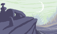
Posted By: JC Denton
Date Posted: 10 March 2010 at 6:39am
Here is my WIP, it is suppose to be a field glass/metal monoliths reflecting the light of the stars. But I have just realized that it might be a bit dark :p

|
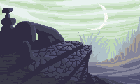
Posted By: Argyle
Date Posted: 10 March 2010 at 7:41am
|
another quick update. Is the illumination on the ground texture too heavy on the foreground? I'm a bit iffy on it.
Great pieces so far, Bosch, JC, and iMoose! |
Posted By: asukicco
Date Posted: 10 March 2010 at 11:51am
|
@nimrod7: John Avon is my f****ing hero! ------------- |
Posted By: smk
Date Posted: 10 March 2010 at 6:46pm
|
@stickytape I liked the old moon better! :o |
Posted By: iMoose
Date Posted: 10 March 2010 at 8:36pm
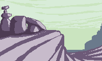
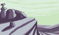
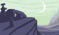
Well I'm not sure I liked my first one too much so I decided to give it another shot. This is the result of a couple hours, but it looks much easier for me to flesh out than the other one. And there's plenty of room for background still :) I may follow through with both if I have time.

I had already progressed much of my way through this before I realized orenshtiv already has something a lot like it... I hope that's ok? I originally planned to have some metropolis on top of the rock, but then I read the rules again :P @StickyTape: Looking back at the first sketches you had, I think a little less intensity on the illumination would look better. |
Posted By: Ruban
Date Posted: 10 March 2010 at 9:54pm
@orenshtiv: Looks good, reminds me of a platformer for some reason  @iMoose: Looking good, I'd move the "island" further down. Add some more in the background. C&C Please! I remember John Avon.... Back in the days I when I played magic I valued his lands above any others. *Sniff* Still have some... |
Posted By: Argyle
Date Posted: 10 March 2010 at 10:16pm
|
Originally posted by iMoose
Well I'm not sure I liked my first one too much so I decided to give it another shot. This is the result of a couple hours, but it looks much easier for me to flesh out than the other one. And there's plenty of room for background still :) I may follow through with both if I have time.
I had already progressed much of my way through this before I realized orenshtiv already has something a lot like it... I hope that's ok? I originally planned to have some metropolis on top of the rock, but then I read the rules again :P @StickyTape: Looking back at the first sketches you had, I think a little less intensity on the illumination would look better. Yeah I'm inclined to agree, I've got some good ideas of what needs tweaked, now I just gotta get to doing it later when I find time. Thanks for your input! Regarding your new piece, I like what you have here so far. Something that might add to this in a nice way would be have some of the roots of that tree bursting out of the bottom of the floating piece of land - you can even have them like talons or spiky or dripping with goo to give it a more fantasy alien feel to it. And adding to the background will bring it all together. Keep it up. |
Posted By: orenshtiv
Date Posted: 11 March 2010 at 8:35am
|
@iMoose - it's ok ^^ ,nice one btw but it's really looks like earth grass and tree... maybe my new update will give you inspiration too xD
------------- ░▒▓█▓▒░ ◘The power is in our hands!◘░▒▓█▓▒░ |
Posted By: bitswitcher
Date Posted: 11 March 2010 at 11:04am
|
okay,
thats my entry: 
|
Posted By: Ruban
Date Posted: 11 March 2010 at 1:35pm
|
Originally posted by bitswitcher okay, thats my entry: Great! But umm... try reading the rules again. |
Posted By: iMoose
Date Posted: 11 March 2010 at 6:17pm
|
@Ruban: Nice, but I'm not sure I like the perspective (Same problem I had with my first one). Try to offset it, at least a little, so that it doesn't look so straight-on. For instance, if the view is looking right at the big rock spire on the bottom, I should be seeing some of the bottom surface of the top rock. It should help it look a little less flat.
About my own piece, I've considered moving the platform down. Problem is, that wouldn't really allow for anything to go beneath the platform (like roots, as suggested), and I wouldn't be able to move it far enough down to show the entire top of the tree anyways. I think where it is gives it a nice sense of floaty-ness. @StickyTape: Ooh, I like that idea. I'll see if I can get it to look as good on the screen as it does in my mind. Thanks! @orenshtiv: True, the things on the platform do look pretty normal. But the platform is floating, so I think that takes care of it for now... :P @biswitcher: Dang, that looks really awesome, but I'm afraid you've exceeded the limit on dimensions :( |
Posted By: bitswitcher
Date Posted: 12 March 2010 at 6:40am
|
oh, okay.
dine some changes. Wich is better? 

|
Posted By: Robinhood
Date Posted: 12 March 2010 at 4:08pm
 I think I'll make it 120 x 200 later. |
Posted By: iMoose
Date Posted: 12 March 2010 at 5:11pm
|
@bitswitcher: I like the 200 x 120 one better, landscape oriented. But what happened to the bottom of the tree? It was there in the original... also, I liked the presence of the second hill in the original. If you could keep it in the modified version by moving it up, I think that'd be great.
@TheRobinHood: Woot pink :D Looks like it can be an interesting idea, try some vegetation scattered along the terrain. Also, the texture on the mountain on the left currently makes no sense (to me). EDIT: Ok, here's what I've got now. I'm thinking this is close to the final. Last minute C&C would be much appreciated :P 
|
Posted By: bitswitcher
Date Posted: 13 March 2010 at 7:52am
|
okay,
edit: 
|
Posted By: Robinhood
Date Posted: 13 March 2010 at 9:22am
|
Originally posted by iMoose @TheRobinHood: Woot pink :D Looks like it can be an interesting idea, try some vegetation scattered along the terrain. Also, the texture on the mountain on the left currently makes no sense (to me).  Well they're sort of pulsing veins in the mountain, and the darker patches are the shadows. I suck at textures so I think this is just about done. |
Posted By: iMoose
Date Posted: 13 March 2010 at 10:07am
|
@bitswitcher: Looking good! Those things over on the right are looking a little funky, though. Nonetheless it's an excellent piece. Love your style :D
@TheRobinHood: Mountains with veins? I guess that is something you don't find on earth :P I like the shape of the clouds. Also, I'm not very good with textures either, but it helps a ton to look at photos and pieces from others' work in the gallery. Look for pieces that include whatever it is you're having trouble drawing, and copy/paste it into an editing tool and zoom in on the part that you're looking for, and study the arrangement of pixels. At least that's what I do. |
Posted By: Robinhood
Date Posted: 13 March 2010 at 12:59pm
|
Tried that a while ago, didn't look so pretty :c Thanks for the advice! |
Posted By: Slemboll
Date Posted: 13 March 2010 at 1:52pm
|
Originally posted by iMoose
I just got one question. WHY did you steal member_profile.asp?PF=22239&FID=1 - orenshtiv `s idea ? come up with something yourself insteadWell I'm not sure I liked my first one too much so I decided to give it another shot. This is the result of a couple hours, but it looks much easier for me to flesh out than the other one. And there's plenty of room for background still :) I may follow through with both if I have time. I had already progressed much of my way through this before I realized orenshtiv already has something a lot like it... I hope that's ok? I originally planned to have some metropolis on top of the rock, but then I read the rules again :P @StickyTape: Looking back at the first sketches you had, I think a little less intensity on the illumination would look better. |
Posted By: iMoose
Date Posted: 13 March 2010 at 2:08pm
|
Originally posted by Slemboll
I just got one question. WHY did you steal member_profile.asp?PF=22239&FID=1 - orenshtiv `s idea ? come up with something yourself instead Read the whole post. Originally posted by iMoose
I had already progressed much of my way through this before I realized orenshtiv already has something a lot like it... I hope that's ok? |
Posted By: Robinhood
Date Posted: 13 March 2010 at 2:18pm
|
Originally posted by Slemboll I just got one question. WHY did you steal member_profile.asp?PF=22239&FID=1 - |
Posted By: Grimsane
Date Posted: 14 March 2010 at 1:56am
thought I'd have a go at this, unfortunately haven't been online or on PC for awhile (due to some fairly personal circumstances), just realized when i did a double take that the challenge is really close to closing, so i am not sure if i will actually finish my entry, but here are 4 quick ideas (in chronological order):


This one is probably exempt i didn't pay attention to the rules when i did the first 2, then when i read over i noticed no creatures. so i guess the dead remains ie skeleton is a creature... 

all rather random. all colours chosen relatively randomly, the 1st one actually uses 2 seperate randomly generated palettes. don't know which idea to pursue, and indeed if i will have time to finish, even so would be a good exercise seeming as i never really do landscapes in pixels or traditional art, some feedback would be appreciated. They are rather rough now though. |
Posted By: Elk
Date Posted: 14 March 2010 at 5:15am
| Nice...yggdrasil! |
Posted By: RollerKingdom
Date Posted: 14 March 2010 at 9:32am
| love the last 2 ones :) |
Posted By: iMoose
Date Posted: 14 March 2010 at 11:57am
| Those last two are very nice, despite the roughness. Whichever you think you can refine enough in time for the end of the challenge, you should go for. Keep in mind you can submit http://www.pixeljoint.com/forum/forum_posts.asp?TID=9378#challengemultiple - as many entries as you like :D |
Posted By: Grimsane
Date Posted: 14 March 2010 at 12:52pm
| thanks guys :)just woke up awhile ago, 6am here, will get to work on the later 2 soon. I will aim to finish 1 and if i have time I will finish a 2nd I'll post some WIPs here sooner or later |
Posted By: Dhr. Bosch
Date Posted: 14 March 2010 at 4:28pm
 any comments before i submot this...? i know it's pretty rough here and there, but i'm pretty rushed. Tell me wich flaw catches your eye the most and i'll try and fix it ------------- Vanitas, vanitatum omnia vanitas |
Posted By: skamocore
Date Posted: 14 March 2010 at 4:40pm
|
K. The ordered dither on the clouds.
------------- |
Posted By: Pixelarg
Date Posted: 14 March 2010 at 5:12pm
| dr bosch: make the smock a lil bit transparent in the trunk's mushroms :) (sorry 4 my english xD) |
Posted By: Grimsane
Date Posted: 14 March 2010 at 11:42pm
|
not really happy with them, don't think i will submit for the challenge.. maybe i will even though they aren't really finished, couldn't get the look i wanted on either, having the flu doesn't help.
gah not enough time 

|
Posted By: Pixelarg
Date Posted: 15 March 2010 at 12:32am
|
sumbited: http://pixeljoint.com/pixelart/51189.htm ^^ plz comment :) |