| Active TopicsSearchRegisterLogin |
| WIP (Work In Progress) | |
| |
  |
| Author | Message |
|
fawful
Commander 
Joined: 06 July 2023 Online Status: Offline Posts: 122 |
  Topic: Improvement needed. Topic: Improvement needed.Posted: 14 October 2008 at 8:40am |
|
Basicly i want some C+C on this unfinished piece here,just anything you can think of that needs improvements or sugestions of what would good thing to add,personly i think it needs more stuff going on but thats just me.
 :edit:
The piece is now finished,and can be seen here.
Edited by fawful - 20 October 2008 at 9:33am |
|
 IP Logged IP Logged |
|
|
RoboBOT
Seaman 
Joined: 21 May 2008 Online Status: Offline Posts: 30 |
Posted: 14 October 2008 at 8:49am |
|
This looks pretty cool! I suggest you go through and AA everything, especially, the monorail track (is that what it is?) and the moons. I'd also rethink your color choices for the grass and tree. They seem a bit saturated, especially given the lighting. The blue light from the moon would tint it a bit towards blue, also. I'd also make the lighting on the tree and other foreground objects a bit more dramatic. The light source in your piece is completely behind the tree, so it would be a lot darker on the side we can see.
|
|
|
IP Logged |
|
|
hsn2555
Commander
Joined: 15 September 2008 Online Status: Offline Posts: 73 |
Posted: 14 October 2008 at 11:16am |
|
awesome
umm , idk but try adding some far stars ,also some bigger grass .. |
|
|
IP Logged |
|
|
chess
Commander
Joined: 11 October 2006 Location: Germany Online Status: Offline Posts: 249 |
Posted: 14 October 2008 at 12:17pm |
|
I agree with hsn2555`s stars. good job
Edited by chess - 14 October 2008 at 12:17pm |
|
|
IP Logged |
|
|
fawful
Commander
Joined: 06 July 2023 Online Status: Offline Posts: 122 |
Posted: 14 October 2008 at 12:52pm |
|
Ok i've done some of the above,added a new building,not sure what bigger grass is but oh well.
 |
|
|
IP Logged |
|
|
Fatalis67
Midshipman 
Joined: 08 August 2008 Online Status: Offline Posts: 80 |
Posted: 14 October 2008 at 2:39pm |
|
I think he means there should be some blades of grass drawn closer to the front. Rather than some grass in the distance then just green.
|
|
|
IP Logged |
|
|
fawful
Commander
Joined: 06 July 2023 Online Status: Offline Posts: 122 |
Posted: 14 October 2008 at 4:07pm |
|
Improved grass,made metal things more shiny,and small tweaks.
 |
|
|
IP Logged |
|
|
Claes
Midshipman
Joined: 04 September 2008 Location: Sweden Online Status: Offline Posts: 49 |
Posted: 14 October 2008 at 11:22pm |
|
Ow, the old building was alot better then that new metal silo or what it is :/ feels rather out of place, did like it more without anything on the right.
The shading on the tree top feels a bit funny, you might want to look at the shadow it casts and then look at the tree itself again. The grass colour is alot better then in the very first wip. Think you can really work more on the sky however, right now it feels rather... Stiff? mecanical? a more realistic sky has more natural flow in it, and think that would work alot better as contrast to the very hightech monorail and buildings in the backgrund. Also, as mentiond before, some stuff needs more AA. like the moons, they feel very much to sharp right now, do not feel disstant as for now. |
|
|
IP Logged |
|
|
skamocore
Admiral 
Joined: 07 April 2021 Online Status: Offline Posts: 3866 |
Posted: 14 October 2008 at 11:33pm |
|
One big problem is, as Robobot pointed out, that it is very saturated. These don't really seem to be the colours you would see at nighttime. A lot of your colours are at full, or almost full, saturation...
A quick saturation adjustment in photoshop: 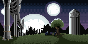
|
|
|
IP Logged |
|
|
Claes
Midshipman
Joined: 04 September 2008 Location: Sweden Online Status: Offline Posts: 49 |
Posted: 14 October 2008 at 11:56pm |
|
Would like to say, that the light from the moon can be very strong if its full, and thus making stuff quite bright with its full colour (with a slright blueness i guess, with a blue moon).
And with this piece, you got 3! full moons, so the light should be rather strong form that (well, if thats how these moons work, they maynot be be same as our moon) However, the change Skamocore did does work alot better. Atlest now the sky gives the hole thing a loot stronger "at night" feeling. Otherwise I suport stronger colours that you have. |
|
|
IP Logged |
|
|
fawful
Commander
Joined: 06 July 2023 Online Status: Offline Posts: 122 |
Posted: 15 October 2008 at 5:46am |

Removed building,changed colours in an attemp to make it look like it's night.
|
|
|
IP Logged |
|
|
minipuck
Commander
Joined: 23 August 2008 Online Status: Offline Posts: 185 |
Posted: 15 October 2008 at 7:17am |
|
everything is more saturated but the red of the guys suit just doesn't look right
|
|
|
IP Logged |
|
|
skamocore
Admiral
Joined: 07 April 2021 Online Status: Offline Posts: 3866 |
Posted: 15 October 2008 at 7:19am |
|
wow, removing the building really helped this piece a lot :O
The man needs a shadow, and the object next to him needs a longer shadow. |
|
|
IP Logged |
|
|
fawful
Commander
Joined: 06 July 2023 Online Status: Offline Posts: 122 |
Posted: 15 October 2008 at 8:58am |
|
|
|
|
IP Logged |
|
|
skamocore
Admiral
Joined: 07 April 2021 Online Status: Offline Posts: 3866 |
Posted: 15 October 2008 at 9:51am |
|
I have to disagree, you didn't really remove the jaggies in the moon at all...
I'm by no means an AA expert, but I edited a quarter of your right-most moon. As I said, it's not perfect, but I think you can learn something by having a look at what I've done and comparing it to your own version: 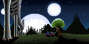 I added one colour, but the rest of the colours I used in my AA were already in your image. Edited by skamocore - 15 October 2008 at 9:52am |
|
|
IP Logged |
|
|
fawful
Commander
Joined: 06 July 2023 Online Status: Offline Posts: 122 |
Posted: 15 October 2008 at 10:25am |
|
I see what you mean,so ive had another go at aaing the moons
 Edited by fawful - 15 October 2008 at 10:26am |
|
|
IP Logged |
|
|
RoboBOT
Seaman
Joined: 21 May 2008 Online Status: Offline Posts: 30 |
Posted: 15 October 2008 at 10:23pm |
|
This is looking great!
I agree with skamocore about the shadows. Also, I think the foliage of the tree should be darker (as in extend the dark shade out a bit). The foliage looks pretty thick, so not a lot of light would reach this side of the branches. |
|
|
IP Logged |
|
|
fawful
Commander
Joined: 06 July 2023 Online Status: Offline Posts: 122 |
Posted: 17 October 2008 at 9:30am |
 Last version,any final nit picks?
|
|
|
IP Logged |
|
|
fawful
Commander
Joined: 06 July 2023 Online Status: Offline Posts: 122 |
Posted: 20 October 2008 at 9:37am |
|
Hate to bump this,but just thought i'd let you know its finished.
|
|
|
IP Logged |
|
| |
||
Forum Jump |
You cannot post new topics in this forum You cannot reply to topics in this forum You cannot delete your posts in this forum You cannot edit your posts in this forum You cannot create polls in this forum You cannot vote in polls in this forum |
|

