| Active TopicsSearchRegisterLogin |
| WIP (Work In Progress) | |
| |
  |
| Author | Message |
|
MadToaster
Seaman 
Joined: 12 September 2005 Online Status: Offline Posts: 8 |
  Topic: Solid Snake Topic: Solid SnakePosted: 12 September 2005 at 2:55am |
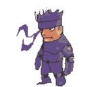 I'm new here but I used to post at pixelation. Just wanted some comments on my color choice (too dark? undersaturated) and if my tooning proportion are pleasing to the eyes or not. Anything else that can be said to help improve this is appreciated. I'll do my final draft based on how it looks to me tomorrow and what you guys have to say. Was upset that pixelation disapeared but it's nice to find another place to learn with like minded people. Edited by MadToaster |
|
 IP Logged IP Logged |
|
|
EyeCraft
Commander 
Joined: 07 July 2005 Location: Australia Online Status: Offline Posts: 425 |
Posted: 12 September 2005 at 3:16am |
|
Hi MadToaster, glad you found your way here. There's a number of
pixelation folk here. Pixelation lives on in our hearts -_- lol.
Hmm, maybe theres too much luminousity contrast between the face and the body parts that are in shadow. Perhaps have the face shadow tones lose some saturation and value. I think he could use a little bit more of a neck, his shoulder literally morphs into his skull. Aaaand I think you need at least 1 more highlight colour for the skin colour and the suit colour, I think.  |
|
|
IP Logged |
|
|
Godslayer
Midshipman 
Joined: 26 June 2005 Online Status: Offline Posts: 69 |
Posted: 12 September 2005 at 4:58am |
|
Oi.
|
|
|
IP Logged |
|
|
MadToaster
Seaman
Joined: 12 September 2005 Online Status: Offline Posts: 8 |
Posted: 14 September 2005 at 5:34am |
|
Originally posted by EyeCraft think he could use a little bit more of a neck, his shoulder literally morphs into his skull. Aaaand I think you need at least 1 more highlight colour for the skin colour and the suit colour, I think. 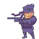 Tightened up the anatomy (he's got a neck now. ;p) and tried out using more shades. Also took a look at some official artwork to draw him more accurately. I'll probably try colorizing the line art next to match the light source and a few other things. Anyone see more room to improve? |
|
|
IP Logged |
|
| |
||
Forum Jump |
You cannot post new topics in this forum You cannot reply to topics in this forum You cannot delete your posts in this forum You cannot edit your posts in this forum You cannot create polls in this forum You cannot vote in polls in this forum |
|
