| Active TopicsSearchRegisterLogin |
| WIP (Work In Progress) | |
| |
  |
| Author | Message |
|
Alexandre Belmonte
Seaman 
Joined: 09 September 2010 Online Status: Offline Posts: 13 |
  Topic: Medieval Fantasy Topic: Medieval FantasyPosted: 01 February 2011 at 11:13am |
|
Hi everybody,
I'm working on this piece, a mock-up of a final fantasy based game. 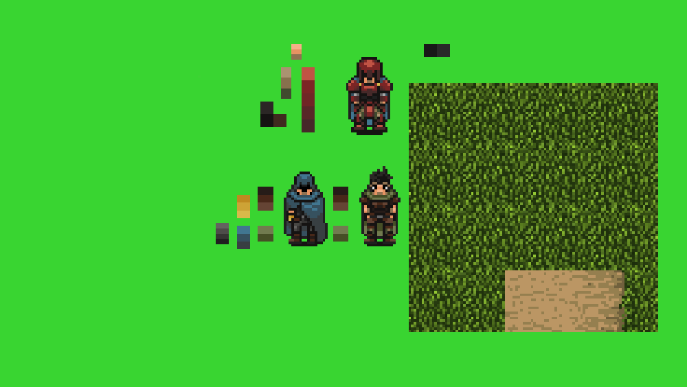 Edited by Alexandre Belmonte - 01 February 2011 at 11:21am |
|
 IP Logged IP Logged |
|
|
vlad61
Midshipman 
Joined: 22 April 2015 Online Status: Offline Posts: 96 |
Posted: 01 February 2011 at 12:02pm |
|
Very cool, you can post your art at a 1:1 scale we can zoom in on our own by clicking the images.
So far no crits really wanna see more! |
|
|
IP Logged |
|
|
ChrisButton
Commander 
Joined: 10 September 2010 Online Status: Offline Posts: 371 |
Posted: 01 February 2011 at 10:16pm |
|
I like the grass tile, I really can't tell where it starts and stops!
The colour ramps appear to be quite bland as they appear to be
softer and faded variations of themselves. If you add a tiny bit of
saturation to the colours they would look great, and shift their hues.
This is particularly directed at the red as the difference between the 5
variations of red is incredibly hard to notice, you could probably emit
some of those colours or just change them. :-)
|
|
|
IP Logged |
|
|
Alexandre Belmonte
Seaman
Joined: 09 September 2010 Online Status: Offline Posts: 13 |
Posted: 03 February 2011 at 1:39pm |
|
Vlad61:
Nice you are liking. About the 1:1 scale, I don't know why but here in my monitor, when I click the image it feels blurry. ChrisButton: Thanks for your tips Chris! I really suck in colors! I tried to change the saturation but coldn't make much progress, almost everything I changed, it changed for worse. Here is the "new" colors I get for my experimentations (left is the old ones, right is the new version). 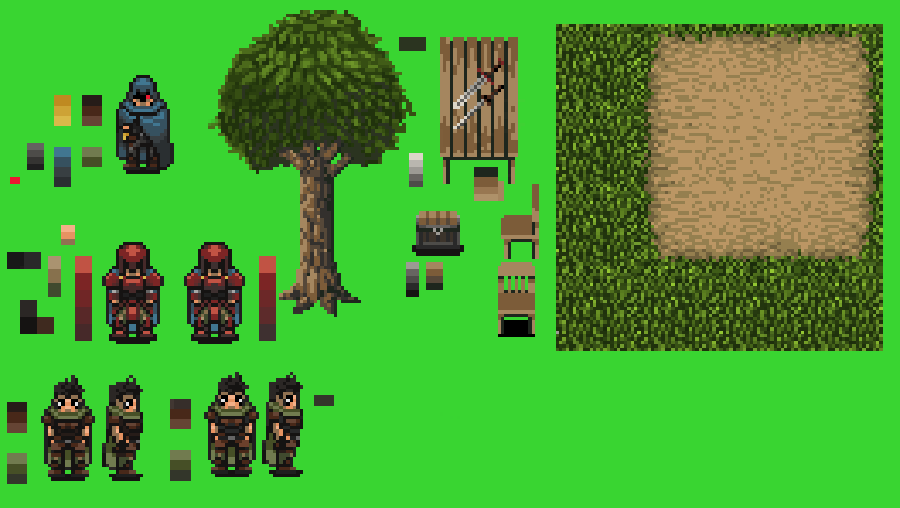 Edited by Alexandre Belmonte - 03 February 2011 at 1:48pm |
|
|
IP Logged |
|
|
yaomon17
Commander
Joined: 07 September 2022 Online Status: Offline Posts: 136 |
Posted: 03 February 2011 at 3:17pm |
|
Grass tessellation.

|
|
|
IP Logged |
|
|
tanuki
Commander
Joined: 01 April 2014 Online Status: Offline Posts: 333 |
Posted: 03 February 2011 at 4:11pm |
|
there's a grey spot in the grass, bottom left corner. :)
I don't see it in yaomon17's edit though. When I click it becomes blurry too, but it's not the monitor. Must be the browser or something. Edited by tanuki - 03 February 2011 at 4:40pm |
|
|
IP Logged |
|
|
Alexandre Belmonte
Seaman
Joined: 09 September 2010 Online Status: Offline Posts: 13 |
Posted: 06 February 2011 at 11:33pm |
|
Thanks for the comments guys. I remade the grass.
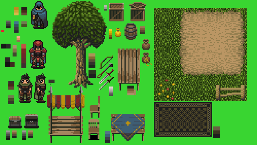 Edited by Alexandre Belmonte - 06 February 2011 at 11:40pm |
|
|
IP Logged |
|
|
vlad61
Midshipman
Joined: 22 April 2015 Online Status: Offline Posts: 96 |
Posted: 09 February 2011 at 1:14am |
|
Lovin it! I think the grass that flows out on the road could be a bit longer, as to emphesize it a little more. atm it still looks a bit square.
Still dont have much to crit but perhaps you can try giving the edges of your models a bit more highlighting / shadowing? especially that front view of the chair. needs seperating the seat from the back seat shading wise. |
|
|
IP Logged |
|
|
Alexandre Belmonte
Seaman
Joined: 09 September 2010 Online Status: Offline Posts: 13 |
Posted: 24 February 2011 at 3:56am |
|
Vlad61:
Sorry for my late response! I made de corners of the road more rounded, perhaps I should make even longer grass. About the highlighting/shadowing on characters can you link some exemples? I'm not sure I understood what you mean. 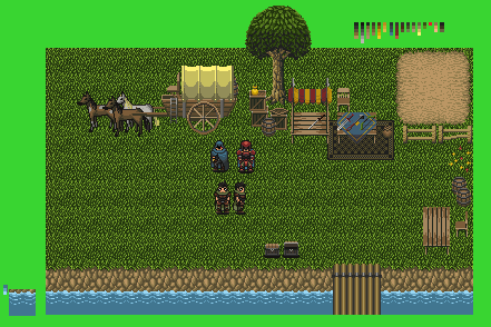 |
|
|
IP Logged |
|
|
Zeratanus
Commander
Joined: 03 December 2020 Online Status: Offline Posts: 576 |
Posted: 24 February 2011 at 10:04am |
|
The grass has more contrast than everything else in the piece :\. Tone down the lightest color a bit. It both makes it hard to focus on the other sprites, and they look flat by comparison to the grass.
|
|
|
IP Logged |
|
|
Demon11777
Seaman
Joined: 25 January 2016 Online Status: Offline Posts: 25 |
Posted: 24 February 2011 at 9:07pm |
|
That grass is Wayyyy to noisy IMO. Doesn't need that much detail. Other sprites are looking pretty damn cool I wanna play this game :]
Edited by Demon11777 - 24 February 2011 at 9:08pm |
|
|
IP Logged |
|
|
Alexandre Belmonte
Seaman
Joined: 09 September 2010 Online Status: Offline Posts: 13 |
Posted: 02 March 2011 at 11:31am |
|
Thanks Zeratamus and Demon. The grass was a white elephant I tried to ignore and convince myself it was ok... :D
I reworked the grass and the sand...here it is: 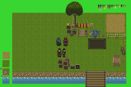 |
|
|
IP Logged |
|
|
Zeiphyrus
Seaman
Joined: 11 July 2015 Online Status: Offline Posts: 23 |
Posted: 02 March 2011 at 12:22pm |
|
maybe you should try limiting the grid effect on the grass unless you wanted it that way...
I personally find the carpet a bit overloaded, maybe try with a simpler pattern. The color are much better and the overall work is very good |
|
|
IP Logged |
|
|
Zeratanus
Commander
Joined: 03 December 2020 Online Status: Offline Posts: 576 |
Posted: 02 March 2011 at 2:05pm |
|
Much better. Though now I notice that your characters stand out since they are the only things with outlines. But whether or not you keep the outlines I'd say is more based on how you want it to look
|
|
|
IP Logged |
|
|
Demon11777
Seaman
Joined: 25 January 2016 Online Status: Offline Posts: 25 |
Posted: 02 March 2011 at 9:32pm |
|
Im liking the grass now much better :] As for the out lines I rather like how it makes the characters stand out, but thats just my opinion. Also you might wanna consider adding some more realism to the grass like a few mushrooms or a stump, some rocks or leafs or even a dirt patch just to loose the repetitive feel it has.
|
|
|
IP Logged |
|
|
Alexandre Belmonte
Seaman
Joined: 09 September 2010 Online Status: Offline Posts: 13 |
Posted: 14 March 2011 at 9:54pm |
|
Sorry for the late response! I was busy with other works.
Zeiphyrus: Thanks for your comments! I didn't intend to make the grid effect, tried to fix that on this update. See what you think. Zeratamus: Now that you mention I don't know if I keep the outlines or not. Demon11777: Nice you like it! At least some rocks and tall grass I will add, stumps is classic too. I done some inclined border to help break the composition. 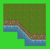 |
|
|
IP Logged |
|
| |
||
Forum Jump |
You cannot post new topics in this forum You cannot reply to topics in this forum You cannot delete your posts in this forum You cannot edit your posts in this forum You cannot create polls in this forum You cannot vote in polls in this forum |
|
