| Active TopicsSearchRegisterLogin |
| WIP (Work In Progress) | |
| |
  |
| Author | Message |
|
AngerAlone
Seaman 
Joined: 30 March 2012 Online Status: Offline Posts: 6 |
  Topic: (WIP) Battle Bunnies sprites Topic: (WIP) Battle Bunnies spritesPosted: 30 March 2012 at 5:35pm |
|
Hey all, my friend and I are working on a mobile tactical rpg (isometric) and I've got some sprites I've been working on for the characters in game. This is my first time ever working with pixel art sprites for anything (I typically just draw/paint) and I wanted some feedback from those of you who are more experienced.
 Edited by AngerAlone - 30 March 2012 at 5:36pm |
|
 IP Logged IP Logged |
|
|
AngerAlone
Seaman
Joined: 30 March 2012 Online Status: Offline Posts: 6 |
Posted: 31 March 2012 at 7:51pm |
|
I got a couple more done earlier today:


I think I've improved a bunch even in the few hours I took to do these three new ones. As always, any feedback is appreciated. |
|
|
IP Logged |
|
|
AngerAlone
Seaman
Joined: 30 March 2012 Online Status: Offline Posts: 6 |
Posted: 01 April 2012 at 2:04pm |
|
Finished a couple more and made some changes to the first couple.

|
|
|
IP Logged |
|
|
echocharliepapa
Seaman
Joined: 06 March 2012 Online Status: Offline Posts: 27 |
Posted: 01 April 2012 at 4:42pm |
|
zombie one might look better with more missing flesh/parts. the shading on some of them looks a little flat, still, especially the ninja (could be fixed just by making the shadow tones darker?) and around the neck on some of the others. overall, they look good, digging the style.
|
|
|
IP Logged |
|
|
AngerAlone
Seaman
Joined: 30 March 2012 Online Status: Offline Posts: 6 |
Posted: 01 April 2012 at 5:10pm |
|
Yeah, I'm gonna have to go back and re-shade Ninja. He's just really bland at the moment, and I think that's more from the color choice than anything, but I feel kinda stuck in that regard. He is a Ninja after all.
|
|
|
IP Logged |
|
|
AngerAlone
Seaman
Joined: 30 March 2012 Online Status: Offline Posts: 6 |
Posted: 02 April 2012 at 10:58pm |


|
|
|
IP Logged |
|
|
Friend
Commander 
Joined: 01 April 2015 Online Status: Offline Posts: 710 |
Posted: 03 April 2012 at 7:09am |
|
|
|
IP Logged |
|
|
cure
Commander
Joined: 23 March 2022 Online Status: Offline Posts: 2859 |
Posted: 03 April 2012 at 7:37am |
|
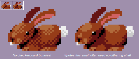
The dithering advice makes more sense in the context of the actual advice. But the crit is valid, there's too much dithering on several of these. Dithering is really something you only really resort to when you're out of other options.
In general I'd say more contrast, your hues are too close together. And because you lack many strong darks, the jump to black is pretty stark. Some indication of separate toes would also be neat. |
|
|
IP Logged |
|
|
AngerAlone
Seaman
Joined: 30 March 2012 Online Status: Offline Posts: 6 |
Posted: 03 April 2012 at 10:17am |
|
Thanks a lot for the advice guys. I made one without the dithering and I tried to do some higher contrast shading.
Is this better? 
EDIT: Uploaded earlier (lighter) version. Here's the darker one.  Edited by AngerAlone - 03 April 2012 at 10:18am |
|
|
IP Logged |
|
| |
||
Forum Jump |
You cannot post new topics in this forum You cannot reply to topics in this forum You cannot delete your posts in this forum You cannot edit your posts in this forum You cannot create polls in this forum You cannot vote in polls in this forum |
|
