| Active TopicsSearchRegisterLogin |
| WIP (Work In Progress) | |
| |
  |
| Author | Message |
|
Mrmo Tarius
Commander 
Joined: 12 February 2022 Online Status: Offline Posts: 367 |
  Topic: A bunny Topic: A bunnyPosted: 28 May 2014 at 6:54am |
|
Been working on this guy on and off... still lacking legs and a background :D

|
|
 IP Logged IP Logged |
|
|
jalonso
Admiral 
Joined: 29 November 2022 Online Status: Offline Posts: 13537 |
Posted: 28 May 2014 at 7:57am |
|
What a great palette...yummy.
|
|
|
|
|
|
IP Logged |
|
|
FrostPumpkin
Commander
Joined: 18 January 2022 Online Status: Offline Posts: 188 |
Posted: 28 May 2014 at 8:05am |
|
This is amazing ! Finish it now :D
|
|
|
IP Logged |
|
|
neofotistou
Commander
Joined: 07 September 2015 Online Status: Offline Posts: 175 |
Posted: 28 May 2014 at 5:53pm |
|
disgusting and amazing! The palette is yummy indeed!
|
|
|
IP Logged |
|
|
tomic
Midshipman 
Joined: 21 July 2020 Online Status: Offline Posts: 93 |
Posted: 29 May 2014 at 2:29am |
|
amazing!
not sure about legs and background.. i think it's most effective with it's legs fading into the dark and without much background.. maybe minimal background at the most, like something forest-ish with the silhouette of somethig scary hanging in the back :) Edited by tomic - 29 May 2014 at 2:30am |
|
|
pixel suit up!
|
|
|
IP Logged |
|
|
Mrmo Tarius
Commander
Joined: 12 February 2022 Online Status: Offline Posts: 367 |
Posted: 29 May 2014 at 3:02am |
|
Well, at least one leg is fading into the darkness :)

(yeah, the canvas size is a bit large, I never learned how to properly crop an image in grafx2 :D ) Thanks for the backdrop suggestion, I'll experiment with silhouettes :D |
|
|
IP Logged |
|
|
DawnBringer
Commander
Joined: 11 August 2024 Online Status: Offline Posts: 568 |
Posted: 29 May 2014 at 3:34am |
|
You pick up a brush and run my brush-2-image script ;)
Cute bunny :D |
|
|
IP Logged |
|
|
Mrmo Tarius
Commander
Joined: 12 February 2022 Online Status: Offline Posts: 367 |
Posted: 29 May 2014 at 3:43am |
|
Good to know! I'm still exploring the toolset :D
|
|
|
IP Logged |
|
|
tomic
Midshipman
Joined: 21 July 2020 Online Status: Offline Posts: 93 |
Posted: 29 May 2014 at 3:53am |
|
quick edit on the first wip... something swamp-ish. doesn't expand the canvas - i liked the first version with small canvas better - gives the feeling of a surprising snapshot.. someone's last photo :)
 your bunny is distracting me from working :) Edited by tomic - 29 May 2014 at 3:54am |
|
|
pixel suit up!
|
|
|
IP Logged |
|
|
Mrmo Tarius
Commander
Joined: 12 February 2022 Online Status: Offline Posts: 367 |
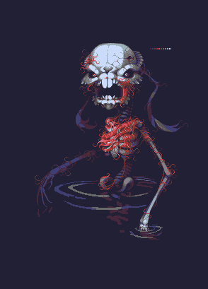
Posted: 30 May 2014 at 3:23am |
|
Dammit, that's a neat idea. Should have thought of it before I made the legs :D
Here's the current wip state: 
|
|
|
IP Logged |
|
|
AshCrimson
Commander
Joined: 24 April 2020 Online Status: Offline Posts: 606 |
Posted: 30 May 2014 at 3:57am |
|
Don't have much to add unfortunately, but it looks really good so far! I like how smooth it is (the AA does it great justice as well as the dithering) and how the tendril-like muscles (could be wrong?) are keeping the entire skeleton together.
|
|
|
IP Logged |
|
|
dyluck
Commander
Joined: 24 July 2015 Online Status: Offline Posts: 231 |
Posted: 30 May 2014 at 10:51am |
|
Awesome!
The crypt Keeper's version of Bugs Bunny. |
|
|
IP Logged |
|
|
Mrmo Tarius
Commander
Joined: 12 February 2022 Online Status: Offline Posts: 367 |
Posted: 30 May 2014 at 11:17am |
|
Here's some palette swaps and edits :P

|
|
|
IP Logged |
|
|
jalonso
Admiral
Joined: 29 November 2022 Online Status: Offline Posts: 13537 |
Posted: 30 May 2014 at 11:42am |
|
To me, its all about how the dithering on the foot works on the BG.
The original colors still looks the best but of these new edits I only like the very first on the left. |
|
|
|
|
|
IP Logged |
|
|
FrostPumpkin
Commander
Joined: 18 January 2022 Online Status: Offline Posts: 188 |
Posted: 30 May 2014 at 11:56am |
|
The third looks good for me, it's more contrasted and it really adds to the dark impression of the piece and the colors works well together.
The 1st is good too but the details on the red/flesh areas are less defined and the dark red needs to be darkened. I vote for the 3rd one The one with green and blue works well too, interesting/surprising color choice, the green makes it looks more putrid, rotten The whole execution of the piece is great, the only thing I have to say is about the highlights on the leg fading into the background being a little too strong compared to the arm |
|
|
IP Logged |
|
|
PixelSnader
Commander
Not a troll! Joined: 05 June 2014 Online Status: Offline Posts: 3194 |
Posted: 30 May 2014 at 12:21pm |
|
Yeah gonna agree on the third palette. It's nice and natural, but not quite as monochromatic as the last. The subtle bluegreens work much better with the white ramp than your initial version.
And I also think the dithered foot might be the biggest issue. Why does it fade away so darkly? It's not that far back,so it should be a bit lighter. Or there could be super dense fog but then the light foot should also be fogged up. In most images it kind of feels as though part of his leg is missing/broken. |
|
|
▄▄█ ▄▄█ ▄█▄ ▄█▄ |
|
|
IP Logged |
|
|
tomic
Midshipman
Joined: 21 July 2020 Online Status: Offline Posts: 93 |
Posted: 30 May 2014 at 12:26pm |
|
noooo!. don't change the pallette,
the red in the palette is indispensable!! |
|
|
pixel suit up!
|
|
|
IP Logged |
|
|
jalonso
Admiral
Joined: 29 November 2022 Online Status: Offline Posts: 13537 |
Posted: 30 May 2014 at 3:16pm |
|
Originally posted by tomic
...the red in the palette is indispensable... The original palette is superb and unique for you. All these new variations are attractive but 'more of the same' from you. Why fight getting into your comfort zone when you so successfully got out of it in the original... ...just saying, k. |
|
|
|
|
|
IP Logged |
|
|
DawnBringer
Commander
Joined: 11 August 2024 Online Status: Offline Posts: 568 |
Posted: 31 May 2014 at 9:13am |
|
Yeah, the 3d is pretty neat and as stated the green in #5 adds a nice rotten feeling.
@Jal: Actually the original is DB32 ;) |
|
|
IP Logged |
|
|
Mrmo Tarius
Commander
Joined: 12 February 2022 Online Status: Offline Posts: 367 |
Posted: 31 May 2014 at 10:21am |
|
Yup, "borrowed" right from DB32. (not that it's very unusual for me to do, right?) :D
The palette swaps are, in left-to-right order: 1) my 13col palette (although I think it's not complete plus there might be another color left from DB32 where needed 2) the hueshifted thing I used for "Abandonment" (really just grayscale with added greenish and pinkish hues) 3) slightly modified palette I used for "Berenice" 4) (I think) Ptoing's C64 palette :P 5) Temple of Lunarius colors (the green and blue thing already noticed a few posts up hehe) 6) The simple, almost monochromatic palette I used for an older portrait study. I might go for some sort of hybrid palette or I can just tweak the reds on the first one to the left to make it appear more... juicy :D Edited by Mrmo Tarius - 31 May 2014 at 10:26am |
|
|
IP Logged |
|
|
jalonso
Admiral
Joined: 29 November 2022 Online Status: Offline Posts: 13537 |
Posted: 31 May 2014 at 10:44am |
|
Damm, that DB palette!!!
|
|
|
|
|
|
IP Logged |
|
|
Mrmo Tarius
Commander
Joined: 12 February 2022 Online Status: Offline Posts: 367 |
Posted: 02 June 2014 at 4:40am |
|
more wip
 Edited by Mrmo Tarius - 02 June 2014 at 5:23am |
|
|
IP Logged |
|
|
AlexHW
Commander
Joined: 19 June 2019 Online Status: Offline Posts: 285 |
Posted: 02 June 2014 at 8:07am |
|
wow, I like where this is going!
|
|
|
IP Logged |
|
|
StoneStephenT
Commander
Joined: 08 April 2021 Online Status: Offline Posts: 252 |
Posted: 02 June 2014 at 11:37am |
|
Well, crap, thats going to give me nightmares.
 |
|
|
IP Logged |
|
|
Temessis
Midshipman
Joined: 21 August 2021 Online Status: Offline Posts: 54 |
Posted: 02 June 2014 at 3:02pm |
|
This is so creepy!!!! But it looks nice :D
|
|
|
IP Logged |
|
|
DawnBringer
Commander
Joined: 11 August 2024 Online Status: Offline Posts: 568 |
Posted: 02 June 2014 at 3:52pm |
|
Consider the dimensions/composition before you get too far. Main object is in the wonky spot between center and thirds right now.
|
|
|
IP Logged |
|
|
PixelSnader
Commander
Not a troll! Joined: 05 June 2014 Online Status: Offline Posts: 3194 |
Posted: 02 June 2014 at 10:06pm |
|
Clearly this should end up as a 1920x1080 (or 1200, for me) background. No, in all seriousness, I think this could work very well as a somewhat minimalist BG.
|
|
|
▄▄█ ▄▄█ ▄█▄ ▄█▄ |
|
|
IP Logged |
|
|
H|F
Commander
Joined: 14 March 2020 Online Status: Offline Posts: 363 |
Posted: 12 June 2014 at 2:13am |
|
It could easily be my eyes but the right paw/hand seems longer/larger even though the other is "closer" to the viewer. Obviously the pose is very different in each so like I said.... I could be totally wrong.
Also, the greens in the 2nd to last palette is very nice! The wormy bits make me think of The Strain btw! Looking forward to the final product. |
|
|
IP Logged |
|
|
linkboy84
Commander
Joined: 16 April 2015 Online Status: Offline Posts: 61 |
Posted: 25 May 2015 at 4:01pm |
|
Maybe you could add some rotting flesh and fur on the main skeleton? And this might make it go overboard, but maybe some blood from the teeth/paws
Edited by linkboy84 - 25 May 2015 at 4:03pm |
|
|
IP Logged |
|
|
Limes
Commander
Joined: 15 September 2021 Online Status: Offline Posts: 683 |
Posted: 25 May 2015 at 6:07pm |
|
DAT NECROBUMP
|
|
|
|
|
|
IP Logged |
|
|
linkboy84
Commander
Joined: 16 April 2015 Online Status: Offline Posts: 61 |
Posted: 26 May 2015 at 6:51am |
|
I was giving a honest suggestion.
|
|
|
IP Logged |
|
|
Hapiel
Rear Admiral 
Joined: 30 June 2023 Online Status: Offline Posts: 3266 |
Posted: 26 May 2015 at 7:06am |
|
And it did not match the suggestions I gave you. It was older than 30 days, not on the front page,and also it was very unlikely that your suggestion would restart the discussion as MRMO also did not respond to the last few suggestions before that.
|
|
|
IP Logged |
|
| |
||
Forum Jump |
You cannot post new topics in this forum You cannot reply to topics in this forum You cannot delete your posts in this forum You cannot edit your posts in this forum You cannot create polls in this forum You cannot vote in polls in this forum |
|
