| Active TopicsSearchRegisterLogin |
| WIP (Work In Progress) | |
| |
  |
| Author | Message |
|
RebeaLeion
Commander 
Joined: 04 October 2017 Online Status: Offline Posts: 321 |
  Topic: Nightkeep (Mega WIP thread) Topic: Nightkeep (Mega WIP thread)Posted: 12 July 2016 at 7:48am |
|
Hi, I am forging my second mega thread.
I am struggling with my pixels and I could use your help like I did before in Arvesia thread , that one was very helpful. I will post anything related to my project to this section. I am currently working on some sprites, but I am bad animator (haha, I think my animations are of the same quality as my coding). I am not often sure what I am even doing. Here's sprite sheet which I want to animate, idle, walk for each character. here's 1st sprite: Idle 
walk 
what do you think ? Also which girl on sprite sheet do you like more A or B ? Thanks for letting me know. |
|
 IP Logged IP Logged |
|
|
DieMango
Commander
Joined: 23 November 2017 Online Status: Offline Posts: 180 |
Posted: 12 July 2016 at 11:25am |
|
The second one looks better but i like the first one more...the very straight line from the hair that is in the forground bothers me...
Walking look fine but something about the arm movement seems to fast.O and the Head looks kinda to fixed...maybe put ita little forward. Also idle shoudt be just legs...arms and body shoud move... |
|
|
IP Logged |
|
|
dpixel
Commander
Joined: 03 February 2015 Online Status: Offline Posts: 564 |
Posted: 12 July 2016 at 1:55pm |
|
First off 18 frames for the idle? It looks like it's only 4. I would shoot for 8.
I agree with DieMango...more should be moving besides the legs. And if you're going to bend at the knees, the shading should reflect that. Can I suggest a slight side to side movement for the idle? I find that easier on sprites this size. Also I count 31 colors (including the pure white). I would knock that down to 8 to 16 max. It will be so much easier when animating. Plus it'll force you pixel more cleanly. I do like your sprites though.  |
|
|
|
|
|
IP Logged |
|
|
RebeaLeion
Commander
Joined: 04 October 2017 Online Status: Offline Posts: 321 |
Posted: 13 July 2016 at 10:08am |
|
walk edit2, moved head a bit forward, hands re bit slower and tried to move scarf(shoulders)

idle 2 
|
|
|
IP Logged |
|
|
DieMango
Commander
Joined: 23 November 2017 Online Status: Offline Posts: 180 |
Posted: 13 July 2016 at 1:30pm |
|
The idle looks very stiff...i am not the best in english so looks at some refrence...think about bretahing rather then....well...it looks like a weird piston motion :S
Ummm..thats and scarf? the walking looks pretty good now but you shoud rally consider make the scarf stand out or make is more see-able... But good progress so far ^^ |
|
|
IP Logged |
|
|
dpixel
Commander
Joined: 03 February 2015 Online Status: Offline Posts: 564 |
Posted: 14 July 2016 at 7:25pm |
|
Here's an idle edit with the side to side movement I mentioned earlier. It's only 4 frames and the colors reduced to 12. I worked it over quite a bit, but maybe it give you some ideas on animating, colors, etc.

|
|
|
|
|
|
IP Logged |
|
|
RebeaLeion
Commander
Joined: 04 October 2017 Online Status: Offline Posts: 321 |
Posted: 15 July 2016 at 5:57am |
|
interesting style dpixel. Anim itself is sure great for just 4 frames,your example changes art-style a bit, which is not the plan for my project I have already animated main hero in the previous style (20+ animations). Thats why i dont plan style-change for sprites, this purple haired girl is side-npc. I like your work tho !
|
|
|
IP Logged |
|
|
Nami
Seaman 
Joined: 16 March 2022 Online Status: Offline Posts: 1 |
Posted: 15 July 2016 at 7:13am |
|
I really like the rework and the colors of dpixel's edit, not so much the idle. I would rather go for a slow breathing or duelyst style, where the whole body slowly rises and descends http://pixelartus.com/post/118593905696/duelyst
At least this is what I usually aim for: http://pixeljoint.com/pixelart/104563.htm I messed with the walk a bit, made it more like this template:  The head low and high points were not consistent and I changed the leg position on 2 frames. Did not finalized the pixels though, just a rough edit. It could also use some hair movement to make it more dynamic :)  Sprite wise those long necks still bother me, it would be much nice to make the shadow smaller on the face, imho. |
|
|
IP Logged |
|
|
Damian
Commander
Joined: 24 February 2023 Location: United Kingdom Online Status: Offline Posts: 455 |
Posted: 16 July 2016 at 4:34am |
|
I can see why Dpixel edited the hair. At the moment on this character the hair looks very stiff and unnatural compared to your other characters.
|
|
|
IP Logged |
|
|
RebeaLeion
Commander
Joined: 04 October 2017 Online Status: Offline Posts: 321 |
Posted: 27 July 2016 at 11:27am |
|
then this mix dpixel and namis edit, combined into the new one.
 thank you ! I hope i cant use it freely. all credits goes to pixeljoint members, I will mention pj anyway. if this ever get to end (lol). thank you ! I hope i cant use it freely. all credits goes to pixeljoint members, I will mention pj anyway. if this ever get to end (lol).
by the way, that idle is more like "confuse" status, or something like that. (there is some black lost pixel nvm that) |
|
|
IP Logged |
|
|
dpixel
Commander
Joined: 03 February 2015 Online Status: Offline Posts: 564 |
Posted: 28 July 2016 at 7:05pm |
|
The walk looks a bit "floppy". The only word I could think of.
 But not bad. A little cleaning up would go a long way. But not bad. A little cleaning up would go a long way.The palette could use some organization too. You have a lot of colors that are very close to each other. Such as reds, flesh colors, browns and darks, that don't add anything. Palette comparison:  I'm no palette expert, but a more refined palette always make animating easier and forces a cleaner, more readable looking image. Also, a bit of an upper body twist would pull it together. |
|
|
|
|
|
IP Logged |
|
|
RebeaLeion
Commander
Joined: 04 October 2017 Online Status: Offline Posts: 321 |
Posted: 27 October 2016 at 5:04am |
|
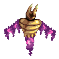
@dpixel ya, walk is not perfect o_o there might be possible more tweaking of walk before I implent the same floppy walk to all npcs. I m having break from npcs tho, before I ll spend sleepless night with walk I am adding some monsters.
------------------ Hi again, I am stucked... After 3+ hours of nothing I decided I need help from more experienced folks once again -_- I did this fellow this week, his arms and lower of body is something like cursed-steam / clouds / smoke, etc. material. (its floating enemy) I am really having hard time to animite it and make it some shape or flow right. I spent 3+ hours trying to animate this purple mass and all my efforts looked terrible. Because I can't animate legs or arms, I am trying to create a lot of monsters in my project arm/leg-less. And I can'ť animate even that -_- suggestions ? I am doing pixelart over 2 years and still I didnt learn how to animate (beside other things). It's really hard. 
|
|
|
IP Logged |
|
|
dpixel
Commander
Joined: 03 February 2015 Online Status: Offline Posts: 564 |
Posted: 27 October 2016 at 7:59am |
|
Looking at some of the duelyst sprites out there might help with something like this.
|
|
|
|
|
|
IP Logged |
|
|
RebeaLeion
Commander
Joined: 04 October 2017 Online Status: Offline Posts: 321 |
Posted: 28 October 2016 at 4:03am |
|
OK. this is hard, looked at duelyst for some fire/smoke effects, that pixelartist is crazy. current WIP, I think arms are done. so now the bottom part. I wasnt able to stick to original tho much.
VERSION 1 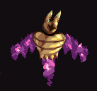
VERSION 2 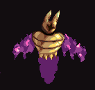
VERSION 3 (FINAL) 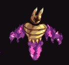
|
|
|
IP Logged |
|
|
RebeaLeion
Commander
Joined: 04 October 2017 Online Status: Offline Posts: 321 |
Posted: 14 December 2016 at 5:53am |
|
My reaction to http://pixeljoint.com/pixelart/109677.htm, stiff cloak was mentioned as mistake. Do you think this new ver is any better ?
QUICK edit: NEW >>>>>> 
idle sprite can be seen here |
|
|
IP Logged |
|
|
eishiya
Commander
Joined: 04 August 2022 Online Status: Offline Posts: 1109 |
Posted: 14 December 2016 at 6:46am |
|
Looks like the cloak's meant to be thick rather than actually rigid?
Don't have the bottoms move so much if you want to communicate thick, heavy fabric. Don't have the cloak edge be a straight line, have it curve around the shoulder and then drop down. That'll avoid the rigid look. Have the edge of the cloak sway/deform as the character moves. A heavy cloak wouldn't bounce, but it would definitely still sway and maybe even ripple. |
|
|
IP Logged |
|
|
Zeshio
Midshipman 
Joined: 07 June 2020 Online Status: Offline Posts: 23 |
Posted: 14 December 2016 at 7:37pm |
|
I agree with eishiya, if you want the cloak lighter it should start rippling from the shoulders, in more of a billowy look. If you want to keep the cloak heavier, it may look better swaying side to side, and not up like it does now.
|
|
|
IP Logged |
|
|
RebeaLeion
Commander
Joined: 04 October 2017 Online Status: Offline Posts: 321 |
Posted: 02 April 2017 at 10:44am |
|
I am trying to re-animate old sprites, like this one :
with new version, I hope this one is better (!) dont mind speed, I will adjust it. I feel I lack talent on animations. 8 frames is my cap. I am trying to draw low-frame animations to proceed with project. I have tons of characters. I am using template from above. 
|
|
|
IP Logged |
|
|
RebeaLeion
Commander
Joined: 04 October 2017 Online Status: Offline Posts: 321 |
Posted: 11 April 2017 at 10:11am |
|
I need help with tent. I drew old circus tent, but it somehow does not fit in. Or at least texture. I d like to look it like its old tent, but it looks weird. What do you think aobut it ? (made two edits of ver 1 during the time it was posted)
ver 1 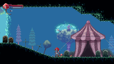
edit, Version 2 : I think I pillowshaded it, but it works the better than random broken clusters of light. 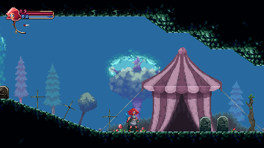
edit : VERSION 3 (even more of pillow shading) 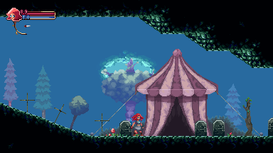
I really dont know how to work on it but pillow shading |
|
|
IP Logged |
|
|
RebeaLeion
Commander
Joined: 04 October 2017 Online Status: Offline Posts: 321 |
Posted: 16 April 2017 at 2:38am |
|
Ok so I think tent is ok this way. I am changing old sprite animations, I couldnt animate walks year ago. So it looked clumsy.
OLD 2015/16 : 
Idle: 
NEW walk- replacement 2017 (I didnt redraw it here, I worked with 2015/16 sprite and edited it), its hard ! 
any thoughts on anim ? / should i keep head static ? |
|
|
IP Logged |
|
|
JaumeAlcazo
Commander
Joined: 09 May 2018 Online Status: Offline Posts: 216 |
Posted: 06 May 2017 at 12:10pm |
|
It looks very nice to me :) I don't know how to improve it.
Hmm the tent. I would add something reddish inside. To give sense of mistery. Inside the tents should feel warm, inviting to enter. Look 
But reddish, not yellow, maybe. And in the background, the blue tint occupies too much space, I would broke it with a rock here and there, maybe. Too much AREA of blue tint. Blue tint is ok, but needs to be broken in chunks, maybe, like the "windows" to the lighter blue. |
|
|
IP Logged |
|
| |
||
Forum Jump |
You cannot post new topics in this forum You cannot reply to topics in this forum You cannot delete your posts in this forum You cannot edit your posts in this forum You cannot create polls in this forum You cannot vote in polls in this forum |
|
