| Active TopicsSearchRegisterLogin |
| WIP (Work In Progress) | |
| |
  |
| Author | Message |
|
PC PIXEL
Midshipman 
Joined: 30 December 2023 Online Status: Offline Posts: 69 |
  Topic: PC PIXEL works Topic: PC PIXEL worksPosted: 26 July 2019 at 2:31am |
|
I will use this thread for my works that are incompete and for ask advice/critics and correction for them. I'm studying the tutorials on the forum but I'm not shure about my works... These are my first try to draw somthing simple whit a gameboy palette, but I'm not sure about the shades and the AA. I wanted to put the light on the upper left, not for the columns that is on the left. I tried also some dithering...  Be rude  |
|
 IP Logged IP Logged |
|
|
Zubb
Midshipman
Joined: 07 October 2020 Online Status: Offline Posts: 38 |
Posted: 26 July 2019 at 7:25am |
|
I don't see any reason to be rude; for first pixel art drawings, they're pretty good. I'd say that the best-looking ones here are the flat rocks and the cubes. Their shading is really solid, and they have a good sense of texture despite their limited color palette. The one thing to watch out for is banding, which you can see in the flat rock's upper shading. You can fix that by adding some midtones in between the shading to 'break up' the shading so it doesn't hug the shape as closely. The rounded cone shaped rock (well, that's what I'm guessing it is) has similar banding problems, and it could also benefit from a little more shading on the bottom to imply its form. Most of the individual rock piles are fine (except for some pillow shading on the bottom one), but I think their lighting is a little inconsistent. The shading on the column is well made, but I feel like it should feel more rounded, especially in the rightmost version of it. Try making the middle shades longer than the ones at the ends to give it a better sense of depth. All in all, this is a good start, and I hope that you keep doing pixel art after this!
|
|
|
IP Logged |
|
|
PC PIXEL
Midshipman
Joined: 30 December 2023 Online Status: Offline Posts: 69 |
Posted: 27 July 2019 at 2:14am |
|
Originally posted by Zubb I don't see any reason to be rude; for first pixel art drawings, they're pretty good. Thanks. The one thing to watch out for is banding, which you can see in the flat rock's upper shading. You can fix that by adding some midtones in between the shading to 'break up' the shading so it doesn't hug the shape as closely. You mean this? The rounded cone shaped rock (well, that's what I'm guessing it is) has similar banding problems, and it could also benefit from a little more shading on the bottom to imply its form.  Most of the individual rock piles are fine (except for some pillow shading on the bottom one), but I think their lighting is a little inconsistent.  The shading on the column is well made, but I feel like it
should feel more rounded, especially in the rightmost version of it. Try
making the middle shades longer than the ones at the ends to give it a
better sense of depth. You mean like this?  The first column I tried for me it seemed like it was no round at all, but the second one I really like. I don't now if it's an improvement but I tried to roud up all the rocks.
|
|
|
IP Logged |
|
|
PC PIXEL
Midshipman
Joined: 30 December 2023 Online Status: Offline Posts: 69 |
Posted: 28 July 2019 at 2:09am |
 |
|
|
IP Logged |
|
|
MicmasH
Midshipman
Joined: 09 September 2019 Online Status: Offline Posts: 32 |
Posted: 28 July 2019 at 9:39pm |
|
Dang proffesional! Your work is worth a lot more than you think,pal. It's game worthy.
|
|
|
IP Logged |
|
|
Greycloak
Midshipman
Joined: 12 May 2025 Online Status: Offline Posts: 59 |
Posted: 29 July 2019 at 12:35pm |
|
I think the lighting on the topleft-most rock is off. It looks like it's being hit by two light sources instead of one. You should shade it in a similar manner as the rock that you made below it. The smaller rocks beside it would also be cast in shadow, if the light source is from the top-left. I also think the pile of rocks isn't very readable. I can't tell if they are supposed to be ontop of each other or not, but if they are, then the ones that are lower in the pile should have more shadows cast upon them and less highlights. (Edit: you fixed the highlight part with your first edit of them)
|
|
|
IP Logged |
|
|
PC PIXEL
Midshipman
Joined: 30 December 2023 Online Status: Offline Posts: 69 |
Posted: 29 July 2019 at 10:45pm |
|
@Micmash: You're too nice.  But I still have a lot to learn. Originally posted by Greycloak I think the lighting on the topleft-most rock is off. It looks like
it's being hit by two light sources instead of one. You should shade it
in a similar manner as the rock that you made below it. The smaller
rocks beside it would also be cast in shadow, if the light source is
from the top-left. I also think the pile of
rocks isn't very readable. I can't tell if they are supposed to be
ontop of each other or not, but if they are, then the ones that are
lower in the pile should have more shadows cast upon them and less
highlights. (Edit: you fixed the highlight part with your first edit of
them) Like this? I saved only these rock, the others I didn't like them... Meanwhile, the anvil/hammer is still in progress...but I don't know how to do the glares on the metal properly...  |
|
|
IP Logged |
|
|
PC PIXEL
Midshipman
Joined: 30 December 2023 Online Status: Offline Posts: 69 |
Posted: 01 August 2019 at 11:53pm |
|
Still in progress...but I need an advice... I have problems with the glares in the metal, and the metal it does not seems to metallic... I have this two solution for now...but...boh...there something that it does not feel right   |
|
|
IP Logged |
|
|
VictorianSolution
Midshipman
Joined: 14 July 2019 Online Status: Offline Posts: 23 |
Posted: 02 August 2019 at 1:04pm |
|
Unless its a perfectly polished, shiny anvil, you're not gonna have big, bright and reflective surfaces. I'd try adding more shades with diphering to give it texture and a more worn, dirty look, as well as using the highlight colour on more edges and fewer surfaces. Here's a reference that might help: 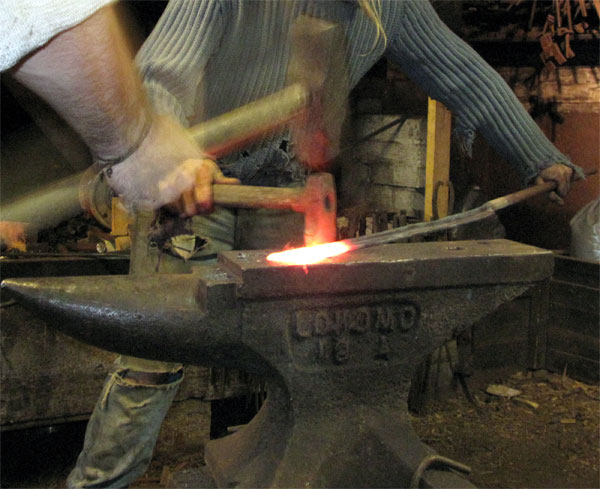 |
|
|
IP Logged |
|
|
PC PIXEL
Midshipman
Joined: 30 December 2023 Online Status: Offline Posts: 69 |
Posted: 03 August 2019 at 10:43am |
|
Nope...I'm not able to do properly the diphering... After 2 hours of tries, I've not a sigle pixel that seems well positioned...
 |
|
|
IP Logged |
|
|
PC PIXEL
Midshipman
Joined: 30 December 2023 Online Status: Offline Posts: 69 |
Posted: 09 August 2019 at 2:11pm |
|
I'm tring to diphering with another image...the anvil made me so nervous that I don't wanna see an anvil for a lot of time  ... ...I've never draw anything like this and I hope is a bit better than the old wip I posted here.  And maybe I have to add another colour and improve the petals...when I find the right way to do that...  Any advice is appreciated .
|
|
|
IP Logged |
|
|
VictorianSolution
Midshipman
Joined: 14 July 2019 Online Status: Offline Posts: 23 |
Posted: 09 August 2019 at 6:14pm |
|
Actually, I like that a lot, I think all you need to do is add a brighter highlight colour to add to some edges to make it look more interesting.
|
|
|
IP Logged |
|
|
PC PIXEL
Midshipman
Joined: 30 December 2023 Online Status: Offline Posts: 69 |
Posted: 11 August 2019 at 6:23am |
|
For now this is it...
 But I still think that's somthing wrong...and I don't know what is... Maybe it's my approach in what really is pixel art... |
|
|
IP Logged |
|
|
MicmasH
Midshipman
Joined: 09 September 2019 Online Status: Offline Posts: 32 |
Posted: 11 August 2019 at 11:53am |
|
No man not at all! This is definately pixel art! It's good too, I think what you're seeing is that the flower doesn't really have a light source. However you are quite amazing, flowers are hard and you've nailed the shape. Maybe learn some color theory, and what values are and you'll be fine! Keep it up man!.
|
|
|
IP Logged |
|
|
PC PIXEL
Midshipman
Joined: 30 December 2023 Online Status: Offline Posts: 69 |
Posted: 13 August 2019 at 10:12pm |
|
Color theory is a bit hard for me, create a palette whit right colors too... I'll keep it up
 |
|
|
IP Logged |
|
|
VictorianSolution
Midshipman
Joined: 14 July 2019 Online Status: Offline Posts: 23 |
Posted: 14 August 2019 at 11:37am |
|
Colour theory is really not that hard, it's really just about understanding some theoretics behind how colours interact, it's literally just explaining things you already know or observed, but putting it into precise theories. And learning it is 5% watching a youtube vid and 95% just trying stuff out. Plenty of skilled artists, especially pixel artists, switch colours around multiple times for a single piece. If you wanna go for a monochrome look, you could go for a more blue-ish green for the stalk and a purple for the red bud. If you want to preserve the three colours but want them to synergize more, you should go for a lighter green more towards yellow and a red more towards orange. Also, if you don't know about hue-shifting (coloured shadows) look that up, it's a major deal in art in general. Pick a colour for your light source (natural light is yellow) and move toward it for brighter parts and away from it for darker parts within the base colour of the object. If you have a gradient tool on your program, that can help you find some hues you like.
|
|
|
IP Logged |
|
|
PC PIXEL
Midshipman
Joined: 30 December 2023 Online Status: Offline Posts: 69 |
Posted: 17 August 2019 at 6:18am |
|
Last update...I know diphering shouldn't be used too much, but I like how is going on and the colours are a bit better than earlier.
 |
|
|
IP Logged |
|
|
dogboydog
Midshipman
Joined: 22 August 2019 Online Status: Offline Posts: 24 |
Posted: 18 August 2019 at 4:19am |
|
I like it! I feel like you have to give it to a girl in some adventure game. In my very amateur opinion it looks a little out of place that the roses have highlights but the leaves don't. But I'd guess you're trying to keep the number of colors down. If you made the red rose blue though you could buy a color for the leaves...I just wonder how it would look. Great job though
|
|
|
IP Logged |
|
|
PC PIXEL
Midshipman
Joined: 30 December 2023 Online Status: Offline Posts: 69 |
Posted: 19 August 2019 at 5:39am |
|
In my very amateur opinion it looks a little out of place that the roses have highlights but the leaves don't. That's because I hadn't touched the leaves yet. But you have right to say that I wanna keep the numbers of color down; searching in the site I found this rose that is absolutely beautiful for me, and obviously much betther than mine, but 22 color are definitely too much for a pixel art that show one object. This is the last update and if there are no issues I think that is done.  |
|
|
IP Logged |
|
|
dogboydog
Midshipman
Joined: 22 August 2019 Online Status: Offline Posts: 24 |
Posted: 19 August 2019 at 7:04am |
|
I really like it. It looks finished to me. I wonder what the shadow on the leaves would look like slightly darker. But it looks great as is
|
|
|
IP Logged |
|
|
PC PIXEL
Midshipman
Joined: 30 December 2023 Online Status: Offline Posts: 69 |
Posted: 20 August 2019 at 5:41am |
|
And darker will be...and it looks better.
 |
|
|
IP Logged |
|
|
dogboydog
Midshipman
Joined: 22 August 2019 Online Status: Offline Posts: 24 |
Posted: 20 August 2019 at 7:18am |
|
Gorgeous. The stem has a similar contrast to the rose now. Personally I think it's great!
|
|
|
IP Logged |
|
|
Sasha127
Midshipman
Joined: 01 June 2017 Online Status: Offline Posts: 20 |
Posted: 21 August 2019 at 7:41pm |
|
Dude... you're great. Im mean, if you really are an amateur artist, you are going places.
|
|
|
IP Logged |
|
|
PC PIXEL
Midshipman
Joined: 30 December 2023 Online Status: Offline Posts: 69 |
Posted: 22 August 2019 at 8:54am |
|
I really am an amateur in pixel art...usually my art was edible,I was a baker and a pastry chef and I have done no other jobs in my life. I started pixel art for fun two moths ago.
|
|
|
IP Logged |
|
|
Sasha127
Midshipman
Joined: 01 June 2017 Online Status: Offline Posts: 20 |
Posted: 22 August 2019 at 5:39pm |
|
Well, you're amazing, also baking is super cool.
|
|
|
IP Logged |
|
|
PC PIXEL
Midshipman
Joined: 30 December 2023 Online Status: Offline Posts: 69 |
Posted: 16 April 2020 at 3:18am |
|
It's quarantine time...I was bored and I started whit this piece.  There's still a lot of work to do... I wanted to do something with nature, trees, flowers, animals and all but i'm no good at making a palette on my own. Somebody has some palette that could fit well?
|
|
|
IP Logged |
|
|
PC PIXEL
Midshipman
Joined: 30 December 2023 Online Status: Offline Posts: 69 |
Posted: 30 April 2020 at 1:27am |
 I worked a bit more... For now I'm drawing people and animals even I'm not sure if it's all right, colors are still a mess...I'm trying to create a palette on my own but the results forn now are terrible. Any advice is well accpeted.  |
|
|
IP Logged |
|
|
PC PIXEL
Midshipman
Joined: 30 December 2023 Online Status: Offline Posts: 69 |
Posted: 07 May 2020 at 11:31pm |
|
That's the other piece I was working on in these weeks, but something's not feel right in the skin...  |
|
|
IP Logged |
|
|
PC PIXEL
Midshipman
Joined: 30 December 2023 Online Status: Offline Posts: 69 |
Posted: 14 May 2020 at 4:19am |
|
That's the piece I've already submitted...I though it was fine but it not seem so... And that's a pity because I have to made this piece in real. In the comments I was pointed out that there are Jaggies and banding and I tried to adjust them but the resuls in these days were worst than the previos pic... Any advice?
|
|
|
IP Logged |
|
|
Harmonica!
Midshipman
Joined: 26 February 2024 Online Status: Offline Posts: 58 |
Posted: 14 May 2020 at 10:29am |
|
I'm assuming that this is based on the icon that was recently put on display in the Vatican. Here's a quick edit that I hope will give an idea on how to address the banding in the face. I also believe that the number of colors used could easily be condensed down. As an example the color I've outlined in red could be gotten rid of and replaced with the color outlined in green which was already being used.  The cloak has a couple instances of banding but otherwise looks great! I would also make the background as flat as possible, and rework the colors to more reflect the gold leaf of the original icon. This way the Virgin will stand out more. I hope this helps!
|
|
|
IP Logged |
|
|
PC PIXEL
Midshipman
Joined: 30 December 2023 Online Status: Offline Posts: 69 |
Posted: 16 May 2020 at 12:05am |
|
Originally posted by Harmonica! I'm assuming that this is based on the icon that was recently put on display in the Vatican. I don't know if it's in the vatican...where I live there are tons of icons everywhere, and mosaics as well in every church and outside... I wanted to do something similar on pixel art, there are really few pieces whit this tipe of subjects... By the way really thaks for the advices, they will be very useful for future works similar at this.  |
|
|
IP Logged |
|
|
PC PIXEL
Midshipman
Joined: 30 December 2023 Online Status: Offline Posts: 69 |
Posted: 19 May 2020 at 6:04am |
|
This is the result...if I followed your advices well...  Maybe 18 colors is still too much but when I take off another color the result is worse than earlier. |
|
|
IP Logged |
|
| |
||
Forum Jump |
You cannot post new topics in this forum You cannot reply to topics in this forum You cannot delete your posts in this forum You cannot edit your posts in this forum You cannot create polls in this forum You cannot vote in polls in this forum |
|

