| Active TopicsSearchRegisterLogin |
| Collaborations/Challenges | |
| |
  |
| << Prev Page of 3 Next >> |
| Author | Message |
|
spartan_117
Commander 
Joined: 14 June 2007 Online Status: Offline Posts: 478 |
  Posted: 05 September 2007 at 9:17am Posted: 05 September 2007 at 9:17am |
|
thanx thats exactly what i needed. i just needed a reference to shade the devils face its my first time doing a profile.
|
|
 IP Logged IP Logged |
|
|
FrostPumpkin
Commander
Joined: 18 January 2022 Online Status: Offline Posts: 188 |
Posted: 05 September 2007 at 9:24am |
|
I'm glad to see that i can help you ;) I let you go for the rest ! I want your work to be great dude
|
|
|
IP Logged |
|
|
Corpus
Seaman 
Joined: 29 August 2007 Online Status: Offline Posts: 21 |
Posted: 05 September 2007 at 10:08am |
|
I dunno, I still think that the devil's head could be bigger - at the moment, it's much smaller than the Neo Spartan's head, so you don't get the impression that this is a formidable opponent.
|
|
|
IP Logged |
|
|
spartan_117
Commander
Joined: 14 June 2007 Online Status: Offline Posts: 478 |
Posted: 05 September 2007 at 12:01pm |
 I think this is final. Maybe change txt color. Thanx frost for the lighting reference. 26 colors total. |
|
|
IP Logged |
|
|
FrostPumpkin
Commander
Joined: 18 January 2022 Online Status: Offline Posts: 188 |
Posted: 05 September 2007 at 12:05pm |
|
you're welcomme dude ;) and I think you should change the text color...only one color would be better
|
|
|
IP Logged |
|
|
Corpus
Seaman
Joined: 29 August 2007 Online Status: Offline Posts: 21 |
Posted: 05 September 2007 at 12:07pm |
|
Cool, I like that blue a lot more than the old red.
Yeah, like Frost says, the text would look better in one colour. You could move the red to the 'Press Start' text to emphasise/differentiate it. |
|
|
IP Logged |
|
|
Blueberry_pie
Rear Admiral 
Joined: 24 July 2015 Online Status: Offline Posts: 2176 |
Posted: 05 September 2007 at 12:08pm |
|
How about pixeling the text yourself? 'Neo Spartan' looks like the font Stencil and 'Press Start' like, well, Press Start (or Press Stark K, I don't know).
|
|
|
IP Logged |
|
|
spartan_117
Commander
Joined: 14 June 2007 Online Status: Offline Posts: 478 |
Posted: 05 September 2007 at 12:11pm |
 You mean like this. |
|
|
IP Logged |
|
|
spartan_117
Commander
Joined: 14 June 2007 Online Status: Offline Posts: 478 |
Posted: 05 September 2007 at 12:18pm |
|
well blue considering the challenge is supposed to be a start screen for a game and considering most people in games use premade text i decided to type it. And considering that the text is just an add on to make it look like a game screen it really isnt the focal point of the challenge. I really hope th text is not gonna affect ur judgement.
 blue u choose which one if it makes u feel better. Edited by spartan_117 - 05 September 2007 at 12:18pm |
|
|
IP Logged |
|
|
Metaru
Commander
Joined: 28 December 2025 Online Status: Offline Posts: 3305 |
Posted: 05 September 2007 at 12:33pm |
|
working, with a bit of luck will finish this before friday.  unfortunately, i couldn't animate it.
|
|
|
I ate leel's babies
|
|
|
IP Logged |
|
|
Corpus
Seaman
Joined: 29 August 2007 Online Status: Offline Posts: 21 |
Posted: 05 September 2007 at 12:54pm |
|
Looks like it should be pretty awesome, Metaru :D
And yeah, Spartan, that looks great. The 'Press Start' text is off-centre relative to the title text, though, which looks a little unbalanced. Oh, also, currently, the contrast between the copyright text and the background is greater than the contrast between the actual title text and the background, which gives the impression that the copyright notice is more important than the title  It's not a huge issue, but design-wise, it's things like this that make all the difference. It's not a huge issue, but design-wise, it's things like this that make all the difference.Well, the title text - and text in general - is an integral part of any game, particularly in the case of the title screen. Also, "if it makes u feel better"? Hmm. Edited by Corpus - 05 September 2007 at 12:57pm |
|
|
IP Logged |
|
|
spartan_117
Commander
Joined: 14 June 2007 Online Status: Offline Posts: 478 |
Posted: 05 September 2007 at 1:08pm |
 there all done. Originally posted by Corpus Also, "if it makes u feel better"? Hmm. i was just saying that text doesnt affect a pixel in this case. Edited by spartan_117 - 05 September 2007 at 1:09pm |
|
|
IP Logged |
|
|
Larwick
Commander
Joined: 18 July 2024 Online Status: Offline Posts: 4015 |
Posted: 05 September 2007 at 6:22pm |
|
Pah, it should've been greys, or at least close to greys. And the greys should fill most of the image. IMHO.
Metaru, that's hot. |
|
 
|
|
|
IP Logged |
|
|
Monkey 'o Doom
Commander
Joined: 24 September 2005 Online Status: Offline Posts: 2994 |
Posted: 05 September 2007 at 6:27pm |
|
Spartan, you should work on polishing your piece before submitting. You have a lot of curves that are really sketchy right now and overall it looks unfinished. Antialias your text a bit; you have the colors, and those fonts look like they were made with a text tool rather than pixelling. I'm not sure how strict the gallery is on that if they're not inflating color count, but I'd pixel them myself in a similar style just to be safe were I in your position. Also, game screens usually have no copyright notifications or say "Copyright (c) <company> 2007" in small unobtrusive text in the corner.
|
|

RPG is numberwang. |
|
|
IP Logged |
|
|
Daria
Seaman
Joined: 27 August 2007 Online Status: Offline Posts: 2 |
Posted: 05 September 2007 at 7:51pm |
|
Spartan: Can't say I'm a huge fan of these new colors. If I didn't have reference from what this was before I wouldn't know this was a helmet/spartan and a devil. The spartan blue is way too strong, I think they should equally stand out.
Also, discounting text is bad form I think. It's not just based on your image, but as the whole.
|
|
|
IP Logged |
|
|
Shinamon
Seaman
Joined: 28 August 2007 Online Status: Offline Posts: 4 |
Posted: 05 September 2007 at 9:01pm |
|
Fixed up the outline, doing the colouring/background tomorrow.
This colour isn't going to be a final colour, I think.  |
|
|
IP Logged |
|
|
Corpus
Seaman
Joined: 29 August 2007 Online Status: Offline Posts: 21 |
Posted: 05 September 2007 at 11:31pm |
|
Holy crap that is awesome.
|
|
|
IP Logged |
|
|
spartan_117
Commander
Joined: 14 June 2007 Online Status: Offline Posts: 478 |
Posted: 06 September 2007 at 2:01am |
 I hope these colors are okay |
|
|
IP Logged |
|
|
tocky
Seaman
Joined: 23 January 2026 Online Status: Offline Posts: 7 |
Posted: 06 September 2007 at 2:37am |
 Just posting this now so it'll burn on my conscience and I finishe eet. 'slooking like I might actually meet a deadline for once. 
|
|
|
IP Logged |
|
|
ScarredShadow
Midshipman 
Joined: 11 May 2018 Location: New Zealand Online Status: Offline Posts: 43 |
Posted: 06 September 2007 at 2:44am |
|
Heres what i have so far (NPA stage)..what should I do with it?
 Edited by ScarredShadow - 06 September 2007 at 2:44am |
|
|
IP Logged |
|
|
spartan_117
Commander
Joined: 14 June 2007 Online Status: Offline Posts: 478 |
Posted: 06 September 2007 at 3:36am |
|
it said that the canvas size is 320x240 so i hope this is only part of the scene. otherwise its good.
|
|
|
IP Logged |
|
|
Metaru
Commander
Joined: 28 December 2025 Online Status: Offline Posts: 3305 |
Posted: 06 September 2007 at 9:02am |

|
|
|
I ate leel's babies
|
|
|
IP Logged |
|
|
spartan_117
Commander
Joined: 14 June 2007 Online Status: Offline Posts: 478 |
Posted: 06 September 2007 at 9:34am |
|
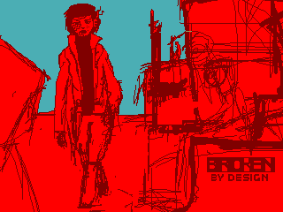
decided to make it more cyber punk so i screwed the text and devil and drew crusher (the bad guy)
 |
|
|
IP Logged |
|
|
Larwick
Commander
Joined: 18 July 2024 Online Status: Offline Posts: 4015 |
Posted: 06 September 2007 at 10:41am |
|
Metaru, i hope you're not gunna continue to use that messy dithering...
 Naughty Metaru, no. Naughty Metaru, no.
|
|
|
|
|
|
IP Logged |
|
|
Shinamon
Seaman
Joined: 28 August 2007 Online Status: Offline Posts: 4 |
Posted: 06 September 2007 at 12:48pm |
 'Course, the background is nowhere half done. But I thought I'd like to let everyone know that it's a window. XD Again, this may be the colours I'm using, but I'm somehow opting for brown to get a 'grungy' look. And no, I'm not leaving the messy squares. They're supposed to be lighting. |
|
|
IP Logged |
|
|
Metaru
Commander
Joined: 28 December 2025 Online Status: Offline Posts: 3305 |
Posted: 06 September 2007 at 1:47pm |
|
don'tlike that dithering eh? guess i'll go back to solid shapes then. throwing an idea of how this could be made, althougth its not PixelArt.Edited by Metaru - 06 September 2007 at 1:54pm |
|
|
I ate leel's babies
|
|
|
IP Logged |
|
|
ScarredShadow
Midshipman
Joined: 11 May 2018 Location: New Zealand Online Status: Offline Posts: 43 |
Posted: 06 September 2007 at 1:53pm |
|
Originally posted by spartan_117 it said that the canvas size is 320x240 so i hope this is only part of the scene. otherwise its good. yeah i didn't see the point of showing the only thing i had on my canvas on the full sized canvas. Yep it's only part of the scene. |
|
|
IP Logged |
|
|
Metaru
Commander
Joined: 28 December 2025 Online Status: Offline Posts: 3305 |
Posted: 06 September 2007 at 3:08pm |
|
Originally posted by Metaru
ok, I won't be able to finish this for the comp. but i want to see it finished. so, if anyone is interested to finish this, feel free to use it and submit it for the challenge. I'm just tired of watching my ideas wasted because i can't finish them in time.
|
|
|
I ate leel's babies
|
|
|
IP Logged |
|
|
skamocore
Admiral 
Joined: 07 April 2021 Online Status: Offline Posts: 3866 |
Posted: 06 September 2007 at 4:52pm |
|
Originally posted by Metaru Originally posted by Metaru
ok, I won't be able to finish this for the comp. but i want to see it finished. so, if anyone is interested to finish this, feel free to use it and submit it for the challenge. I'm just tired of watching my ideas wasted because i can't finish them in time.
Finish it later and submit it after the competition...you don't need to scrap it entirely even if you aren't entering into the challenge...but you really don't need that much dithering...the max colour count is 32 |
|
|
IP Logged |
|
|
Gelsamel
Seaman
Joined: 28 August 2007 Online Status: Offline Posts: 19 |
Posted: 06 September 2007 at 8:38pm |
|
Originally posted by Shinamon 'Course, the background is nowhere half done. But I thought I'd like to let everyone know that it's a window. XD Again, this may be the colours I'm using, but I'm somehow opting for brown to get a 'grungy' look. And no, I'm not leaving the messy squares. They're supposed to be lighting. WOW D: Amazing. |
|
|
IP Logged |
|
|
spartan_117
Commander
Joined: 14 June 2007 Online Status: Offline Posts: 478 |
Posted: 07 September 2007 at 12:39am |
 finnished a basic lighting scheme. whadya think??? @metaru : it would be a bigger shame if u didnt hand it in in time. |
|
|
IP Logged |
|
|
Metaru
Commander
Joined: 28 December 2025 Online Status: Offline Posts: 3305 |
Posted: 07 September 2007 at 7:23am |
|
Originally posted by skamocore
Finish it later and submit it after the competition...you don't need to scrap it entirely even if you aren't entering into the challenge...but you really don't need that much dithering...the max colour count is 32 and so? That doesn't mean I will/have to/can use 32 colors. The less the best. But I have to admit, parts of the image dithering (50%) were produced for my foolish intention of saving it as a GIF in MSPaint. fortunately, I'm using a BMP backup.
I'll finish it. Edited by Metaru - 07 September 2007 at 7:29am |
|
|
I ate leel's babies
|
|
|
IP Logged |
|
|
FrostPumpkin
Commander
Joined: 18 January 2022 Online Status: Offline Posts: 188 |
Posted: 07 September 2007 at 9:52am |
|
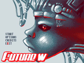
I have finished my entry...the game is just named "tokyo"
 Edited by FrostPumpkin - 07 September 2007 at 9:56am |
|
|
IP Logged |
|
|
Metaru
Commander
Joined: 28 December 2025 Online Status: Offline Posts: 3305 |
Posted: 07 September 2007 at 10:16am |
|
As I see, the most used composition will be a profile in one of the sides of the picture, like the example I provided a few post above. its my duty to break this lack of originality!
 still not finished. removed the bad dithering. found a good background color.
|
|
|
I ate leel's babies
|
|
|
IP Logged |
|
|
raelz
Seaman
Joined: 06 June 2007 Online Status: Offline Posts: 30 |
Posted: 07 September 2007 at 11:05am |
|
ok frost, your pixel is just exactly what I was hoping to see in this competition and I am proud of being the actually small adviser on this pixel! :D Be sure to have my vote! (unless some super-artists come with three never seen amazing technics :-)
|
|
|
Brod:
That's odd... I saved as png. It must've changed it to png when I uploaded it... m0d: I am astounded by your brilliant deductive skills. You humble me, o great logician. MWAHAHAHAA xD |
|
|
IP Logged |
|
|
FrostPumpkin
Commander
Joined: 18 January 2022 Online Status: Offline Posts: 188 |
Posted: 07 September 2007 at 11:21am |
|
thank you very much raelz ! I can't wait to see the results >.<
|
|
|
IP Logged |
|
|
Metaru
Commander
Joined: 28 December 2025 Online Status: Offline Posts: 3305 |
Posted: 07 September 2007 at 12:18pm |

added the second ramp, working on details and UI. I'm finishing this today after all.
|
|
|
I ate leel's babies
|
|
|
IP Logged |
|
|
raelz
Seaman
Joined: 06 June 2007 Online Status: Offline Posts: 30 |
Posted: 07 September 2007 at 12:24pm |
|
Metaru:
Just an opinion - I just do not like the complete view of the pixel :P Not that it would be drawed wrongly, I just don't like it, Im sorry about it... Maybe some background could change my mind? I dunno. Edited by raelz - 07 September 2007 at 12:28pm |
|
|
Brod:
That's odd... I saved as png. It must've changed it to png when I uploaded it... m0d: I am astounded by your brilliant deductive skills. You humble me, o great logician. MWAHAHAHAA xD |
|
|
IP Logged |
|
|
Metaru
Commander
Joined: 28 December 2025 Online Status: Offline Posts: 3305 |
Posted: 07 September 2007 at 12:45pm |
|
A matter of taste maybe? Edited by Metaru - 07 September 2007 at 12:45pm |
|
|
I ate leel's babies
|
|
|
IP Logged |
|
|
raelz
Seaman
Joined: 06 June 2007 Online Status: Offline Posts: 30 |
Posted: 07 September 2007 at 1:10pm |
|
Of course, but are you gonna do some background? It should be a title screen for a game after all...
|
|
|
Brod:
That's odd... I saved as png. It must've changed it to png when I uploaded it... m0d: I am astounded by your brilliant deductive skills. You humble me, o great logician. MWAHAHAHAA xD |
|
|
IP Logged |
|
|
spartan_117
Commander
Joined: 14 June 2007 Online Status: Offline Posts: 478 |
Posted: 07 September 2007 at 1:19pm |
|
metaru ill tell you what the heart really needs. not love nope. it needs to look natural not plastic. make blue(/purple) colored veins on the heart and add some white fat at the top.
 see. Edited by spartan_117 - 07 September 2007 at 1:20pm |
|
|
IP Logged |
|
|
Jim The Wonder Dog
Seaman
Joined: 31 July 2007 Online Status: Offline Posts: 4 |
Posted: 07 September 2007 at 2:01pm |
|
jee, i was eating :)
|
|
|
IP Logged |
|
|
pixelblink
Commander
Joined: 19 February 2023 Online Status: Offline Posts: 2865 |
Posted: 07 September 2007 at 10:29pm |
|
thought I should post what I have so far in case I don't make the deadline
 So far it is indeed a bit too symmetrical but I will change that near the end with some offset items. I also would like to add something on the sides to fill up space. Originally I was going to have a street scene with a character running through it but my instinct told me to do otherwise. Ideas? |
|
|
IP Logged |
|
|
raelz
Seaman
Joined: 06 June 2007 Online Status: Offline Posts: 30 |
Posted: 08 September 2007 at 3:19am |
|
I think that even that you won't have enough time to finish it, it is amazing enough to post it like that and be in top3 :P
The symmetric head does not matter, since it's title screen for a game, it's more what game title screen looks like... I don't really have an idea what would fit to the head, I'll post if find one. Just the head looks scary... so maybe something scary at the background aswell, something hopeless etc. But thats pretty much whats cyberpunk about :P |
|
|
Brod:
That's odd... I saved as png. It must've changed it to png when I uploaded it... m0d: I am astounded by your brilliant deductive skills. You humble me, o great logician. MWAHAHAHAA xD |
|
|
IP Logged |
|
|
phob
Seaman
Joined: 25 November 2020 Online Status: Offline Posts: 1 |
Posted: 08 September 2007 at 9:16am |
|
new version. is it correct ?
|
|
|
IP Logged |
|
|
Corpus
Seaman
Joined: 29 August 2007 Online Status: Offline Posts: 21 |
Posted: 08 September 2007 at 9:57am |
|
Originally posted by phob
That is made of win. Is there even any point in me completing my piece any more? Ah, it's all about taking part I suppose  |
|
|
IP Logged |
|
|
Elk
Commander
Joined: 12 May 2024 Online Status: Offline Posts: 483 |
Posted: 08 September 2007 at 12:40pm |
|
his lip is odd :0
but i like the eye =) |
|
|
IP Logged |
|
|
Corpus
Seaman
Joined: 29 August 2007 Online Status: Offline Posts: 21 |
Posted: 08 September 2007 at 1:02pm |
|
I like pretty much everything about it. The lip's really cool and stylized. It could do with a background, though.
|
|
|
IP Logged |
|
|
jesusbot3000
Seaman
Joined: 22 October 2005 Online Status: Offline Posts: 9 |
Posted: 08 September 2007 at 2:10pm |
|
I'm working on something that should hopefully be pretty cool and a nice re-intro to pj. Should have a preview/wip up late tonight.
Frost, the font for "Tokyo" is seriously amazing. And Metaru, I'd really like to see you finish that heart, should be good. Edited by jesusbot3000 - 08 September 2007 at 2:13pm |
|
|
IP Logged |
|
|
raelz
Seaman
Joined: 06 June 2007 Online Status: Offline Posts: 30 |
Posted: 08 September 2007 at 2:42pm |
|
I just don't like that everybody does pixels without background.. :(
To phob: Ok, if I don't think about the background, I like your piece very much. The text fits there perfectly aswell! |
|
|
Brod:
That's odd... I saved as png. It must've changed it to png when I uploaded it... m0d: I am astounded by your brilliant deductive skills. You humble me, o great logician. MWAHAHAHAA xD |
|
|
IP Logged |
|
| << Prev Page of 3 Next >> |
| |
||
Forum Jump |
You cannot post new topics in this forum You cannot reply to topics in this forum You cannot delete your posts in this forum You cannot edit your posts in this forum You cannot create polls in this forum You cannot vote in polls in this forum |
|
