| Active TopicsSearchRegisterLogin |
| WIP (Work In Progress) | |
| |
  |
| Author | Message |
|
fucbillgates
Seaman 
Joined: 05 June 2008 Online Status: Offline Posts: 36 |
  Topic: Green Ball Monster Topic: Green Ball MonsterPosted: 07 August 2008 at 12:20am |
|
It's a weird green ball thing trying to be camouflaged as a part of a tree.
i drew when i was at work. Check it out 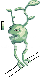 What should i do to improve it?? EDIT: 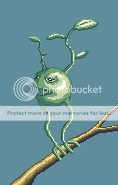 no aa but after i make the background i will add some. Edited by fucbillgates - 14 August 2008 at 10:22am |
|
 IP Logged IP Logged |
|
|
dro man jerr
Midshipman 
Joined: 31 July 2008 Location: United States Online Status: Offline Posts: 64 |
Posted: 07 August 2008 at 1:04am |
|
add a branch and a bg
and fix the les |
|
|
IP Logged |
|
|
Blu
Commander 
Joined: 23 January 2008 Online Status: Offline Posts: 208 |
Posted: 09 August 2008 at 2:57pm |
|
It looks pillow-shaded on the main bit/body. :/
|
|
|
Gremlins rule the world; you just don't know it yet.
|
|
|
IP Logged |
|
|
cure
Commander
Joined: 23 March 2022 Online Status: Offline Posts: 2859 |
Posted: 09 August 2008 at 4:20pm |
|
Define your lightsource, you have several at the moment. The dithering adds unnecessary texture, ditch it.
|
|
|
IP Logged |
|
|
Krobelus
Seaman
Joined: 14 August 2008 Location: Philippines Online Status: Offline Posts: 1 |
Posted: 14 August 2008 at 2:17am |
|
Hi guys Phoebe, I'm new here.. I'm really into art, I'm a student in IAFT. I really enjoy Photography. I am really a fan of guys who draw so well. ^_^ I'm in my second term now in IAFT. I hope I could finish soon. wish me luck guys! :)
|
|
|
aw
|
|
|
IP Logged |
|
|
fucbillgates
Seaman
Joined: 05 June 2008 Online Status: Offline Posts: 36 |
Posted: 14 August 2008 at 10:20am |
|
OK!!!!!!!
I went and changed colors and also colored the branch. What should i do for the background?? And should i add leaves on the branch?? Edited by fucbillgates - 14 August 2008 at 10:21am |
|
|
IP Logged |
|
|
cure
Commander
Joined: 23 March 2022 Online Status: Offline Posts: 2859 |
Posted: 14 August 2008 at 1:04pm |
|
Easy there chief, you don't need to go addin' all sorts of new colors for AA that you don't need, you just need to utilize the palette a bit better. You're using a few too many colors as is, tbh. There are two greens in there that are way too close in value to justify using both.
The inconsistent outline is also a bit bothersome, here's a partial edit I made on the fly, it should illustrate a few points that I don't feel like explaining: 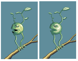 mine yours |
|
|
IP Logged |
|
|
Aurial
Seaman
Joined: 09 July 2008 Online Status: Offline Posts: 13 |
Posted: 14 August 2008 at 1:19pm |
|
Dunno man... it seems weird, even the edits. Look at it... light source of monster body cames from right-front, but stick and monster leaves's lightsource comes from up... That is just strange ._.
I guess even monsters proyects shadows... this shadow is not reflected on the stick. The design is cool, but it has a lot of basic mistakes. Edited by Aurial - 14 August 2008 at 1:21pm |
|
|
IP Logged |
|
|
cure
Commander
Joined: 23 March 2022 Online Status: Offline Posts: 2859 |
Posted: 15 August 2008 at 12:20pm |
|
I didn't edit the leaves or the stick, just the monster's body. But that is a good point, make sure to have a consistent light source and believable shadows in the final product.
|
|
|
IP Logged |
|
| |
||
Forum Jump |
You cannot post new topics in this forum You cannot reply to topics in this forum You cannot delete your posts in this forum You cannot edit your posts in this forum You cannot create polls in this forum You cannot vote in polls in this forum |
|
