| Active TopicsSearchRegisterLogin |
| Collaborations/Challenges | |
| |
  |
| << Prev Page of 2 |
| Author | Message |
|
Chibiwing
Commander 
Joined: 02 June 2024 Online Status: Offline Posts: 122 |
  Posted: 01 September 2011 at 2:55pm Posted: 01 September 2011 at 2:55pm |
|
Originally posted by CELS
Thank you for replying! I'm surprised by where you see this going because I wasn't anywhere near that, but I can see it now, and I'm considering going with it. As far as the skulls not seeming Indian; didn't the Indian culture have nagas (half snake people)? Grotesque demons and malicious gods will play to my weaknesses in anatomy by making them strengths, maybe.
Ah, this is vintage Chibiwing pixel art :) I'm not sure what to say about the technique, I mean it's a bit low contrast, but your stuff is usually like that. Your colours here are quite similar, but they usually are. What you have so far reminds me of Indian art. Everything looks so ornate and luxurious, with all the gold and decorations, and then you have the skulls as an opposite to that. In Indian [Hindu] art, you'd often see grotesque demons and malicious gods decorated with gold and ornate jewelry. Perhaps that's a useful direction to explore. It's just what came to mind, for me. I'm still open to more ideas from you guys. I'll also probably start something else and work on that when I get stuck on the first piece.
|
|
 IP Logged IP Logged |
|
|
Chrispy
Seaman 
Joined: 28 October 2016 Online Status: Offline Posts: 17 |
Posted: 01 September 2011 at 3:52pm |
|
Very early WIP. I'm making mine based off the movie Fight Club using this reference
 EDIT: Ack, it seems I skimmed over the "platform" bit. I'm still gonna continue with this, just not submit it to the challenge. XP Edited by Chrispy - 01 September 2011 at 4:30pm |
|
|
IP Logged |
|
|
showtime
Commander
Joined: 14 May 2020 Online Status: Offline Posts: 105 |
Posted: 01 September 2011 at 7:36pm |
|
Jinn, that is a very strange pose. I find it to be visually confusing, as it's very unusual for a character's head to face in (essentially) the opposite direction of their body. Unless you're going for a surreal effect, I guess. : )
Based on your image, I have no idea whether he is supposed to be moving to the left, to the right or hell, just jumping vertically. I'm trying really hard to picture him in motion but it's just not happening.  Anyway, I made a REALLY REALLY messy edit here to, hopefully, show you what I mean. I really think that making the body face in the same direction as the head will unify the sprite and produce a more easy-to-read gesture. Sorry for murdering your work, I was just trying to get an idea across, not produce a masterpiece. Cheers |
|
|
IP Logged |
|
|
Jinn
Rear Admiral 
Joined: 27 February 2026 Online Status: Offline Posts: 191 |
Posted: 01 September 2011 at 8:05pm |
|
Honestly i don't see this as a huge problem, I tried to find some examples of this pose, and I found a pretty good one, from Hook on the snes:
 I think it's a purelly artistical way to make jumps, but I like it. Also, you did use an old version of him, I changed a bit his right arm.  Anyway, thanks for the support. I do think your edit is more suitable, but less artistical.. Spartans prized for the beauty of the body, afterall. Edited by Jinn - 01 September 2011 at 8:06pm |
|
|
IP Logged |
|
|
showtime
Commander
Joined: 14 May 2020 Online Status: Offline Posts: 105 |
Posted: 01 September 2011 at 8:30pm |
|
Weeeell, in your example Peter Pan's (it is Peter Pan, right? : P) shoulders are rotated -- and it's very obvious that he's doing this to be able to deliver a powerful swing with his sword. Also, his hips are facing the same way as his face, so I would argue that this sprite is not an example of the same pose.
And sorry if I wasn't being clear, I was not trying to edit your style or anything like that!! I was only trying to edit the pose. heh, a little part of me wants to challenge you to animate the sprite. Anyway, just wanted to say that I really admire your art and I'm really looking forward to seeing this piece finished. : ) |
|
|
IP Logged |
|
|
Jinn
Rear Admiral
Joined: 27 February 2026 Online Status: Offline Posts: 191 |
Posted: 01 September 2011 at 8:40pm |
|
Thank you very much for the support. I think it's better to start over than try to fix...
So, would you mind to tell what do you think of this pose then? (before I star to shade, hehe)  Edited by Jinn - 01 September 2011 at 8:43pm |
|
|
IP Logged |
|
|
AirStyle
Commander
Joined: 13 November 2017 Online Status: Offline Posts: 376 |
Posted: 01 September 2011 at 8:49pm |
|
I think it would be good for the naked spartan to do a jumping sword-stab attack onto the spear-holder, wherein the spartan would have his legs stretched out below his torso, with his sword clutched in both hands above his head. It would show that he's putting everything into this last attack.
Moreover, if you want to add to the dynamic of the pre-described pose, you make the spear holder hold the spear aimed at the spartan's torso, as opposed to aiming blindly at the ground. It's obvious the naked spartan isn't going to be at that spot anytime soon... |
|
|
IP Logged |
|
|
Cammymoop
Midshipman 
Joined: 27 July 2022 Online Status: Offline Posts: 43 |
Posted: 01 September 2011 at 8:53pm |
|
My First post
 I decided to make a 2 color mock-up, mostly done just wanted to see if anyone had some advice for me (because i'm a pixel noob) before i submitted it.  Edited by Felix20 - 01 September 2011 at 8:53pm |
|
|
IP Logged |
|
|
CELS
Commander
Joined: 23 September 2022 Online Status: Offline Posts: 758 |
Posted: 01 September 2011 at 8:54pm |
|
I guess Jinn has fallen in love with the pose (and has also decided to have the Spartan use his curved sword as a stabbing weapon, which is a bit unusual), which is fair enough. I agree that the new background is absolutely fabulous and I'm sure this piece will be top 3.
One thing I didn't notice before, Jinn, was that you seem to have the shield upside down. The V is actually supposed to be the greek letter Lambda, which is an upside down V. According to Wikipedia, the letter L is for Lakedaimon, the name of the region of Sparta. (You'll see this in most illustrations and the movie 300) EDIT: Jinn, the new pose is much better. Looks like Achilles in Troy, when he kills the enemy's champion with a single strike. Basically the same movement. @Chibiwing: I didn't really consider the Nagas, but that's an interesting observation, since your skulls have the bodies of snakes. As you say, it's at least an option, unless you think of something else. Edited by CELS - 01 September 2011 at 9:16pm |
|
|
IP Logged |
|
|
showtime
Commander
Joined: 14 May 2020 Online Status: Offline Posts: 105 |
Posted: 01 September 2011 at 9:14pm |
|
Jinn, I think this new pose is a step in the right direction. I made some minor edits, but I'm not great with anatomy so I'm not really sure if they're even helpful:
 My edit is on the left. It's just a couple of minor things, although I might have misunderstood some stylistic choices of yours. ; )
Anyway, I'm really sleepy right now and can't tell if my edit even makes any sense, so maybe somebody else will have some input. Nighty night. : ) Edited by showtime - 01 September 2011 at 9:15pm |
|
|
IP Logged |
|
|
Chrispy
Seaman
Joined: 28 October 2016 Online Status: Offline Posts: 17 |
Posted: 01 September 2011 at 9:20pm |
|
Jinn, nice job on the newer pose. It's much better. I'd adjust his furthest leg's angle a bit, maybe. I dunno, I'm not the greatest at anatomy XP
|
|
|
IP Logged |
|
|
surt
Commander
Joined: 30 December 2015 Online Status: Offline Posts: 413 |
Posted: 01 September 2011 at 10:41pm |
|
Djinn: I'm not a professional soldier by any means, but for the nudist I feel you should reverse the sword-hand and flip the sword-blade. That should allow him to perform a downward thrust and have sword ready for a slash on landing.
|
|

|
|
|
IP Logged |
|
|
Chibiwing
Commander
Joined: 02 June 2024 Online Status: Offline Posts: 122 |
Posted: 02 September 2011 at 12:55am |
|
My second attempt:
 Ignore the bad aa and stuff on the grass; I just stretched it a minute ago because it was too small compared to the picnic blanket.
|
|
|
IP Logged |
|
|
Lathien
Midshipman
Joined: 07 August 2011 Online Status: Offline Posts: 84 |
Posted: 02 September 2011 at 6:32am |
|
Hopefully I'll meet the deadline this week :S
 The game is called WallRun and it's a new take on the platformer genre; taking it vertical. You tap the run button to keep running and press jump to jump outwards to avoid obstacles. Once you hit an obstacle or slow down too much, you flip back to ground and check your distance. C&C Very much welcome. Except for the building and sky, they're just placeholders. EDIT: BTW, this is also Dawnbringer's palette. Edited by Lathien - 02 September 2011 at 6:39am |
|
|
IP Logged |
|
|
neofotistou
Commander
Joined: 07 September 2015 Online Status: Offline Posts: 175 |
Posted: 02 September 2011 at 7:31am |
|
Everything is looking awesome!!
I will comment when I get the time. Meanwhile can anyone answer this question? Does this SNES mode: "Pixel-to-pixel Mode 1 comprised of three scrolling layers: two 16 color (4-bit) per tile layers and one 4 color (2-bit) layer" Mean I can have one 16color layer as background, one 4 color layer (as a sky or whatever) and one layer with platforms on it? And on top of that any sprites I want? Am I missing a layer? Am I adding more than the SNES could handle? Thanks Edited by neofotistou - 02 September 2011 at 8:15am |
|
|
IP Logged |
|
|
waloumi
Seaman
Joined: 29 August 2023 Online Status: Offline Posts: 1 |
Posted: 02 September 2011 at 8:23am |
|
All the wip's posted so far looks amazing, im condesidering to join this and i would to restrict the colors to the snes palette, how do i do that?
|
|
|
IP Logged |
|
|
shampoop
Commander
Joined: 12 January 2015 Online Status: Offline Posts: 202 |
Posted: 02 September 2011 at 9:04am |
|
I think you are right about mode 1. 4-bit means 2^4 = 16 and 2-bit means 2^2 = 4. 0100 maps to one color for layer one and 0100 maps to a different color in layer two. I imagine a map to fetch a color given the 4-bits. I do not see any specifications on how large a specific layer can be.
In mode 1, the three layers scroll at the same speed. In mode 2, you get two layers that can scroll at independent speeds. Edited by shampoop - 02 September 2011 at 9:08am |
|
|
IP Logged |
|
|
PureAwesomeness
Midshipman
Joined: 20 July 2011 Online Status: Offline Posts: 46 |
Posted: 02 September 2011 at 12:57pm |
|
Few video game plots are more self-explanatory than "alien invasion," so there you go.
 I still have to add at least one alien chasing him, and possibly redo the ship, but that shouldn't take too long. I'm also not sure whether outlining or shading is better in terms of readability:  I looked through the thread, and there's lots of nice art here! Looking forward to seeing everyone's completed pieces. |
|
|
IP Logged |
|
|
Lathien
Midshipman
Joined: 07 August 2011 Online Status: Offline Posts: 84 |
Posted: 02 September 2011 at 1:25pm |
|
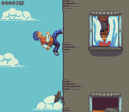
Update:
 I think I'm done but I'm not sure. Anything I should change before I submit? @PureAwesomeness. I'd say the one on the left. Reads a lot better with higher contrast. |
|
|
IP Logged |
|
|
PureAwesomeness
Midshipman
Joined: 20 July 2011 Online Status: Offline Posts: 46 |
Posted: 02 September 2011 at 1:37pm |
|
@Lathien: Thanks. What do you think of it overall?
By the way, yours looks nice! A little nitpick would be that adjacent rows of bricks are offset by a bit instead of aligning in perfect rows. You might also want to shade them a little in order to give the side of the building a little dimension like the window and your character, so it looks more like a foreground instead of just a separate colour from the sky. Edited by PureAwesomeness - 02 September 2011 at 1:37pm |
|
|
IP Logged |
|
|
Lathien
Midshipman
Joined: 07 August 2011 Online Status: Offline Posts: 84 |
Posted: 02 September 2011 at 1:54pm |
|
How's this?
 Not sure what you meant by "adjacent rows of bricks are offset by a bit instead of aligning in perfect rows." though. Care to elaborate? As for your piece, I like it, although it's a little cluttered, personally. But I assume that's what you're going for so it works. The heel of the player's front foot is a little square and the green palette for the alien portrait in the bottom corner doesn't contrast enough so all the shades tend to just kind of blend into each other, lessening the "pop" so to speak. Edited by Lathien - 02 September 2011 at 1:55pm |
|
|
IP Logged |
|
|
Jinn
Rear Admiral
Joined: 27 February 2026 Online Status: Offline Posts: 191 |
Posted: 02 September 2011 at 3:01pm |
|
Due the close deadline, I'll stick with the current edit, I'll just adjust what showtime
said. But I really apreciate your ideas, guys! Thanks for all! ^^
Soon you will see the result in my gallery! See ya! |
|
|
IP Logged |
|
|
CELS
Commander
Joined: 23 September 2022 Online Status: Offline Posts: 758 |
Posted: 02 September 2011 at 4:04pm |
|
Originally posted by Lathien Not sure what you meant by "adjacent rows of bricks are offset by a bit instead of aligning in perfect rows." though. Care to elaborate? I assume he's referring to the fact that you have bricks positioned directly on top of each other. If you just google "bricks" and look at the images, you'll notice that they have a different pattern. By the way, while I do applaud your original approach, I can't help but wonder how your game would work. I assume your guy can't jump, because he'd fall off the wall. Does he meet enemies and just run through them? EDIT- Never mind, I saw you already explained. Kudos for originality. Edited by CELS - 02 September 2011 at 4:05pm |
|
|
IP Logged |
|
|
PureAwesomeness
Midshipman
Joined: 20 July 2011 Online Status: Offline Posts: 46 |
Posted: 02 September 2011 at 5:56pm |
|
I solved my readability issue at the expense of my nice, bright palette. *sigh...*
So anyway, I gave the alien a spear for some unknown reason. Any suggestions or comments?  |
|
|
IP Logged |
|
|
neofotistou
Commander
Joined: 07 September 2015 Online Status: Offline Posts: 175 |
Posted: 02 September 2011 at 6:22pm |
|
@alart way to go! don't give this up
@CELS: you might want to try to separate the background, midground and foreground a little bit. Color-wise. Looking good @kevink so pretty! keep it up! @shampoop: thanks for the help! Ok here's my WIP as well. 19 colors (so far) What do you think?  |
|
|
IP Logged |
|
|
neofotistou
Commander
Joined: 07 September 2015 Online Status: Offline Posts: 175 |
Posted: 02 September 2011 at 6:25pm |
|
@Jinn: what showtime said.
Also, here's a rough edit. It's where I would take it, it's not 'the right way' or anything. More specific anatomy, heroic proportions and a more dramatic poise. The hand holding the sword is more loose, because it's getting ready to strike. Minor nitpick: the greeks didn't have curved swords.  Edited by neofotistou - 03 September 2011 at 1:33am |
|
|
IP Logged |
|
|
Jinn
Rear Admiral
Joined: 27 February 2026 Online Status: Offline Posts: 191 |
Posted: 02 September 2011 at 6:55pm |
|
I was going for the last version, I even had it shaded:
 But how can I say no for sush a badass edit? Thank you very much, Neo! I'll for sure take this pose in consideration. I just hope it's my last edit! hehehe Edited by Jinn - 02 September 2011 at 6:56pm |
|
|
IP Logged |
|
|
Chibiwing
Commander
Joined: 02 June 2024 Online Status: Offline Posts: 122 |
Posted: 02 September 2011 at 7:34pm |
 I decided to make a boss; bad idea? He's obviously not done, but are there major errors?
|
|
|
IP Logged |
|
|
AirStyle
Commander
Joined: 13 November 2017 Online Status: Offline Posts: 376 |
Posted: 02 September 2011 at 8:33pm |
|
Taking into consideration the style of level, the only thing I would say is to highlight the "spine" with the vibrant red used on his head, and may be make it drape over the platform he's on.
Also, the level does not inspire fear, although the boss intends to to. He doesn't seem to fit... Edited by AirStyle - 02 September 2011 at 8:34pm |
|
|
IP Logged |
|
|
Chibiwing
Commander
Joined: 02 June 2024 Online Status: Offline Posts: 122 |
Posted: 02 September 2011 at 9:30pm |
|
Originally posted by AirStyle
I was planning on the red highlights, just hadn't made it that far yet. ^_^ The draping is an excellent idea!
Taking into consideration the style of level, the only thing I would say is to highlight the "spine" with the vibrant red used on his head, and may be make it drape over the platform he's on. Also, the level does not inspire fear, although the boss intends to to. He doesn't seem to fit... I get what you mean, and I think the best way to fix that is to change my background.
|
|
|
IP Logged |
|
|
neofotistou
Commander
Joined: 07 September 2015 Online Status: Offline Posts: 175 |
Posted: 03 September 2011 at 1:31am |
|
@chibiwing: the background is fantastic. The foreground doesn't read well, however, with these colors. Check some bubble bobble 3 or bubble bobble evolution references maybe?Also, good job with the skulls.
@jinn you're welcome/I'm sorry. lol Edited by neofotistou - 03 September 2011 at 1:32am |
|
|
IP Logged |
|
|
Chibiwing
Commander
Joined: 02 June 2024 Online Status: Offline Posts: 122 |
Posted: 03 September 2011 at 1:45am |
|
Originally posted by neofotistou
Thank you. o///o I'm terrible with color choices; are there any you think would work better against that background? I looked at them both but I'm not exactly sure what I should be looking for...? Thank you... >///< With zero anatomy instruction I'm amazed they came out as well as they did.
@chibiwing: the background is fantastic. The foreground doesn't read well, however, with these colors. Check some bubble bobble 3 or bubble bobble evolution references maybe?Also, good job with the skulls. @jinn you're welcome/I'm sorry. lol |
|
|
IP Logged |
|
|
neofotistou
Commander
Joined: 07 September 2015 Online Status: Offline Posts: 175 |
Posted: 03 September 2011 at 2:00am |
|
Sure, but don't take my word for it.
I think your background suggests old house wallpaper and lace and chocolate cookies. So, if you want to keep the background, maybe you could go with wood for the platforms or something. Like grandma's coffee tables. It feels nostalgic, to me at least. What do you think? |
|
|
IP Logged |
|
|
surt
Commander
Joined: 30 December 2015 Online Status: Offline Posts: 413 |
Posted: 03 September 2011 at 2:47am |

|
|
|
|
|
|
IP Logged |
|
|
neofotistou
Commander
Joined: 07 September 2015 Online Status: Offline Posts: 175 |
Posted: 03 September 2011 at 3:00am |
|
@surt: this is very good! It reminds me of "gods" by the bitmap brothers. Maybe make his legs less crooked.
|
|
|
IP Logged |
|
|
kevink
Midshipman
Joined: 16 August 2009 Online Status: Offline Posts: 61 |
Posted: 03 September 2011 at 6:42am |
|
Originally posted by neofotistou
Ok here's my WIP as well.19 colors (so far)What do you think?
Nice WIP neofotistou, I would love to see this finished. Edited by kevink - 03 September 2011 at 6:41am |
|
|
IP Logged |
|
|
Mr Special
Commander
Joined: 20 December 2017 Online Status: Offline Posts: 106 |
Posted: 03 September 2011 at 8:08am |
|
Omg, these WIPS are awesome! I especially like neo's and surt's! Everyone is doing great. I wish I coulda participated in this challenge, but I didn't have any good ideas

Neo, your's will make me mad if it isn't an actual game in the near future! 
|
|
|
IP Logged |
|
|
CELS
Commander
Joined: 23 September 2022 Online Status: Offline Posts: 758 |
Posted: 03 September 2011 at 9:40am |
|
Originally posted by neofotistou @CELS: you might want to try to separate the background, midground and foreground a little bit. Color-wise. Looking good Thanks! Actually, I was going for a Schindler's List thing. You know the scene with the girl in the red dress and everything else is black and white. Well, just pure grey tones would be boring, so I used blue and yellow with very low saturation instead. But the principle is the same: make the world look bleak and monotonous, and make the girl stand out. Do you think I should increase contrast instead of separating the colors? Slight changes, btw.  Originally posted by neofotistou Ok here's my WIP as well. 19 colors (so far) What do you think? I think it's great. I love the steampunk and the colors. Is that a bionic eye, or just a really big monocle? And he's wearing white socks. How embarrassing. |
|
|
IP Logged |
|
|
PureAwesomeness
Midshipman
Joined: 20 July 2011 Online Status: Offline Posts: 46 |
Posted: 03 September 2011 at 10:27am |
|
@CELS: It's still nice. Maybe add some more contrast in the front layer of buildings, so you can tell it's part of the foreground.
@neofotistou: Ooh, nice. Not really much to say. P.S. what do you guys think about mine? I looked at it today, and it doesn't look as good as it did yesterday when I was working on it. I think I should probably just keep the colours, maybe brighten the buildings a little more. Any suggestions? |
|
|
IP Logged |
|
|
Cammymoop
Midshipman
Joined: 27 July 2022 Online Status: Offline Posts: 43 |
Posted: 03 September 2011 at 3:00pm |
|
Fixed some stuff, I think it's done
not sure if I should add anything else  |
|
|
IP Logged |
|
|
jalonso
Admiral 
Joined: 29 November 2022 Online Status: Offline Posts: 13537 |
Posted: 03 September 2011 at 3:07pm |
|
WOW! some really great stuff this week.
@ Chibiwing and Felix2, Kinda sloppy and disorganized. Think quality lines the competition is tough this week. @ Chibiwing You are going back to that 'hen-pecking' pixelling style that never quite works, PJ members dislike and generally are not well received. That works ok for 1bit pieces but you tend to use enough colors that its not really needed. Your AA and general pixelling was improving with every piece but something has happened...*slaps* Edited by jalonso - 03 September 2011 at 3:08pm |
|
|
|
|
|
IP Logged |
|
|
Cammymoop
Midshipman
Joined: 27 July 2022 Online Status: Offline Posts: 43 |
Posted: 03 September 2011 at 3:27pm |
|
@ jalonso
what specifically do you think I should change, I'm not very good at this I think I should redo the background |
|
|
IP Logged |
|
|
Chibiwing
Commander
Joined: 02 June 2024 Online Status: Offline Posts: 122 |
Posted: 03 September 2011 at 3:41pm |
|
Originally posted by neofotistou
You totally nailed the feeling I was going for but couldn't pin down; thank you, thank you! If I take that direction (and a part of me really, really wants to) should I abandon these monsters for something else?
Sure, but don't take my word for it.  I think your background suggests old house wallpaper and lace and chocolate cookies. So, if you want to keep the background, maybe you could go with wood for the platforms or something. Like grandma's coffee tables. It feels nostalgic, to me at least. What do you think? |
|
|
IP Logged |
|
|
AirStyle
Commander
Joined: 13 November 2017 Online Status: Offline Posts: 376 |
Posted: 03 September 2011 at 3:51pm |
|
Probably so. Think of what kind of stuff would attack in Grandma's kitchen. I don't think I've ever seen skull monsters in mine, but you never know.
~Spiders maybe? ~Cockroaches? ~Very aggressive dust bunnies? ~Moths? ~Half-eaten Gingerbread men, although this could lead to a Shrek reference... ~Mouse traps? ~Mice? ~Levitating floor tiles? (BIIGGG stretch on this one...) ~Rotten food? ~Wild light fixtures? ~Mean old oven: I'm talking smokestack oven!! ~Tea kettle? ~Forks and other various pieces of cutlery? You name it! |
|
|
IP Logged |
|
|
jalonso
Admiral
Joined: 29 November 2022 Online Status: Offline Posts: 13537 |
Posted: 03 September 2011 at 7:48pm |
|
Originally posted by Felix20 @ jalonso what specifically do you think I should change, I'm not very good at this I think I should redo the background Well the background is what needs help. The clouds look good but they don't quite match the style overall. Also the mountains have minimal pixelwork but the way you've shown them they also don't quite match. Maybe a pixel pattern that's anything but 50/50 for the caps? or lines... Whatever makes every item suit the style on its own. Also remember that its a game so the player sprite IS the most important thing. If lost you failed. Not saying it is now but it sure is close. Fyi, the less colors the harder it is. For your next work, If you're new and learning keep colors low but use enough to hide the flaws ;) |
|
|
|
|
|
IP Logged |
|
|
surt
Commander
Joined: 30 December 2015 Online Status: Offline Posts: 413 |
Posted: 03 September 2011 at 10:48pm |
|
neofotistou: Tweaked dudes legs, hopefully works better now.
 Edited by surt - 03 September 2011 at 10:55pm |
|
|
|
|
|
IP Logged |
|
|
neofotistou
Commander
Joined: 07 September 2015 Online Status: Offline Posts: 175 |
Posted: 04 September 2011 at 3:34am |
|
@surt: yeap. Love the cyclops
Edited by neofotistou - 04 September 2011 at 3:34am |
|
|
IP Logged |
|
|
Lathien
Midshipman
Joined: 07 August 2011 Online Status: Offline Posts: 84 |
Posted: 04 September 2011 at 7:59am |
|
@surt: Love the piece, it all works well, especially the cyclops, but the skeleton guy underground has his bones the same color as the masonry and his hat and cloths the same color as the bricks, so he becomes very hard to see. I didn't even know he was there until I looked more carefully.
|
|
|
IP Logged |
|
|
PureAwesomeness
Midshipman
Joined: 20 July 2011 Online Status: Offline Posts: 46 |
Posted: 04 September 2011 at 9:43am |
|
I think I'm finally done!
 |
|
|
IP Logged |
|
|
Cammymoop
Midshipman
Joined: 27 July 2022 Online Status: Offline Posts: 43 |
Posted: 04 September 2011 at 12:15pm |
|
I guess I'm finished, i think it turned out ok but I probably won't be wining any awards.
Thanks for helping, jalonso   |
|
|
IP Logged |
|
| << Prev Page of 2 |
| |
||
Forum Jump |
You cannot post new topics in this forum You cannot reply to topics in this forum You cannot delete your posts in this forum You cannot edit your posts in this forum You cannot create polls in this forum You cannot vote in polls in this forum |
|
