| Active TopicsSearchRegisterLogin |
| WIP (Work In Progress) | |
| |
  |
| << Prev Page of 4 Next >> |
| Author | Message |
|
RebeaLeion
Commander 
Joined: 04 October 2017 Online Status: Offline Posts: 321 |
  Posted: 05 November 2014 at 10:13am Posted: 05 November 2014 at 10:13am |
|
Originally posted by Limes
Nice design Try a tablet on the headstone. I did not made a sketch for this picture and I started to draw it from a head (a mistake) I could not keep proportion in real-time paint. Tablet (+ edited legs)  Edited by RebeaLeion - 05 November 2014 at 10:59am |
|
 IP Logged IP Logged |
|
|
RebeaLeion
Commander
Joined: 04 October 2017 Online Status: Offline Posts: 321 |
Posted: 06 November 2014 at 1:44pm |
|
As you told I tried to focus on pixel details and I am rewriting graphic of the game again. Because of that old assests do not match at all and I have to recreate "some" again. But I will do it in order to improve. I also posted screen how game looked 5months ago (I added it in the first post of this thread)
IN GAME SCREEN with new graphic :: For screen CLICK here --> Link will redirect you to indiedb screen (the light effect on the left is genereated). I post this screen to show a change in pixelart. I would not be here without everyone here. still way to go... Stand animation with leg movement: 
Do not fall animation (hero's foot is over a cliff), 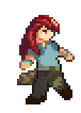
LINK:In game screen with the foot over the edge you can notice on the screen I have added one strand of hair. I made the change eve on the anim above. 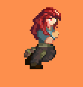 Edited by RebeaLeion - 06 November 2014 at 3:37pm |
|
|
IP Logged |
|
|
Limes
Commander
Joined: 15 September 2021 Online Status: Offline Posts: 683 |
Posted: 06 November 2014 at 4:42pm |
|
The run is pretty damn good for the first try.

|
|
|
IP Logged |
|
|
RebeaLeion
Commander
Joined: 04 October 2017 Online Status: Offline Posts: 321 |
Posted: 07 November 2014 at 2:53pm |
|
Its hard! I did run animation like 20 hours (total). (because I reworked it like 4x)
This is final result: 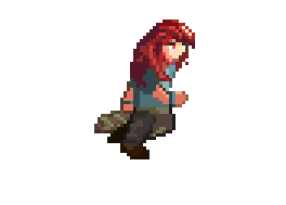
and jump  Edited by RebeaLeion - 07 November 2014 at 5:27pm |
|
|
IP Logged |
|
|
RebeaLeion
Commander
Joined: 04 October 2017 Online Status: Offline Posts: 321 |
Posted: 08 November 2014 at 2:18am |
|
Alright, again. I am really appreciative for the feedback I got here on the pixelart. It showed me that it's better to use less colors to make sprite to look cleaner. Because of this I am reworking game gfx like this goblin for example. Let me know what do you think about the new version - thanks ! 3x scale
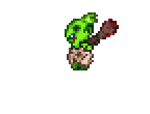
NEW: 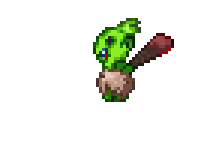 Edited by RebeaLeion - 08 November 2014 at 7:55am |
|
|
IP Logged |
|
|
SuperTurnip
Commander
Joined: 25 March 2026 Online Status: Offline Posts: 301 |
Posted: 08 November 2014 at 12:42pm |
|
I love how you're progressing. Great general improvement. I have to say though, this does mean that we're not going to let the same things slide that we would a month ago. *evil laugh*
So, I'm a little late to the table when it comes to critiquing your latest work, so I'm going to focus on some specific stuff rather than the whole set of things you've produced. Mainly, your animation. In general, it's way better. In specifics, it still doesn't pass for anything close to real most of the time. My favourite animation would have to be the goblin, just because you haven't over-animated it. It's simple, pac-man stuff, and though the motion could be improved a lot (having the club drag along the ground for a moment before the goblin weightily lifts it up, for instance), it still works. Take a look at this topic again (it's great to see you looking at other topics and building skill through helping and asking questions, by the way). Starting midway down page three, the artist begins to work on animation. Try looking at their journey outside of tools (rotated bone program? Frame by frame animation?), and just see what changes as they progress. However, when we are talking about tools, something AshCrimson did was draw individual "bones" to animate, whilst making the animation frame by frame. The bones aren't copied frame-to-frame, they're just kept in mind as a guide to the anatomy of the character. It's the physical equivalent of remembering "the legs are brown, the shirt is blue": "The leg has this bone that is this long, and that never changes except if there is this perspective". Of course, this can look boring--a character that does not stretch and squish in ways that it probably wouldn't in real life doesn't look real! But, as a general rule, it is one way of helping the animation along so it doesn't wobble or twist oddly. Whew. Okay, now for an edit of your "unbalanced" animation. Right now it looks like your main character is dipping his foot into a bath to test the water, or hanging upside down from the straight leg. The body and limbs are twisted and unreadable. You gotta look at things in simple terms. If it doesn't make sense in three lines, it won't work in a thousand carefully placed pixels. 
Look how the weight of the edit is really off-center. He's not halfway over the edge, he's over the edge. The grounded leg is the one that follows the gesture line, and everything about the rest of the character does not want to be on the righthand side of it! Legs swing back, arms wheel in the air (sorry there's no animation--those suckers are fighting for balance, not hanging stiff at chest height), and even the head is tilting backwards. Only the loose elements such as hair and the scabbard flop with gravity, which shows the viewer just which way this person is heading if they don't correct their balance. This should be true for every key frame of your animations--strong lines are what tell the most stories, so an extended stride or the moment before a sword is drawn should be simple and dynamic. This may be why your goblin is my favourite. With the club drawn back, every part of it bends back along one line and it looks awesome. Alright, I hope that massive text dump helped you out with animation. Use rules to give structure to your animation, follow flowing lines to create stronger poses, and as usual, have a good time pixeling! |
|
|
IP Logged |
|
|
Finlal
Rear Admiral 
Joined: 08 November 2016 Online Status: Offline Posts: 404 |
Posted: 08 November 2014 at 3:16pm |
|
HUGE progress in animation but there are still many mistakes - first of all, you can make animation speed 0,08 sec or even 0,07 with 10 frames for it to look more dynamic.

Second - running is a series of jumping. While running you jump from your right leg, then from left, then from right etc. And while jumping you spend some time in the air, so you really should show it in your animation. Another thing - arms and legs. I just can't figure out where is right ones ad where is left ones. Either hero swing arms too quickly or you make front one (which is closer to camera) darker and back (which is far from camera) ligher. For animation I higly recommend to read or watch "Animator's Survival Kit", it's from Disney animators. Those fellas know animation. |
|
|
IP Logged |
|
|
RebeaLeion
Commander
Joined: 04 October 2017 Online Status: Offline Posts: 321 |
Posted: 09 November 2014 at 1:35am |
|
Thanks again for great tips! Owww... your sprite is so clean and nice readable SuperTurnip (I keep in mind that's a quick edit - but wow!). Also for these sketch lines - etc. I will try to use them for any animation that will require some bigger body movement since now (like sword attack or the mentioned hanging).
Finlal anim is running at speed which you mentioned in the game( I made it slower for forum). 
I should look at it eventually and make some re-animation. I have to move forward now, pherhaps when a time is right I will redone even that hanging animation too. (animations re really my weakest point, and it hits a game very hard ! :((( ). I am really appreciating every feedback. And I am trying to re-done everything in a game(trees, basic enemies, etc... to make it more readable) and in same style. 
I will try to follow what I learned from you so far. It may be not perfect yet (I don't even aim there now), I will try to do it the readable, clean and with the bones and lines in mind for next animations.  Edited by RebeaLeion - 10 November 2014 at 5:53pm |
|
|
IP Logged |
|
|
RebeaLeion
Commander
Joined: 04 October 2017 Online Status: Offline Posts: 321 |
Posted: 10 November 2014 at 6:31am |
|
I finally got to a tent, which I held off because of graphic re-design.
Thanks for tips and reference. I stayed at my orig.design but I also tried to make a changes based on feedback. New edit: 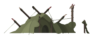
with other assets 
Edited by RebeaLeion - 10 November 2014 at 5:12pm |
|
|
IP Logged |
|
|
RebeaLeion
Commander
Joined: 04 October 2017 Online Status: Offline Posts: 321 |
Posted: 10 November 2014 at 5:23pm |
|
So how excatly to animate - well the reference book won't help me much as I am not so perfect in English when it comes to terms, etc. (not native speaker), I looked @book but it's not in our language.
NEW method I am trying. So first I tried to make some lines ( I tried to center them over hero's orig. static body +/-). I am starting with it because of feedback here + the anatomy thread, where it is common. 
It's first time I used this method. *note month ago I created animations only by rotation of body parts + edits over it, with an image that is is the best i can do. I had no much idea how to animate. I started to animate human body first when I tried legs and i drew them frame by frame. I also made a mistakes with resizing (aka, old sample, new run is above): 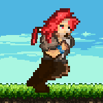
Now when I prepared animations with lines, I am trying to draw final shapes over it. But I am not sury if I am doing it ok. (I am trying to follow that of the anatomy thread). Guys shows usually complete animation, but I am curious about the progress itself now. Now I am @ 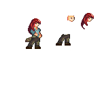
I started with a head, then I added legs - body should come next as legs should move a hips.. etc. am I not following some *bad* habits here ? EDIT FEB/2016 : I am not animating using those lines. Frame by frame suits me better. |
|
|
IP Logged |
|
|
SuperTurnip
Commander
Joined: 25 March 2026 Online Status: Offline Posts: 301 |
Posted: 10 November 2014 at 8:15pm |
|
Looks good! I'm still not a total fan of the run. Without the shoulders swinging, it's a little lifeless. That said, your new work animating looks good. Try animating actions by starting them slow, then speeding them up--then slowing them just before they finish. Small details, like having the character start the really fast stabbing by leaning back and then leaping forwards, can help tell the viewer what's happening.
The sword strike could have the character lean back a little further. I'm nitpicking for details here, sorry :) Remember to make really important frames (like the end of the sword swing) follow simple, flowing lines. Other than that, you're doing really well! |
|
|
IP Logged |
|
|
RebeaLeion
Commander
Joined: 04 October 2017 Online Status: Offline Posts: 321 |
Posted: 12 November 2014 at 3:07am |
|
10 hours of work (total time).

EDIT: I don't want to create trivial replies, so.. I agree that 10 hrs is too much, I did run animation 20hrs. I really dont know how else to create so I can make it in hour or two. When I consider that my anims're uhh...*out of places, tho I tried to keep lines in a motion last time, I don't see any more perspective in my tries.  I really don't want to animate one motion 10-20 hours (3-4-7+days) when I consdier doing it after work till the late evening. This is not how I want to make a game /pace/ I will rather postpone it. I may reconsider whole process. I really don't want to animate one motion 10-20 hours (3-4-7+days) when I consdier doing it after work till the late evening. This is not how I want to make a game /pace/ I will rather postpone it. I may reconsider whole process.
youtube vid Edited by RebeaLeion - 12 November 2014 at 12:13pm |
|
|
IP Logged |
|
|
Limes
Commander
Joined: 15 September 2021 Online Status: Offline Posts: 683 |
Posted: 12 November 2014 at 9:28am |
|
Maybe try working on speed in the video game industry you are pretty much expected to make 10x's this ammount in 10 hours, Its really easy to practice speed, Just set a time that you want it done and strive for that goal. You'll get better.
|
|
|
IP Logged |
|
|
SuperTurnip
Commander
Joined: 25 March 2026 Online Status: Offline Posts: 301 |
Posted: 13 November 2014 at 7:30pm |
|
10 hrs is good if you haven't been at it for years... You'll begin to get a feeling for the weights and forms of bodies as you go along. You've dropped whole days of work into the character here, and it's improved a great amount. Do reconsider how you draw and what you're doing--thinking about your art can help.
Remember: First you get good. Then you get fast. Then you get better. |
|
|
IP Logged |
|
|
jtfjtfjtf
Commander
Joined: 17 July 2018 Online Status: Offline Posts: 162 |
Posted: 14 November 2014 at 7:57am |
|
I agree with SuperTurnip, work on getting good first. Since you're in the learning/thinking phase you're probably always scrutinizing your decisions and that's a good thing. Once you develop familiarity with your subject and your workflow then speed will come with just doing things over and over again. And then you learn new things, slow down a little to be conscious of your decisions and absorb them and add them to your workflow, and then you're fast again.
Edited by jtfjtfjtf - 14 November 2014 at 7:58am |
|
|
IP Logged |
|
|
RebeaLeion
Commander
Joined: 04 October 2017 Online Status: Offline Posts: 321 |
Posted: 22 November 2014 at 6:36pm |
|
I gave up on this sprite, it was too difficult for me at this phase (yes difficult + very time consuming). I remade sprite again (made few anims, all are visible in the vid - link). All together took me around 4 hrs when I consider I remade some (6), its improvement anyway, i did it faster but truth is its simple. new sprite fits in a game more (compared to goblins, etc.)
New sprite is on vid now: (in motion) https://www.youtube.com/watch?v=myPQklrKJ78 I also changed this on the edge anim. not excatly like : , but I did it with this in mind :o) hanging anim in the vid + motion.
example: I did this jump anim excatly 1 hr. 
EDIT : exc.my eng. 
Edited by RebeaLeion - 23 November 2014 at 4:25am |
|
|
IP Logged |
|
|
Limes
Commander
Joined: 15 September 2021 Online Status: Offline Posts: 683 |
Posted: 23 November 2014 at 7:46pm |
|
That looks fantastic!
|
|
|
IP Logged |
|
|
PixelSnader
Commander
Not a troll! Joined: 21 May 2026 Online Status: Offline Posts: 3194 |
Posted: 24 November 2014 at 1:36pm |
|
Speed isn't the goal. Especially for the main character, take your time. Right now you still have a -lot- of random motion and conflicting animation (where frame A to B shows one direction/motion, and B to C a completely different one.)
The spinny one has super messy hair. The face itself is okay, the legs are kinda wobbly, and the arms are just flapping about. The bottom one... is supposed to be a run I guess? But it doesn't work at all. first make the animation, then add the shapes, then add the shading, then add the details: 
|
|
|
▄▄█ ▄▄█ ▄█▄ ▄█▄ |
|
|
IP Logged |
|
|
RebeaLeion
Commander
Joined: 04 October 2017 Online Status: Offline Posts: 321 |
Posted: 01 December 2014 at 8:41am |
|
Alright if I may reanimate character when I have more of work done, till then I got some feedback that I should just move on now and reanimate later.
I have no much time lately to work on... title screen - ( few-th try ) : 
ver2 with full sword // edit : i fixed V (out and in, not in pic) 
also quick edit of hair :  Edited by RebeaLeion - 01 December 2014 at 9:44am |
|
|
IP Logged |
|
|
Limes
Commander
Joined: 15 September 2021 Online Status: Offline Posts: 683 |
Posted: 01 December 2014 at 9:50am |
|
Background isn't bad at all.
|
|
|
IP Logged |
|
|
Finlal
Rear Admiral
Joined: 08 November 2016 Online Status: Offline Posts: 404 |
Posted: 01 December 2014 at 10:53am |
|
I like menu, but maybe it would look better without character sitting on it?
|
|
|
IP Logged |
|
|
RebeaLeion
Commander
Joined: 04 October 2017 Online Status: Offline Posts: 321 |
Posted: 01 December 2014 at 12:06pm |
|
Here's quick test why chara is sitting on it :
*video link removed* vid is down clouds ll be slower this was just quick edit menu - try / concept Edited by RebeaLeion - 24 January 2015 at 2:40am |
|
|
IP Logged |
|
|
skittle
Commander
Joined: 20 July 2021 Online Status: Offline Posts: 350 |
Posted: 01 December 2014 at 2:37pm |
|
I like the idea, but the mountains kind of seem to stick out a bit too much imo. Also, the red near the horizon really competes with the blue clouds and mountains. Maybe you should go for some less saturated colours and first make a gradient and then pixel in some clouds afterwards? Just a suggestion, keep at it though
Edited by ADrawingMan - 01 December 2014 at 2:37pm |
|
|
IP Logged |
|
|
RebeaLeion
Commander
Joined: 04 October 2017 Online Status: Offline Posts: 321 |
Posted: 06 December 2014 at 1:47am |
|
I tried some cave tileset :
edit : light of upper side (of bottom layer) is off in the pic, I fixed it. *cave picture is missing* link removed |
|
|
IP Logged |
|
|
Damian
Commander
Joined: 24 February 2023 Location: United Kingdom Online Status: Offline Posts: 455 |
Posted: 06 December 2014 at 4:15am |
|
Just a thought, but, when people go smaller in pixel art, I've noticed a tendency to try and cram small objects everywhere. At this size, too much small, creates a lot of noise. Try and break up that background tile with a rock that is 10x the size of the others. In real caves I'm almost certain that the majority of rocks and cave walls will be larger relative to the persons size, it doesn't hurt to look at references for a short amount of time.
I like the change in direction, try and stick to it from now on. keep up the good work. |
|
|
IP Logged |
|
|
RebeaLeion
Commander
Joined: 04 October 2017 Online Status: Offline Posts: 321 |
Posted: 07 December 2014 at 4:55am |
|
Damian:Thanks for a tip, I will try to experiment with a bigger backgroud shapes in the future.
---------------------------------------------- I tried house, uh that's so hard. Very hard, took me around 6-7 hrs. First is on the left, the second is quick edit 
I bow down in front of ADrawingMan and his excellent houses. Edited by RebeaLeion - 07 December 2014 at 6:54am |
|
|
IP Logged |
|
|
SuperTurnip
Commander
Joined: 25 March 2026 Online Status: Offline Posts: 301 |
Posted: 08 December 2014 at 9:22pm |
|
Light the entire front of the house... or is it the front? It's very unclear what shape the houses are. The roof says rectangular, but the wall shading is almost incomprehensible. If both of the walls are on the front-facing side of the house, they should be lit the same.
I really like how you've simplified for the houses though. Your other work can be a bit noisy, so it's good to see you trying something different. The extra control is welcome. Compared to the grass and trees, it clashes a lot. Can you find a balance between lots of details and a simpler and more controlled way of working? It's good to see your progress. Keep up the good work. |
|
|
IP Logged |
|
|
RebeaLeion
Commander
Joined: 04 October 2017 Online Status: Offline Posts: 321 |
Posted: 09 December 2014 at 5:54am |
|
Two edits ::
I find 1th (on left) very bright tho, so I tried a second attempt to change a look a bit by adding a shadow to back side to make a front - more front like. So is the second (right one) better than the original (first posted above) ? 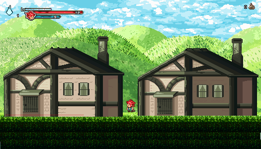
EDIT3 : avoiding to multiposting. /i now changed a way how I handle the right window. dont mind crates, its alpha-testplay scrn.  Edited by RebeaLeion - 09 December 2014 at 9:39am |
|
|
IP Logged |
|
|
eishiya
Commander
Joined: 04 August 2022 Online Status: Offline Posts: 1109 |
Posted: 09 December 2014 at 7:05am |
|
Having the windows be in shadow makes the building look hexagonal. If the door and windows are on the same plane, they should receive the same light.
Is the house a split-level or something? The windows are too high to be on the same level as the door, too low to be on a second floor. |
|
|
IP Logged |
|
|
RebeaLeion
Commander
Joined: 04 October 2017 Online Status: Offline Posts: 321 |
Posted: 10 December 2014 at 9:52am |
|
latest version of houses.

edit/update : 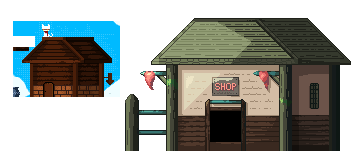
here I used adrwaing's man house as a reference, i hope he won't be angry about this. (I find him as good artist and this house / shape helped me a lot) edit / update 2 : after this shop I realized how should I tune the other house too so I reedit it. 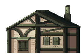 Edited by RebeaLeion - 11 December 2014 at 12:00pm |
|
|
IP Logged |
|
|
SuperTurnip
Commander
Joined: 25 March 2026 Online Status: Offline Posts: 301 |
Posted: 11 December 2014 at 5:19pm |
|
Good improvement. It looks odd that the door is so high above the ground, and the windows ARE too high up for a person that small to actually use. You might want to draw smaller houses! But your technique is getting better. Keep drawing!
|
|
|
IP Logged |
|
|
RebeaLeion
Commander
Joined: 04 October 2017 Online Status: Offline Posts: 321 |
Posted: 12 December 2014 at 1:08pm |
|
I made smaller houses. they can be seen in this concept sheet here :
http://3.bp.blogspot.com/-MlCQzhP6Z-E/VItYEIUUjtI/AAAAAAAABsg/_NvVNQo8U58/s1600/backg.png Edited by RebeaLeion - 12 December 2014 at 1:08pm |
|
|
IP Logged |
|
|
eishiya
Commander
Joined: 04 August 2022 Online Status: Offline Posts: 1109 |
Posted: 12 December 2014 at 1:12pm |
|
I think those new houses look better, but the same two issues from before remain:
- the houses aren't drawn at the same scale as the character so they look out of place - the shading on the houses seems to suggest a very different shape to them than the linework/feature placement does. What is the purpose of the shadow on the front of the buildings, if not to separate planes? |
|
|
IP Logged |
|
|
RebeaLeion
Commander
Joined: 04 October 2017 Online Status: Offline Posts: 321 |
Posted: 13 December 2014 at 4:31pm |
|
I am still working on houses, trying to do a little adjustments.
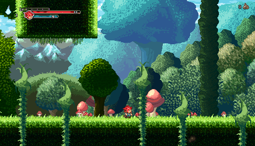
Meantime I took a break and did some mushrooms and branches. I used red from this pallete for mushroom hat: , it helped me a lot. (Link does not work, uh. its one from color thread - those spheres) 
 Edited by RebeaLeion - 13 December 2014 at 4:49pm |
|
|
IP Logged |
|
|
eishiya
Commander
Joined: 04 August 2022 Online Status: Offline Posts: 1109 |
Posted: 13 December 2014 at 4:59pm |
|
I think the mushrooms look great! However, your background elements are too similar in their value range to the foreground, so it's hard to tell which is which. It looks like you are using a reduced value and hue range for the background, which is good, but it needs to be reduced even more.
I'd also be wary of using so much red for the mushrooms unless they're foreground interactable elements, as red stands out a lot from the background. The character being red is a great idea for that same reason, though. |
|
|
IP Logged |
|
|
RebeaLeion
Commander
Joined: 04 October 2017 Online Status: Offline Posts: 321 |
Posted: 16 December 2014 at 11:25am |
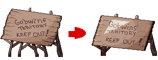
I changed sign, please let me know what do u think about the new one. Edited by RebeaLeion - 16 December 2014 at 11:41am |
|
|
IP Logged |
|
|
eishiya
Commander
Joined: 04 August 2022 Online Status: Offline Posts: 1109 |
Posted: 16 December 2014 at 11:42am |
|
I think the new sign looks better, except for that triangular area of... paint? light? It looks extraneous if it's paint, and nonsensical if it's light. The white lines near the edge also don't read as anything in particular. If they're meant to be highlights, I don't think you need them since wood isn't normally that shiny (unless it's treated, but that sign doesn't look that fancy).
The old sign looked made of distinct boards because the edges (especially on the right) were irregular with some implied gaps between the boards. I think that gave it more personality, whereas the new one seems like it's a solid board with some irregularities. I think if it's meant to be multiple boards, you should incorporate some of that edge irregularity into the new one, while keeping the interior of the sign free of the dark shadows. The shading on the sign makes the sign look spherical. The sign is largely a flat plane, there's no reason for it to have that rounded gradation of shadows on it unless it's being lit by a very weak light source (e.g. a candle) that's right next to it. If this is for a game, I'd avoid such specific light sources and aim for something more general, like a distant overhead light source. Such a light source would make your forms easier to read, and it'd make it easier to make all the game objects to look like they belong together no matter where you put your in-game light sources (if you have any at all). |
|
|
IP Logged |
|
|
RebeaLeion
Commander
Joined: 04 October 2017 Online Status: Offline Posts: 321 |
Posted: 16 December 2014 at 11:45am |
|
is here any example of this distant overhead light source ?
I combined borders from 1st sign. 
or a test without a light : 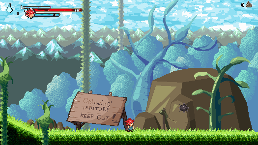
with  Edited by RebeaLeion - 16 December 2014 at 12:15pm |
|
|
IP Logged |
|
|
eishiya
Commander
Joined: 04 August 2022 Online Status: Offline Posts: 1109 |
Posted: 16 December 2014 at 12:18pm |
|
The light source I am describing is the standard for 2D games, you've seen it everywhere. Here's a generic cube stolen from Gas13's tutorial. Look how each side of the cube is a solid colour. This is because they are flat planes, and the light source is distant and bright enough that its falloff (gradual diminishing of intensity with distance) is irrelevant to the scale of this cube. With very weak light sources, the falloff is raid enough to be seen, like with these lights. With weak light sources, it's possible that one part of a flat plane will get noticeable more light than another, but with strong light sources, the light will be (practically) equal across every part of the surface. This is desirable because it makes your assets work in any part of your game without looking weird. The lighting you have on that sign now would only look natural if the sign is positioned right next to a small light source, which isn't practical for a game.
Here are examples from various games that use distant light sources for their shading, note how the flat surfaces all have a flat level of light/shadow, and how the level of light/shadow only changes at corners and curves (or where an object is casting a shadow on another): Seiken Densetsu 3 Final Fantasy Tactics Advance Metal Slug 3 is full of detail, but look at how all the shadows are the result of irregular forms, and flat surfaces have a consistent shadow instead of one that fades out. The metal-suit guys are a great example of flat surfaces, but check out the wagon too. The part facing the sky is the brightest, and the sides are darker because they're facing away from the light (with internal variation because they're irregular rather than perfectly smooth). Chasm also illustrates this - levels of shadow change for exactly 2 reasons*, surfaces turning/curving away from the distant light source, and cast shadows. Basically, the distant strong light source is what most people tend to use unless they're specifically aiming for another type of lighting. You were probably thinking in similar terms too, but then added that rounded shadow just for visual interest. I can understand the desire to add visual interest, but making your flat sign look like a bulbous shape isn't a great way to achieve that xP * Actually 3, there's also something called ambient occlusion that makes concave corners and such darker, but that's irrelevant for a free-standing object such as your sign. Ambient occlusion is found in most of the better-drawn games out there, but it's an effect that happens regardless of light source and has nothing to do with the lighting problems in your sign. |
|
|
IP Logged |
|
|
RebeaLeion
Commander
Joined: 04 October 2017 Online Status: Offline Posts: 321 |
Posted: 19 December 2014 at 2:47pm |
|
All advices're really helping me a lot.
My last sign edit, I think I fixed shadows now ? Font is a little messy but clean one did not fit in goblin's territory. 
a little off: Here's a vid that's capturing how my concept/assets progressed since april, when I started with pixelart. https://www.youtube.com/watch?v=Feg3vR2evCk Edited by RebeaLeion - 19 December 2014 at 3:56pm |
|
|
IP Logged |
|
|
RBL
Midshipman 
Joined: 07 February 2018 Online Status: Offline Posts: 55 |
Posted: 19 December 2014 at 8:00pm |
|
Try to avoid noisy or dithered textures if the game is intended for scaled viewing. Dithering came from the analog monitor era.
|
|
|
IP Logged |
|
|
RebeaLeion
Commander
Joined: 04 October 2017 Online Status: Offline Posts: 321 |
Posted: 21 December 2014 at 1:27pm |
|
I am keeping a lot of different trees (different style of creation) in game, but it quite does not matter as it creates forest together. I however discovered a very simple and easy way to create graphic now and I m sticking to it (so far) and its quite ok readable in the game.
I even uploaded quick tutorial for beginners. https://www.youtube.com/watch?v=97O1ELnOKxk Everyone could draw such simple thing as this (I just didnt think of it sooner).(I made special brush of leaf shape and it's really helpful for this style too). same style was used here :  Edited by RebeaLeion - 21 December 2014 at 3:01pm |
|
|
IP Logged |
|
|
eishiya
Commander
Joined: 04 August 2022 Online Status: Offline Posts: 1109 |
Posted: 21 December 2014 at 1:55pm |
|
The parallax sky in the gif looks wrong. If it's not going to scroll in x, it should also not scroll in y.
|
|
|
IP Logged |
|
|
RebeaLeion
Commander
Joined: 04 October 2017 Online Status: Offline Posts: 321 |
Posted: 23 December 2014 at 12:04am |
|
Originally posted by eishiya I changed p. of X, it's now moving too along with mountains.
The parallax sky in the gif looks wrong. If it's not going to scroll in x, it should also not scroll in y.  Edited by RebeaLeion - 24 January 2015 at 2:38am |
|
|
IP Logged |
|
|
Turon
Commander
Joined: 03 March 2016 Online Status: Offline Posts: 128 |
Posted: 23 December 2014 at 3:03am |
|
This looks like a very interesting game, does it have RPG elements?
The ground kind of reminds me of "Grasstown" in Cave Story. |
|
|
IP Logged |
|
|
SuperTurnip
Commander
Joined: 25 March 2026 Online Status: Offline Posts: 301 |
Posted: 23 December 2014 at 12:09pm |
|
The goblin in the background is an awesome touch. :)
I think you can get rid of the noisiness under the grass, and in the background trees (which have, by the way, improved a HUGE amount! Great work!). You have a lot of very simple tiles and sprites, and a lot of very complicated ones. They look good from far away, because your colours are nice, but closer up they can seem out of place. Toning down the noisiest sprites and adding details to the simplest ones means you don't need to change everything, but it'll help make everything fit together. |
|
|
IP Logged |
|
|
RebeaLeion
Commander
Joined: 04 October 2017 Online Status: Offline Posts: 321 |
Posted: 23 December 2014 at 12:32pm |
|
Turon> yes. This is RPG's concept zone. I decided that I will create a concept zone first - how a game could look like. I uploaded a full-play vid for friends, but you can take a look too if u d like to.
https://www.youtube.com/watch?v=ycg7J8ol4-U /vid description. You can see it combines both new and old assets together as I didnt want to rework everything. I think it kinda works together. Turnip, You actually noticed a goblin! usually you don´t even notice during a play :) ( he will move on the bridge too,I m having his walk anim done but I ll have to code it later). Which trees do you mean ? those in the latest pic with the goblin on the bridge ? Two on the left ? What noisy is there ? those-re leaf like shapes. Those on , same like on this tree : 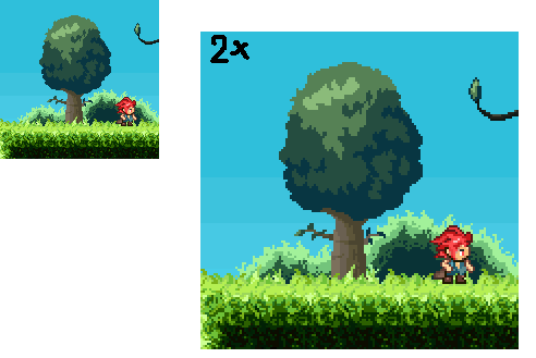
I like pixeljoint. I m getting Many useful tips here. So happy Christmas now! Edited by RebeaLeion - 11 January 2015 at 1:15am |
|
|
IP Logged |
|
|
RebeaLeion
Commander
Joined: 04 October 2017 Online Status: Offline Posts: 321 |
Posted: 24 December 2014 at 6:12am |
|
I didnt do much and I won't these few days but I did some quick noise? edit on the grass, because everyone is telling me to :) so here it is, how do you like the new one ? i d like to keep texture instead of one colour blocks. Original is the upper one: 
EDIT : I plan another edit of grass in the future I think I know what you meant. It's little distracting. Edited by RebeaLeion - 17 January 2015 at 12:26pm |
|
|
IP Logged |
|
|
RebeaLeion
Commander
Joined: 04 October 2017 Online Status: Offline Posts: 321 |
Posted: 02 January 2015 at 11:49pm |
|
edit: early alpha link was here, downlaod removed as assets were outdated.
Edited by RebeaLeion - 24 January 2015 at 2:39am |
|
|
IP Logged |
|
|
RebeaLeion
Commander
Joined: 04 October 2017 Online Status: Offline Posts: 321 |
Posted: 09 January 2015 at 2:10pm |
|
final grass touch ? removed the noisy things.
EDIT2016: This was still noisy, I didnt realize back then. 
|
|
|
IP Logged |
|
| << Prev Page of 4 Next >> |
| |
||
Forum Jump |
You cannot post new topics in this forum You cannot reply to topics in this forum You cannot delete your posts in this forum You cannot edit your posts in this forum You cannot create polls in this forum You cannot vote in polls in this forum |
|
