| Active TopicsSearchRegisterLogin |
| WIP (Work In Progress) | |
| |
  |
| << Prev Page of 4 |
| Author | Message |
|
RebeaLeion
Commander 
Joined: 04 October 2017 Online Status: Offline Posts: 321 |
  Posted: 25 April 2015 at 6:23am Posted: 25 April 2015 at 6:23am |
|
so, i have enough that it can go into WIP progress now. I will try to fill it eventually. If you see anything off-place let me know, so i can fix it.
After practice map and peoples response on it I think I get an idea how to do the second map right. note: upper back trees will be hand-fixed a bit.  Edited by RebeaLeion - 25 April 2015 at 6:24am |
|
 IP Logged IP Logged |
|
|
dyluck
Commander
Joined: 24 July 2015 Online Status: Offline Posts: 231 |
Posted: 25 April 2015 at 7:27am |
|
It's beatiful! just some scale-distance issues.
The threes and other elements far away should look much more little than the closer ones. Edited by dyluck - 25 April 2015 at 7:28am |
|
|
IP Logged |
|
|
RebeaLeion
Commander
Joined: 04 October 2017 Online Status: Offline Posts: 321 |
Posted: 25 April 2015 at 8:22am |
|
I guess you re right ! thanks for the tip. I didnt think about it before, I just scaled 1 row a bit and 2nd even more and put it as background. But that puts me in front of a question.
Because I decided to use background (sky line) as part of map too i could not scale it down as locations need to be of same size. However I will try to think about it next time. edit : uploaded to gallery Edited by RebeaLeion - 25 April 2015 at 12:24pm |
|
|
IP Logged |
|
|
RebeaLeion
Commander
Joined: 04 October 2017 Online Status: Offline Posts: 321 |
Posted: 13 August 2015 at 3:35am |
|
So I have been working on game again, after break.
I recently posted mockup into gallery, this is the one : I am not sure about the old hills at all now. so I made new hills. Please let me know which do you like more. I think new are much better tho without a doubt. New :  Edited by RebeaLeion - 13 August 2015 at 4:09am |
|
|
IP Logged |
|
|
eishiya
Commander
Joined: 04 August 2022 Online Status: Offline Posts: 1109 |
Posted: 13 August 2015 at 6:56am |
|
I definitely prefer the newer ones. But maybe you could make the colour band transitions a little more grass-textured? There's some style dissonance currently between the background and foreground because the foreground is very texture-heavy, while the hills look much more cartoony with their large clumps.
|
|
|
IP Logged |
|
|
RebeaLeion
Commander
Joined: 04 October 2017 Online Status: Offline Posts: 321 |
Posted: 13 August 2015 at 8:44am |
|
Originally posted by eishiya
while the hills look much more cartoony with their large clumps. 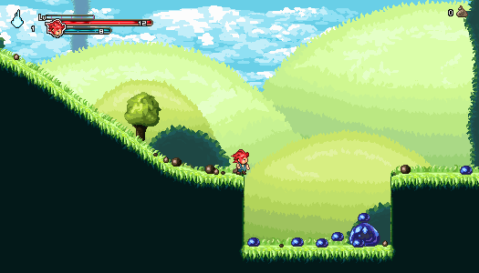
ok, I changed clumps. What about this one. Edited by RebeaLeion - 13 August 2015 at 8:47am |
|
|
IP Logged |
|
|
eishiya
Commander
Joined: 04 August 2022 Online Status: Offline Posts: 1109 |
Posted: 13 August 2015 at 9:22am |
|
I think that suits the style better! I think you could add a little more life and a more natural look to them by not just using straight bands of colours. Vary the thickness of each band, have some dips and swirls. Hills are rarely perfectly smooth bulbs of grassy ground, they often have more complex shapes. Play around with that. With the low-contrast palette you're using for the background, you can do a lot with your hills without them looking distracting.
|
|
|
IP Logged |
|
|
RebeaLeion
Commander
Joined: 04 October 2017 Online Status: Offline Posts: 321 |
Posted: 13 August 2015 at 12:20pm |
|
Did you mean something like this ? I added some curls there.

|
|
|
IP Logged |
|
|
eishiya
Commander
Joined: 04 August 2022 Online Status: Offline Posts: 1109 |
Posted: 13 August 2015 at 2:10pm |
|
I meant on a larger scale, making shapes with your bands of colours, not with the individual features.
|
|
|
IP Logged |
|
|
RebeaLeion
Commander
Joined: 04 October 2017 Online Status: Offline Posts: 321 |
Posted: 13 August 2015 at 2:58pm |
|
Oh, I understand. I will try not make such straight lines for next hills, also will try new shapes. Thanks for tips ! Hills look better now.
Edited by RebeaLeion - 13 August 2015 at 3:02pm |
|
|
IP Logged |
|
|
RebeaLeion
Commander
Joined: 04 October 2017 Online Status: Offline Posts: 321 |
Posted: 17 August 2015 at 12:01pm |
|
This is a bit off-topic post.
Thanks to everyone's support and feedback I was able to create some pixel graphic and thanks to it I was able to put some game-footage video together. You may look at youtube trailer, if you re intersted how the game looks now. https://www.youtube.com/watch?v=n0rL8TU_HxQ |
|
|
IP Logged |
|
|
CritiqueMyWork
Midshipman 
Joined: 12 May 2025 Online Status: Offline Posts: 56 |
Posted: 17 August 2015 at 1:24pm |
|
Originally posted by V U L C A N
Was really enjoyable to read through this topic and see your progress as a new pixel artist there were alot of tips i picked up on. Nice job^_^ I agree with you, we truly live in a unique time where we can see bit a bit the progress of a person. It was really interesting looking how someone in one year improves so much. It gives to other learners (such as me) hope about future improvements. It is tempting to start a thread like this and receive guidance. Congratz RebeaLeion. |
|
|
IP Logged |
|
|
RebeaLeion
Commander
Joined: 04 October 2017 Online Status: Offline Posts: 321 |
Posted: 11 February 2016 at 9:31am |
|
I am pixelling all the time!
This is my current WIP, creating another part of the world. It's quite fun. I will mash some island to right side and new landscape. What do you think - should there be mountains behind seas horizon as well (same as those faded/further on the left). 
|
|
|
IP Logged |
|
|
Noimagin
Midshipman
Joined: 08 July 2016 Online Status: Offline Posts: 12 |
Posted: 12 February 2016 at 12:32pm |
|
Hey, random post but thanks for bumping this, was a really interesting read and amazing to see how much youve improved with every post.
Has inspired me to make a thread of my own in the hopes I'll see such an improvement also! Keep up the good work! |
|
|
IP Logged |
|
| << Prev Page of 4 |
| |
||
Forum Jump |
You cannot post new topics in this forum You cannot reply to topics in this forum You cannot delete your posts in this forum You cannot edit your posts in this forum You cannot create polls in this forum You cannot vote in polls in this forum |
|
