| Active TopicsSearchRegisterLogin |
| WIP (Work In Progress) | |
| |
  |
| Author | Message |
|
Paulo Peres
Seaman 
Joined: 26 February 2023 Online Status: Offline Posts: 23 |
  Topic: (WIP) - Female Character Topic: (WIP) - Female CharacterPosted: 04 November 2008 at 6:59pm |
|
Hi, everyone.
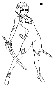
In this topic I will be posting a PA progress of my character. This is the original picture in pencil:
 And this is the picture in the final size, base of the PA pic:
 Bye, I see you in the next post!
|
|
 IP Logged IP Logged |
|
|
Tarenken
Commander 
Joined: 19 September 2023 Online Status: Offline Posts: 251 |
Posted: 04 November 2008 at 7:03pm |
|
So, are you going to trace it?
I love the original art. I can't wait to see how you'll shade it. The asymmetrical swords bother me, but otherwise it's good. |
|
|
IP Logged |
|
|
Paulo Peres
Seaman
Joined: 26 February 2023 Online Status: Offline Posts: 23 |
Posted: 05 November 2008 at 3:37am |
|
Originally posted by Tarenken
So, are you going to trace it? I love the original art. I can't wait to see how you'll shade it. The asymmetrical swords bother me, but otherwise it's good. Thanks, man!
I'm trancing the pic, now. I will post it, soon.
|
|
|
IP Logged |
|
|
Paulo Peres
Seaman
Joined: 26 February 2023 Online Status: Offline Posts: 23 |
Posted: 07 November 2008 at 7:59am |
|
New images:
Lineart:
 Base color:
 |
|
|
IP Logged |
|
|
Damian
Commander
Joined: 24 February 2023 Location: United Kingdom Online Status: Offline Posts: 455 |
Posted: 07 November 2008 at 2:22pm |
|
looking good! I like the character as a whole, very sexy if I may add.
|
|
|
IP Logged |
|
|
jalonso
Admiral 
Joined: 29 November 2022 Online Status: Offline Posts: 13537 |
Posted: 07 November 2008 at 2:30pm |
|
Very nice but those base colors are horrid. Will wait on progress.
|
|
|
|
|
|
IP Logged |
|
|
Claes
Midshipman 
Joined: 04 September 2008 Location: Sweden Online Status: Offline Posts: 49 |
Posted: 08 November 2008 at 4:44am |
|
Ah, nice indeed. But must agree with jalonso there, some extrem eye killing base colors you have there. Will look foward to more progress :) |
|
|
IP Logged |
|
|
Paulo Peres
Seaman
Joined: 26 February 2023 Online Status: Offline Posts: 23 |
Posted: 09 November 2008 at 9:16am |
|
Thanks for the views, guys. I don't undertand so much why the base colors was too bad (because my english knowledge)... but let's go foward! Edited by Paulo Peres - 09 November 2008 at 9:16am |
|
|
IP Logged |
|
|
ellie-is
Commander
Joined: 12 September 2021 Online Status: Offline Posts: 706 |
Posted: 09 November 2008 at 9:40am |
|
They hurt the eyes =P
|
|
|
IP Logged |
|
|
Paulo Peres
Seaman
Joined: 26 February 2023 Online Status: Offline Posts: 23 |
Posted: 10 November 2008 at 6:19pm |
|
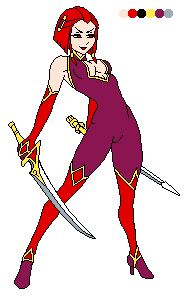
New atualization:
Lights, shadows and backlights:
 Time for the AA and dither effects.
|
|
|
IP Logged |
|
|
Fatalis67
Midshipman
Joined: 08 August 2008 Online Status: Offline Posts: 80 |
Posted: 10 November 2008 at 6:37pm |
|
Still, the colors are a bit too saturated/bright imo.
|
|
|
IP Logged |
|
|
Ravey
Seaman
Joined: 04 November 2008 Location: United Kingdom Online Status: Offline Posts: 11 |
Posted: 10 November 2008 at 11:51pm |
|
Hey Paulo,
I agree with the comments on your colour palette. More than anything, there isn't much variation! Sure brightness and saturation are important, but the shades are all the same hue. Without hue, you'll have trouble for example, making skin tones look anything but pale, so don't forget it! You should also try using blues and subtle shades of purple together or if you want to make gold, use shades of yellows and oranges. Just treat it like a palette in real life...you're going to have to mix things together to get exactly what you want out of it! Besides that, the lineart isn't as sharp as it could be in places, there are still some instances of double pixeling which could've been avoided quite easily. I also think you lost some of the original drawing along the way, particularly the woman's face and the handles on her sword. In terms of shading, you should use a rounded brush to show the curves of her thighs etc and then just remove the extra pixels. Here's an edit for you:  Edited by Ravey - 10 November 2008 at 11:58pm |
|
|
IP Logged |
|
|
Paulo Peres
Seaman
Joined: 26 February 2023 Online Status: Offline Posts: 23 |
Posted: 11 November 2008 at 8:23am |
|
Ok...
I think I find the problem, is the monitor in my home. I see the image in the monitors in my job (it's better calibrated) and there, the image it's very bright too... I gonna try a modification. Originally posted by Ravey Hey Paulo, I agree with the comments on your colour palette. More than anything, there isn't much variation! Sure brightness and saturation are important, but the shades are all the same hue. Without hue, you'll have trouble for example, making skin tones look anything but pale, so don't forget it! You should also try using blues and subtle shades of purple together or if you want to make gold, use shades of yellows and oranges. Just treat it like a palette in real life...you're going to have to mix things together to get exactly what you want out of it! Besides that, the lineart isn't as sharp as it could be in places, there are still some instances of double pixeling which could've been avoided quite easily. I also think you lost some of the original drawing along the way, particularly the woman's face and the handles on her sword. In terms of shading, you should use a rounded brush to show the curves of her thighs etc and then just remove the extra pixels. Very thanks for the attention, Ravey. But about of the hue choice of the colors... I think this is relative, my intention was really a predominance of a red tones for this character, because I feel this colors combinated with the personality of the her. Before choose the reds I maked the experience of more colors for the clothes and hair, but nothing was too good like the red and derivatives, for me. Ah! The lineart need be more worked better indeed, there is much work on it yet! |
|
|
IP Logged |
|
|
Ravey
Seaman
Joined: 04 November 2008 Location: United Kingdom Online Status: Offline Posts: 11 |
Posted: 11 November 2008 at 9:23am |
|
Originally posted by Paulo Peres
But about of the hue choice of the colors... I think this is relative, my intention was really a predominance of a red tones for this character, because I feel these colours combined with her personality. Before choosing the reds I tried more colours for the clothes and hair, but nothing was good like the red and derivatives, for me. Yeah, you're probably right. It might even look good if you used the same shades of red for the entire suit and you would even save a few colours that way too. Sometimes variation can be good too...maybe try a shade of purple with a red highlight? Anyways i'll keep an eye on this topic if you get around to posting a new version. Edited by Ravey - 11 November 2008 at 9:23am |
|
|
IP Logged |
|
|
Paulo Peres
Seaman
Joined: 26 February 2023 Online Status: Offline Posts: 23 |
Posted: 24 November 2008 at 6:31pm |
|
Hi, after a long time, I'm here again.
There's a new atualization. I modified some colors and began the AA work.
 Edited by Paulo Peres - 24 November 2008 at 6:35pm |
|
|
IP Logged |
|
|
Damian
Commander
Joined: 24 February 2023 Location: United Kingdom Online Status: Offline Posts: 455 |
Posted: 25 November 2008 at 12:09am |
|
I like it, but...the colours seem to bother me a bit.
On the body suite it doesn't look like the colours contrast that much or define a specific movement well enough. |
|
|
IP Logged |
|
| |
||
Forum Jump |
You cannot post new topics in this forum You cannot reply to topics in this forum You cannot delete your posts in this forum You cannot edit your posts in this forum You cannot create polls in this forum You cannot vote in polls in this forum |
|
