[Feedback] Drawing a Knight
Printed From: Pixel Joint
Category: Pixel Art
Forum Name: WIP (Work In Progress)
Forum Discription: Get crits and comments on your pixel WIPs and other art too!
URL: https://pixeljoint.com/forum/forum_posts.asp?TID=27307
Printed Date: 21 April 2026 at 11:05pm
Topic: [Feedback] Drawing a Knight
Posted By: SydneyMatheus
Subject: [Feedback] Drawing a Knight
Date Posted: 13 February 2022 at 6:22pm

Hi, I'm a beginner in Pixel Art, this was an attempt to draw a knight as a "half-demon" samurai hahaha (idk) based on the tutorial: http://derekyu.com/makegames/pixelart.html - http://derekyu.com/makegames/pixelart.html . I tried to put into practice the shading and selout techniques present in the tutorial, some other techniques I didn't give much importance and some I avoided because they seem more complex like Dithering and AA. My inspirations for this creation were images from Google and the PixelJoint gallery itself. Some problems and difficulties I had, in addition to the application of the techniques, was in the anatomy as you can see, at the end of the art I discovered a site that simulates a 3D puppet where I could have based myself, but anyway, that's for next time ( https://app.justsketch.me/ - https://app.justsketch.me/ ). If anyone has any tips I would be grateful, thanks. (This is my first post here, sorry if I made any mistakes and sorry for my bad English) |
Replies:
Posted By: specialmin64
Date Posted: 14 February 2022 at 9:46am
|
pretty good for a beginner, kinda reminds me of the sprites in golden axe. If you'll forgive my audacity, I made a quick edit: 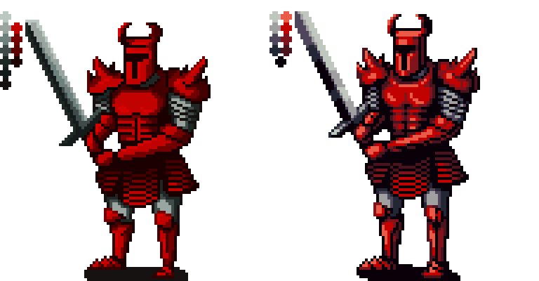 My main advice is: -Make sure lines are anti-aliased ("AA'd") when possible. You can get away with not using AA (Cure, for instance, has a lot of great pixel art that keeps AA minimal) but I highly recommend learning how to AA properly if you want pixel art that looks smooth. Even touches of it can make a big difference IMO -Avoid placing highlights right up against the boundaries of rounded forms. For example: put some distance between the forearm's dark edge and its highlight) -Make sure forms appear symmetrical. For example: even out the helmet's bottom edge, the lengths of the calves... -Shift hues between light and shadow. Adjusting hue and value simultaneously makes colors appear more dynamic. Usually, areas in shadow have cooler colors, while illuminated areas have warmer colors (the opposite can work too, though) -Add core shadows to make surfaces appear shinier. This one's just a suggestion. Cyangmou's armor renders are probably the best reference out there if you like this sort of look. I also recommend checking out Snake's "Shovel Knight Redo", which features similar characters and scale to your drawing. I made a few other adjustments, like lengthening the legs and making the elbows more level. I struggle with anatomy and proportions myself, so it probably isn't perfect, lol. Also I don't really know how to render weapons, either. Someone else might be able to help with that! Cheers
|
Posted By: SydneyMatheus
Date Posted: 14 February 2022 at 12:03pm
| First of all your editing is amazing, thank you very much for your time. I liked the reference mentions, your tips and suggestions were very clear, I will try to put into practice all these points. Probably my focus of joint study of anatomy will be AA and shadow as you mentioned. And again thank you very much. |
Posted By: specialmin64
Date Posted: 14 February 2022 at 2:20pm
|
My pleasure! Good luck |
Posted By: 2blackbar
Date Posted: 10 May 2022 at 2:58pm
|
Limit grayscale to like 5 shades , this is way too much, also introduce higlights on red + shift hue on shadows and his. Overall id change his proportions and pose, steal and study from some beatemups of early 90s, thats how you learn.
|